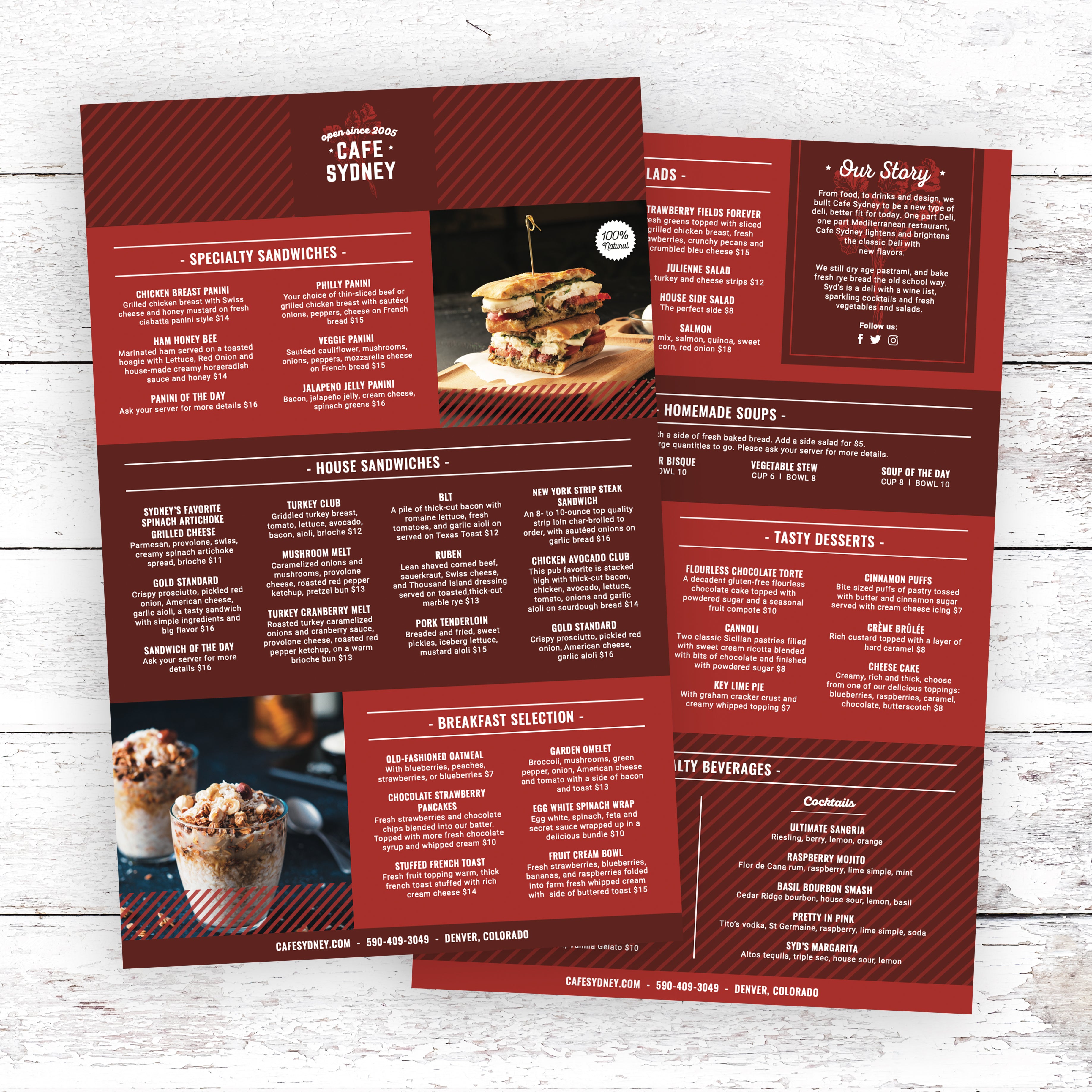
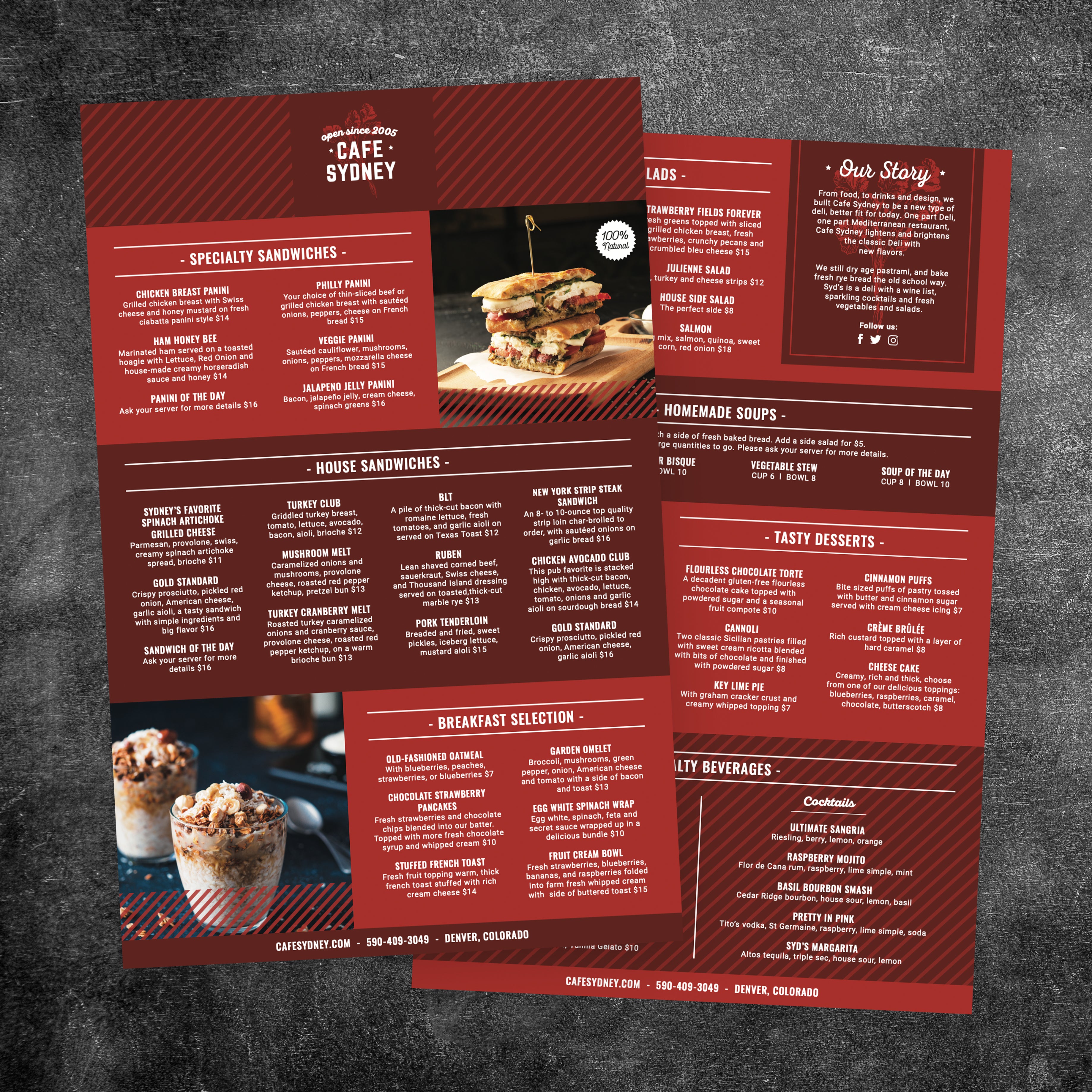
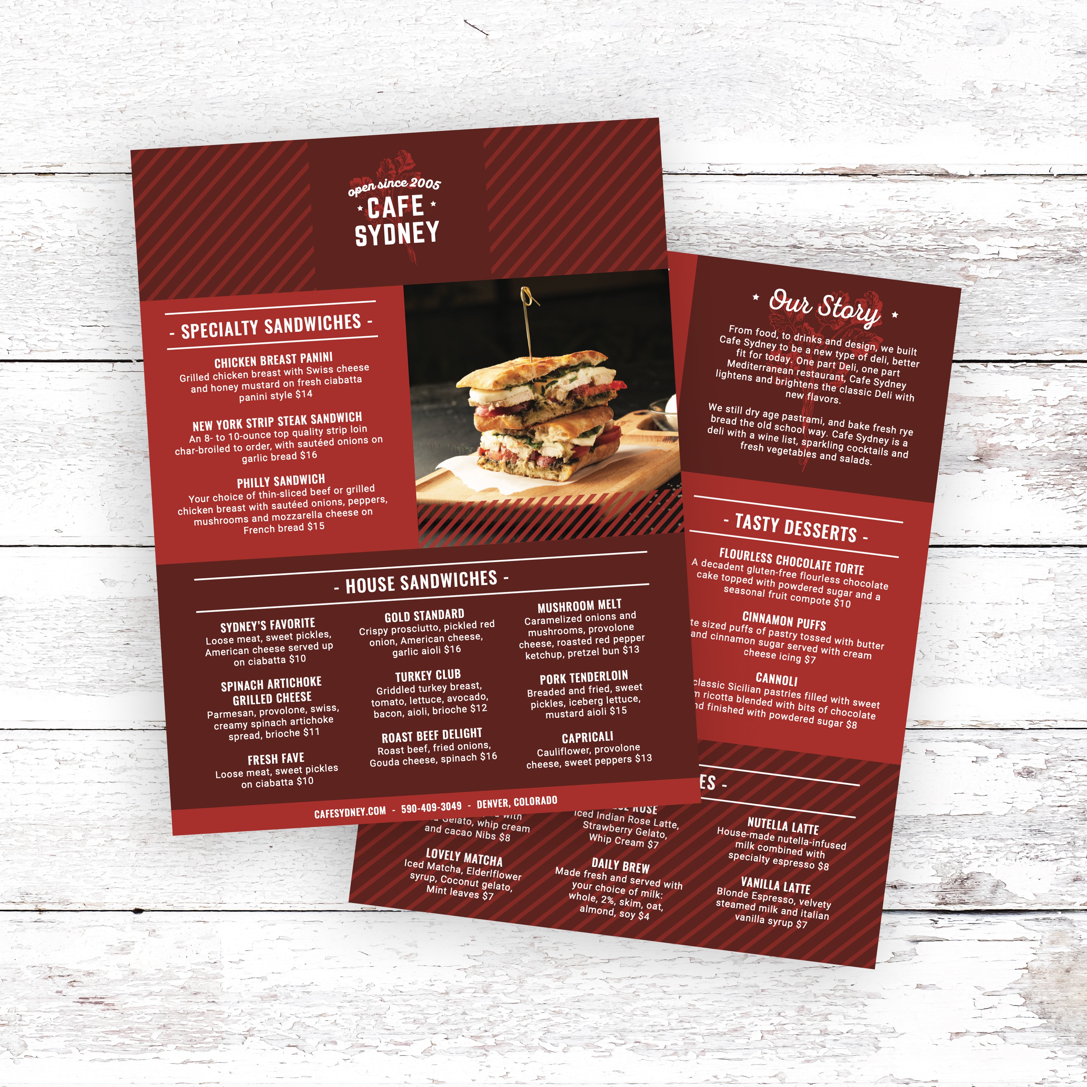
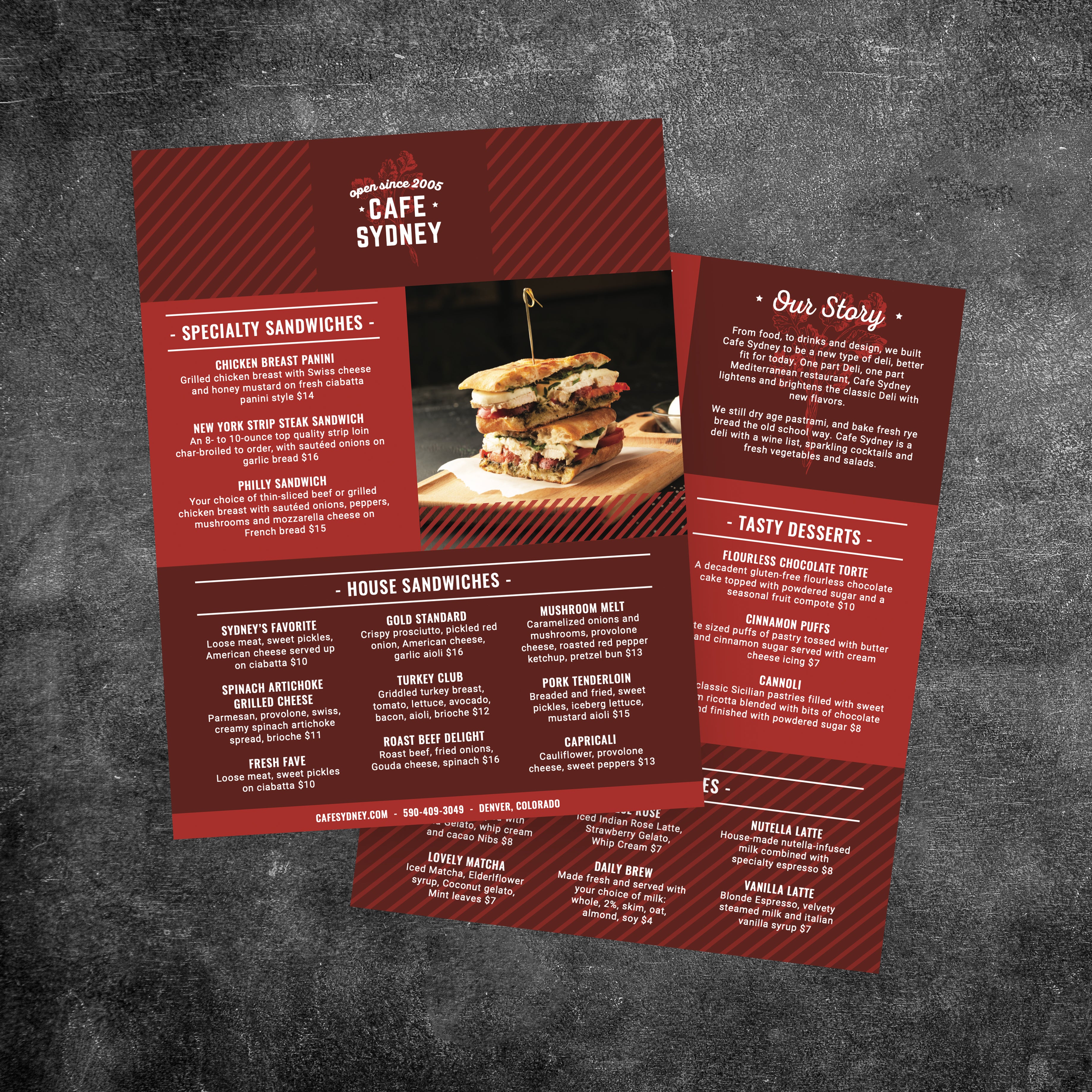
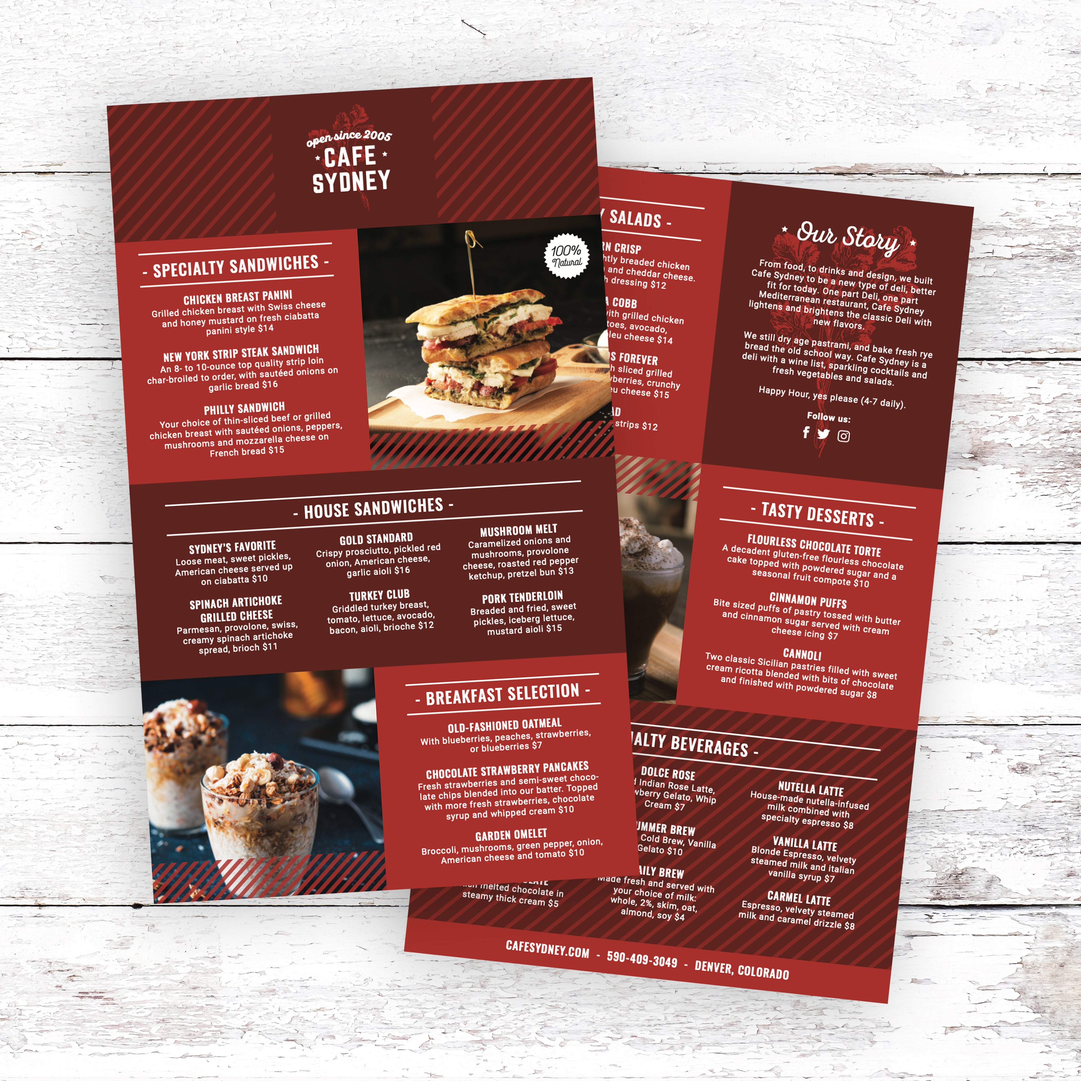
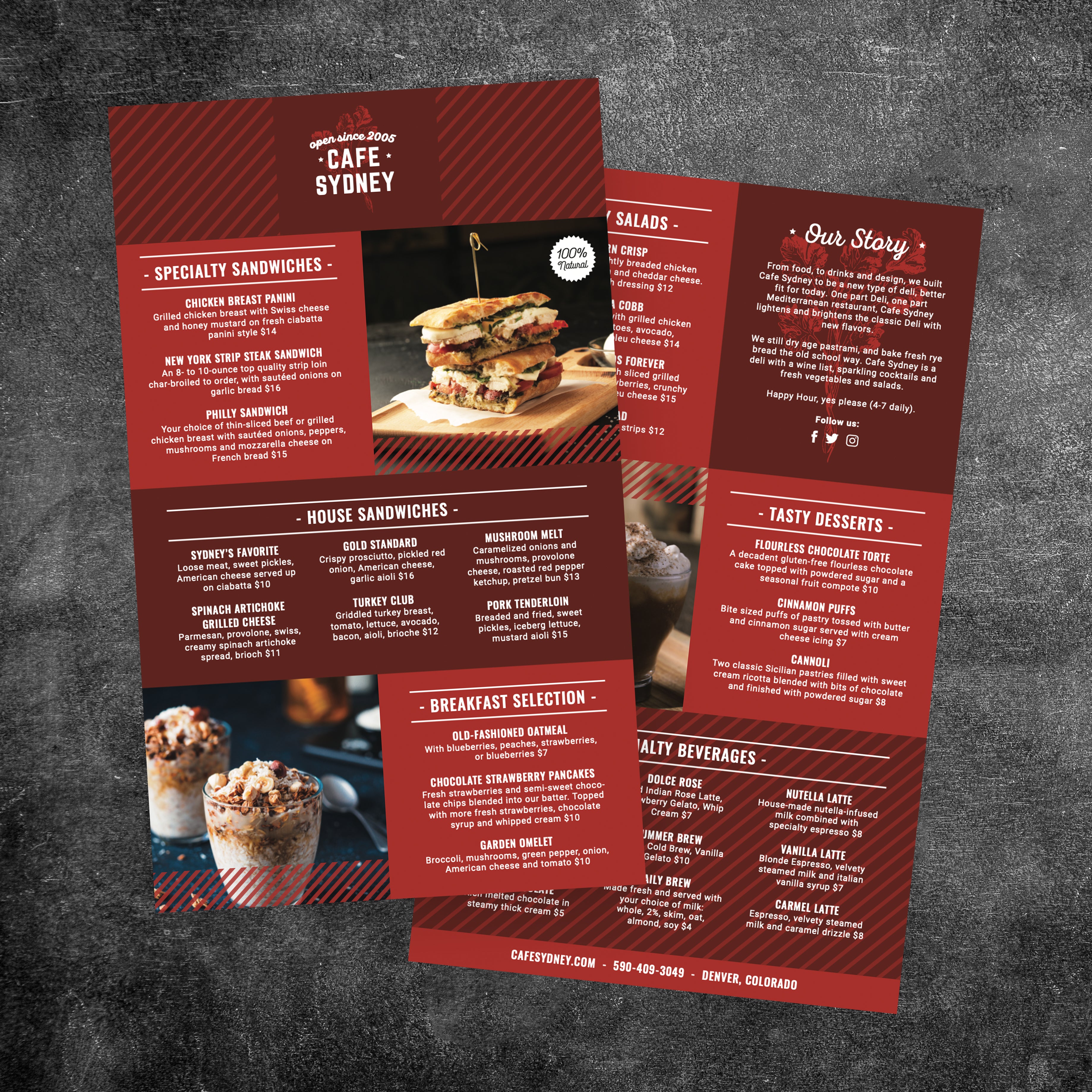
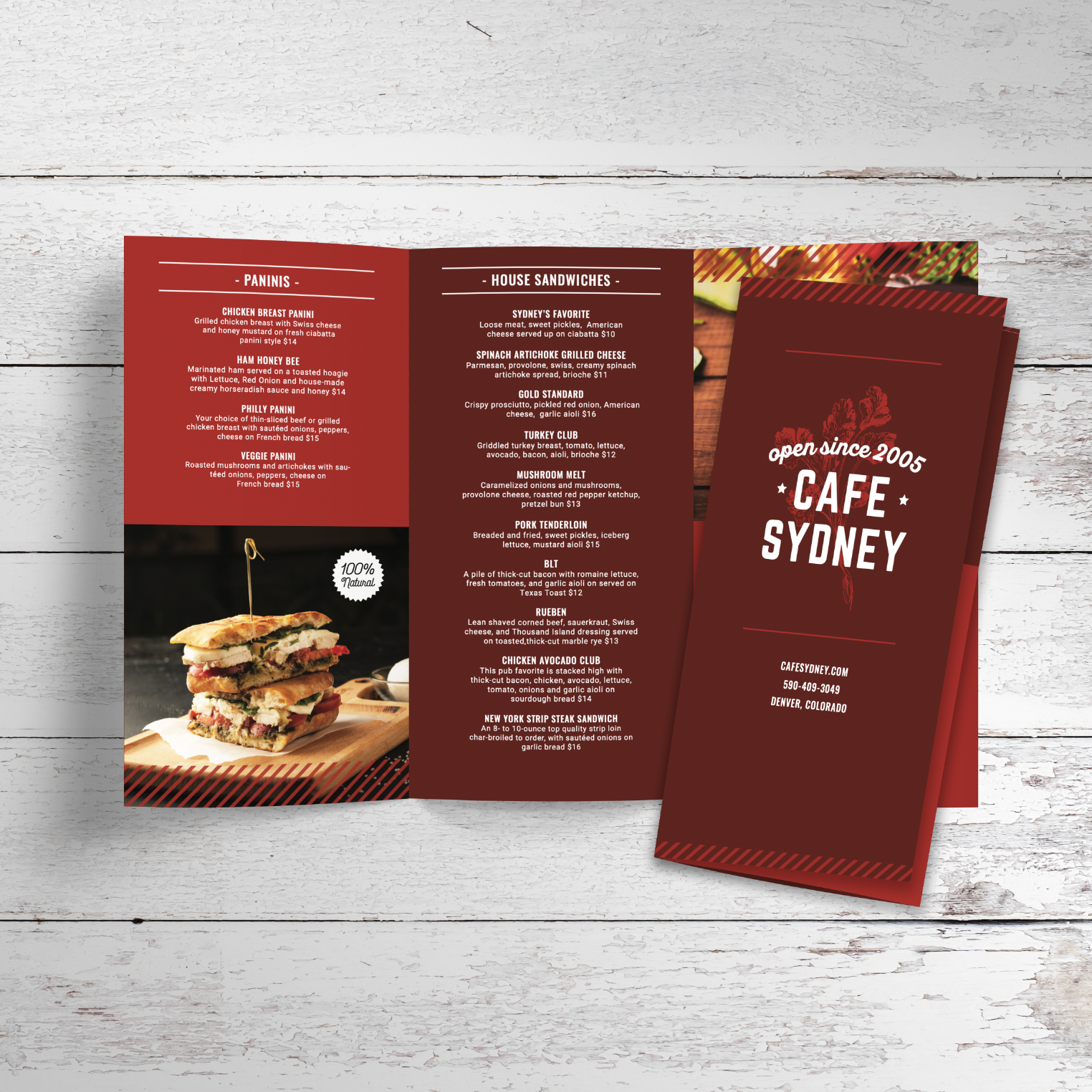
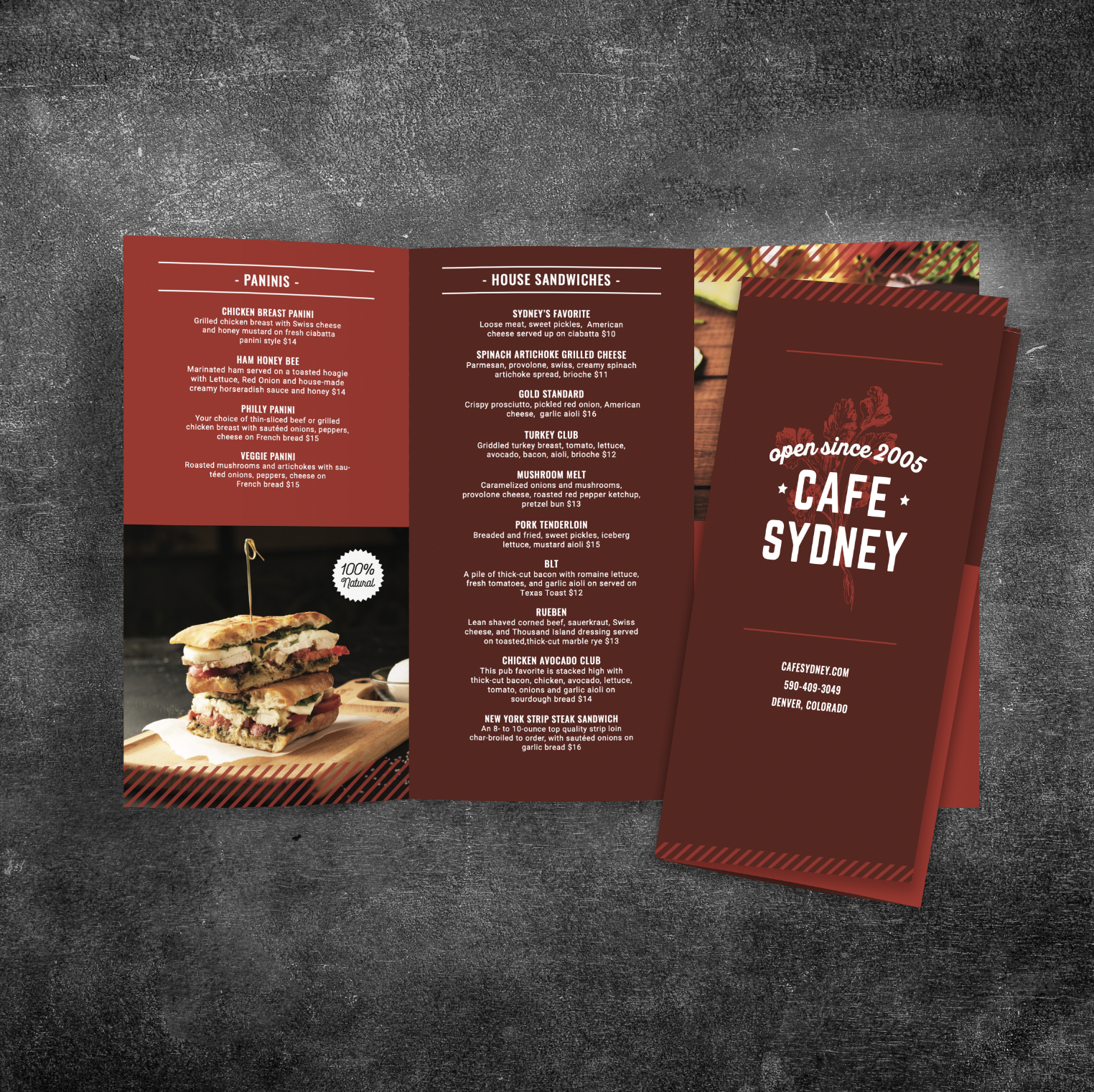
Modern Cafe Menu Template
9 products
Showing 1 - 9 of 9 products


Recently viewed
A cafe menu does more than list items. It shapes first impressions, supports fast ordering, and reflects how organized and modern your space feels. Starting from scratch often leads to wasted time, inconsistent formatting, and design decisions that don’t translate well once the menu is printed and used daily. A free modern cafe menu template gives you a proven structure so the focus stays on clarity, readability, and easy updates, not constant redesigns.
A Clean Structure that Saves Time From the Start
Designing a menu without a framework usually means repeated adjustments to spacing, fonts, and alignment. Templates eliminate that guesswork by providing a balanced layout that already accounts for hierarchy and flow. This allows cafes to move straight into organizing items instead of troubleshooting design issues later.
Built-in Readability for Real Service Conditions
Menus need to work in varied lighting, at different distances, and during busy rushes. A modern template is built with readable font sizing, logical section breaks, and enough spacing to prevent crowding. This helps customers scan quickly and make decisions without needing extra explanation from staff.
Easier Updates When Menus Change Frequently
Seasonal drinks, price updates, and limited-time items are common in cafes. Templates are designed so changes can be made without shifting the entire layout. When categories and spacing remain consistent, updates stay clean and professional instead of looking patched together.
Consistent Presentation Across Different Menu Sizes
Cafes often use more than one menu format, such as counter menus, full-size dine-in menus, or compact takeaway versions. Templates make it easier to keep the same look and structure across sizes, so customers recognize the menu instantly, no matter how they’re viewing it.
Professional Printing That Supports Daily Use
A well-designed template works best when paired with durable printing. We print cafe menus on TerraSlate waterproof, rip-proof paper designed for frequent handling and simple cleaning with soap and water. Unlike menus with traditional lamination, our menus avoid clouding and delamination over time, helping cafes maintain a clean, modern presentation day after day.
A modern cafe menu should look clean, but it also needs to perform during real service. Customers should be able to scan categories quickly, understand pricing without effort, and move from browsing to ordering without hesitation. When layout choices are intentional, your menu reduces confusion at the counter and helps your staff spend less time answering basic questions.
Fonts and Spacing that Improve Readability
Typography is one of the biggest factors in menu usability. Modern templates use clean fonts that remain legible at smaller sizes and don’t rely on decorative styling that slows down scanning. Spacing matters just as much. Enough white space between items and categories prevents the menu from feeling crowded and helps customers locate what they want quickly, even in low light or fast-moving lines.
Category Structure that Matches How Customers Scan
Customers read menus in patterns. Drinks are usually scanned first, then food, then extras. A strong layout groups items logically and uses consistent formatting so the eyes can move naturally from one section to the next. When categories follow a predictable order, customers spend less time searching and more time deciding, which keeps ordering smooth during peak hours.
Clear Placement of Prices and Sizes
Pricing should be easy to find and consistent across the menu. A modern layout keeps prices aligned, avoids scattered placement, and formats sizes in the same order throughout the menu. This reduces confusion and prevents customers from asking staff to repeat pricing details. If you offer multiple sizes or add-ons, clean formatting keeps the menu readable without adding clutter.
Subtle Highlights that Guide Decisions
Highlighting best sellers can help customers decide faster, but too much emphasis creates visual noise. The best modern templates use subtle markers, small callouts, or a featured section to guide attention without turning every item into a “special.” This keeps the menu balanced while still supporting higher-performing products.
Layout Mistakes that Slow Down Ordering
The most common issues are overcrowding, inconsistent fonts, unclear category breaks, and messy price formatting. When customers can’t find what they’re looking for quickly, they hesitate. A modern template prevents these problems by building structure into the design, so even when you add new items or adjust pricing, your menu stays clear, readable, and easy to order from.
A menu should feel like part of your cafe, not a generic document. The right template supports your brand personality while keeping the layout practical for daily use. When the structure matches your style, customers recognize your vibe immediately, and staff can update the menu without breaking consistency.
Template Styles that Fit Different Cafe Concepts
Every cafe has a different feel. Minimalist espresso bars usually look best with airy spacing, simple typography, and a tight focus on core drinks. Brunch-forward cafes often need more room for food descriptions, add-ons, and combo options. The goal is to choose a template that matches how much content you offer while still keeping the page clean and modern.
Brand Colors and Typography that Stay Readable
Brand colors should be used as accents, not backgrounds that reduce legibility. A modern cafe menu looks best when color supports navigation, such as section headers or dividers, while the main text stays high contrast and easy to read. Fonts should reflect your brand but stay practical in print. If your design looks great on screen but becomes hard to read in print, it will slow down ordering.
A Consistent Look Across Drink and Food Menus
If your cafe has both drinks and food, consistency matters. Even if you split menus into separate pages, customers should recognize the same visual system: matching headers, same spacing rules, and consistent price formatting. This keeps the experience smooth and helps customers navigate faster, especially during busy service hours.
Scaling One Template into Multiple Menu Formats
Most cafes need more than one format. A full-size menu works well for dine-in service, while smaller formats are more suitable for counter service and grab-and-go options. Using one design style across sizes helps your cafe look organized and intentional. Our collections make it easy to maintain a consistent layout across formats, including Modern café menu templates. Two popular sizes include our Free 8.5" x 11" menu templates and Free 5.5" x 8.5" menu templates.
Printing Choices that Protect Your Brand Presentation
A modern design only works if it stays clean in real service conditions. We print menus on TerraSlate waterproof, rip-proof paper designed for frequent handling and simple cleaning with soap and water. Unlike menus with traditional lamination, our menus avoid clouding and delamination over time, helping your cafe maintain a polished look without constant replacements.
A modern cafe menu should feel simple to navigate, even when you offer a wide range of drinks and food. The goal is to help customers decide quickly without needing staff to translate the menu. Clear content structure improves service speed, reduces confusion, and makes your offerings feel more intentional.
A Curated Item Count that Keeps the Menu Focused
Most modern cafes perform better with a curated list instead of an oversized menu. Too many options cause hesitation and slow lines, especially during rushes. A focused menu helps customers spot best sellers quickly and makes seasonal additions stand out without disrupting the entire layout.
Descriptions that Support Decisions Without Overloading the Page
Descriptions should be short, useful, and consistent. For drinks, a simple flavor cue or preparation note is often enough. For food, listing the key ingredients works better than long storytelling. Overly detailed descriptions crowd the menu and reduce scan speed. When the menu is meant to support ordering, clarity beats creativity.
Clean Price Formatting that Prevents Confusion
Prices should follow one format across the entire menu. Keep them aligned, avoid mixing styles, and list sizes in the same order every time. When customers can find pricing instantly, they ask fewer questions and feel more confident ordering. Price clarity also reduces staff interruptions and keeps service moving.
Add-Ons and Modifiers that Stay Easy to Find
Add-ons work best when they are grouped in one clear area instead of repeated under every item. This keeps the menu clean and prevents customers from missing upgrades like extra shots, syrups, or milk alternatives. Grouped modifiers also help staff take orders faster because options are presented consistently.
Content Mistakes that Make Menus Harder to Use
Common mistakes include inconsistent naming, poor category order, crowded formatting, and unclear add-on placement. When the menu lacks structure, customers hesitate, and staff spend more time explaining basics instead of focusing on service. A modern cafe menu succeeds when content is organized in a way that supports fast decisions and smooth ordering.
Cafes often need menus in more than one format, and each format should stay consistent with your brand while remaining easy to read. The key is formatting each menu version with its specific use case in mind, so the design supports fast scanning whether the menu is on the counter, on a table, or in a customer’s hands.
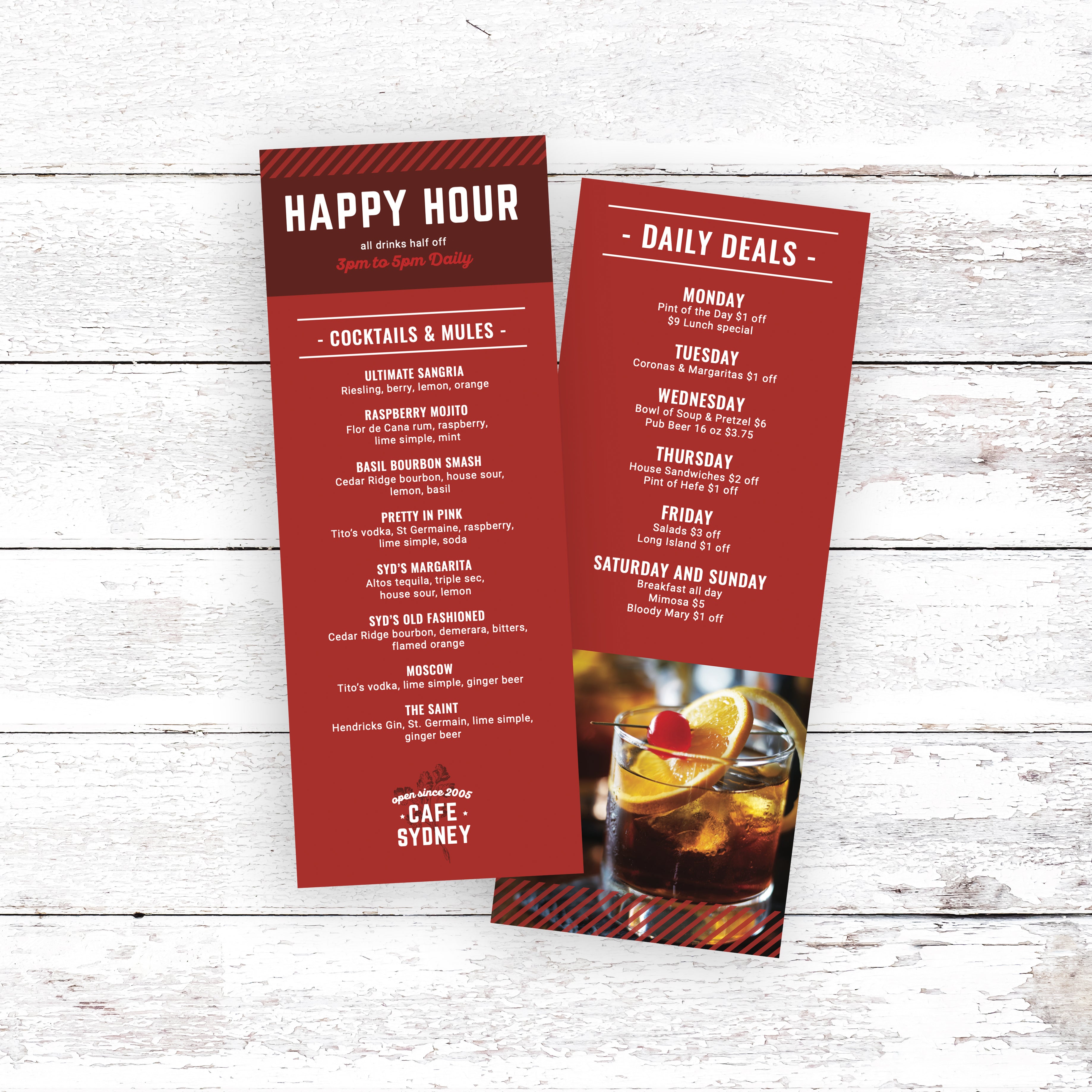
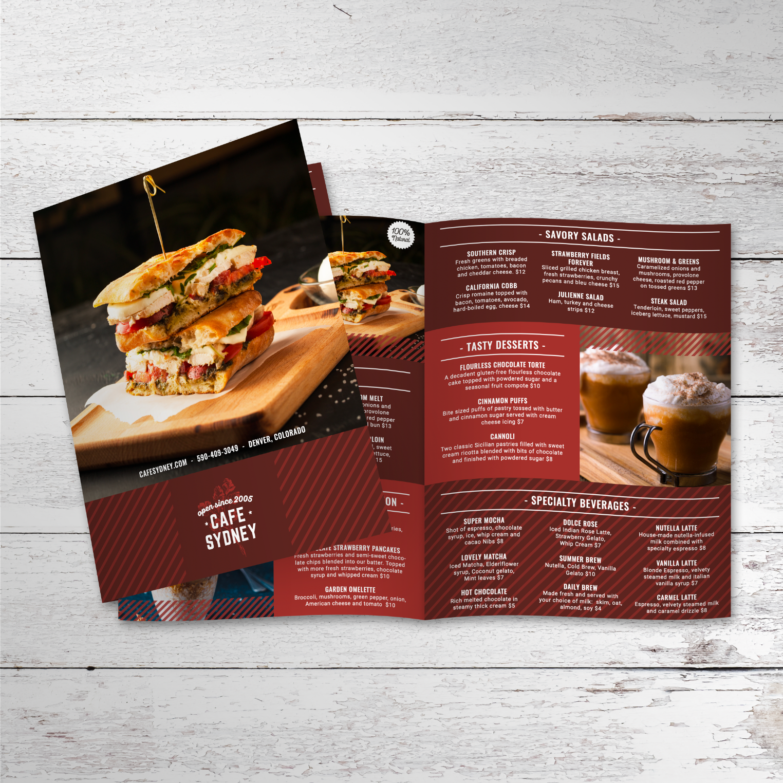
- Full-Size Menus That Support a Broader Selection: A full-size menu works best when you offer a wide range of drinks, food items, and add-ons that need space to stay readable. The larger format allows for clearer hierarchy, stronger section separation, and comfortable font sizing, which helps customers scan quickly without feeling overwhelmed during peak service hours:
- Smaller Menus That Encourage Faster Decisions: Smaller formats are ideal for limited menus, drink-only menus, and counter menus where customers need quick reference. Compact menus also work well as takeaway inserts or specials lists because the format naturally supports a curated selection, which reduces decision fatigue and keeps ordering fast:
- Legibility That Comes From Editing Content, Not Shrinking Text: Smaller menus stay readable when content is simplified. Shorter descriptions, fewer categories, and grouped add-ons prevent layouts from becoming cramped. If the menu starts to look crowded, the solution is reducing content density, not lowering font size to a point where customers struggle to read:
- A Consistent Design System Across Every Format: The layout should feel like the same menu everywhere, even when the size changes. Consistent fonts, section naming, spacing rules, and price formatting keep the menu recognizable and easy to navigate. This helps customers move from one format to another without needing to re-learn how the menu is structured:
- Multiple Versions Built From One Template Structure: Using one template style makes it easier to create several menu versions without redesigning everything. When the core layout stays consistent, updates can be applied across formats faster and with fewer errors. This keeps your branding aligned, reduces formatting issues, and helps your menu look modern in every display style.
When menu formatting is designed for real service conditions, customers scan faster, staff answer fewer questions, and your cafe maintains a modern, polished presentation across every menu format you use.
A modern cafe menu should look just as clean after weeks of daily use as it does on the first day. Printing choices play a major role in how long menus last, how easy they are to clean, and how professional they continue to look over time. When durability is built into the material, the menus support service instead of becoming something that constantly needs replacing.
Why Traditional Lamination Breaks Down Over Time
Menus with traditional lamination often start strong but wear down quickly. Repeated wiping causes lamination to cloud up, bubble, or separate along the edges. Once that happens, the menu looks worn even if the design itself is modern. Laminated menus also struggle with folds, which can crack or peel at stress points, making them unsuitable for certain layouts.
Waterproof Materials that Handle Daily Cleaning
Menus that are truly waterproof hold up better under real service conditions. Simple soap and water are often enough to clean menus thoroughly without damaging the surface. Because the material itself resists moisture, there’s no laminated layer to peel or haze. This keeps text clear, colors sharp, and menus easy to maintain throughout the day.
Choosing the Right Thickness for Cafe Use
Menu thickness affects both durability and usability. Thinner menus work well for lightweight handling or short-term use, while thicker options provide a sturdier feel for menus that are handled frequently. Choosing the right thickness helps prevent bending, curling, or premature wear, especially in busy cafes where menus are passed from hand to hand.
Folded Menus That Stay Clean and Functional
Folded menus are useful when content needs to be organized into sections without crowding. Unlike laminated menus, waterproof menu materials can be folded without cracking or peeling at the edges. This makes bi-folds and tri-folds practical options for cafes that want more space while keeping menus compact and easy to store.
Printing Solutions Designed for Real Cafe Conditions
Printing matters just as much as material. We print cafe menus on TerraSlate waterproof, rip-proof paper designed for heavy handling and repeated cleaning. We can also print menus for you with our proprietary TerraShield™ anti-microbial coating with industry-leading turnaround, helping cafes maintain clean, professional menus without relying on lamination that clouds up or delaminates over time.