8.5" x 14" Menu Templates

25 products

Showing 1 - 24 of 25 products

Showing 1 - 24 of 25 products
View
Classic Black & White Template 8.5" x 14" - TerraSlate Inc.

Recently viewed

A longer menu format gives you more room to organize categories, spacing, and pricing without forcing smaller fonts or crowded layouts. That’s why free 8.5 x 14 menu templates are a smart choice for restaurants, cafes, and service-based businesses that need to list more items on a single page while keeping the menu modern and easy to scan. If a standard size feels too tight, templates like Free 8.5" x 11" menu templates can be a good comparison point, while smaller formats like Free 5.5" x 8.5" menu templates work better for shorter, curated menus.

Long-Format Layout Benefits for Busy Menus

The biggest advantage of 8.5" x 14" is the breathing room. Instead of compressing categories into tight blocks, this format lets a menu hold more content while still looking clean. Busy menus, like those with breakfast, lunch, drinks, and add-ons, can separate sections clearly so customers don’t get lost. A long-format layout also supports consistent spacing between items, which improves readability and helps customers compare options faster.

Better Category Spacing Without Reducing Font Size

Small fonts make menus harder to read and slow ordering. With 8.5" x 14", categories can stay clearly separated while keeping text at a comfortable size. This helps in low-light environments and fast-paced service settings where customers glance quickly and decide. More vertical space also allows for stronger hierarchy, such as distinct headers and logical sub-grouping, without cluttering the layout.

Ideal Use Cases for Single-Page Menus with Many Items

This format works especially well for menus that need to stay on one page but include a lot of offerings. Full-service diners, casual restaurants, cafes with multiple drink categories, and bars with extensive cocktails often benefit from the extra room. It also works well for service menus and price lists where customers need clear comparisons, such as catering menus, tasting menus, and combo offerings.

When 8.5" x 14" Looks Better Than Multi-Page Menus

Multi-page menus can feel bulky and harder to navigate, especially for quick-service environments. A long single-page menu often feels cleaner and faster because customers can see more options in one view. When the layout is structured well, customers move from section to section without flipping pages, which reduces hesitation and speeds up ordering. It also makes printing and replacement simpler, since only one sheet needs to be updated.

The 8.5" x 14" format works well anywhere businesses need extra space for product lists, pricing, and add-ons without moving to multiple pages. It supports clarity, easy scanning, and a modern look across industries that rely on fast customer decisions and frequent menu updates.

Cafes and Coffee Shops with Seasonal Drink Lists

Cafes often rotate seasonal drinks, limited-time pastries, and specialty add-ons. An 8.5" x 14" menu gives more room to list espresso drinks, brewed coffee, teas, and seasonal highlights without squeezing text. This is especially helpful when offering multiple sizes or milk options, since spacing stays clean and readable while the menu remains a single page.

Bars and Cocktail Lounges with Large Beverage Selections

Bars and lounges often need to display long lists of cocktails, spirits, wines, and non-spirit options. The longer menu format supports clear category separation and makes it easier to group items by spirit type, signature cocktails, or house specialties. This improves scanning speed and helps customers compare pricing across options without struggling to find details.

Food Trucks and Pop-Ups That Need One Large Menu

Food trucks and pop-ups benefit from a single-page format that can be displayed at a counter or handed out. The larger size allows enough space for combos, add-ons, and pricing clarity without requiring multiple menu sheets. It also works well for fast ordering environments where customers want to see everything quickly and make decisions without waiting.

Catering Menus for Events and Corporate Ordering

Catering menus often include packages, tiers, and large lists of options that need to be presented cleanly. An 8.5" x 14" menu provides enough space to list package inclusions, price points, and serving sizes while keeping the layout structured. This helps customers compare catering options without feeling overwhelmed, which is important when orders involve higher budgets and planning.

Specialty Shops with Price Lists and Service Menus

Beyond restaurants, this format works well for specialty retail menus and service pricing lists, such as bakeries, juice bars, and grab-and-go shops. It also supports service menus for businesses that list offerings and pricing in structured categories. The additional vertical space helps prevent clutter and keeps the pricing layout clean, which improves readability and reduces customer questions during checkout.

Space alone doesn’t make a menu work. An 8.5" x 14" template performs best when the layout is structured to guide customers from category to category quickly, with consistent formatting that makes comparisons easy. The right template improves ordering speed by removing friction, reducing questions, and keeping information clear even when the menu includes a lot of items. This is also why larger display-style formats like Free 12" x 18" flat menu templates work well for wall menus, since the same principles of hierarchy and spacing apply at any size.

Pricing Layout That Stays Consistent Across Categories

Pricing should be aligned and predictable. If some prices appear on the right and others appear under descriptions, customers hesitate. A good template keeps prices in one consistent position and uses the same format across the entire menu. This is especially important for long menus, because customers compare items across categories and expect pricing to be easy to find without scanning every line.

Best Practices for Descriptions and Add-Ons

Descriptions should be short and functional. Long descriptions slow scanning and create clutter, even on larger menus. The best approach is to keep descriptions to one line when possible and focus on key ingredients or preparation details. Add-ons should be grouped into a dedicated section instead of being repeated under every item. This keeps the menu cleaner and helps customers customize orders without slowing down service.

How to Highlight Best Sellers Without Clutter

Highlighting helps customers decide faster, but only when it’s used strategically. A long-format template should use subtle emphasis like a small icon, a short label, or a dedicated featured area instead of bolding everything. Too many callouts turn the menu into visual noise. A clean layout that highlights just a few best-selling guides, decisions, and keeps the menu modern.

Accessibility and Readability Considerations

Ordering speed depends on readability for all customers. A strong 8.5" x 14" template keeps font size comfortable, maintains strong contrast, and avoids overly decorative fonts that reduce legibility. Spacing also matters for accessibility because crowded text causes customers to skip items or misread pricing. When the template is designed with readability in mind, customers scan faster, understand the menu more easily, and place orders with more confidence.

Many restaurants use the same menu template across printed menus, counter displays, and digital screens. The key is making sure the layout stays readable and consistent in every format. 

Here are the most important formatting steps to follow when building an 8.5" x 14" menu for both print and digital use.

  • Build a Layout that Works at Multiple Viewing Distances: Printed menus are read up close, while digital screens and wall displays are often viewed from several feet away. A strong template uses clear category headers, consistent spacing, and readable font sizing so the same menu still scans well whether it’s held in hand or viewed from a distance:
  • Use Font and Spacing Rules That Stay Clean in Print and on Screens: Some fonts look great on screen but lose clarity in print, especially if they are thin or overly stylized. The best approach is using clean typography, comfortable line spacing, and consistent margins so the menu stays legible in both formats without needing major redesigns:
  • Prevent Cropping and Bleed Problems Before Printing: Long-format menus can run into printing issues if content sits too close to the edges. Keeping safe margins and avoiding edge-to-edge critical text helps prevent trimming mistakes. A template designed with proper spacing prevents awkward cropping that can cut off prices or category headers:
  • Keep Multiple Menu Formats Consistent Without Rebuilding Designs: Once the menu is structured correctly, the same design system can be applied across additional formats like 8.5" x 11" or smaller versions for curated menus. This allows updates to stay consistent across sizes and keeps branding aligned across printed menus, digital screens, and display boards.

When formatting is done correctly, your 8.5" x 14" menu stays readable, professional, and consistent everywhere customers interact with it, whether they’re holding it in hand or viewing it across the room.

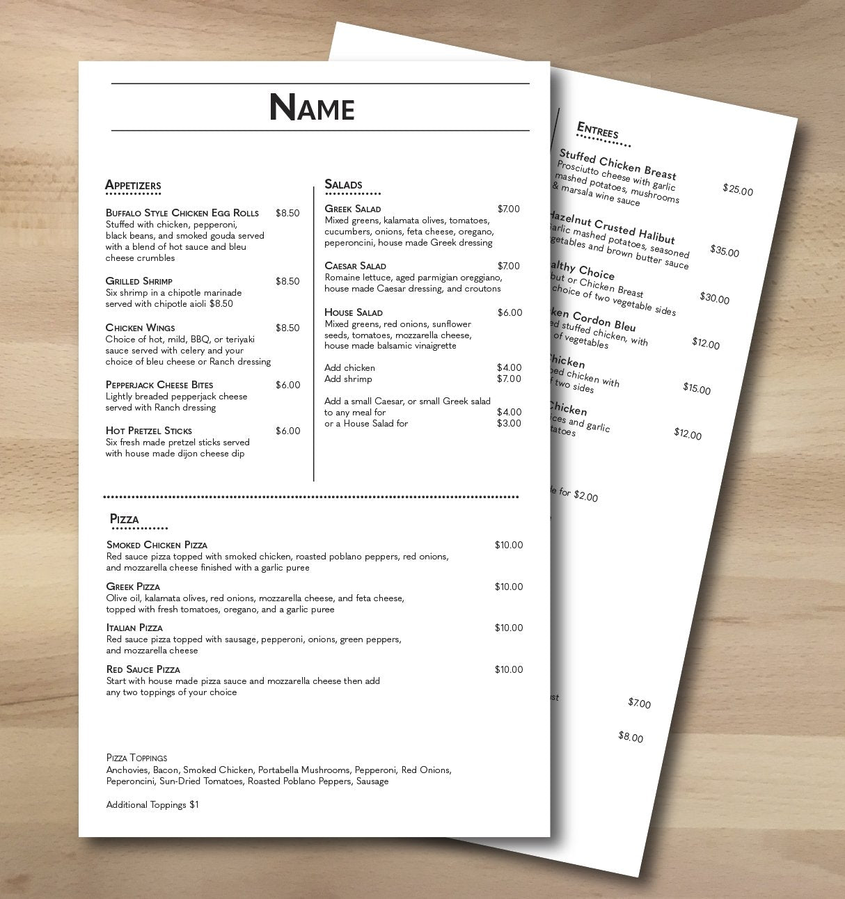
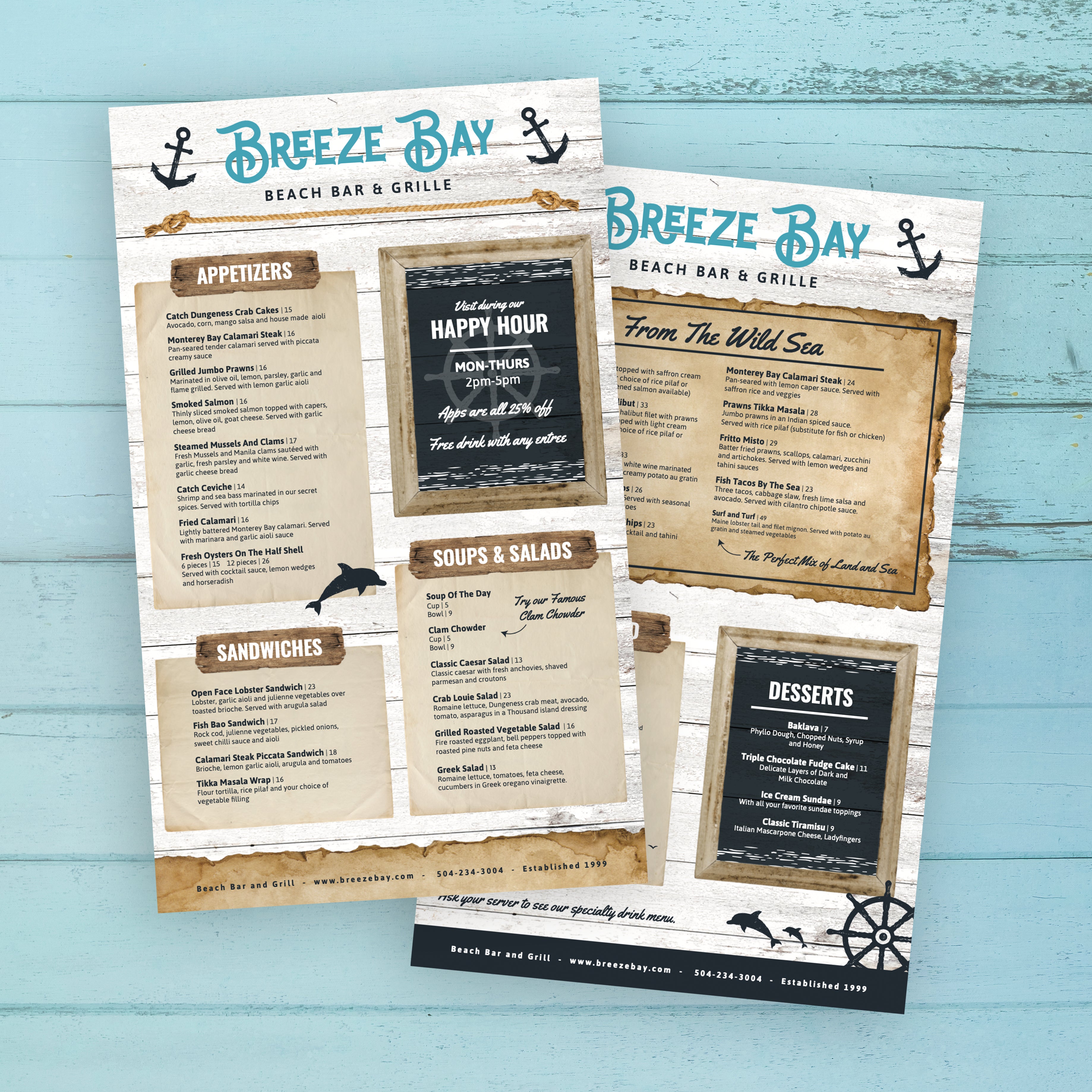
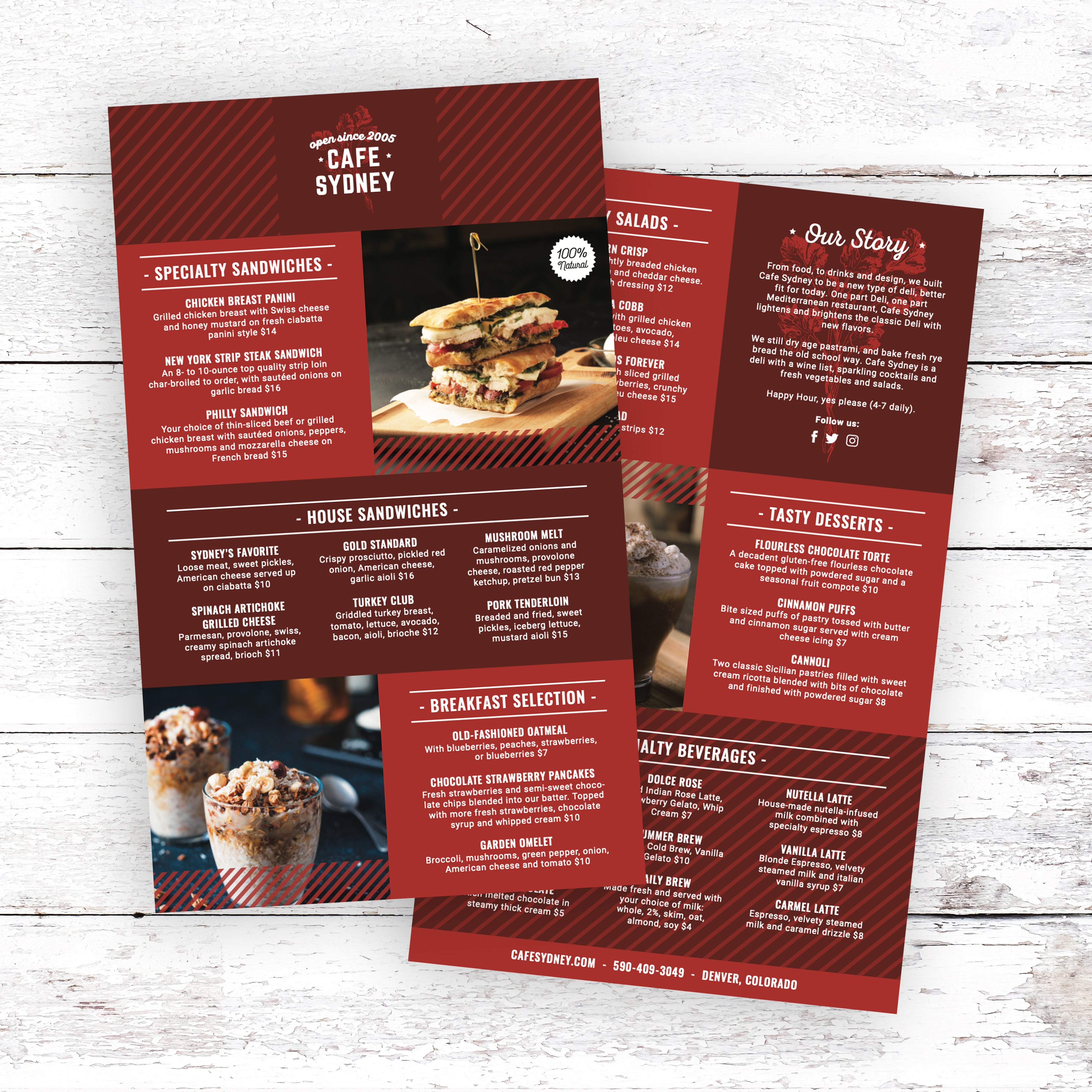
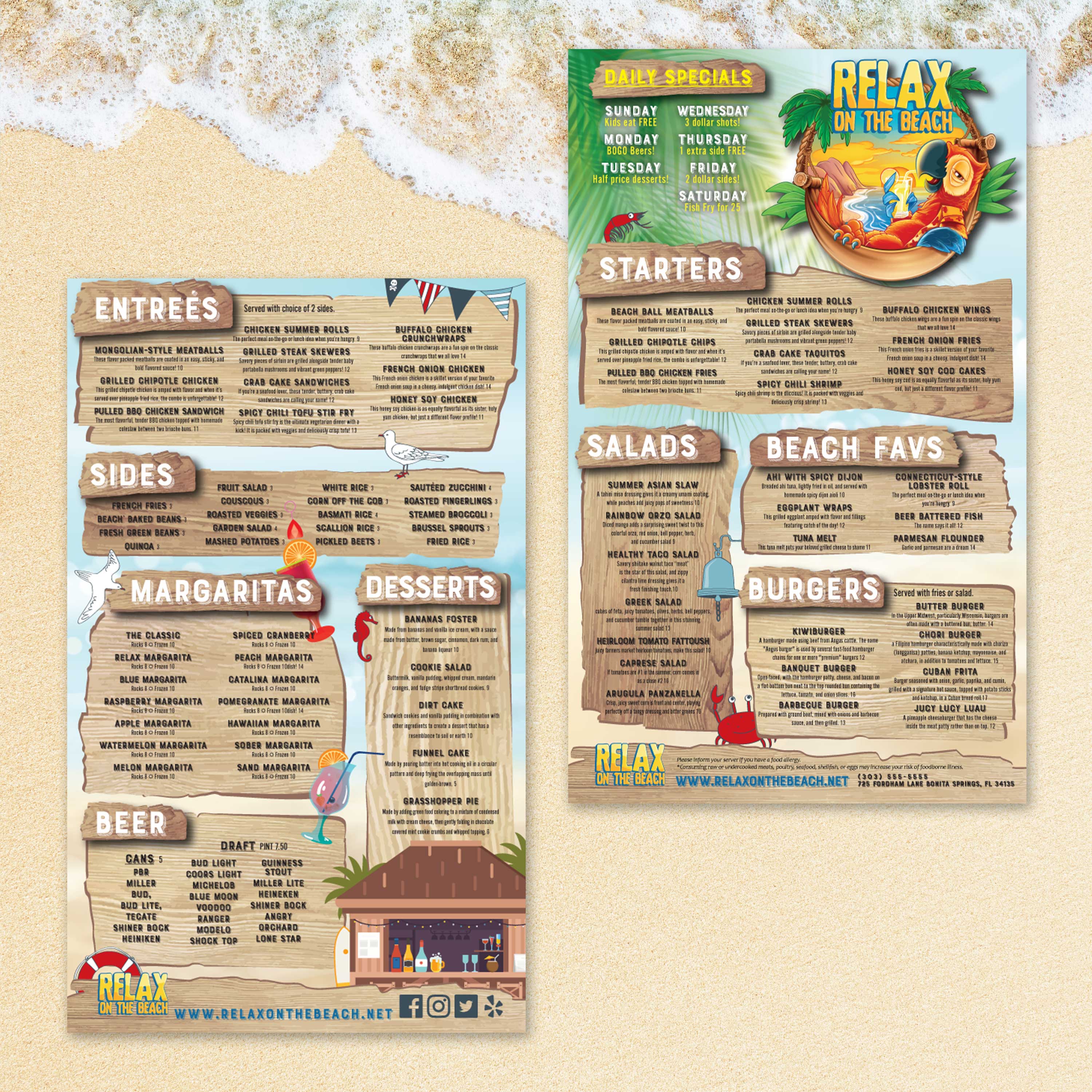
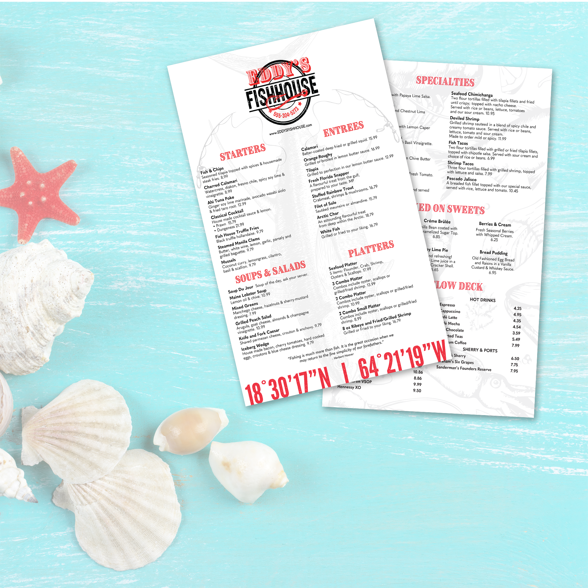
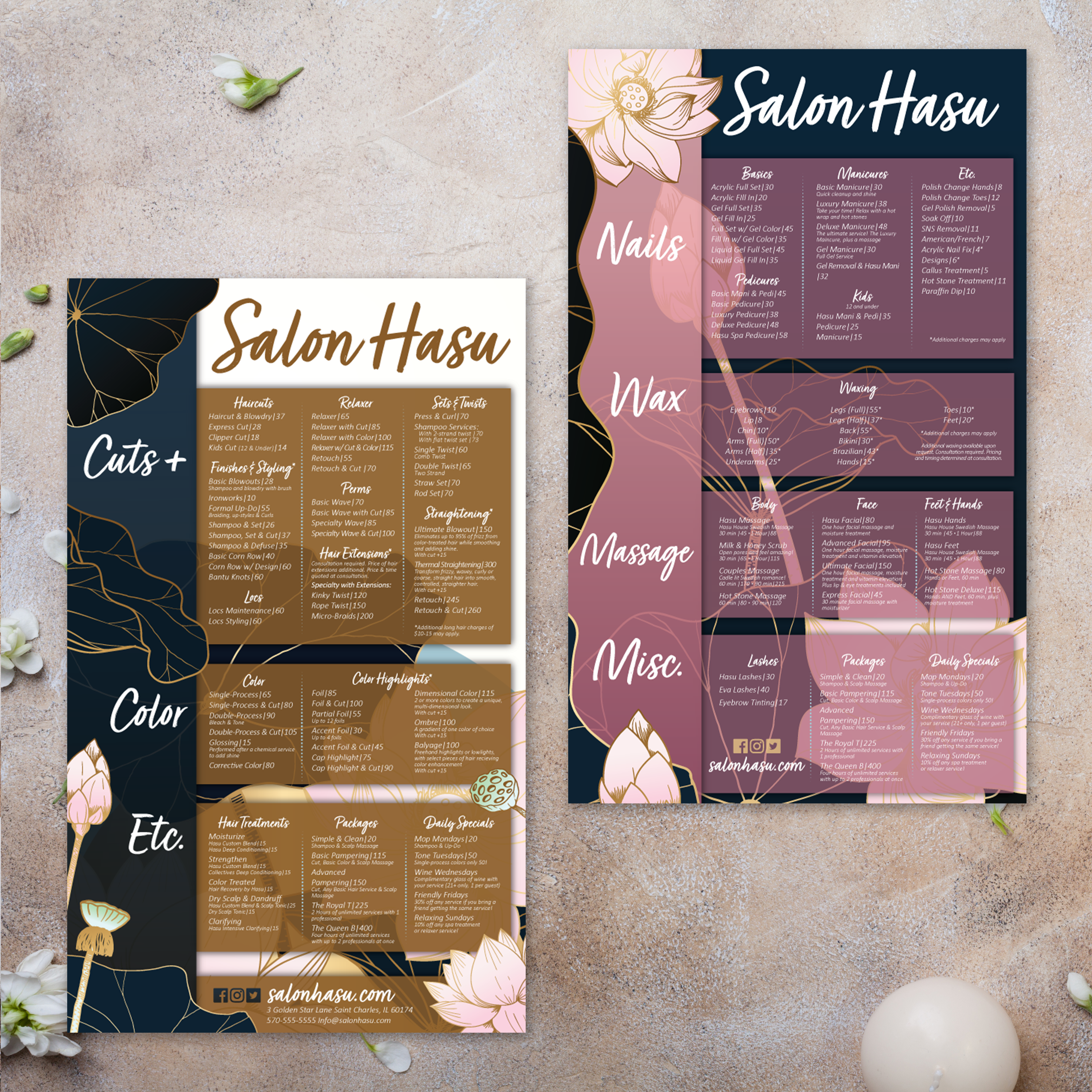
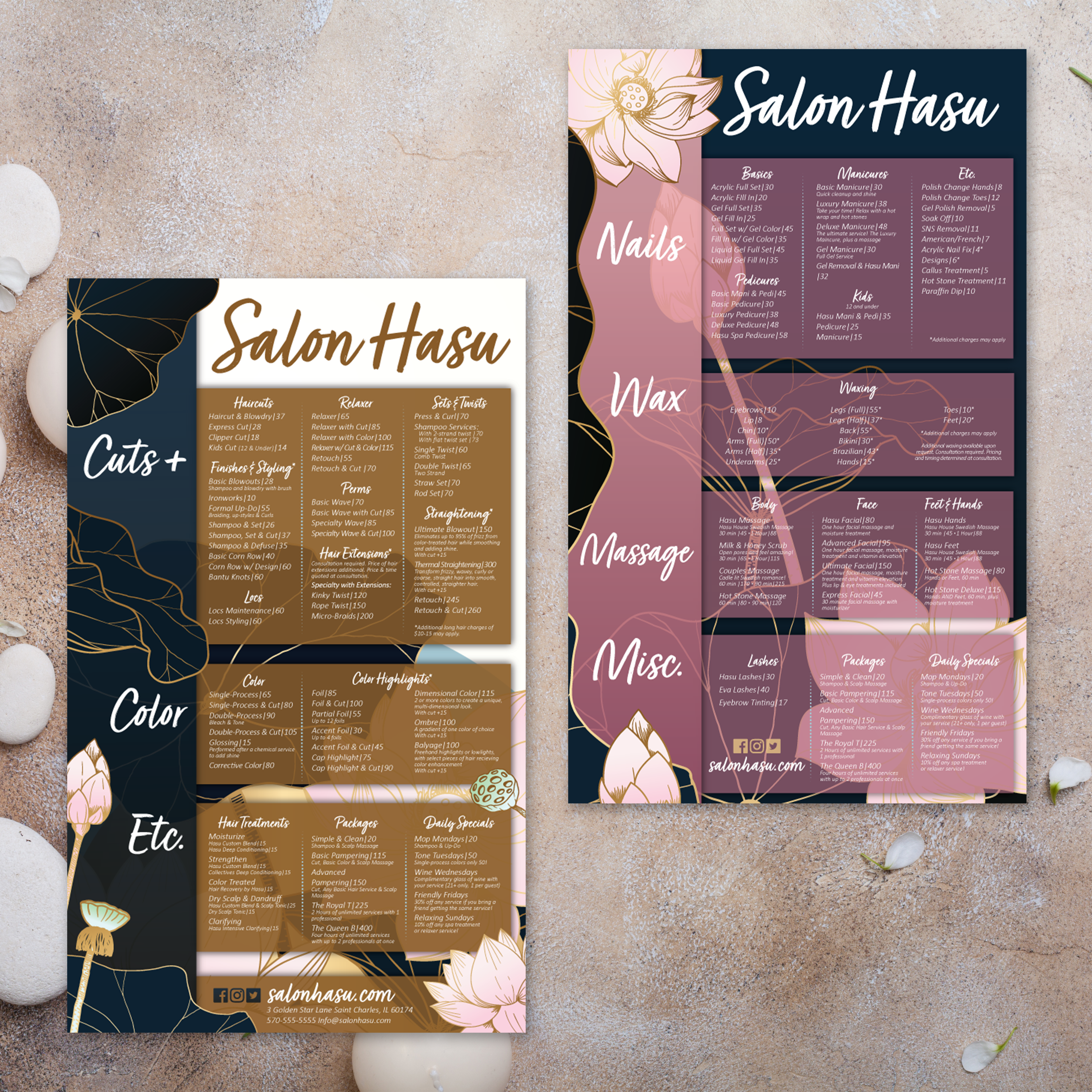
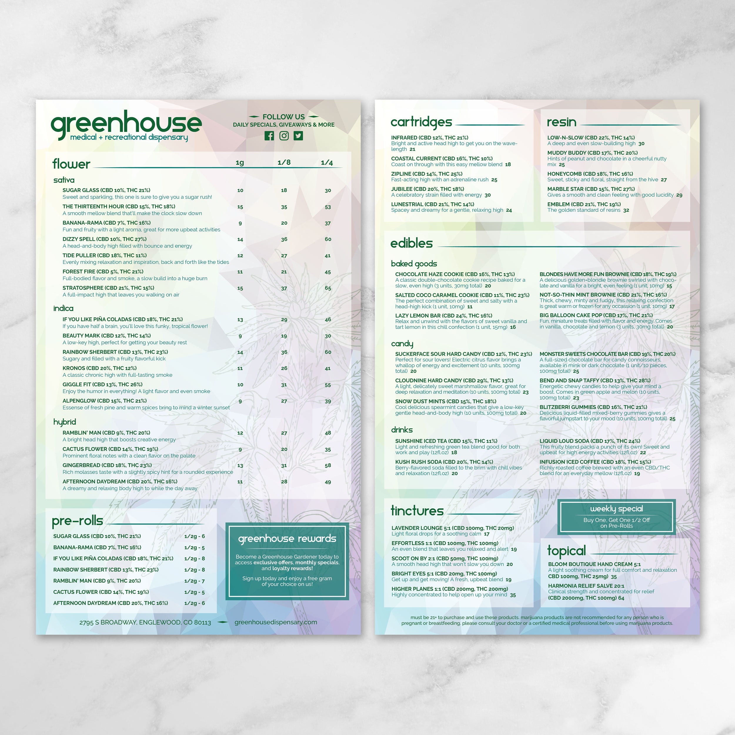
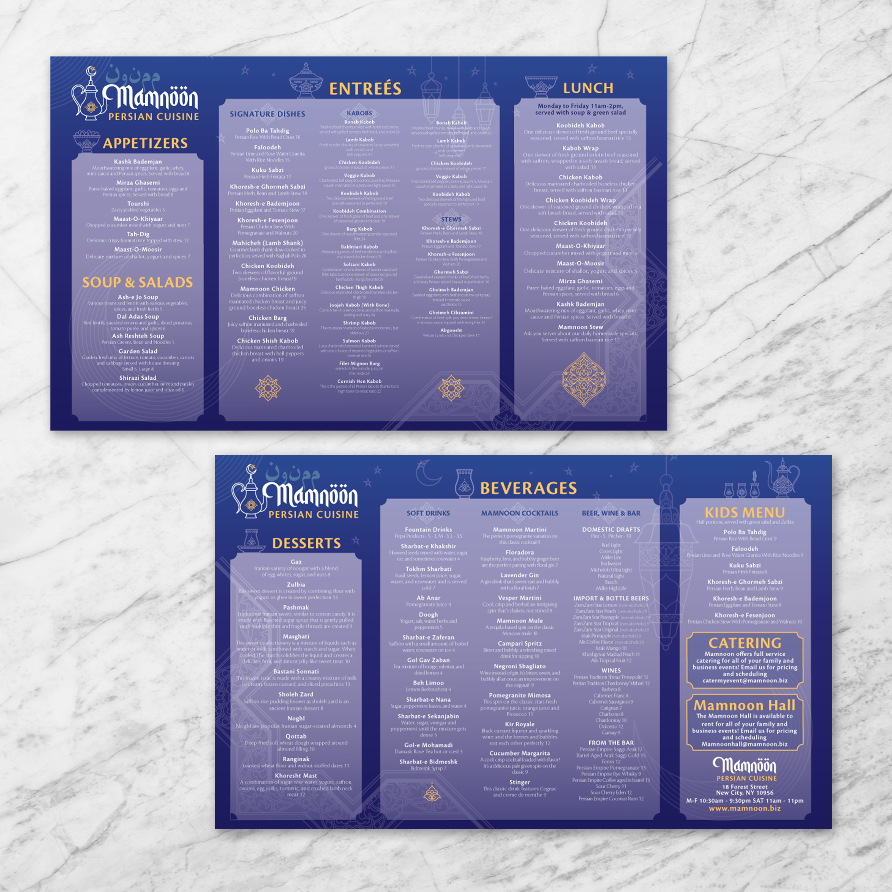
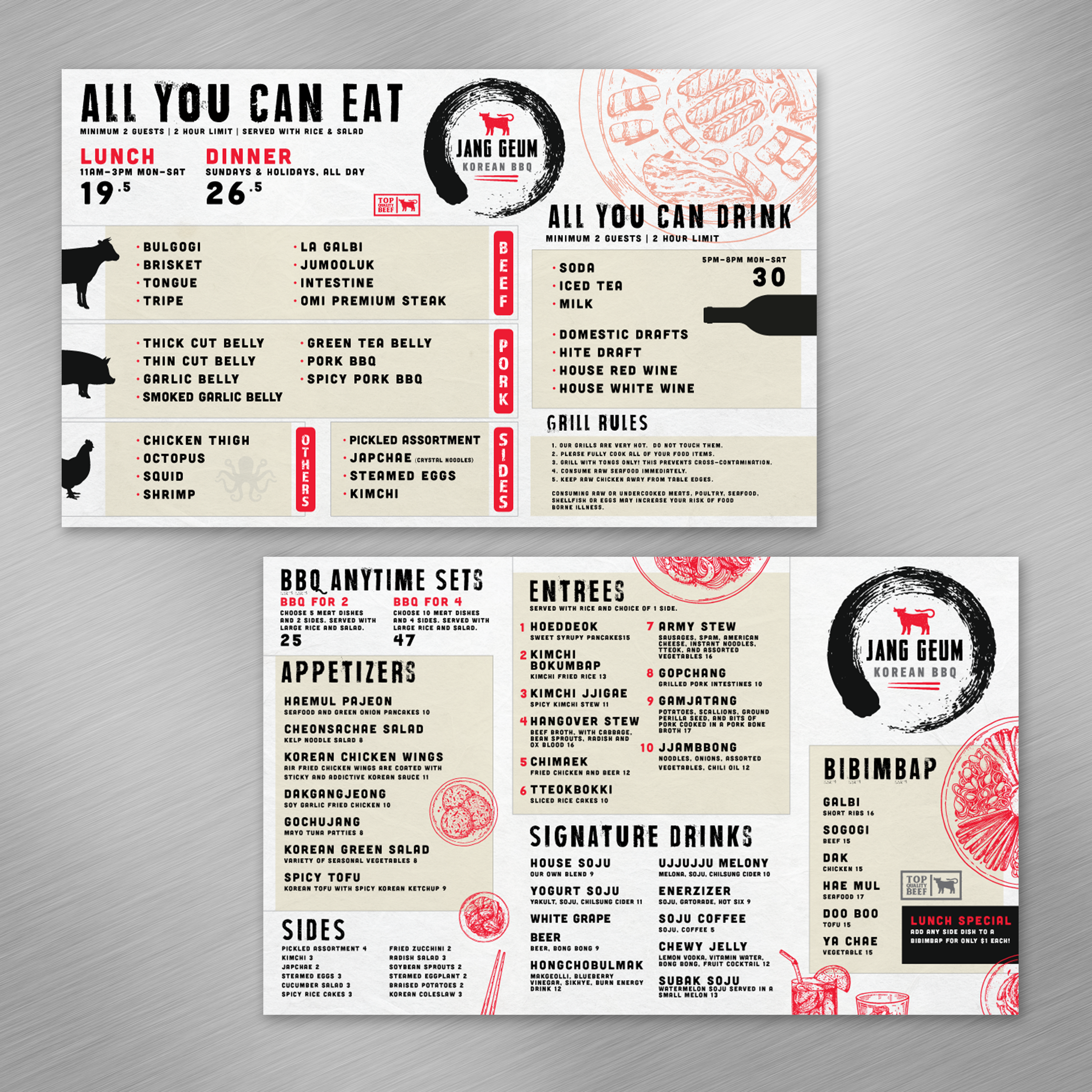
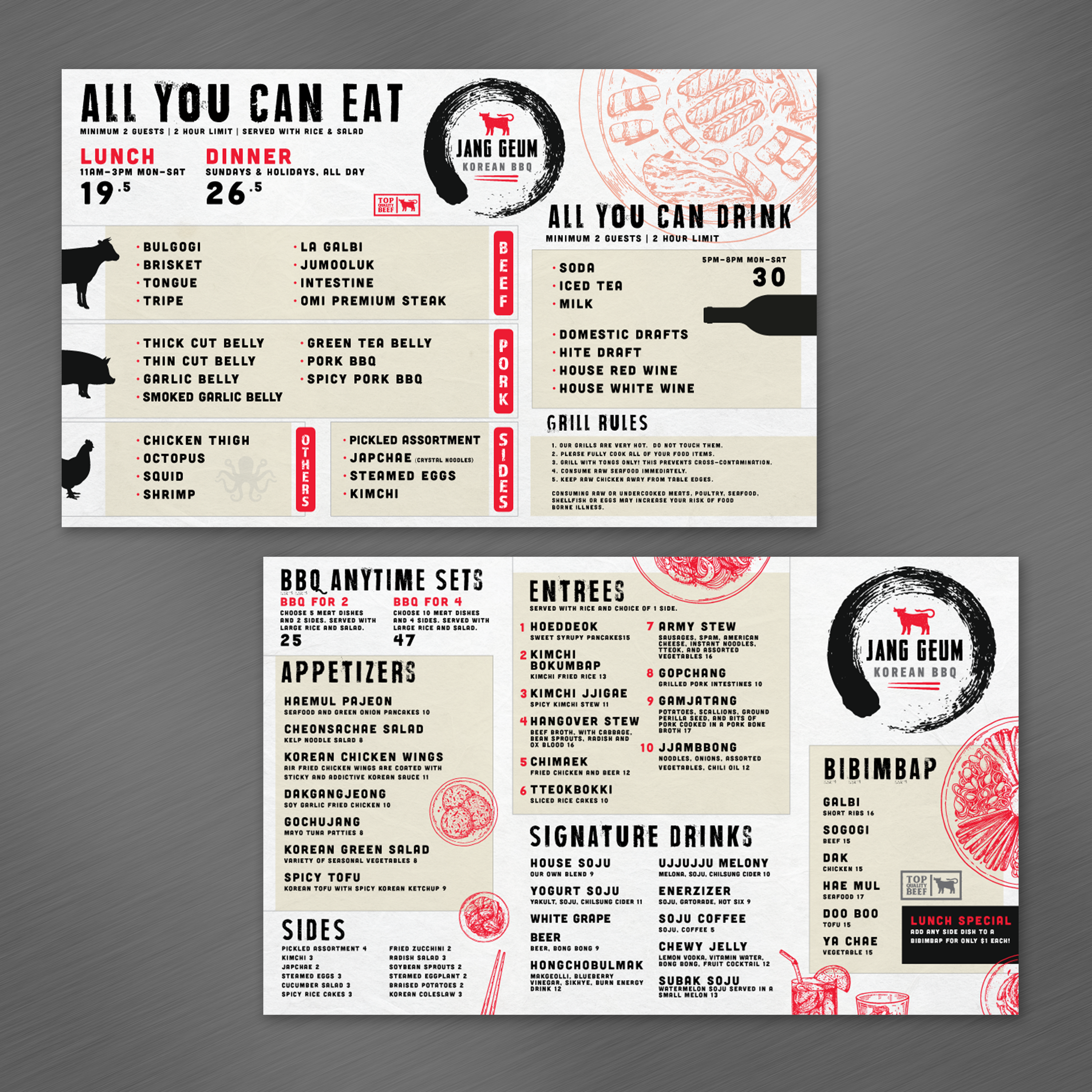
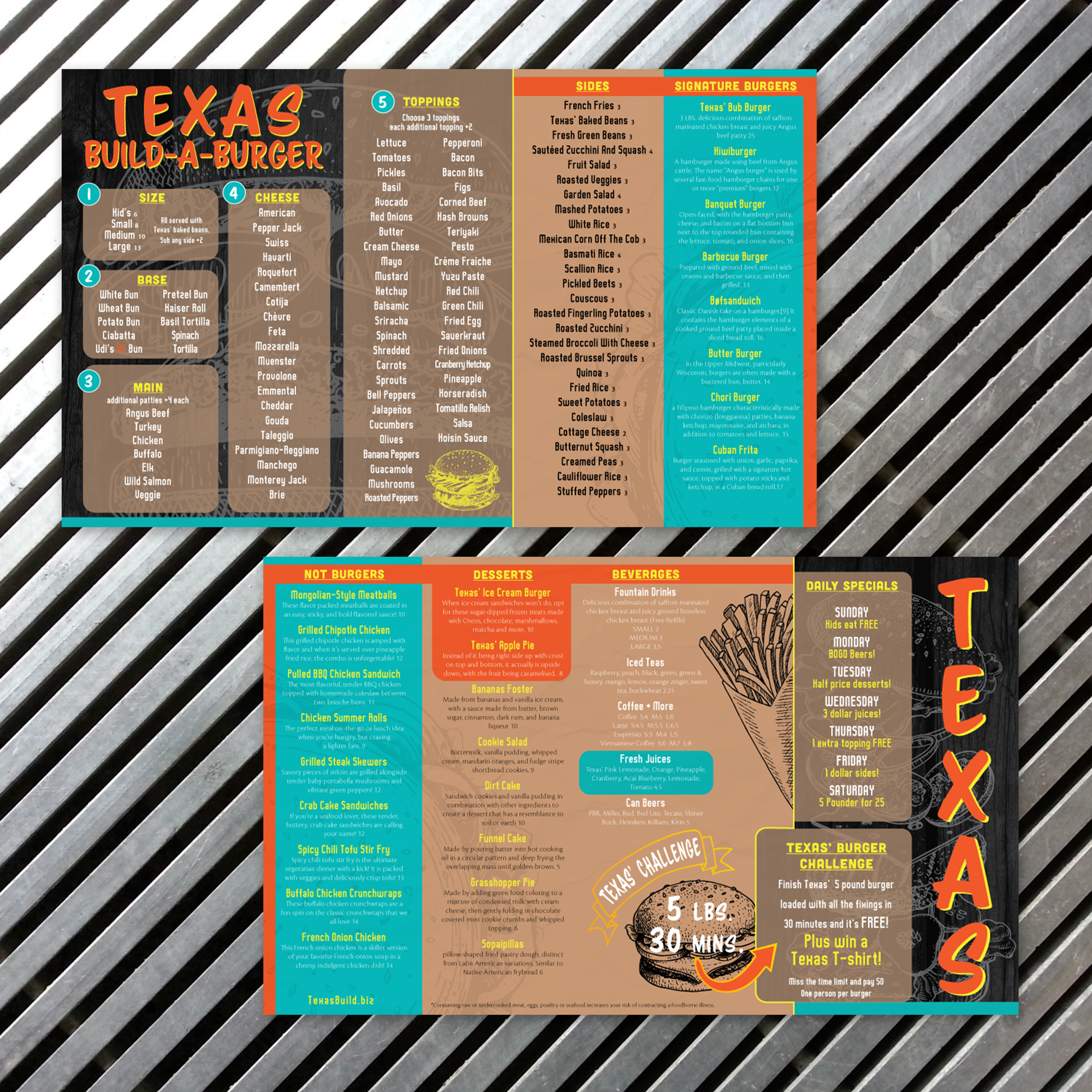
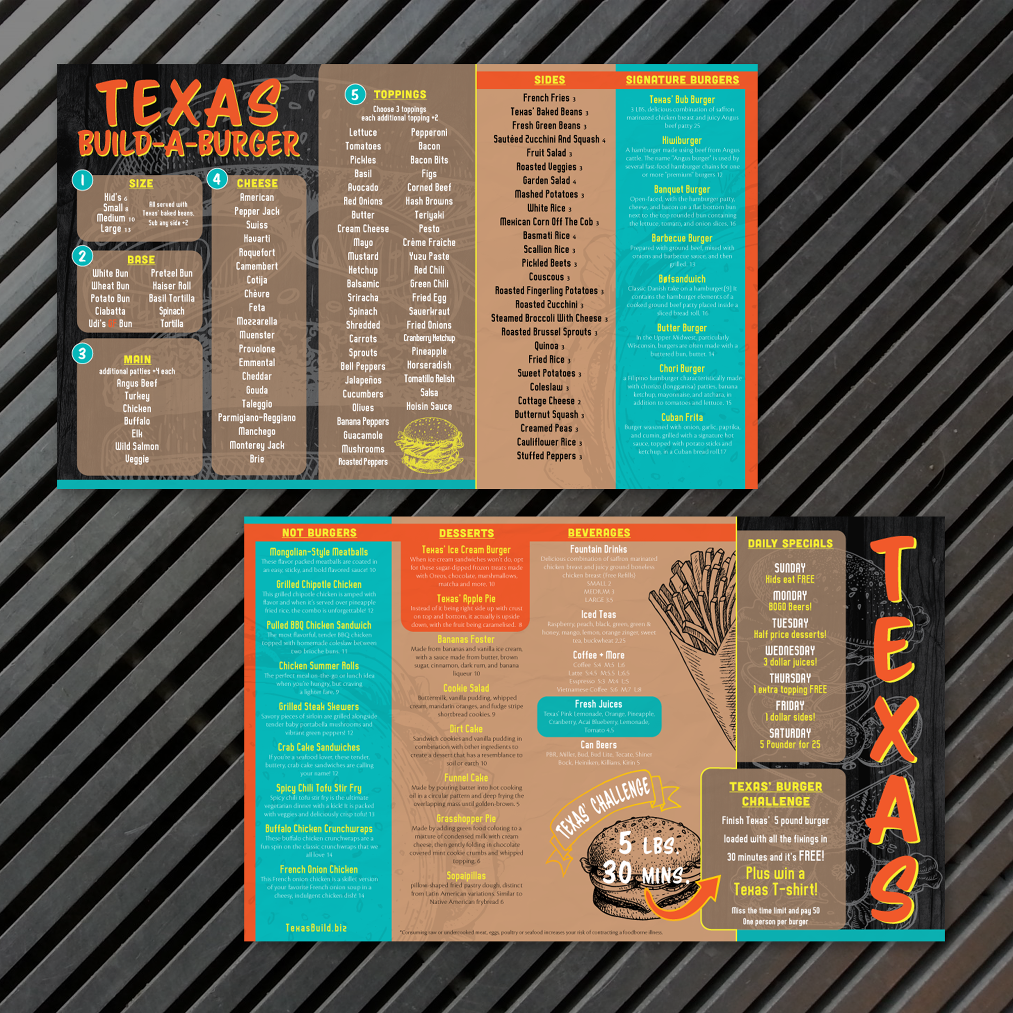
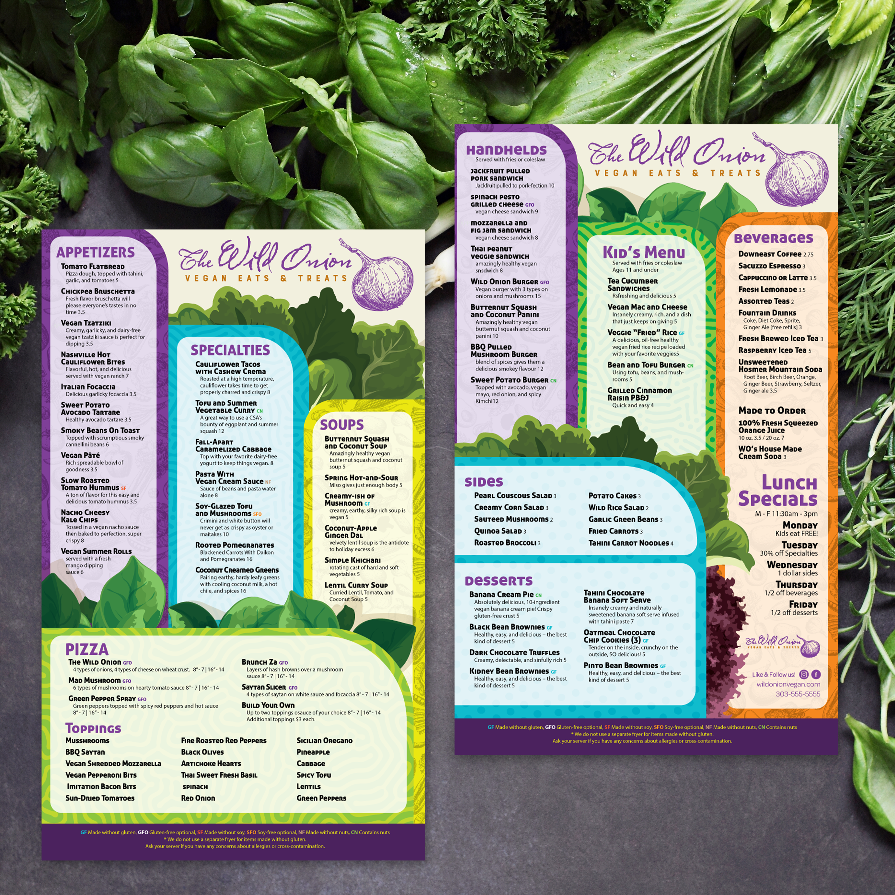
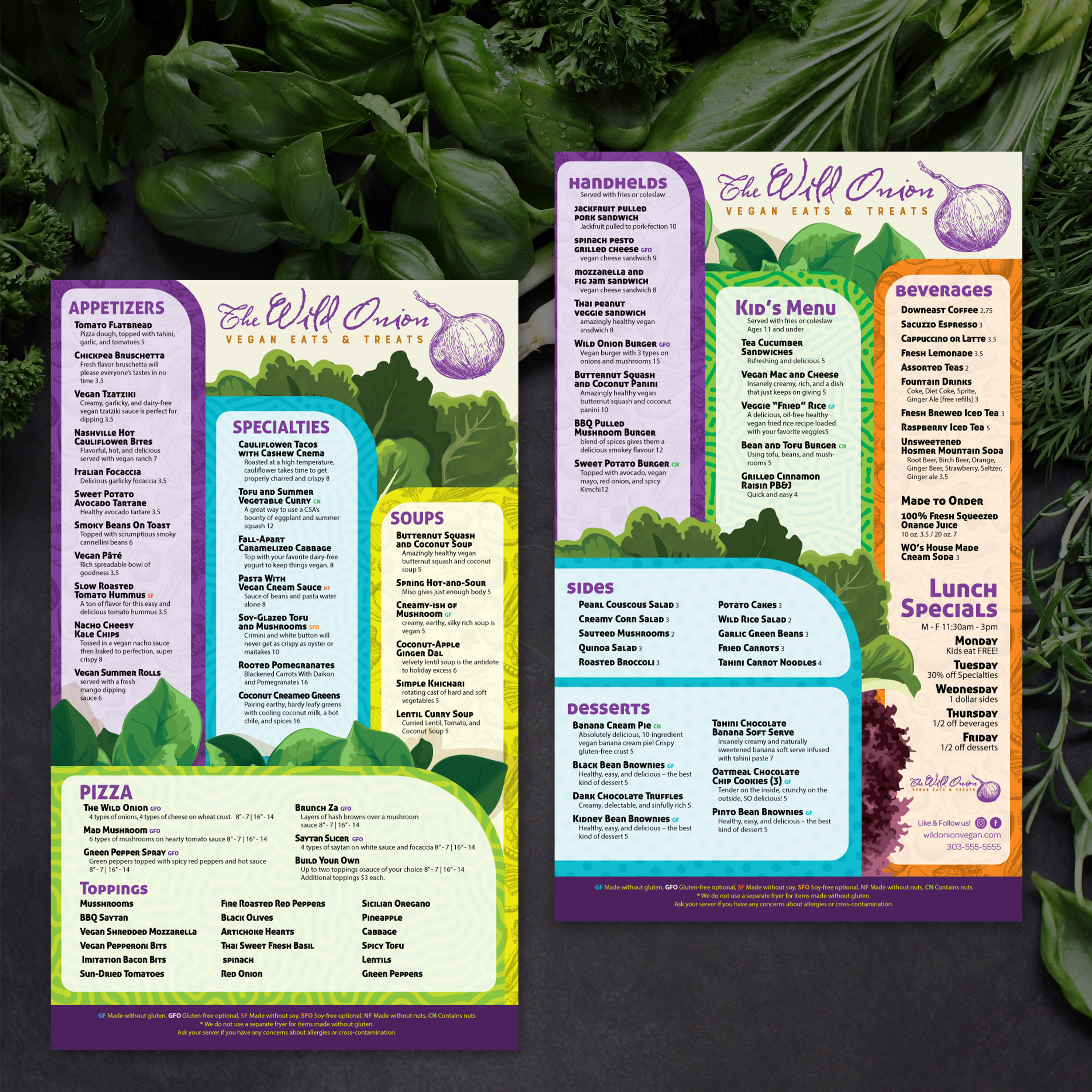
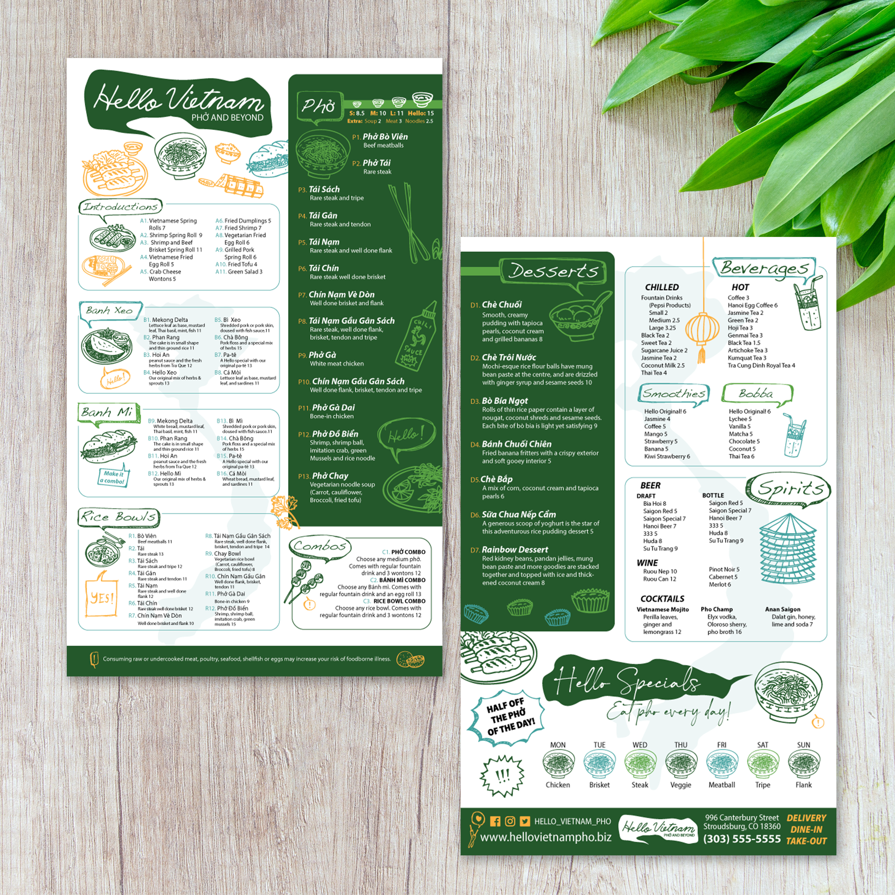
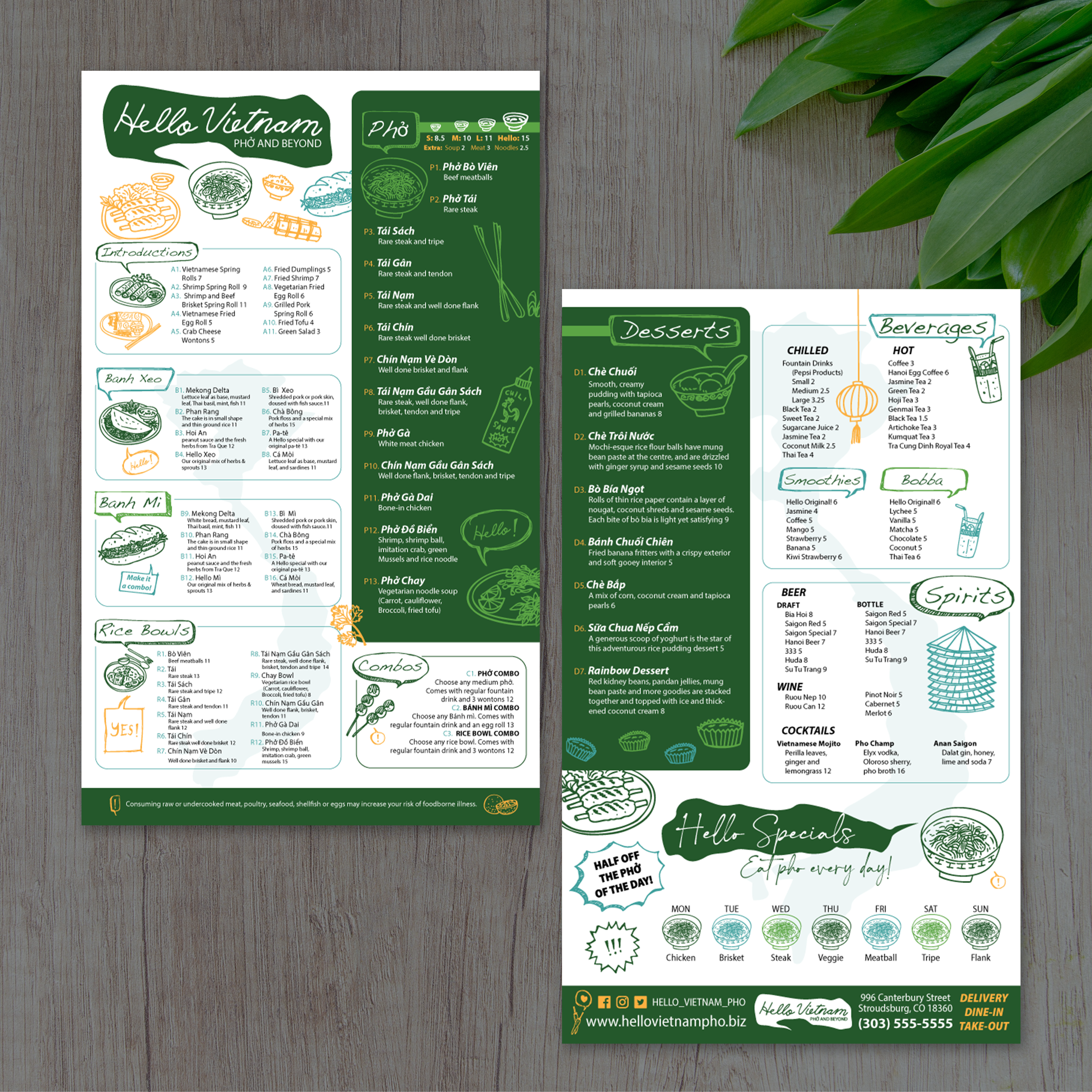
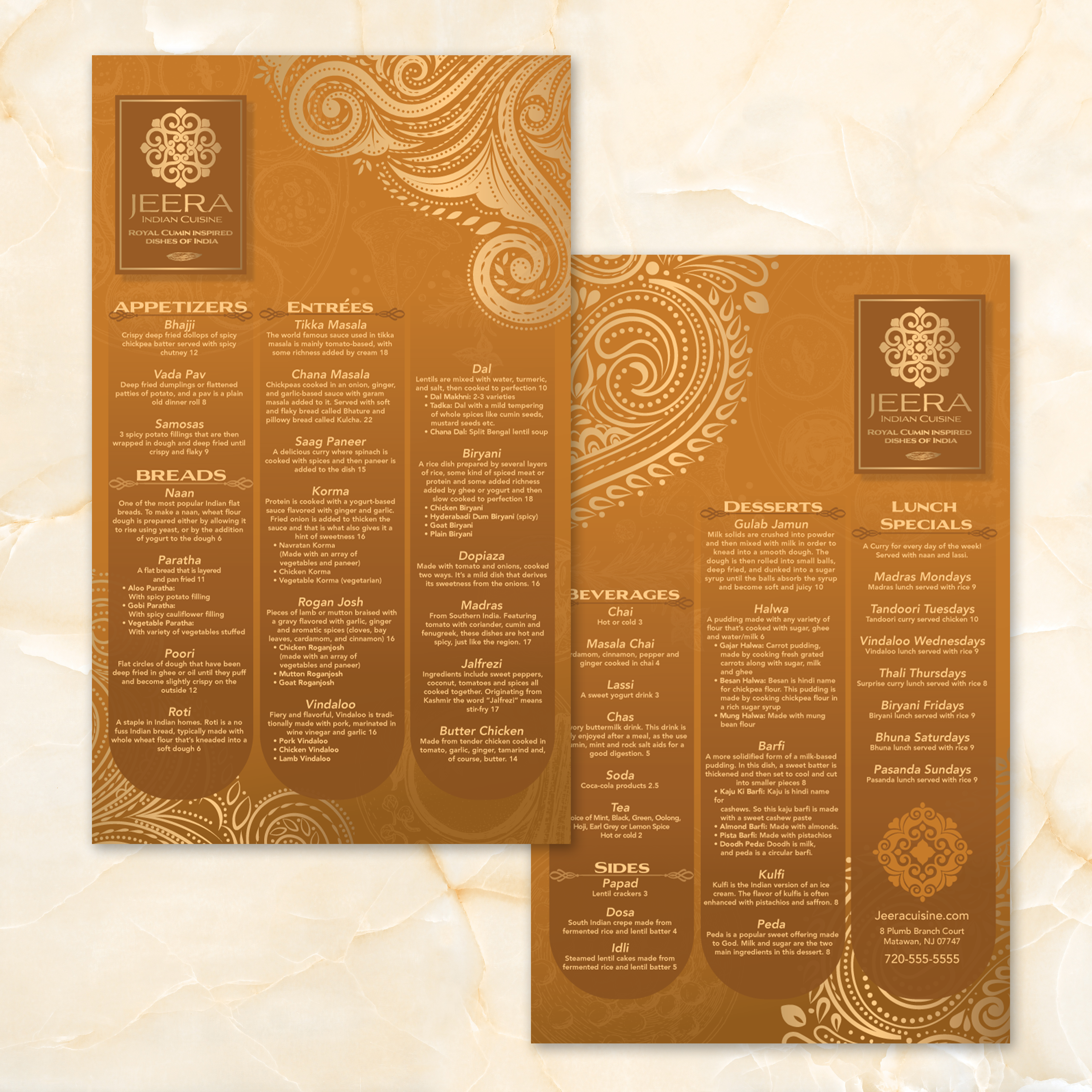
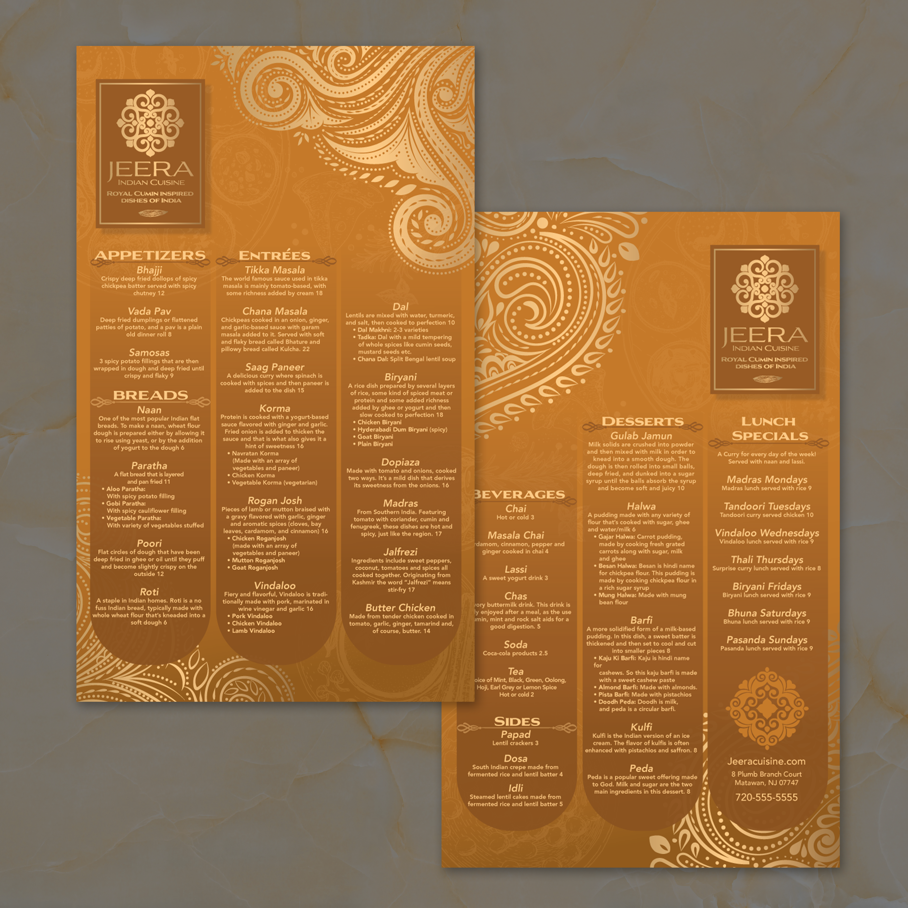
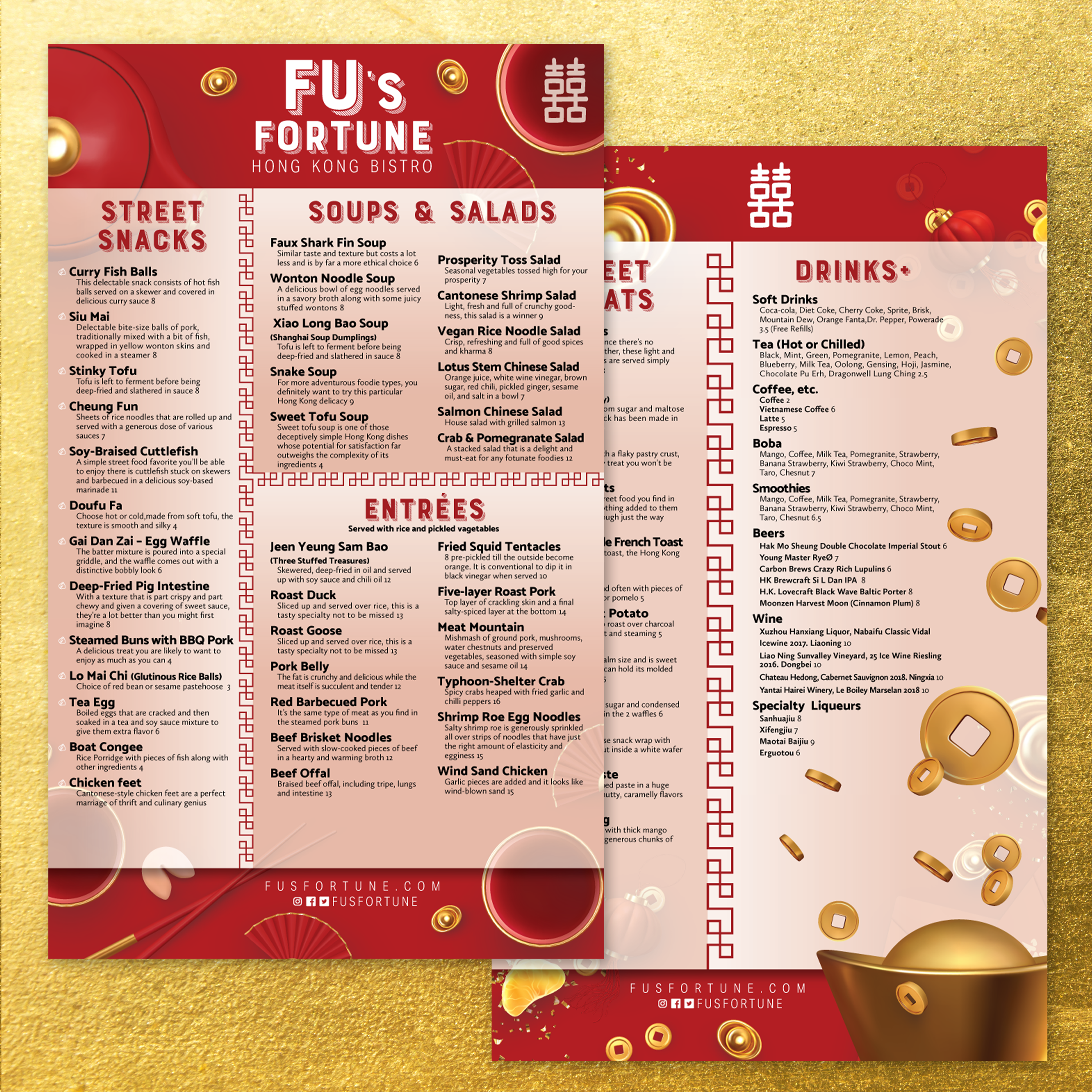
Menu size impacts readability, ordering speed, and how professional your menu looks in daily use. An 8.5" x 14" menu gives you more vertical space than standard letter size, which helps you organize longer item lists without shrinking fonts or crowding categories. The best size depends on how much content you need to show, how customers interact with the menu, and where the menu is displayed.

When 8.5" x 11" Feels Too Small for Your Menu

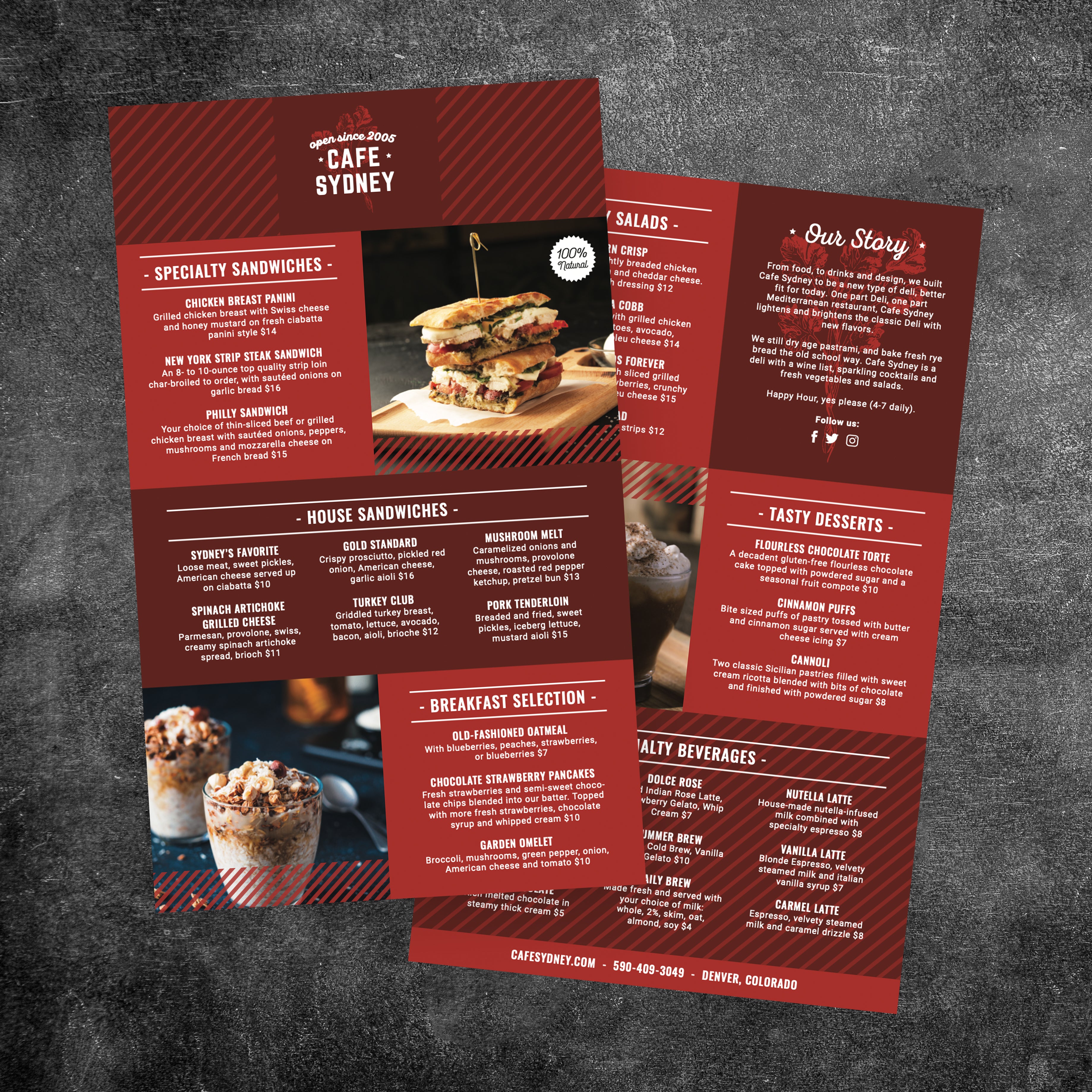
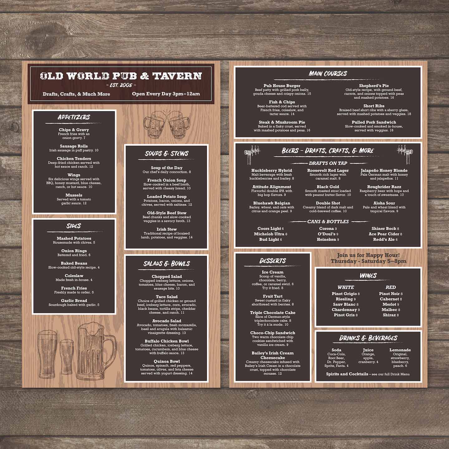
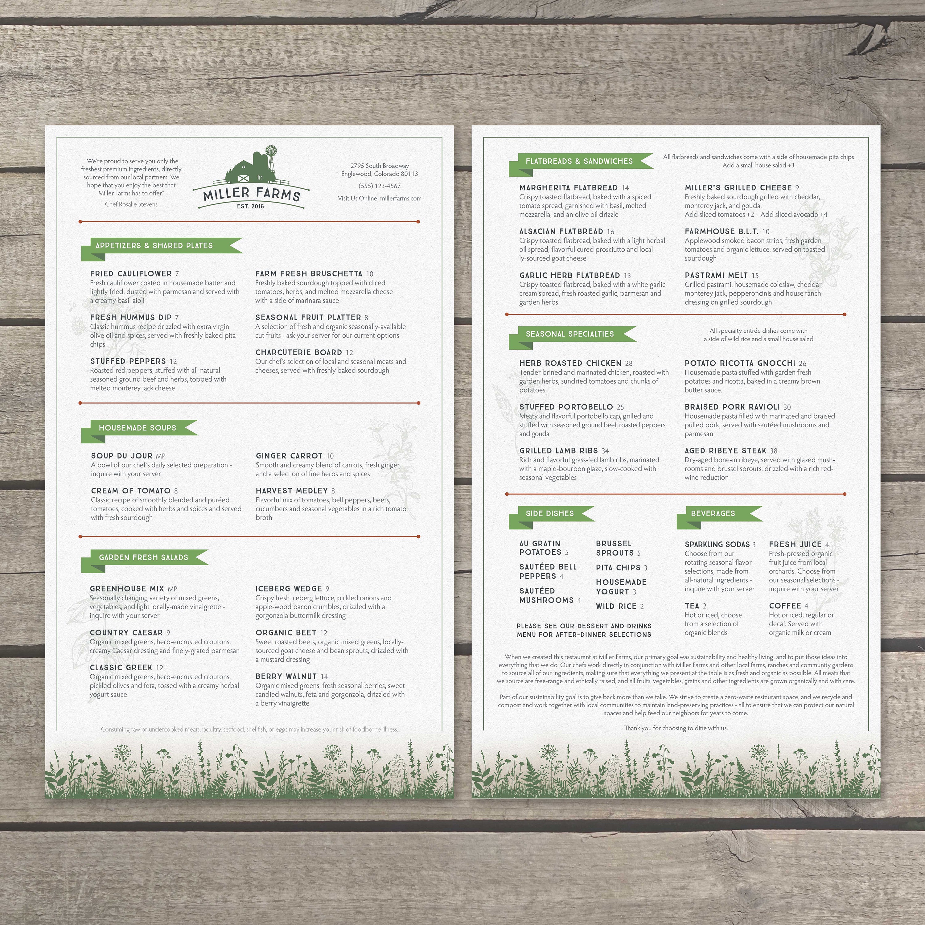
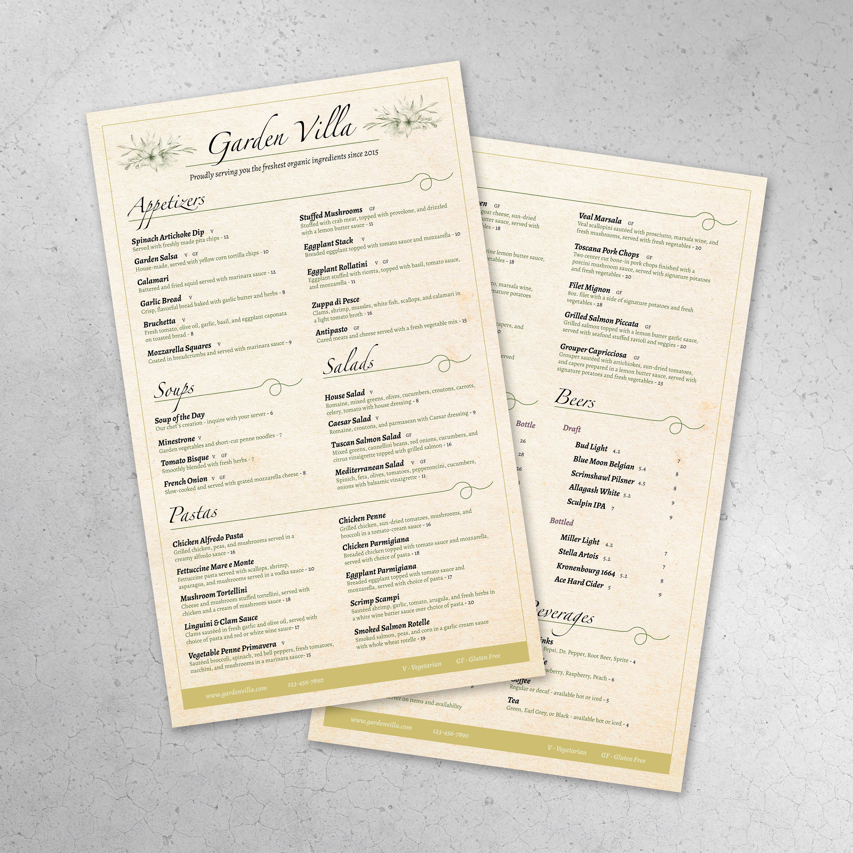
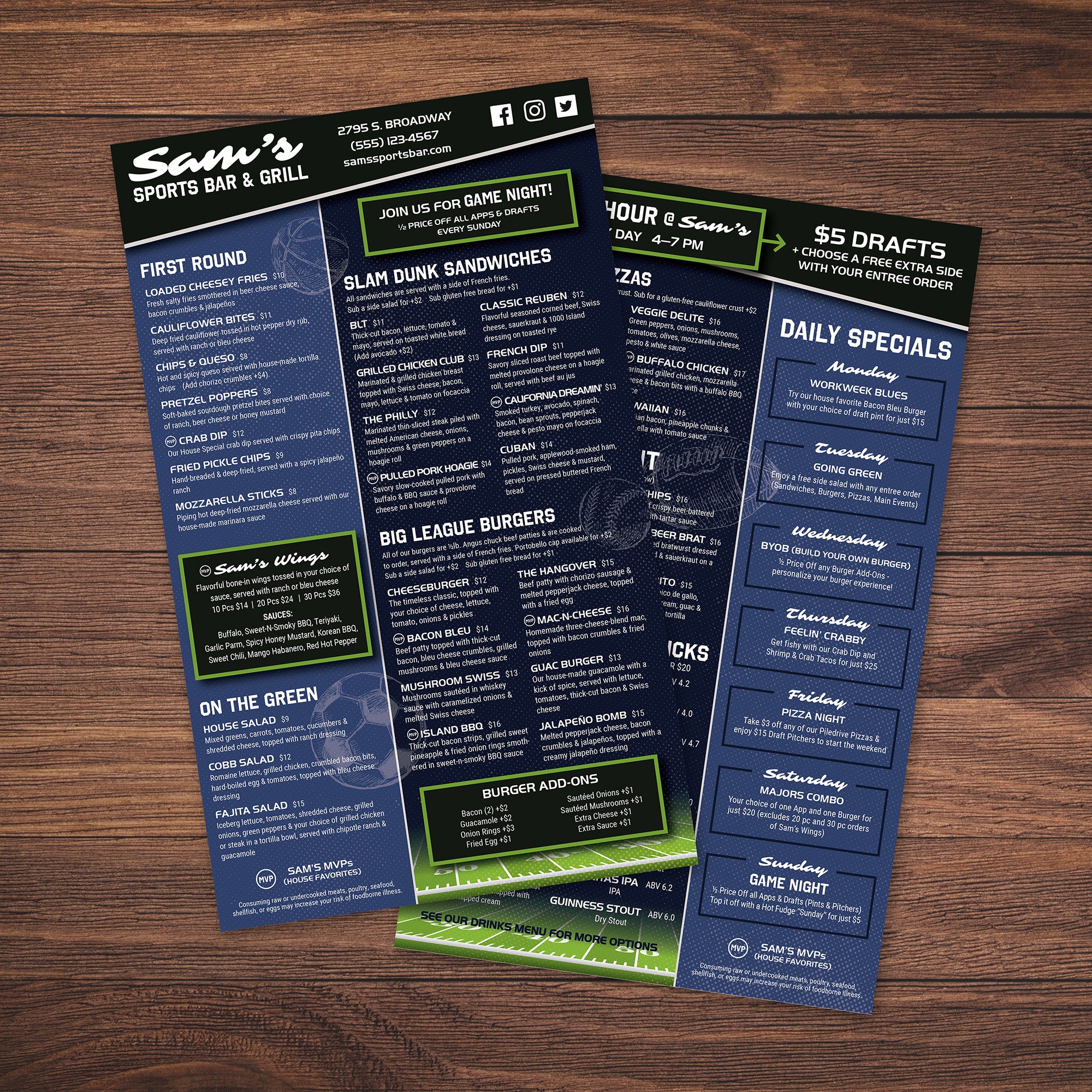
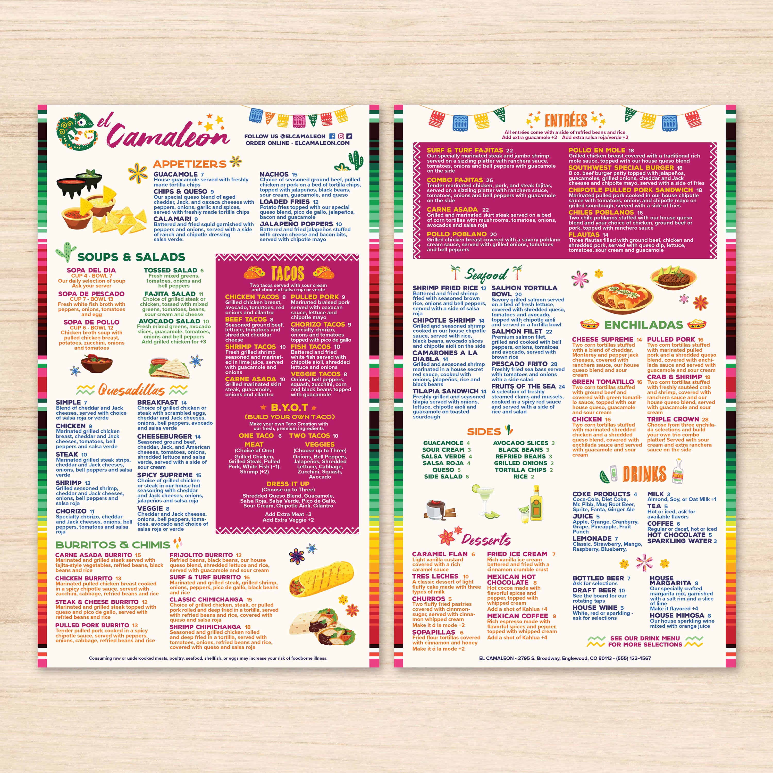
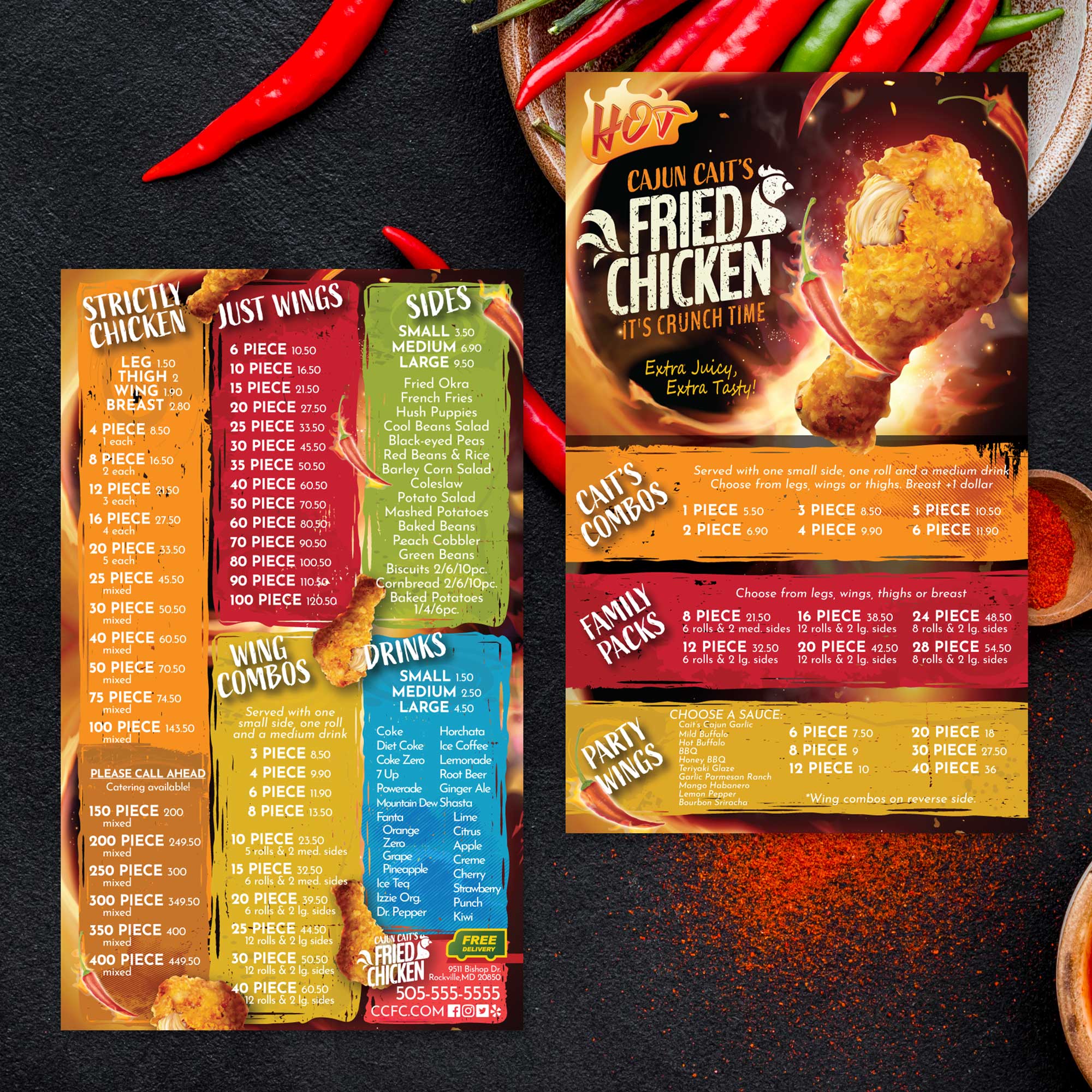
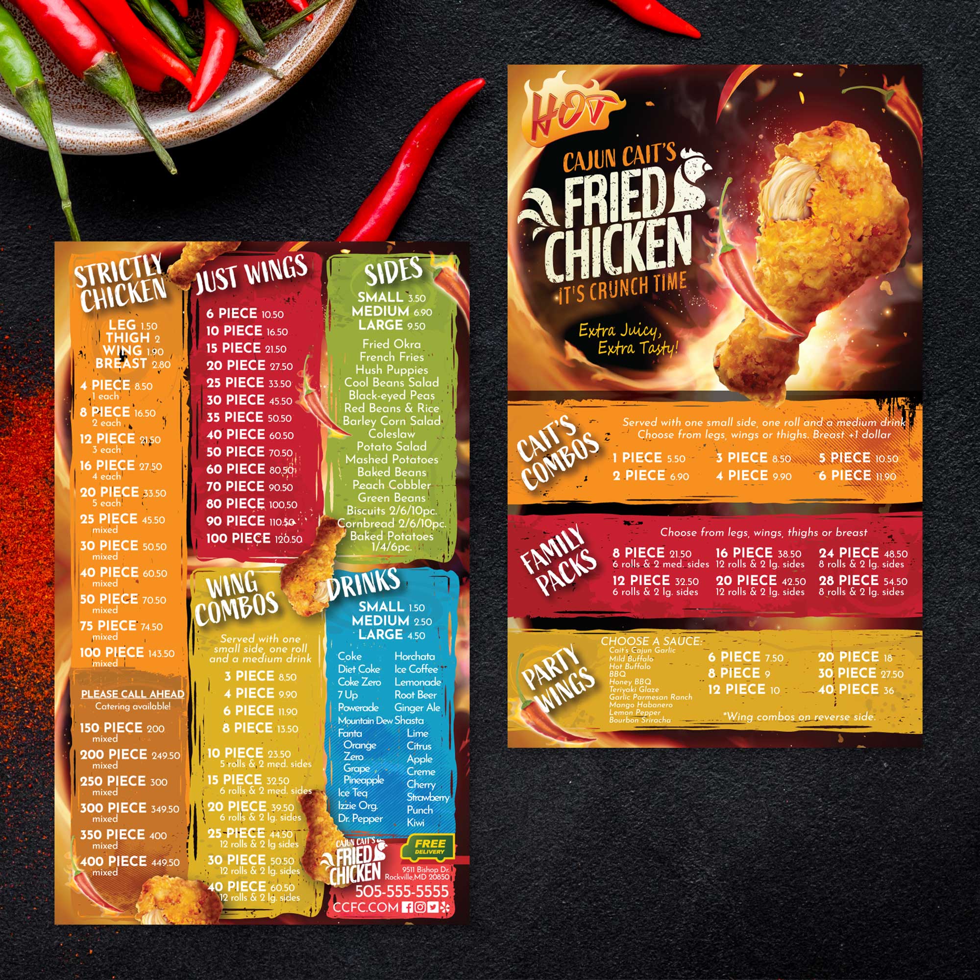
An 8.5" x 11" menu is a solid standard, but it can become tight if you’re listing multiple categories, add-ons, and pricing tiers. When content gets compressed, font size often shrinks and spacing disappears, which makes scanning harder. If your menu includes multiple drink sections, a full food lineup, or several modifiers, moving to 8.5" x 14" helps keep the layout clean while still staying single-page.

When 5.5" x 8.5" Works Better for Curated or Limited Menus

A 5.5" x 8.5" menu is best when your goal is simplicity and speed. This format works well for drink-only menus, daily specials, grab-and-go menus, or limited offerings. Smaller menus encourage a curated selection, which can actually improve decision-making because customers have fewer choices to process. The key is keeping content short and removing long descriptions so the layout stays readable.

When 12" x 18" Flat Menus are Better for Wall Displays

A 12" x 18" flat menu works best when the menu needs to be seen from a distance, such as on a wall, behind a counter, or in a quick-service line. This size allows large text, wider spacing, and stronger category separation. It’s ideal when the menu is primarily a display tool, and customers need to browse without holding a printed menu. For businesses that want a clear visual ordering board, this format often performs better than handheld sizes.

How Menu Size Impacts Printing, Handling, and Replacement

Larger menus can display more information, but they also need to be comfortable to handle. An 8.5" x 14" menu balances space and usability because it still feels like a standard sheet while offering extra room. Smaller menus are easier to hold and store, but they limit how much detail you can include. Wall formats are excellent for visibility but aren’t practical for handheld use. Choosing the right size reduces reformatting and makes reprints easier when prices or items change.

How to Choose a Size Based on Your Menu Type

The simplest way to choose is to match size to content volume and service style. If the menu is long but should remain single-page, 8.5" x 14" is a strong option. If the menu is intentionally minimal and designed for quick ordering, 5.5" x 8.5" works well. If the menu is meant to be viewed from across the room, 12" x 18" is a better fit. When the size matches how customers actually interact with the menu, readability improves, and ordering becomes faster.

A long-format menu only works if it holds up in real service conditions. Frequent handling, spills, and cleaning can quickly wear down standard paper menus, especially when traditional lamination is involved. Printing on the right material helps protect your layout, keeps text readable, and reduces the need for constant replacements.

  • Why Traditional Lamination Clouds Up and Fails Over Time: Menus with lamination often look fine at first, but repeated cleaning causes the surface to cloud up, bubble, or begin separating at the edges. Once this happens, even a well-designed menu can look worn and unprofessional, which often leads to frequent reprints and added cost.
  • Choosing the Right Thickness for Long-Format Menus: Longer menus benefit from a thickness that provides structure without making the menu heavy or awkward to handle. Thinner stock can bend or curl over time, while thicker options help menus keep their shape during frequent use. The right thickness depends on how the menu is handled, displayed, and stored:
  • Folded Versus Flat Menus for Extended Layouts: Some businesses prefer flat long menus, while others benefit from folded formats that break content into panels. Folded menus can help organize large amounts of information while remaining compact. Traditional lamination struggles with folds, often cracking or peeling, which limits layout flexibility:
  • Durable Printing That Reduces Replacement Cycles: We print 8.5" x 14" menus on TerraSlate waterproof, rip-proof paper designed for heavy handling and repeated cleaning. Our menus remain clear, avoiding the clouding and delamination issues common with lamination, which helps businesses maintain a professional presentation while reducing the frequency of menu reprinting.

When menus are printed on materials built for real-world use, the design stays sharp, customers read faster, and your menu continues to support service instead of becoming a maintenance issue.