4.25" x 11" Menu Templates

25 products

Showing 1 - 24 of 25 products

Showing 1 - 24 of 25 products
View
Classic Black & White Template 4.25" x 11" - TerraSlate Inc.

Recently viewed

When you need a menu that’s compact, easy to update, and quick for guests to scan, the 4.25” x 11” format is one of the best options available. It’s slim enough for table inserts, bar tops, and check presenters, but still long enough to organize categories cleanly. At TerraSlate, we built free 4.25” x 11 templates to help restaurants and bars create polished layouts without starting from scratch.

What 4.25” x 11” Is Best For (Slim Menus and Quick Scanning)

This size is ideal for drink lists, happy hour menus, dessert menus, and rotating specials. Guests can quickly scan from top to bottom, which helps them make a decision faster. It also keeps the table less cluttered than full-size menus, especially in busy dining rooms.

Where This Format Works Best in Restaurants and Bars

4.25” x 11” menus work well on bar counters, cocktail tables, and small dining tables where space is limited. They’re also a strong fit for cafés, lounges, and quick-service concepts that want a simple menu handout. Many teams use them as daily specials inserts that can be swapped out without reprinting the main menu.

When 4.25” x 11” Beats 8.5” x 11”

If your content is focused, a slim format often looks cleaner than a full-page menu. It naturally limits overload and encourages tighter categories, which improves readability. It’s also easier to print, store, and replace in small batches, which makes it perfect for frequent updates.

What to Prepare Before You Customize a Template

Before editing, gather your final list of items, including pricing and brief descriptions. Decide where you want to highlight specials or top sellers. Because space is tight, keep descriptions concise and choose a clear category order so guests don’t have to hunt.

Choosing the Right Template Style for Your Concept

A themed template can make your menu feel more intentional. If you’re building an Italian menu or a restaurant-specific style, our Free Italian menu templates and Free Italian garden templates give you a strong starting point for a clean, premium layout that still prints fast and reads easily in real service.

A slim menu format forces better design decisions. You can’t hide clutter behind extra space, so every line needs purpose. When a 4.25” x 11” menu is built correctly, it looks premium, reads fast, and supports ordering without slowing guests down. At TerraSlate, we recommend designing narrow menus with structure first, then layering in visual style only where it improves clarity.

Layout Strategy: Single Column Structure That Reads Fast

A single-column layout is the cleanest option for this size. It allows guests to scan from top to bottom without having to jump across the page. Keep category breaks clear, and avoid stacking too many sections. If the menu starts to feel dense, consider removing low-performing items or moving extras to a separate insert.

Text Hierarchy: Headers, Item Names, and Pricing

Hierarchy matters more than decoration. Use clear category headers, bold or slightly larger item names, and consistent price placement. If prices fluctuate, guests tend to slow down. When everything aligns, the menu feels intentional and easier to use.

How to Use Dividers and Spacing Without Wasting Room

Use thin dividers or small spacing gaps to separate items, but don’t overdo it. White space is essential, but in a narrow menu, it has to be earned. The best approach is consistent spacing between items, plus slightly larger spacing between categories.

How to Feature a Signature Item or Promo

If you want one promo, place it near the top or in the middle where the eye naturally lands. Use a small label, such as “Featured” or “Special,” and keep the copy concise. A single callout works better than multiple highlights that compete for attention.

Designing for Multiple Uses: Drinks, Desserts, and Happy Hour

This format works best when it stays focused. If you need more room for multiple categories, upgrading to a longer layout can help while still maintaining a slim profile. Our Free 6 x 15 menu templates are a strong option when you want the same narrow feel with more space for full drink menus, happy hour sections, or expanded dessert lists.

Narrow menus look sharp when the file is built for precision. Because the format is slim, minor alignment issues stand out faster than they do on larger menus. A clean setup ensures that your menu trims correctly, remains readable, and appears consistent across every print run.

Bleed and Safe Zones for Narrow Layouts

If your menu uses background colors, borders, or design elements near the edges, include bleed so that trimming doesn’t leave white gaps. Keep all critical text inside safe zones so item names, pricing, and headings never get clipped. Slim layouts need strong margins to avoid feeling cramped.

Font Size Rules That Prevent Crowding

Choose fonts that stay crisp and readable at smaller sizes. Avoid thin typefaces and keep body text large enough to read in dim dining rooms or bar lighting. If the menu feels crowded, reduce the number of items, not the font size. Readability always wins.

Print Settings That Keep Text Crisp

Export your design as a print-ready PDF with fonts embedded and images set to high resolution. Avoid compressing graphics too heavily, especially logos. Crisp typography is one of the most significant quality signals in narrow menus, so clean export settings are crucial.

Proofing Checklist for One-Sheet Inserts

Print one test copy at actual size and review it in real conditions. Check trimming, spacing, and price alignment. Confirm that headers stand out, item names are easy to read, and no text sits too close to the edge. This one proof prevents most reprint mistakes.

Common Narrow-Format Mistakes and Fixes

The most common issues are text pushed too close to trim lines, inconsistent spacing between items, and too many categories forced into one sheet. Improve them by refining your menu content, utilizing clear category breaks, and maintaining strong margins. A narrow menu should feel intentional, not compressed.

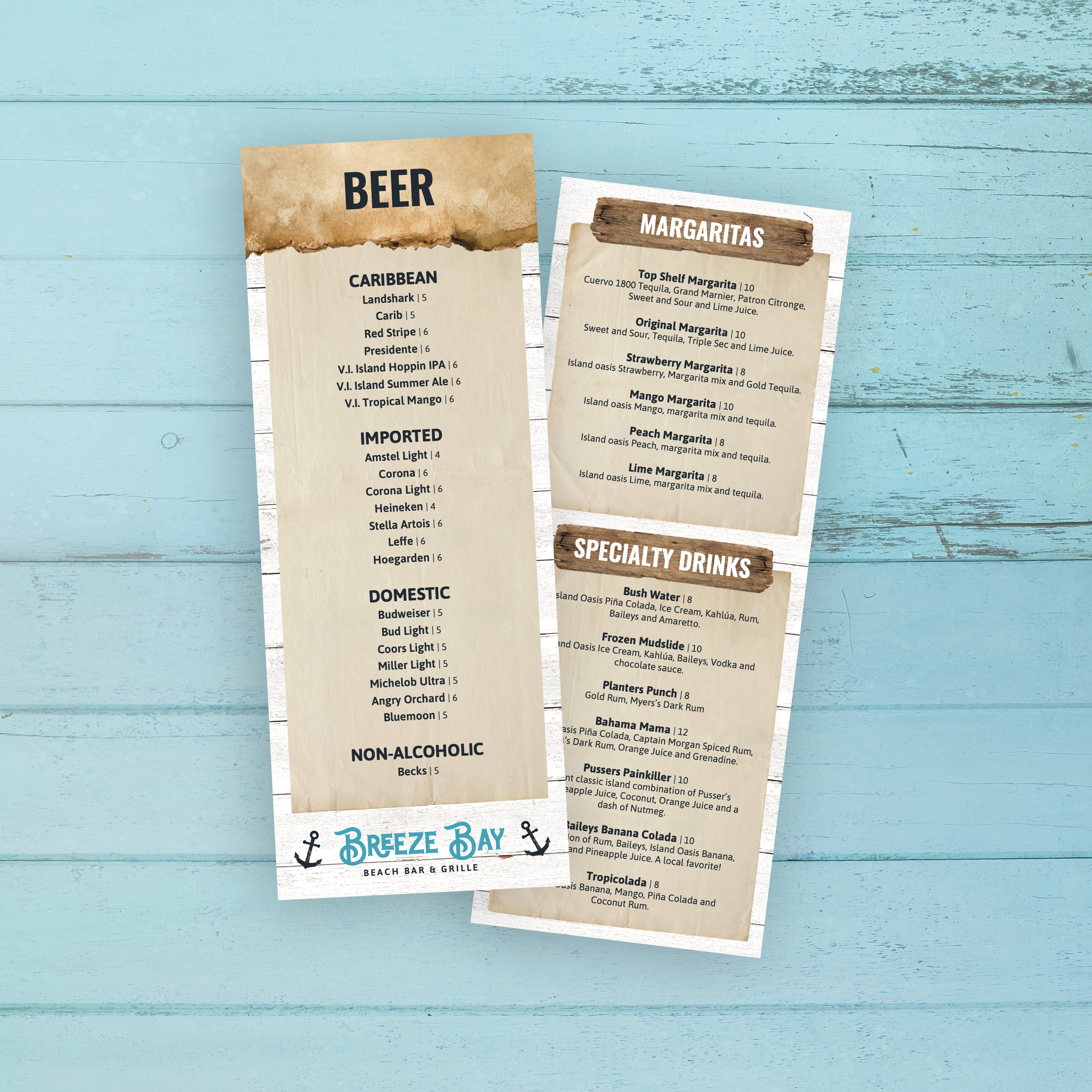
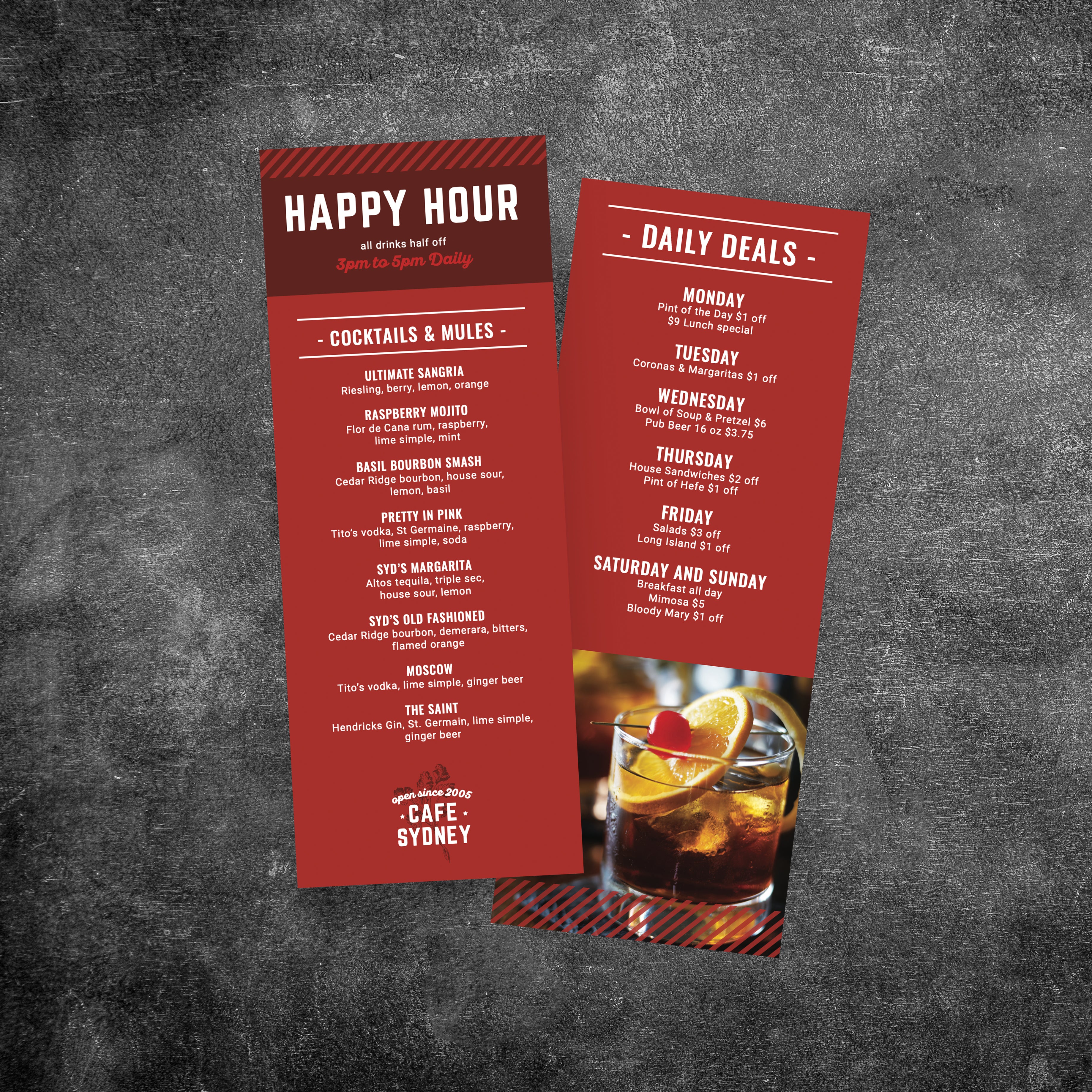
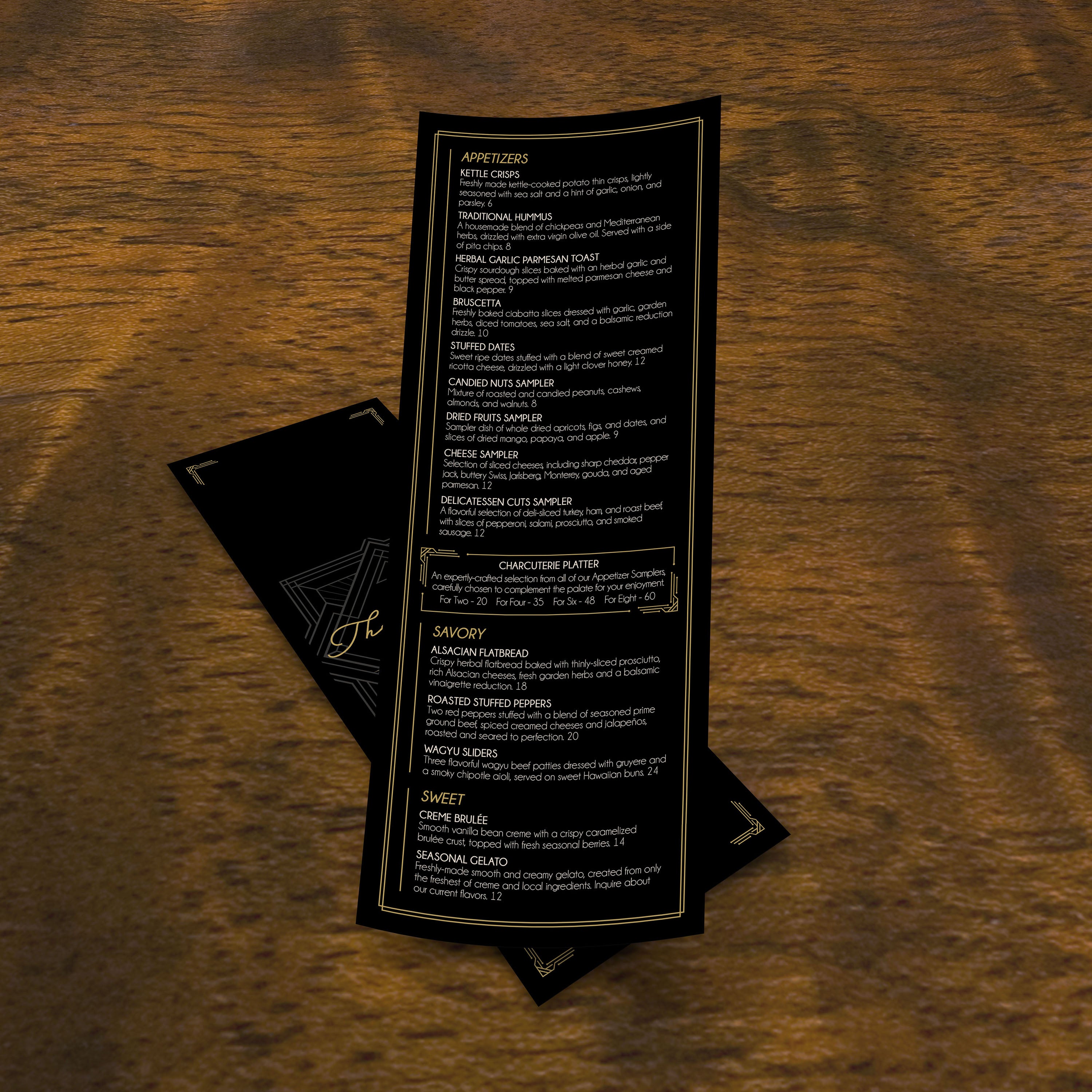
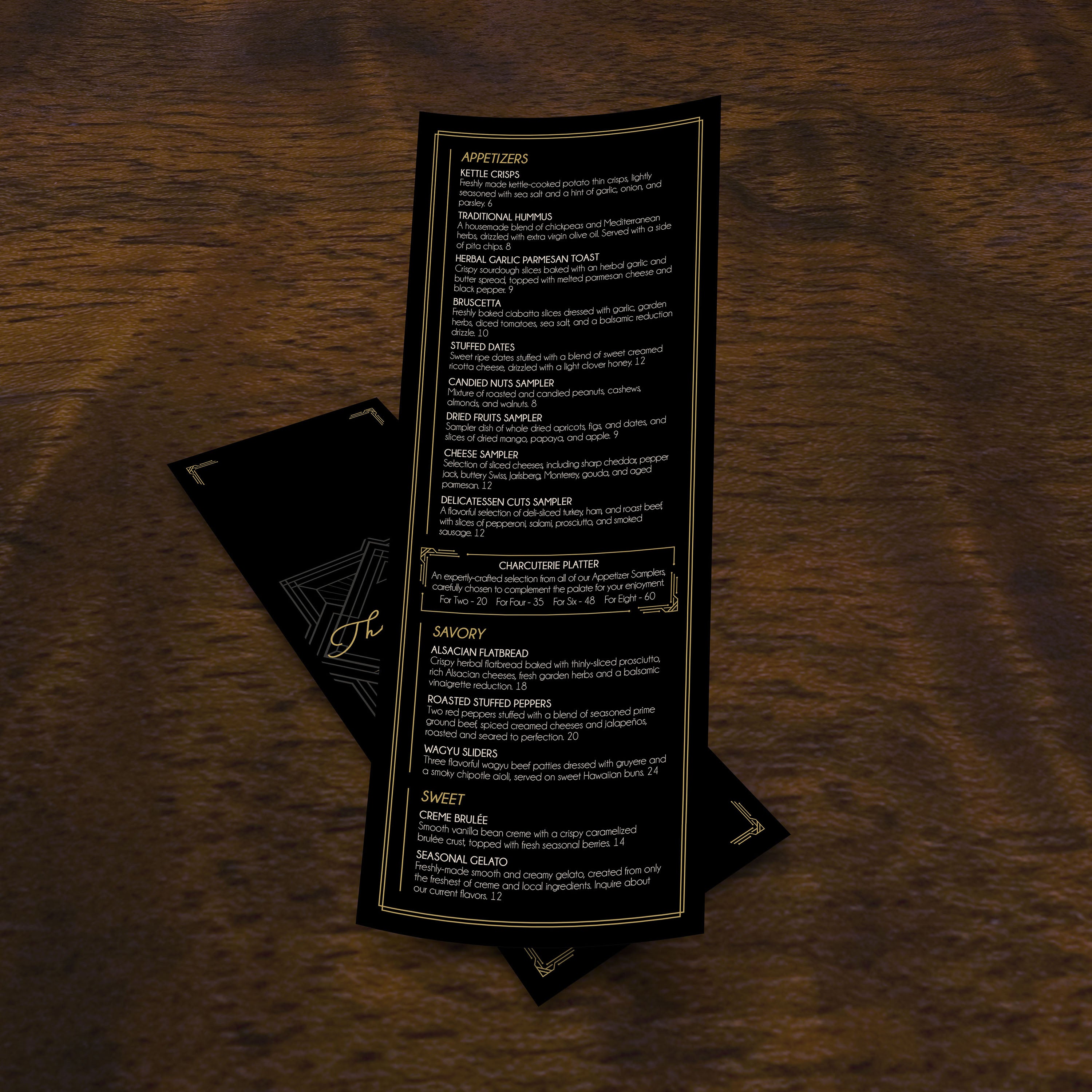
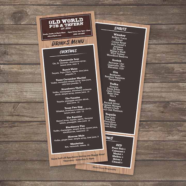
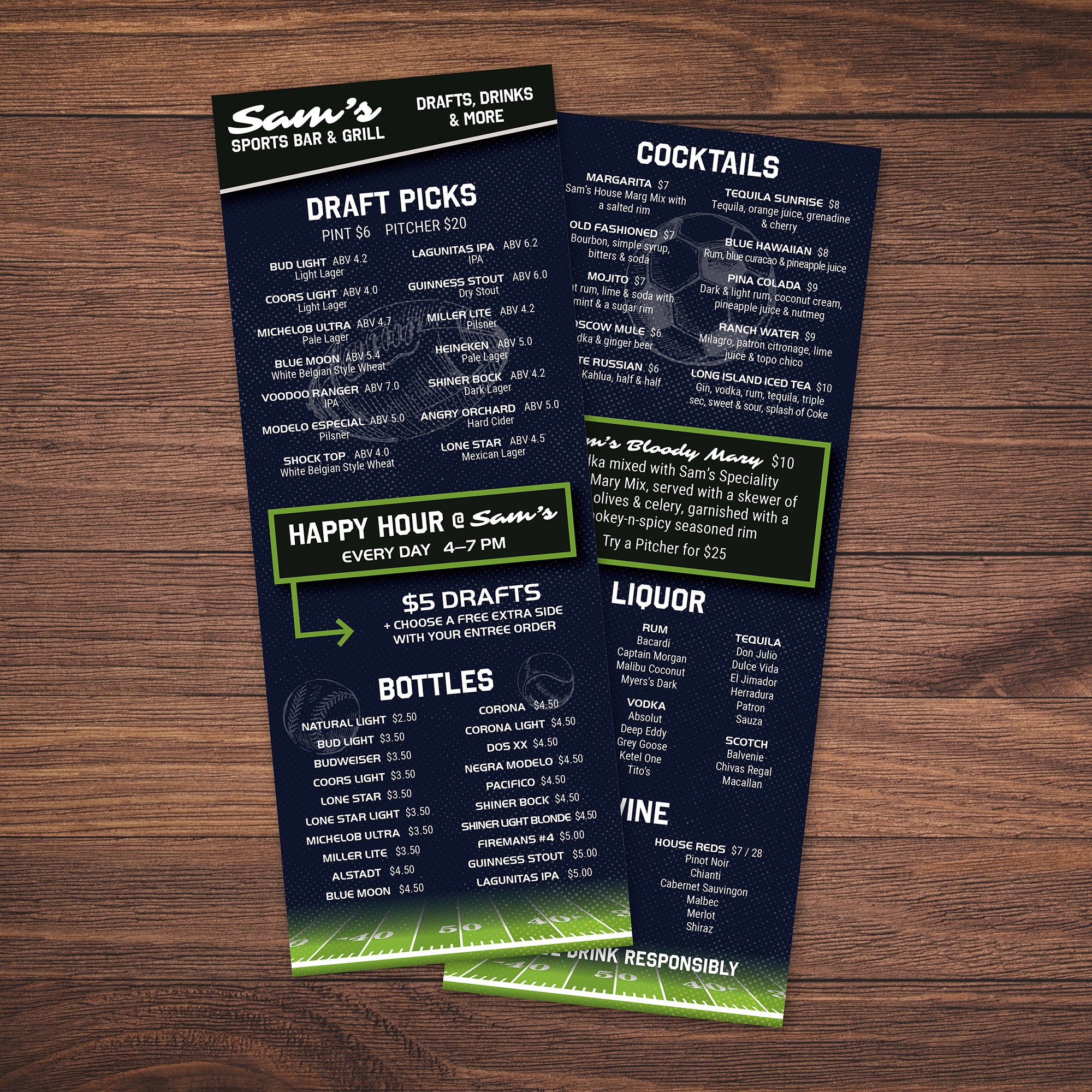
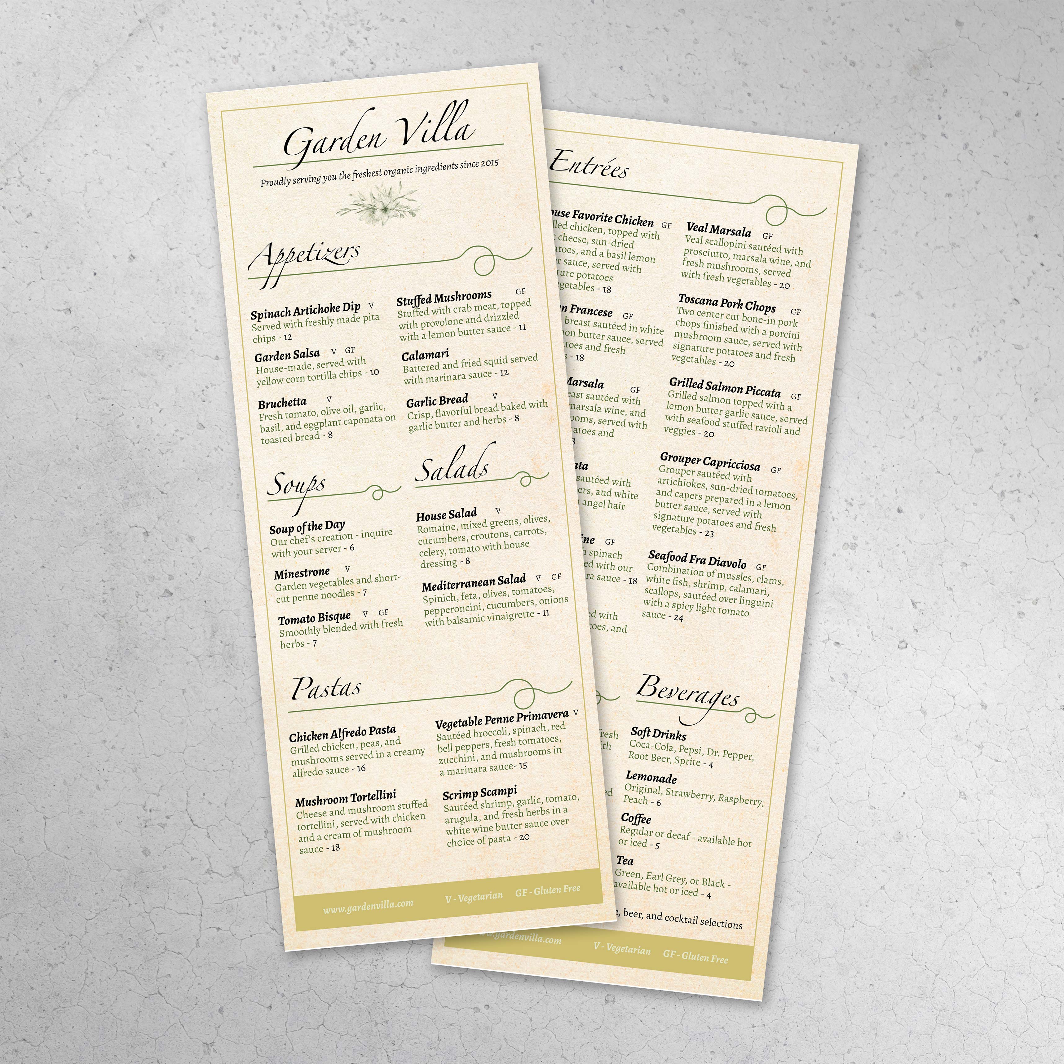
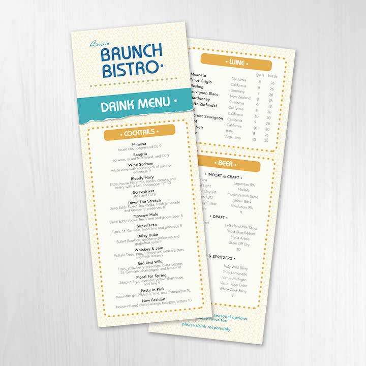
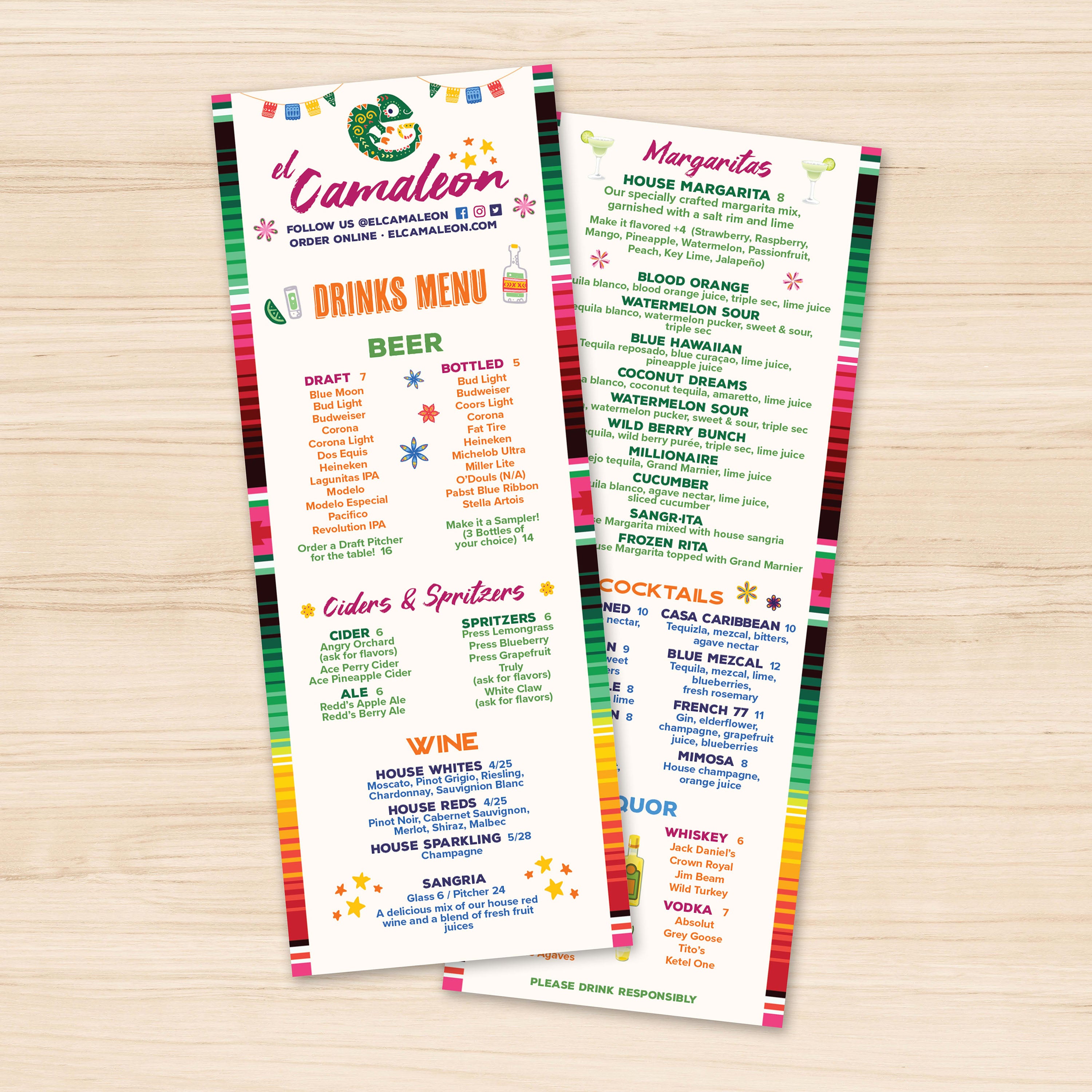
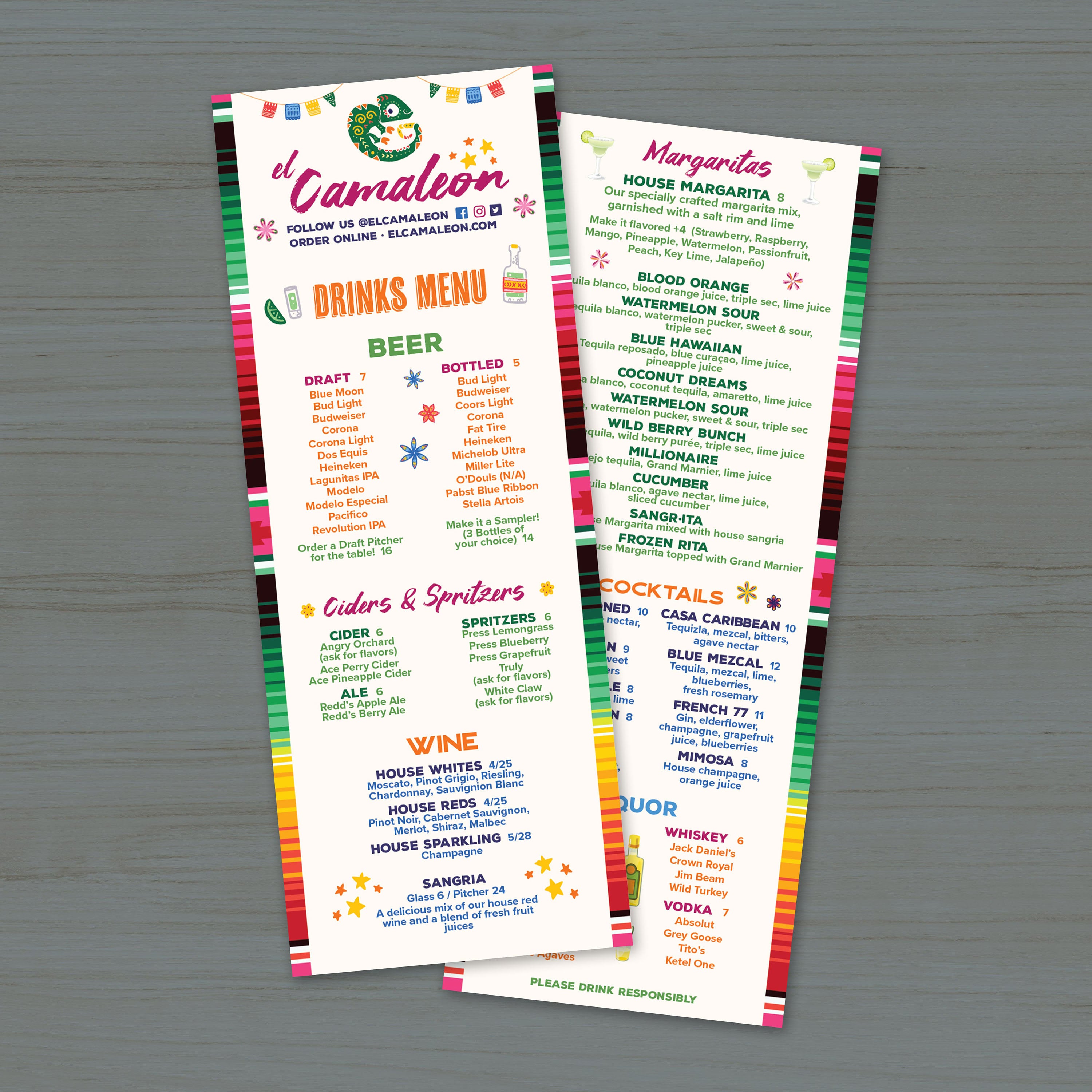
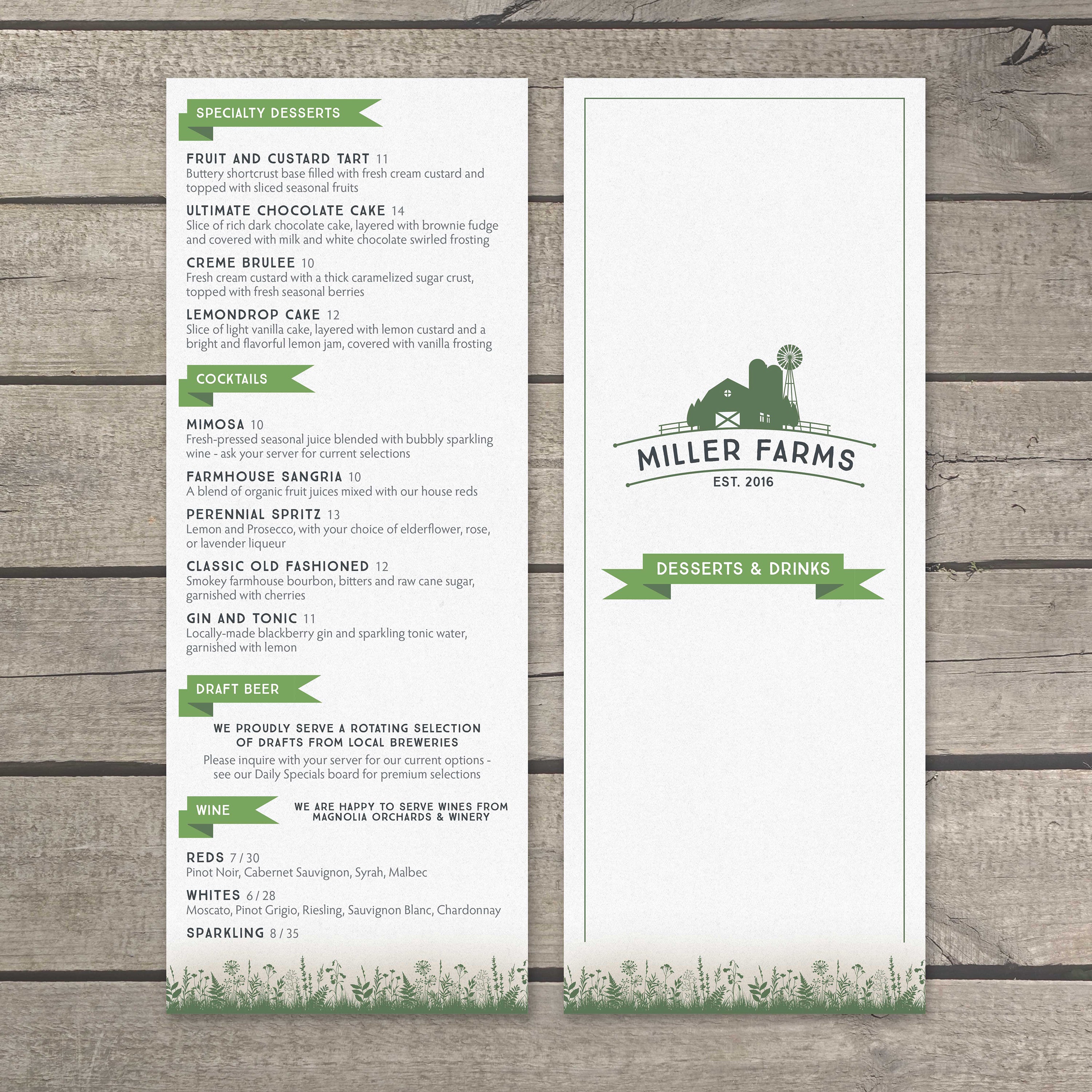
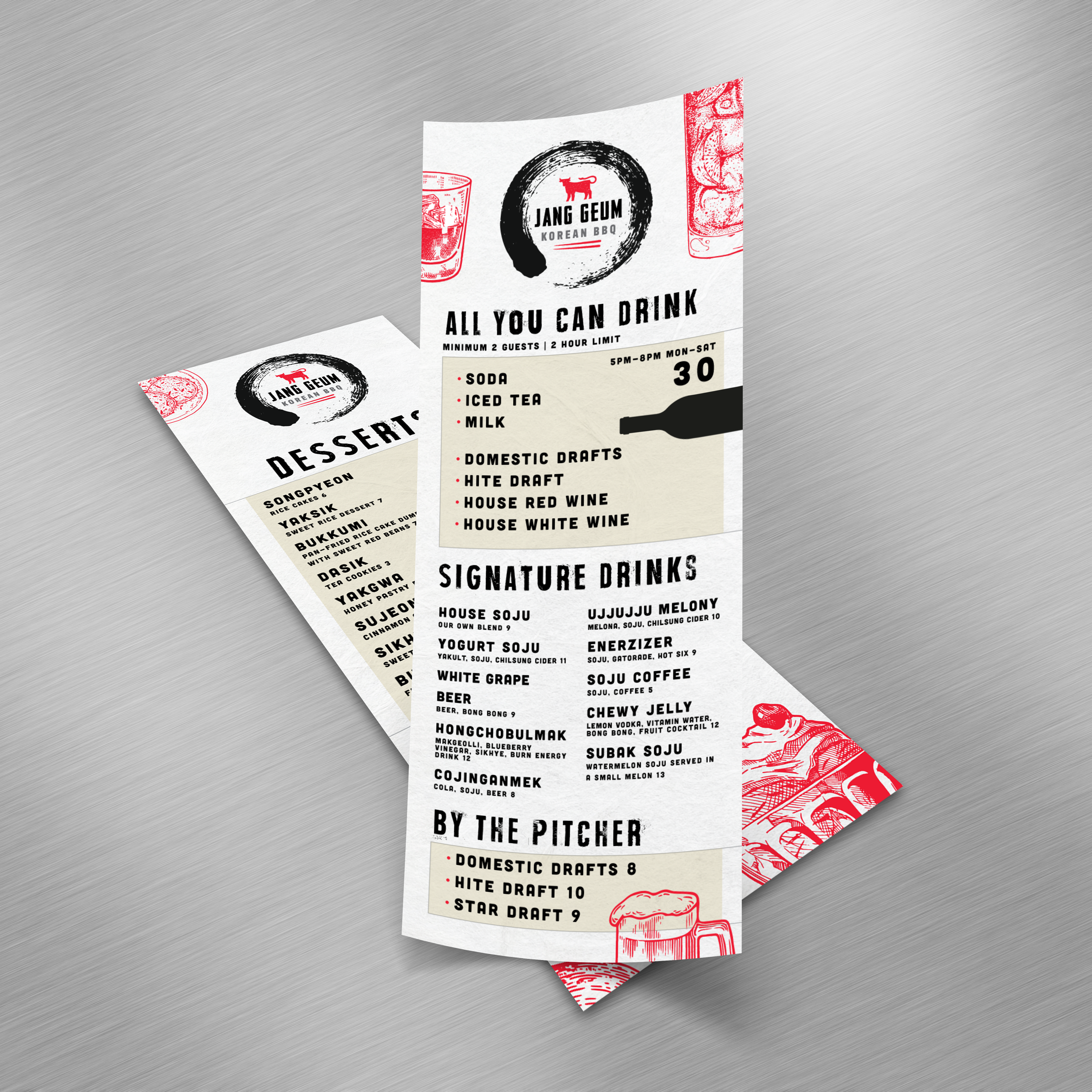
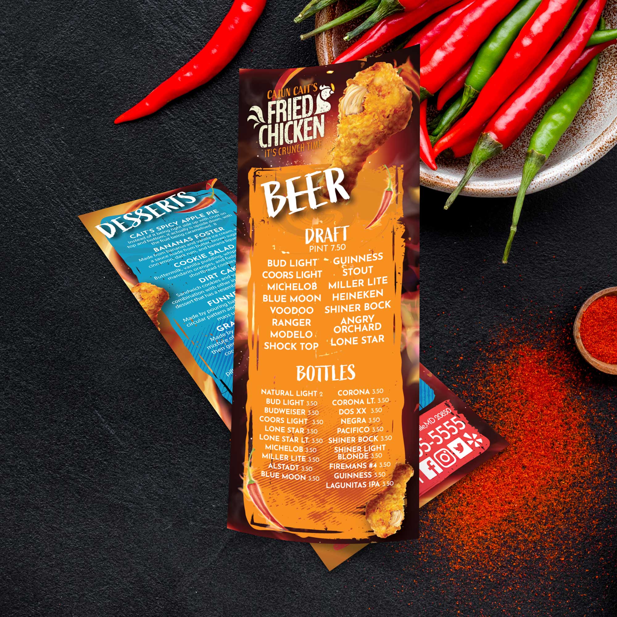
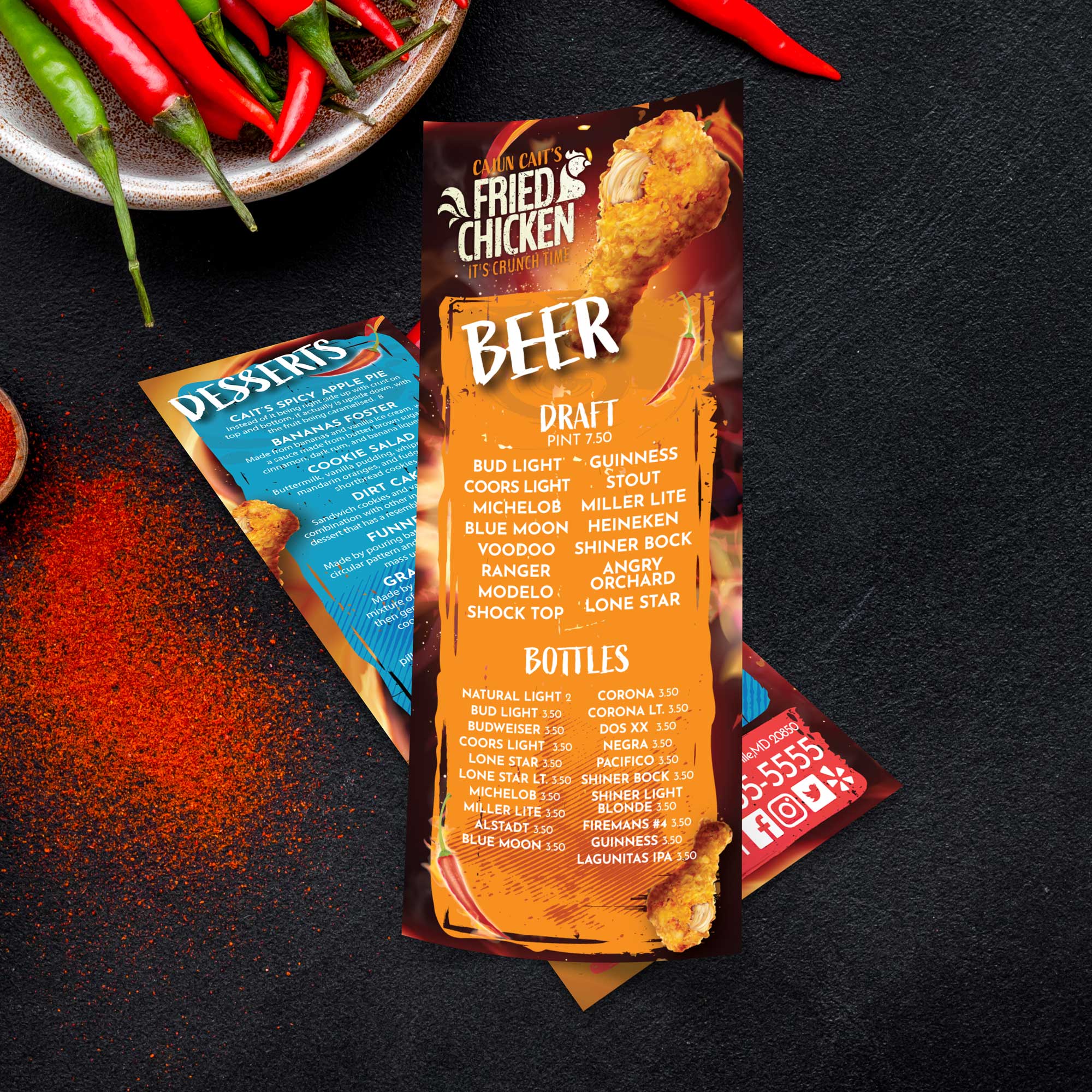
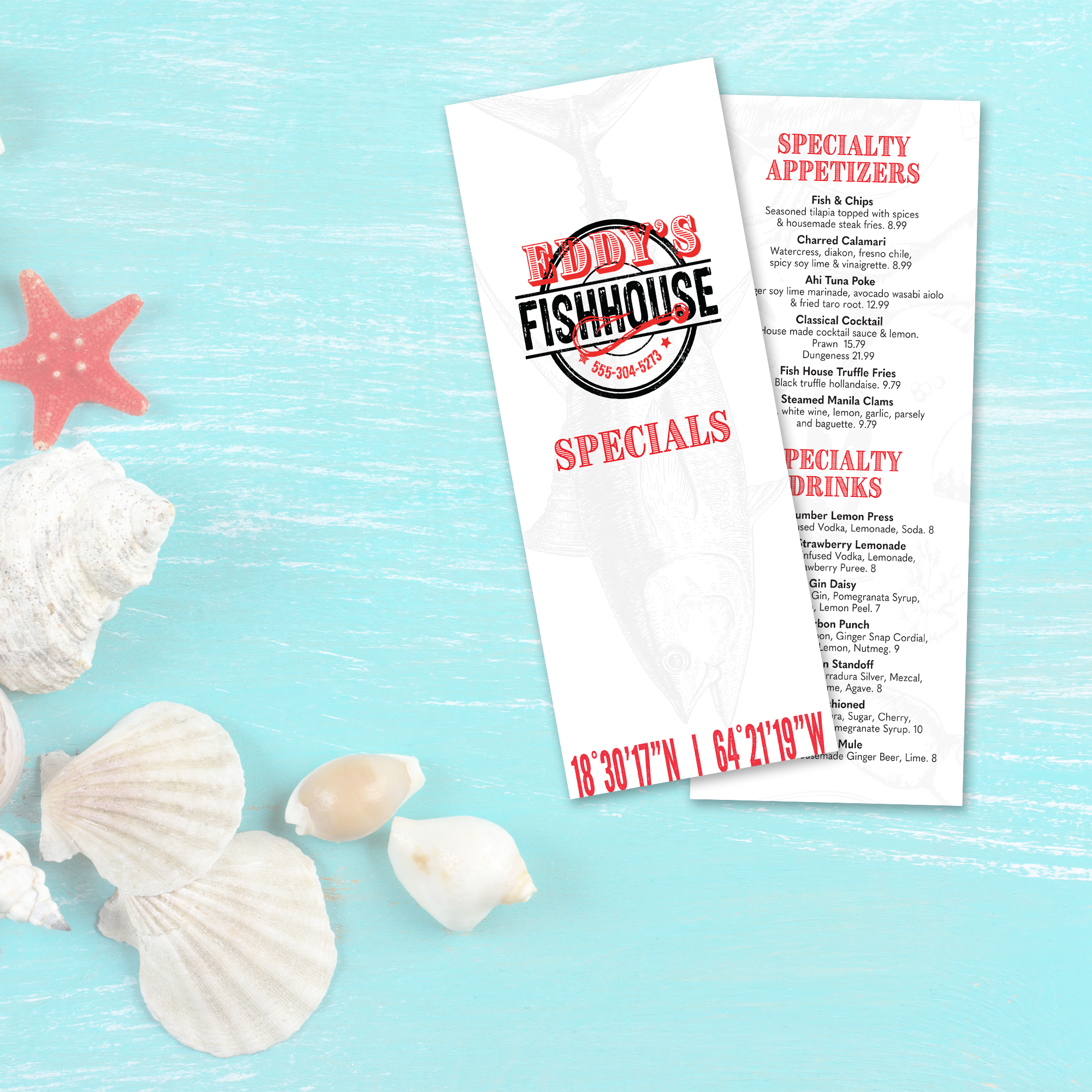
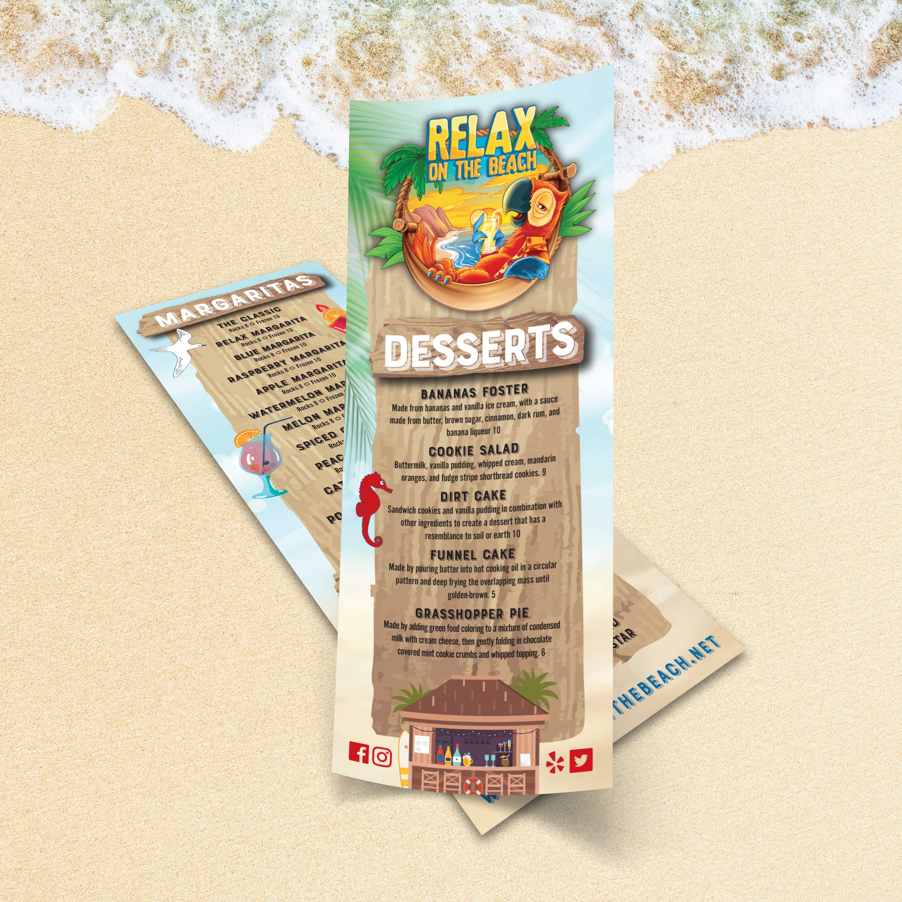
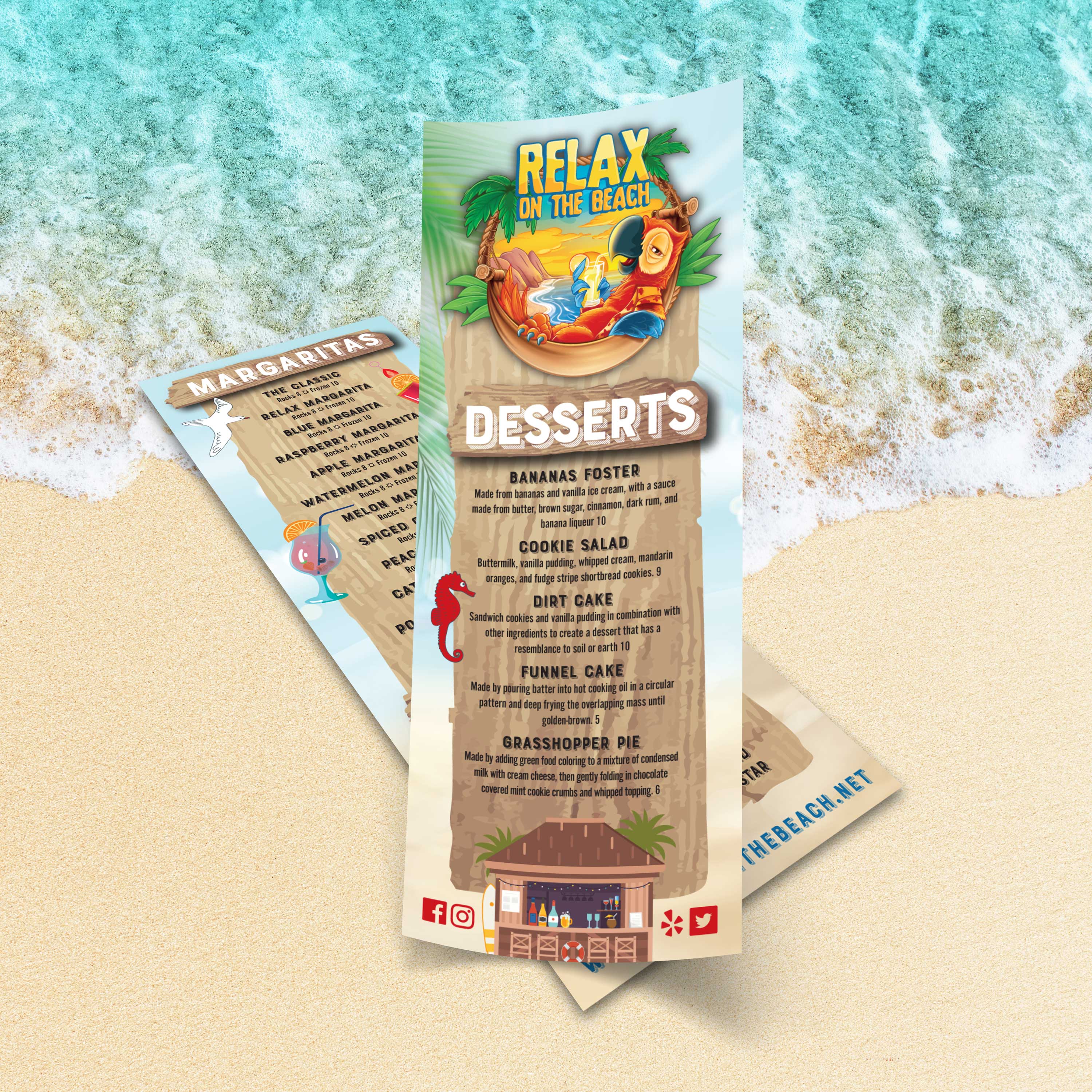
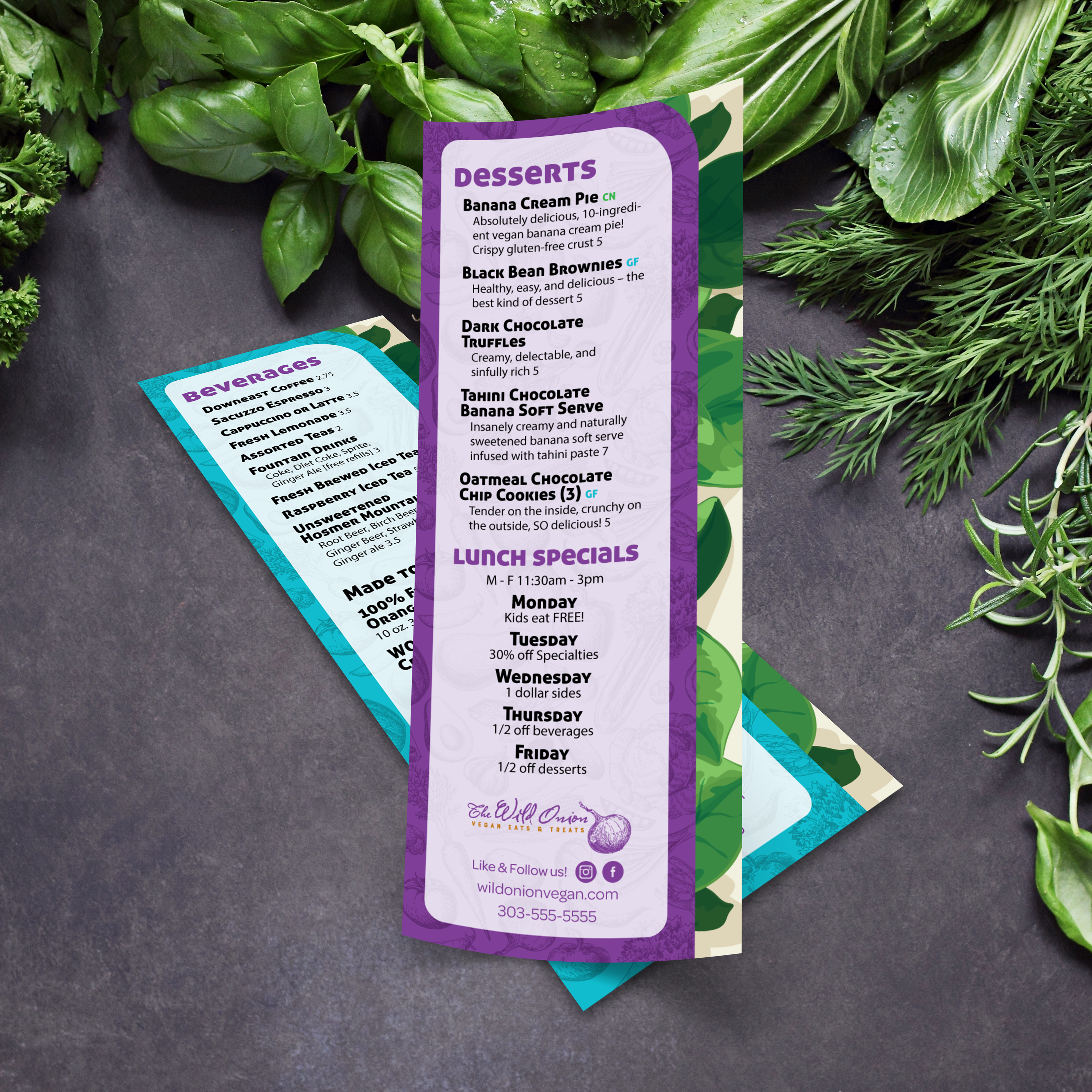
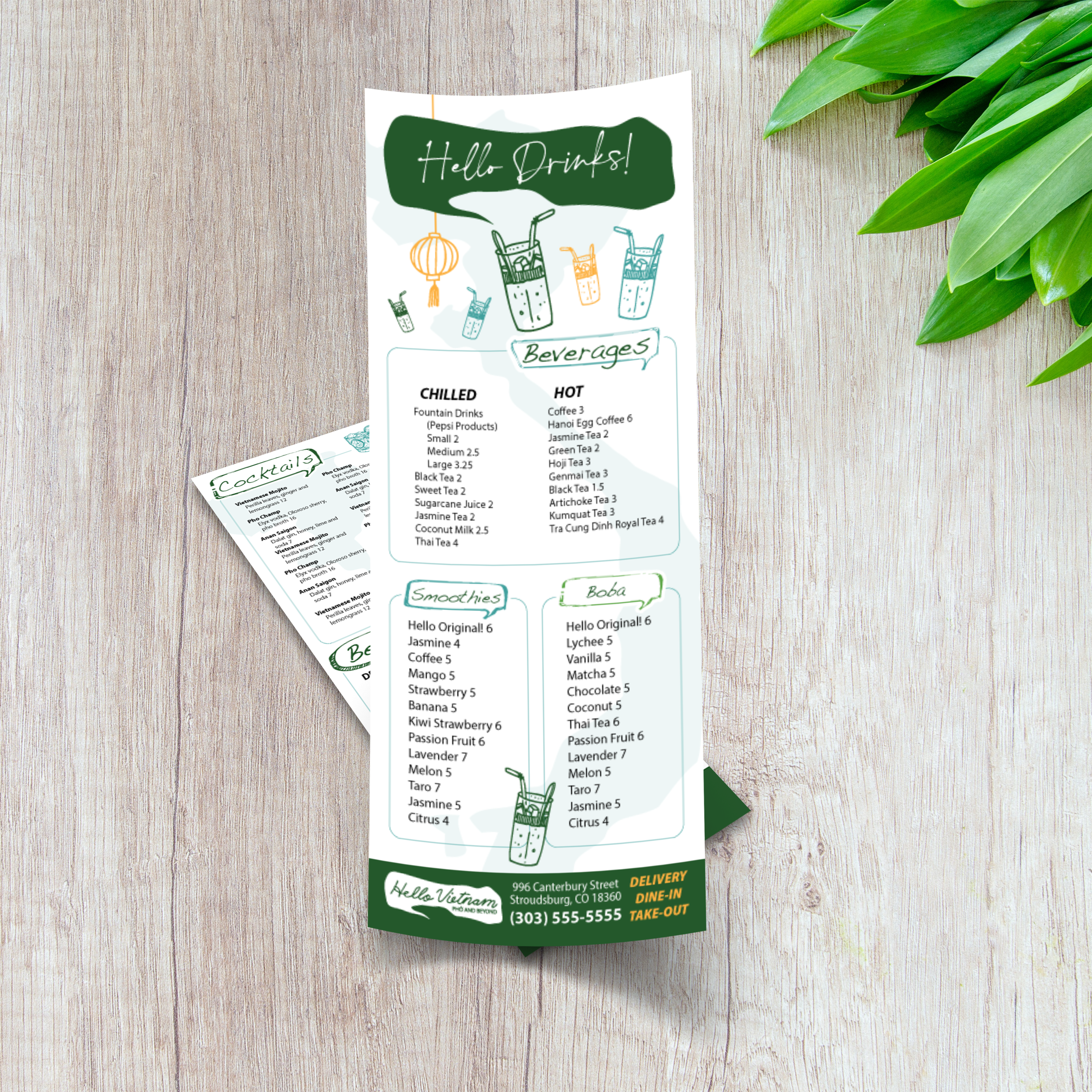
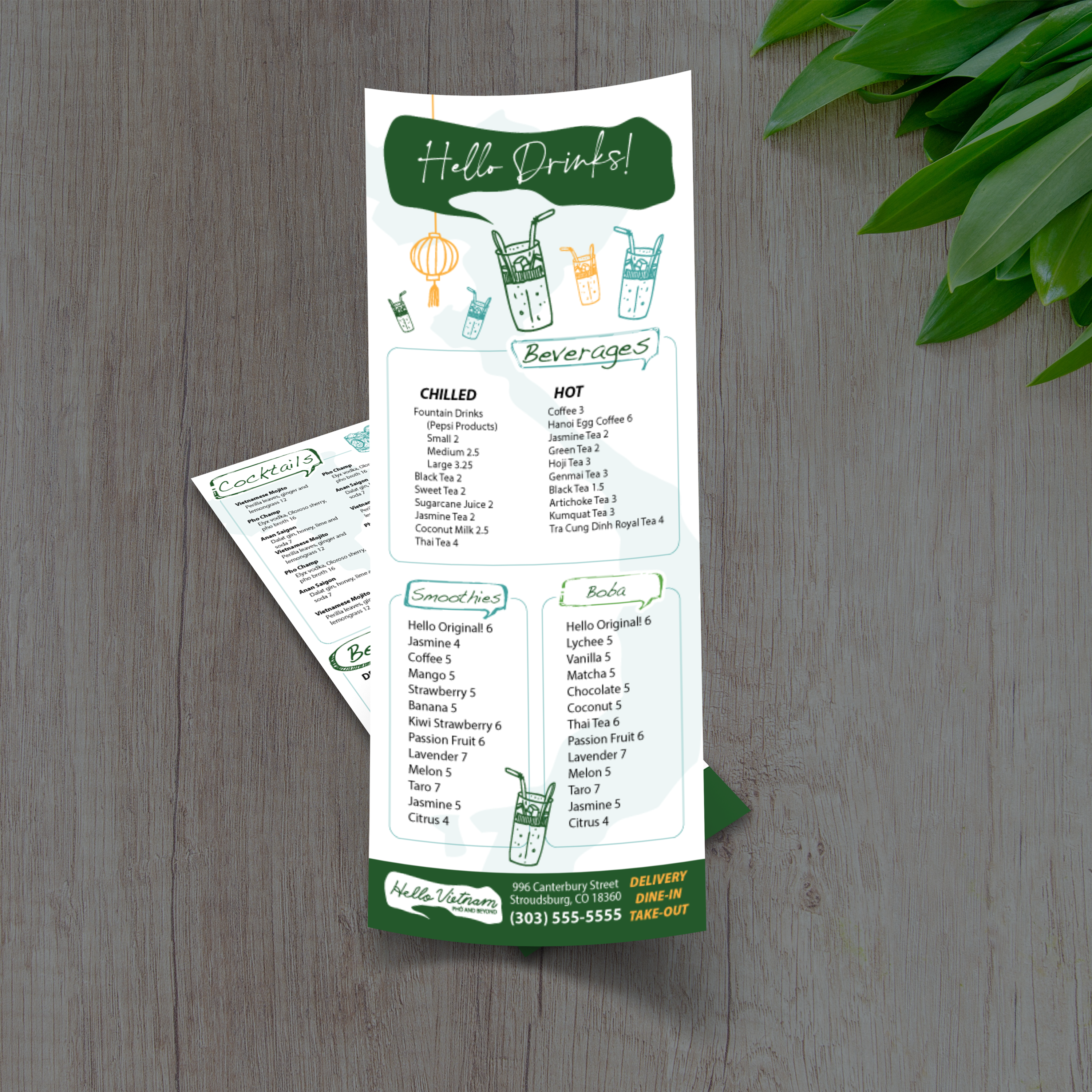
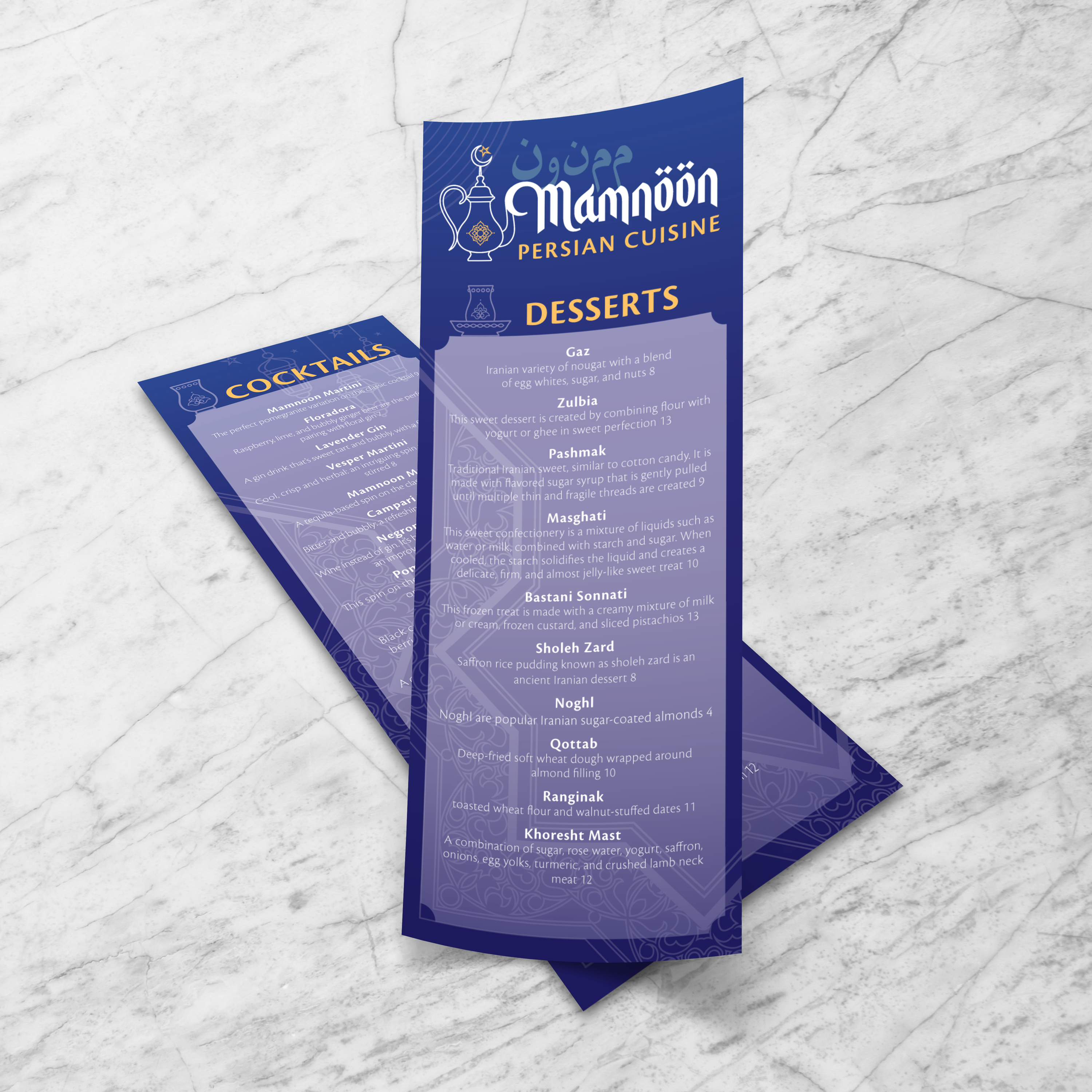
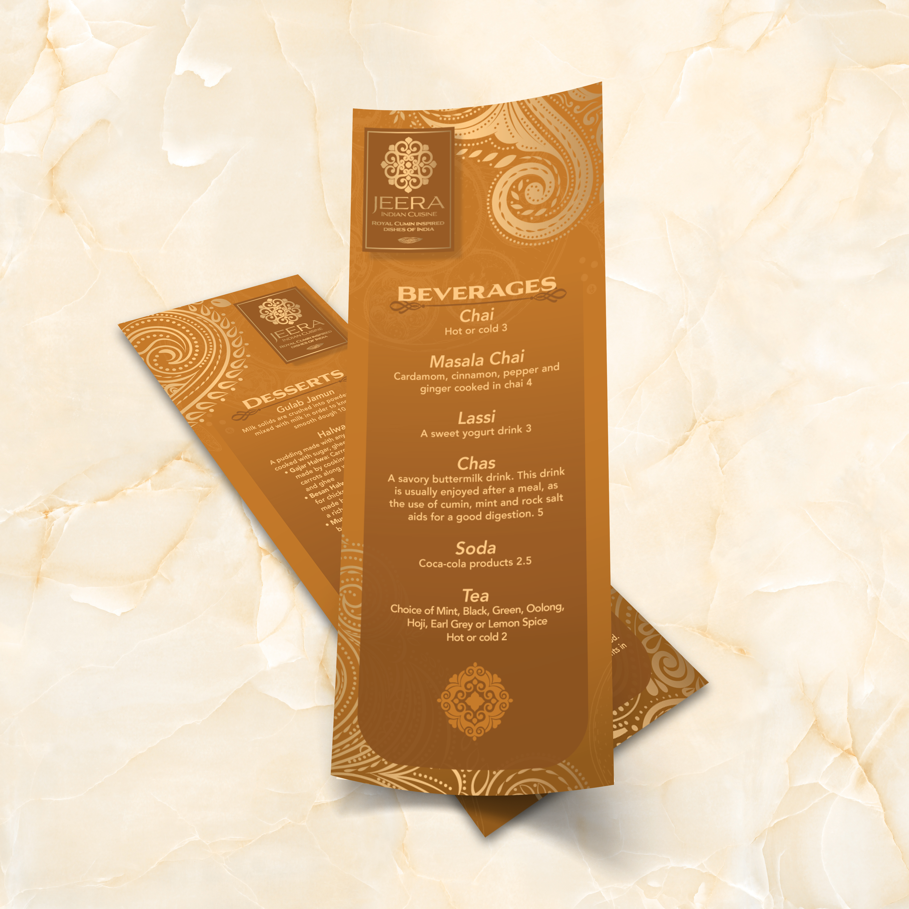
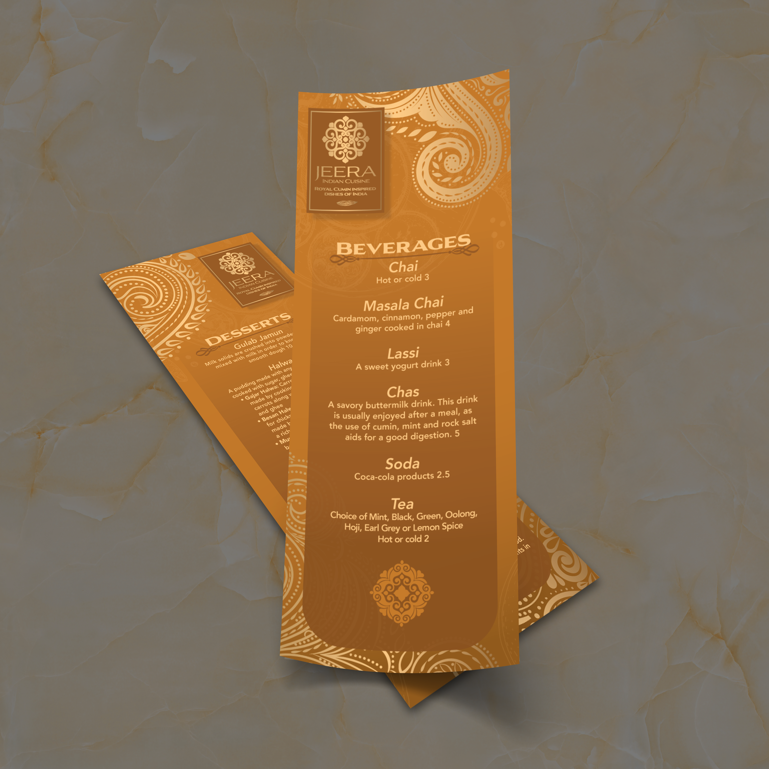
Slim menus often receive more attention than full menus because they are frequently used as inserts, drink lists, and daily specials. They’re passed around quickly, set on wet bar tops, and cleaned often. If the material can’t handle that cycle, edges wear out, corners bend, and the menu starts looking tired fast. At TerraSlate, we create waterproof, rip-resistant options that replace lamination, helping slim menus stay presentable for longer.

Why Paper Inserts Get Ruined Fast

Standard paper absorbs moisture and grease, stains easily, and tends to break down at the edges. Because slim menus are handled repeatedly during service, they tend to wear out faster than people expect. Even thick stock can curl, wrinkle, and soften after a few spills or cleanings.

Why Lamination Clouds and Scratches Over Time

Lamination adds a plastic layer that initially appears smooth, but it can cloud up, scratch, and even bubble or delaminate at the edges. It also creates a worn surface over time, especially on menus that are cleaned often. For bars and restaurants, the “new laminated menu” look doesn’t last long.

TerraSlate Flagship Sheets for Waterproof, Rip-Proof Inserts

TerraSlate is our flagship synthetic paper, built to be 100% waterproof and rip-proof. For slim menus, it’s ideal because it withstands heavy handling, spills, and routine cleaning without compromising readability. If you want the longest-lasting drink lists or specials inserts, this is the premium option.

Value-Oriented PolySlate for High-Volume Runs

Value-oriented PolySlate is a strong fit when you want waterproof menus at a lower cost per sheet, especially for high-volume printing. It’s designed for laser printing and works well for menus that frequently require updates. If your specials rotate weekly, PolySlate helps you stay durable without overspending.

Choosing Thickness for Flexibility and Durability

Thickness affects how the menu feels and its durability. Lighter options stay flexible and easy to stack, while thicker options feel more substantial and resist wear. 8 Mil is a strong balance for most slim menus, while 10 Mil adds more structure for heavy use. If you want the most durable feel, 14 Mil is more rigid and built for demanding environments.

A slim menu works best when it’s part of a larger system, not a standalone piece. When you use 4.25” x 11” templates alongside full menus, you create a flexible setup that supports daily changes, seasonal updates, and targeted promotions without forcing constant redesigns. This format is especially valuable for restaurants that want to maintain a consistent main menu while still offering rotating specials and limited-time offerings.

Pairing Slim Inserts with Full Menus

Use slim inserts to complement a full menu, rather than replacing it. For example, your main menu stays stable while a 4.25” x 11” insert highlights seasonal features or chef specials. This reduces the need for full-menu reprints and keeps updates fast.

Seasonal Specials and Limited-Time Offers

Seasonal changes are easier when you have a dedicated insert format. Swap out items, pricing, and short descriptions without touching the core menu. Guests still enjoy a consistent ordering experience, while your menu remains fresh and up-to-date.

Table Inserts for Upsells and Add-Ons

This size is ideal for upsells like appetizer features, dessert promotions, wine pairings, or premium add-ons. Because the insert is slim and focused, it doesn’t feel like extra clutter. It feels like intentional guidance that helps guests discover high-margin items naturally.

Dedicated Drink Lists and Dessert Menus

Drink lists and dessert menus are often updated more frequently than food menus. A dedicated slim format makes those updates painless. It also prevents drink sections from dominating the main menu, which improves readability and speeds up ordering.

Matching Design Across Formats for a Premium Look

A comprehensive menu system appears premium when everything is cohesive. Use the same typography, spacing style, and category structure across your main menu and inserts. When your slim menus feel like part of the same brand set, guests trust the presentation, and your staff can manage updates without needing to redesign from scratch.

Slim menus are handled constantly, which means they show wear quickly if the material or routine isn’t built for real service. The best approach is simple: use a durable menu material, clean it correctly, store it properly, and update the layout without redesigning every time. That system keeps your 4.25” x 11” menus looking sharp while reducing replacement costs.

Cleaning Routine for Waterproof Menus

Clean menus regularly to prevent grease buildup, especially on bar tops and high-touch tables. Wipe down after peak shifts and spot-clean during service when spills happen. Waterproof menu materials make this routine simple because moisture doesn’t soak in, and the surface won’t warp. If your menus are in constant rotation, a quick wipe at the end of each shift helps keep them crisp and guest-ready without adding work for your team.

Why Soap and Water Work Best

Simple soap and water are recommended for our paper because they clean effectively without degrading the printed surface over time. Harsh chemical cleaners can be unnecessarily aggressive when used frequently. Soap and water keep menus clean, readable, and professional without shortening their lifespan. If you want a consistent routine across locations, standardizing on soap and water also helps your staff avoid guesswork and over-cleaning.

Storage Tips That Prevent Curling and Edge Wear

Store slim menus stacked flat or upright in clean bins. Keep them away from heat sources and avoid bending or rolling them. Rotating stacks also helps prevent the same few menus from wearing out, which extends the life of the full set. If you’re using inserts for daily specials, keep a designated “active” stack for service and a separate “backup” stack to prevent menus from getting shuffled and damaged unnecessarily.

Updating Templates Without Redesigning

Use the same layout and swap content as needed. Update pricing, rotate specials, or refresh seasonal items while maintaining consistent spacing and typography. This reduces mistakes and ensures that every update appears intentional. An intelligent workflow is to lock your design structure, then only change the content fields that need updating. That makes approvals faster, prevents layout drift, and helps your inserts look consistent week after week.

Why Better Than Lamination Saves Time and Money

Paper menus wear out quickly, and lamination can cause them to cloud, scratch, bubble, or delaminate at the edges. Slim menus are especially prone to edge wear because they’re handled rapidly and stored in stacks. Durable, waterproof, rip-proof menu materials reduce replacement cycles and keep menus looking premium longer. Over time, that lowers your total menu cost and makes your menu program easier to manage. Instead of reprinting because menus look worn, you reprint because you want to update your offerings, which is precisely how a strong menu system should work.