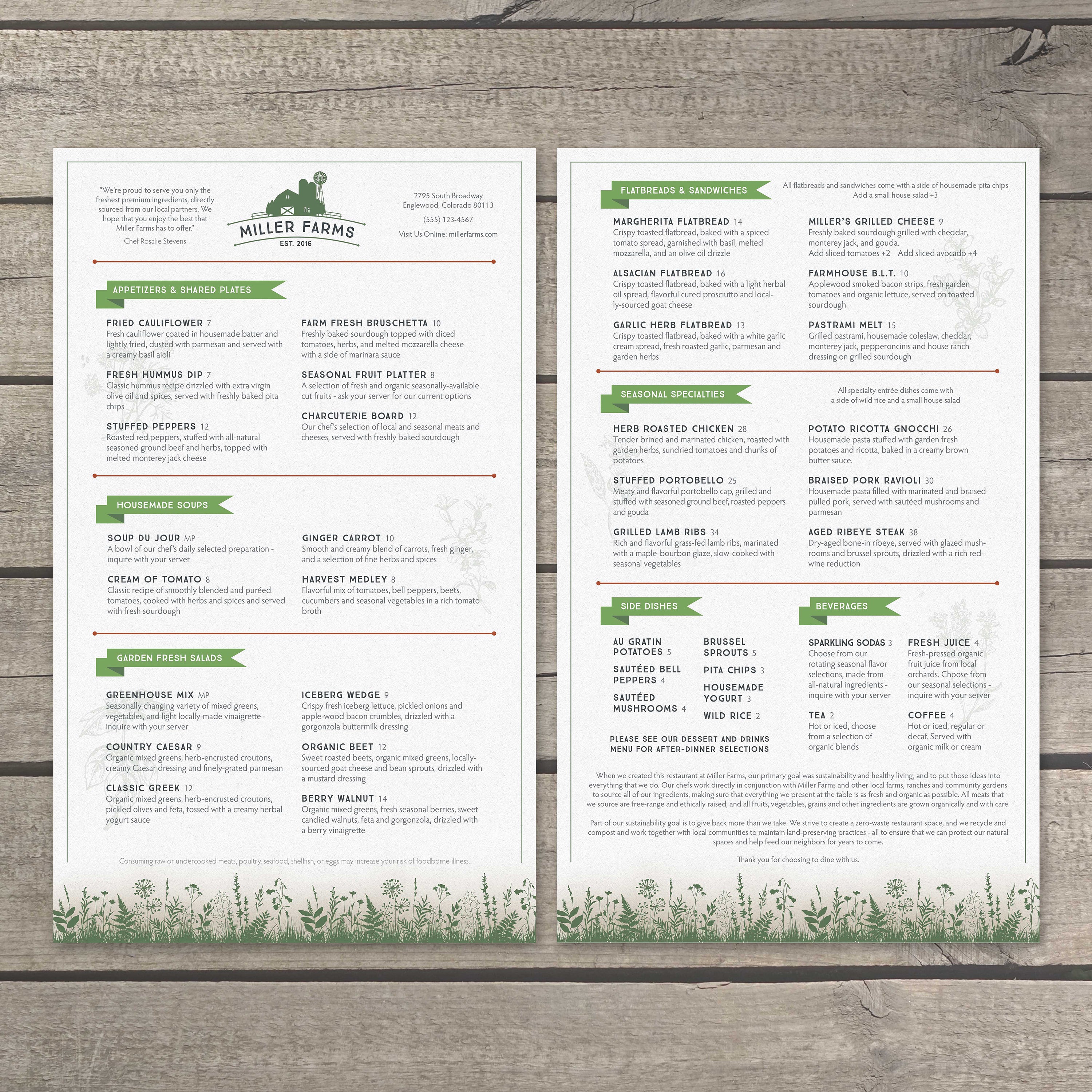
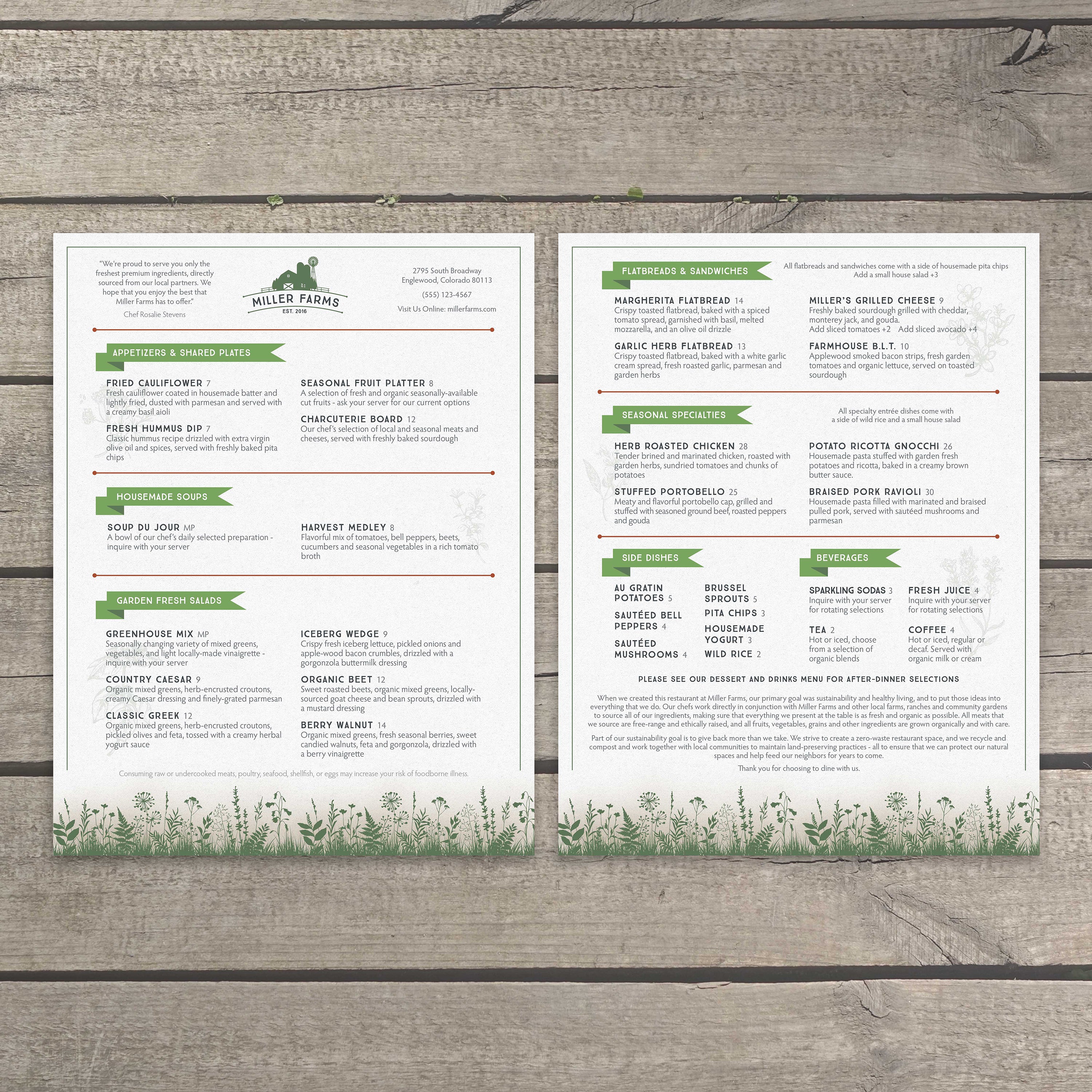
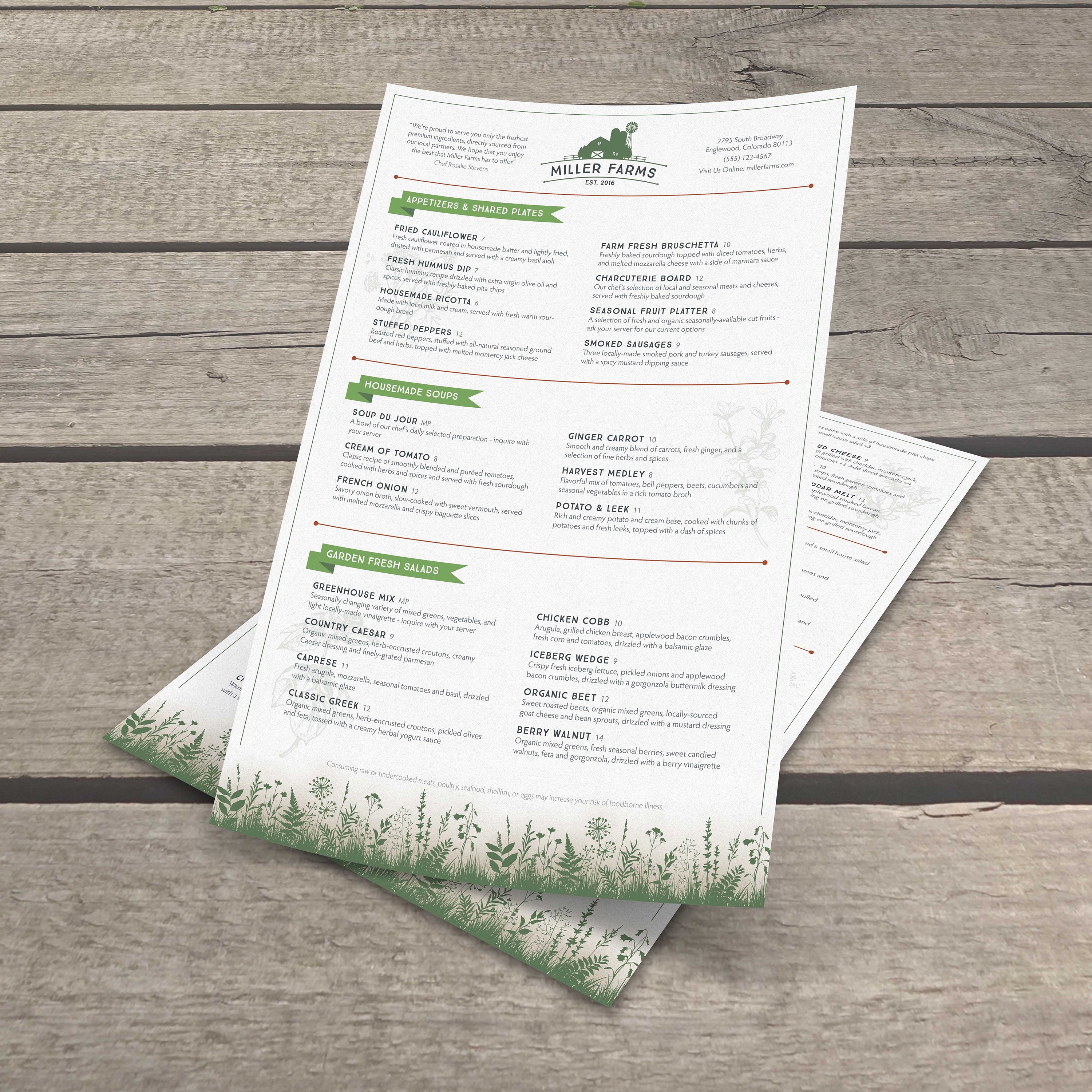
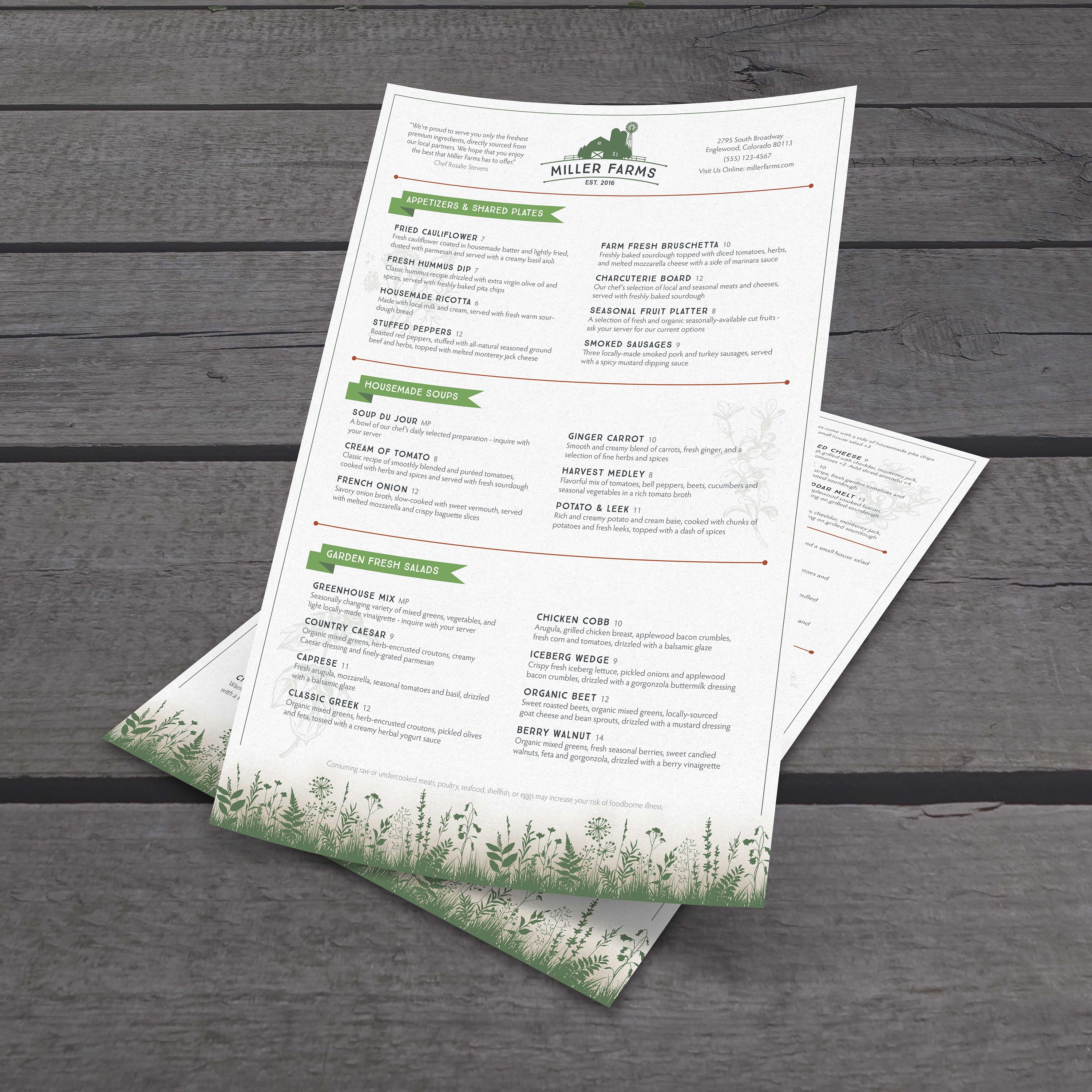
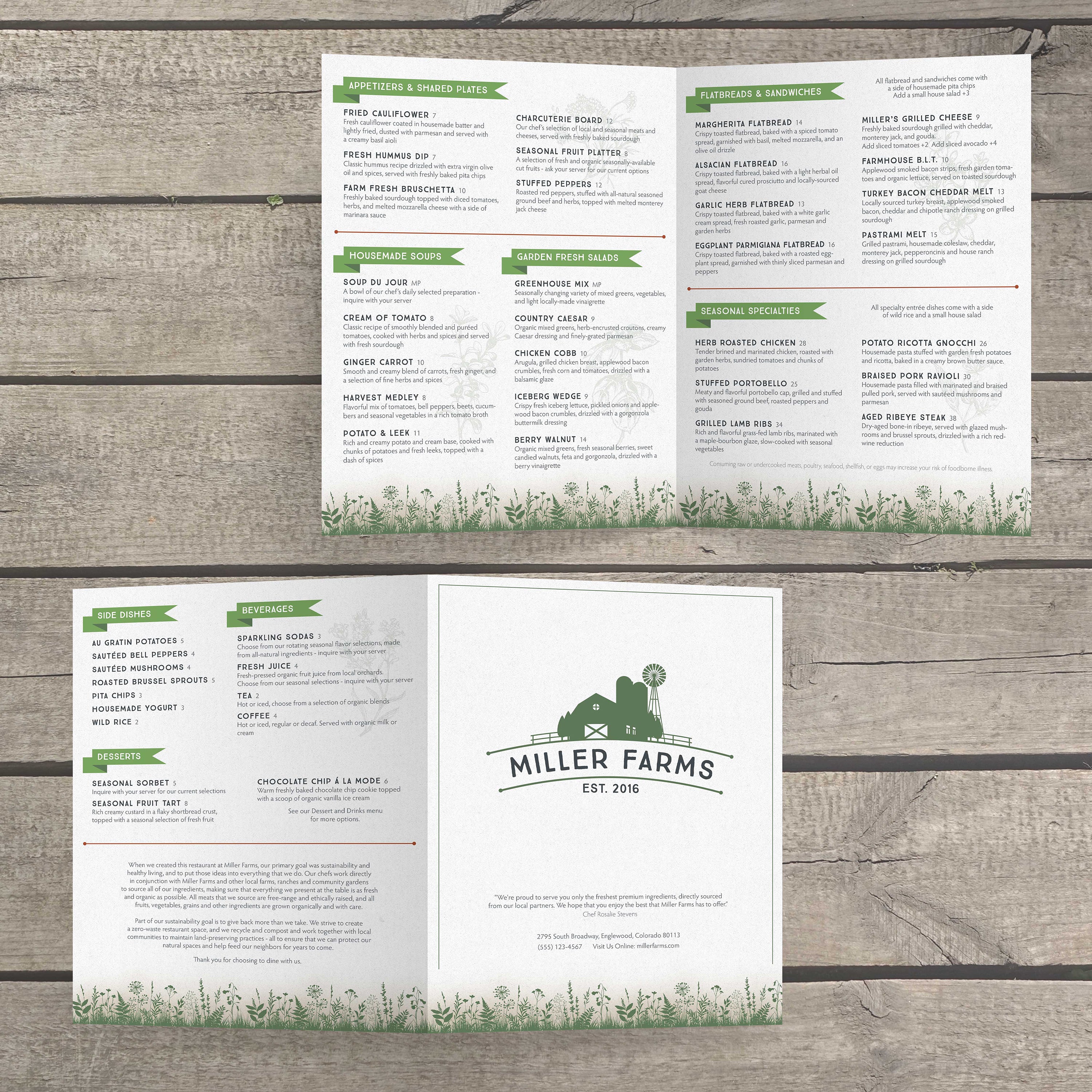
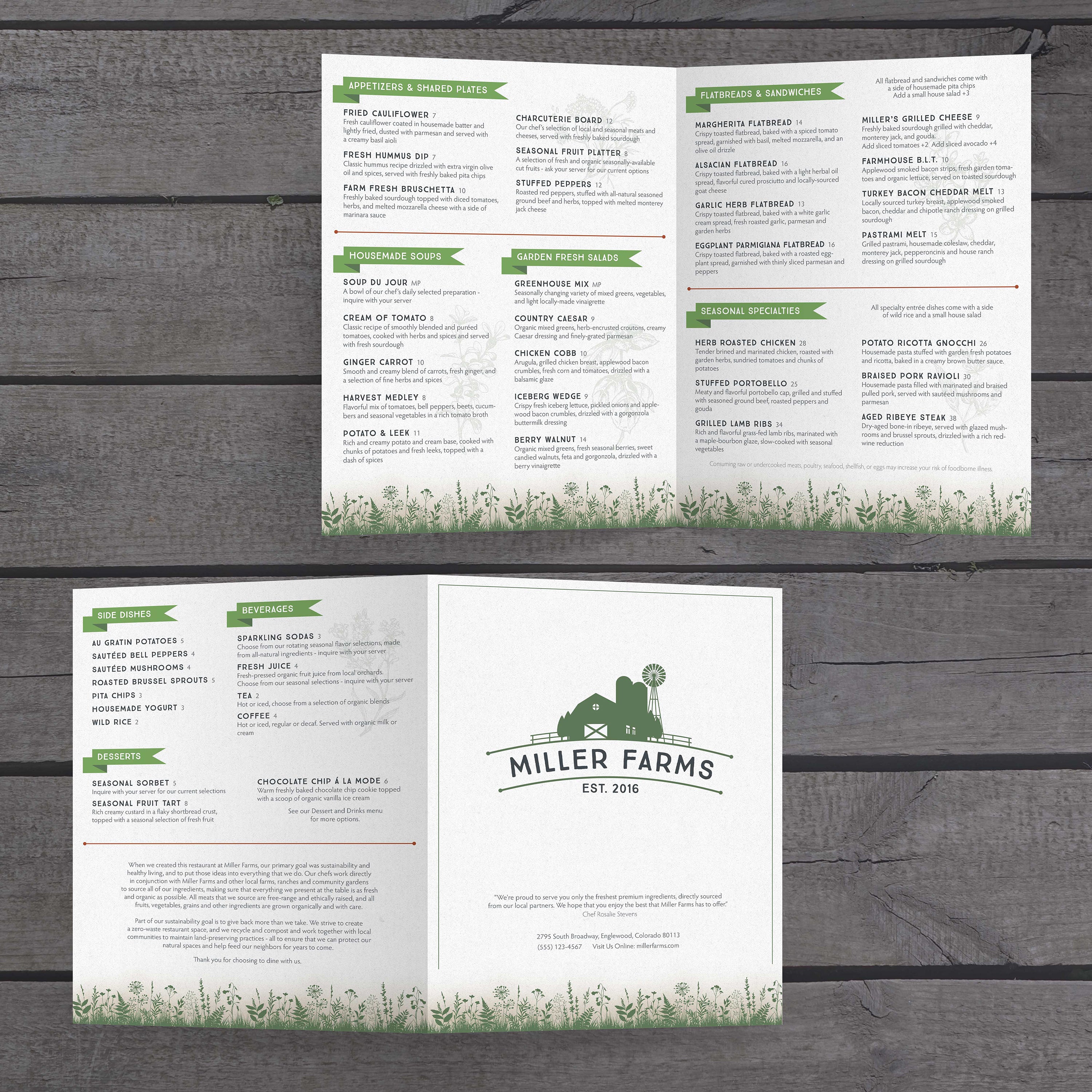
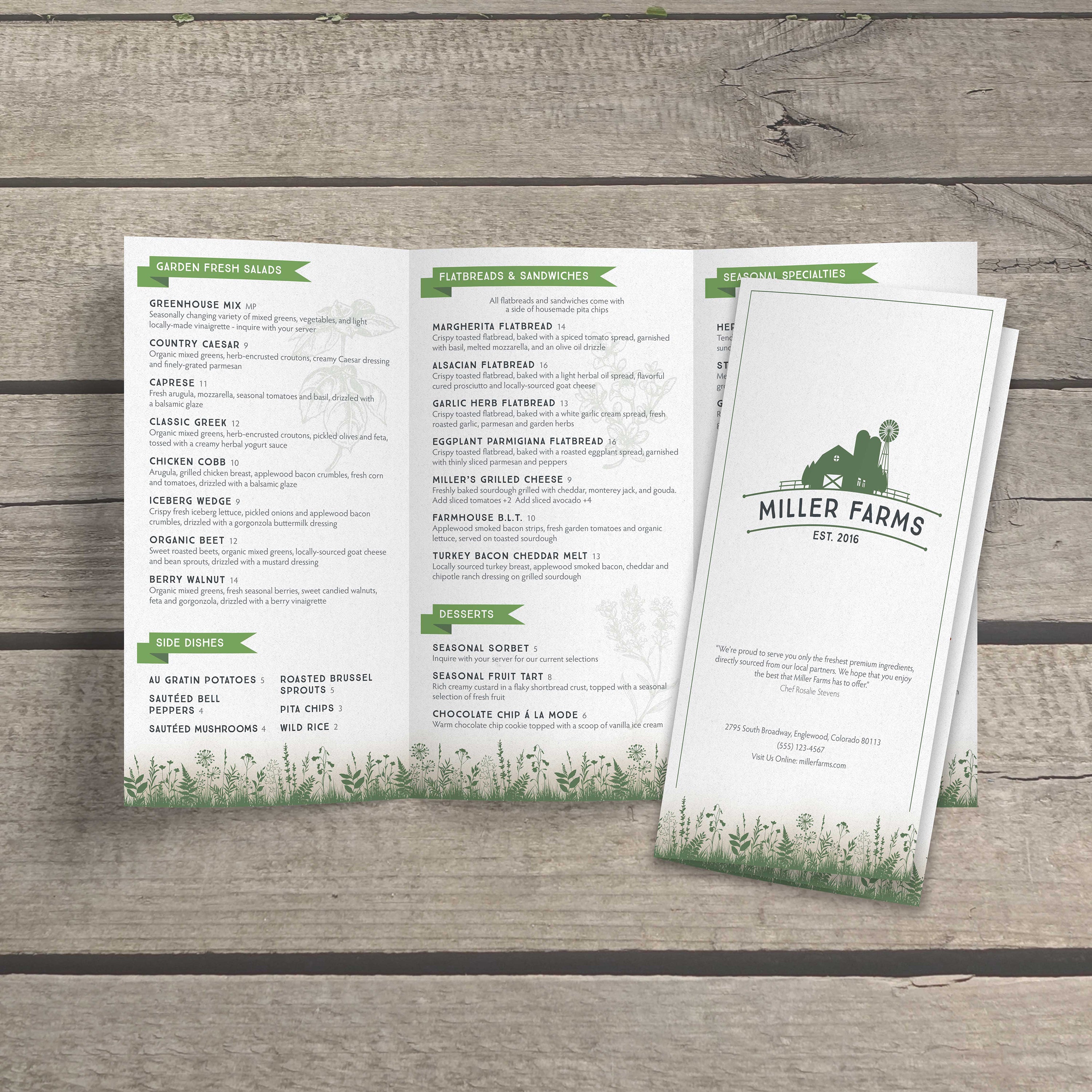
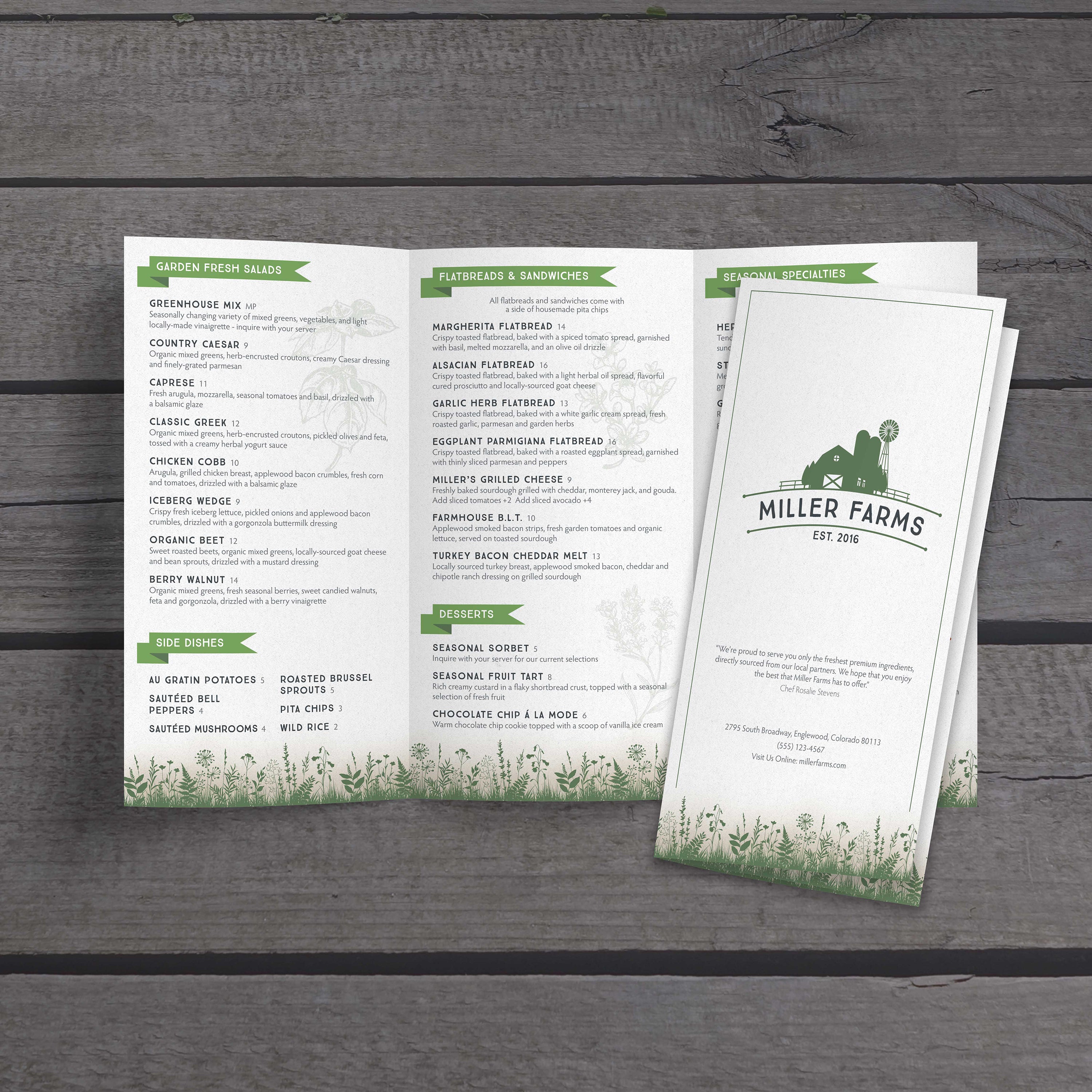
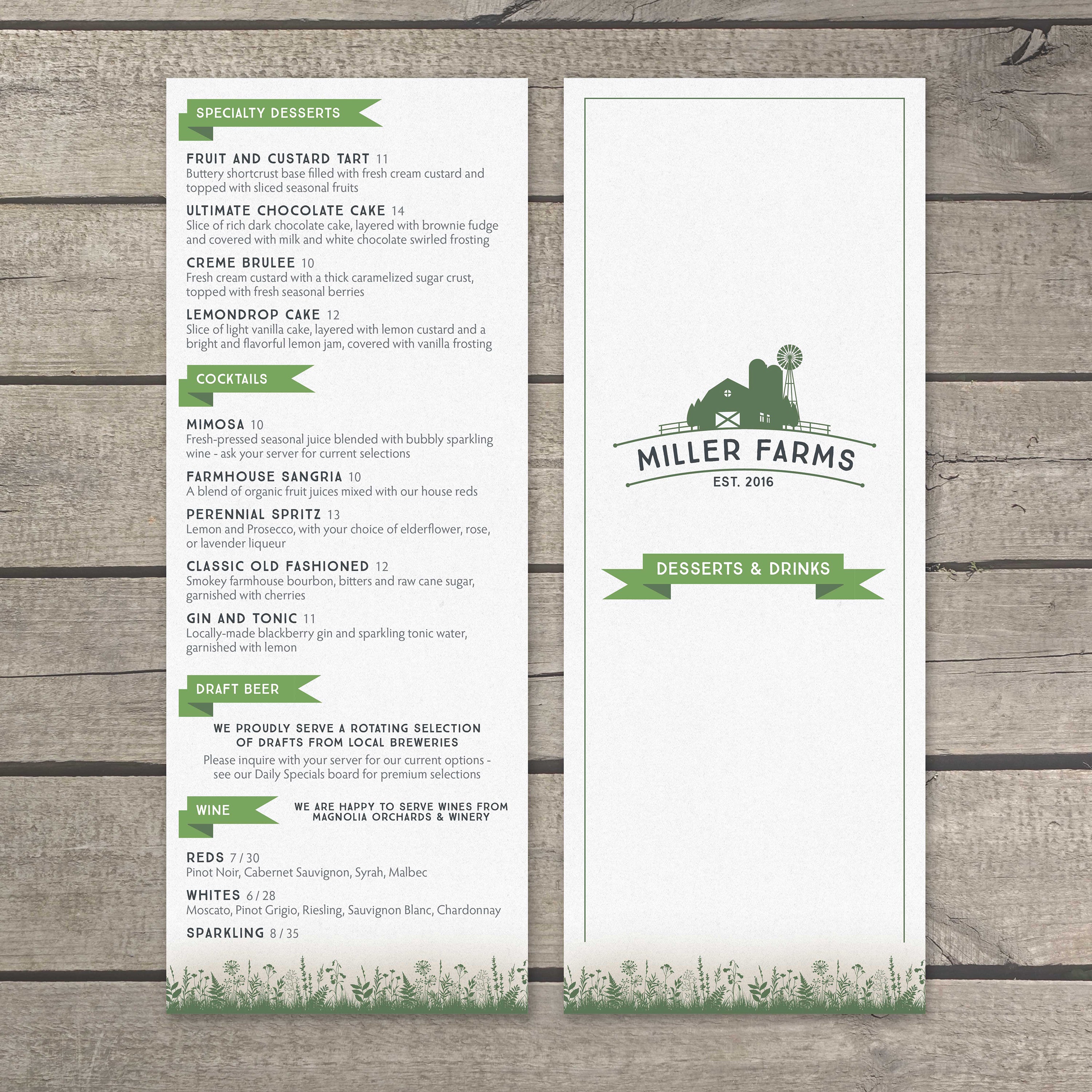
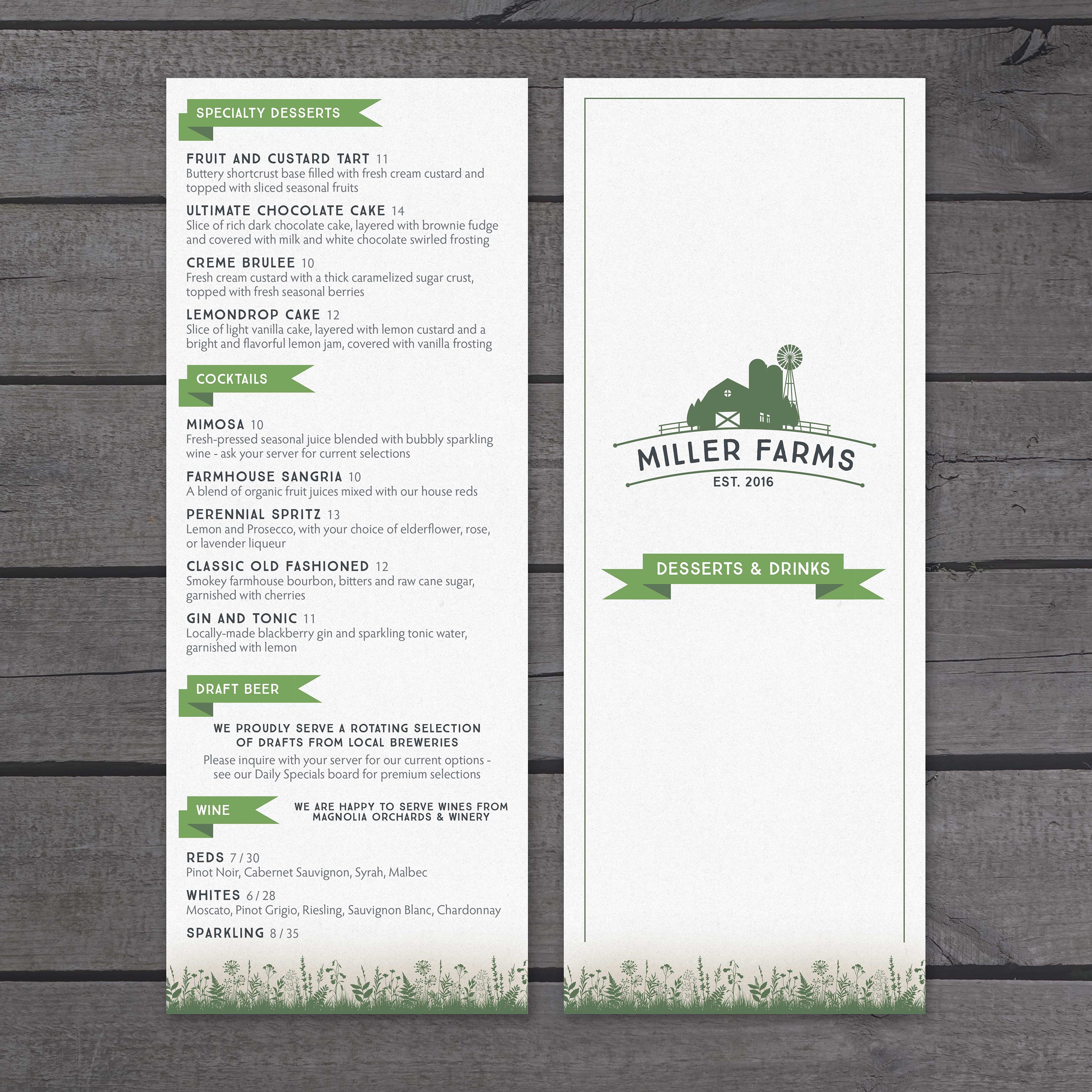
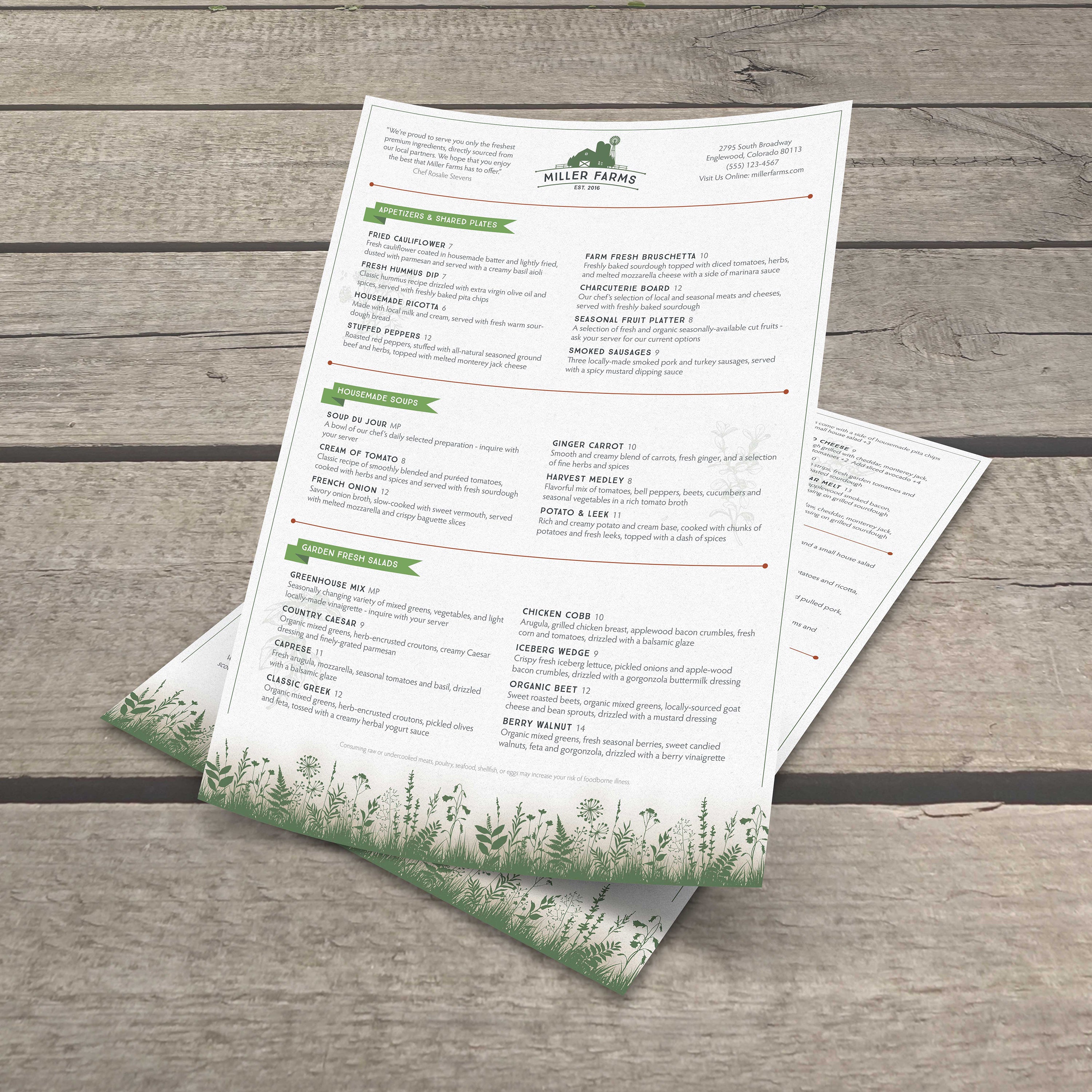
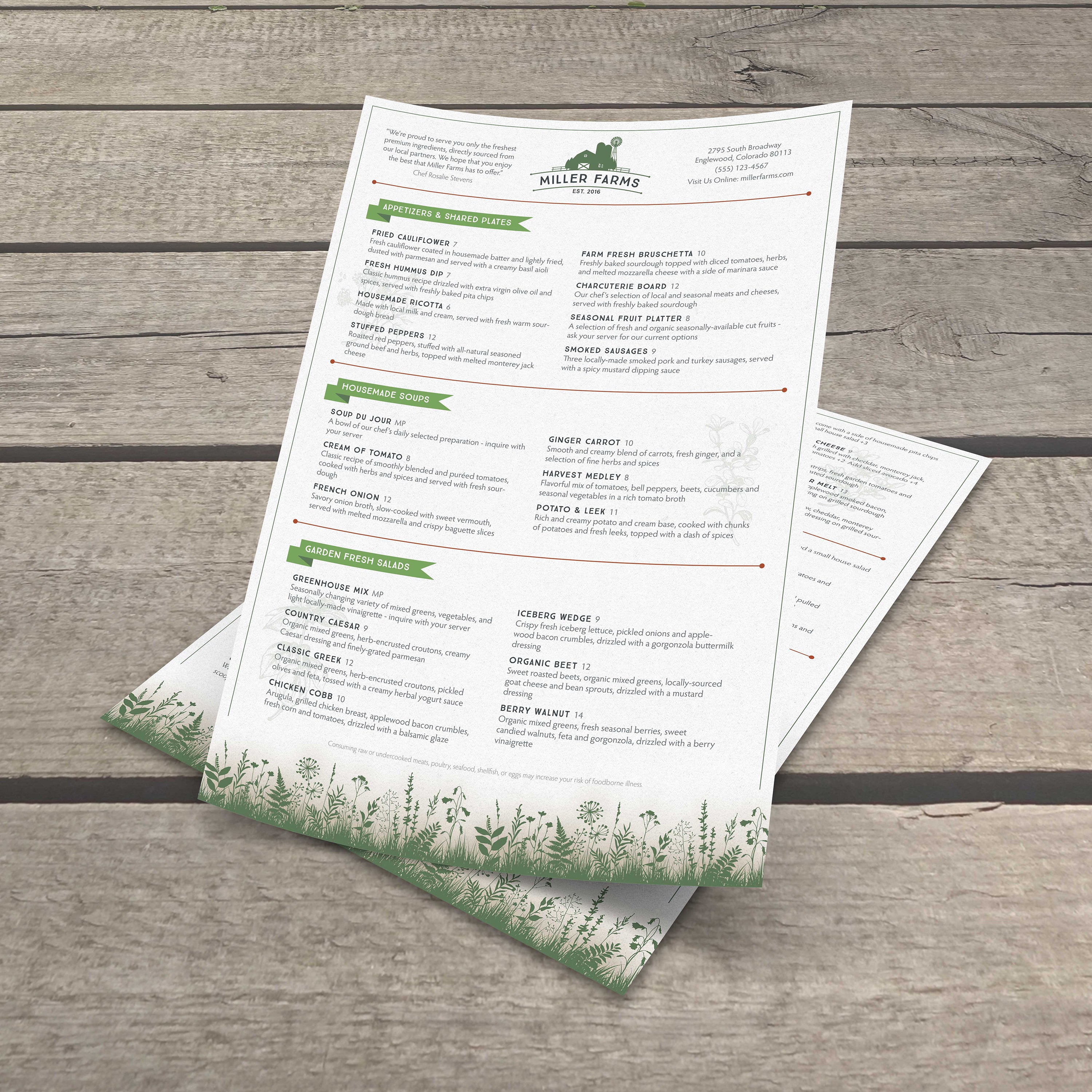
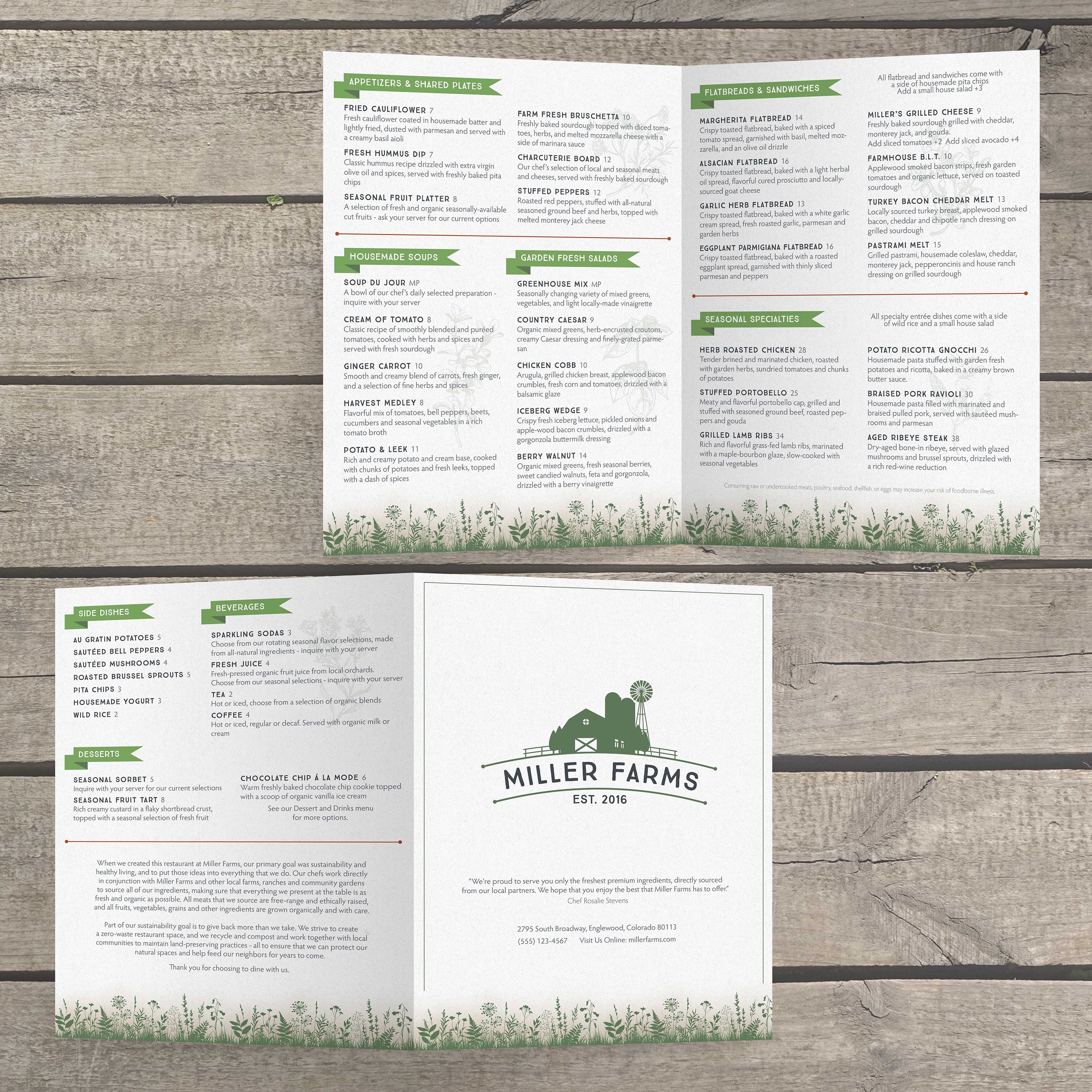
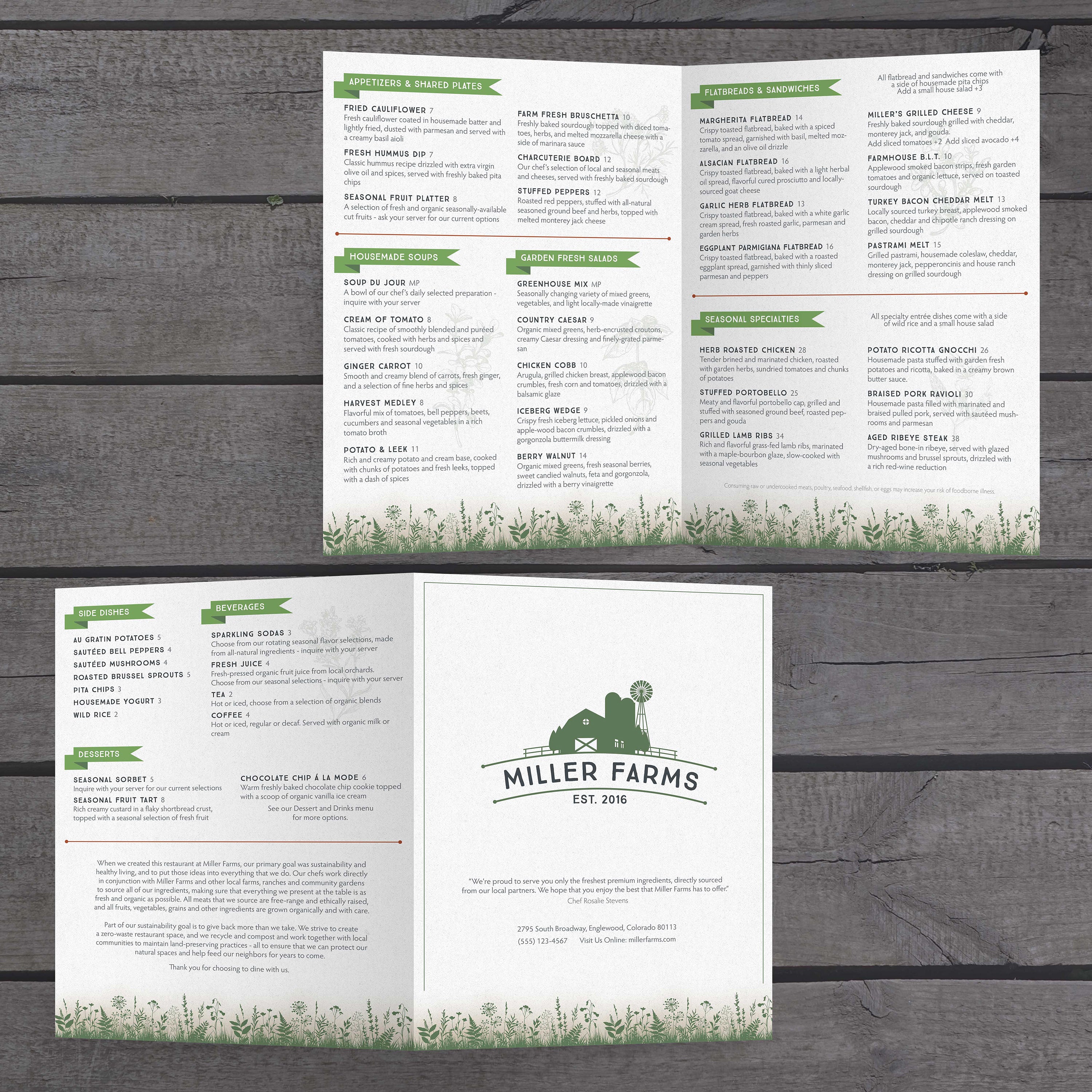
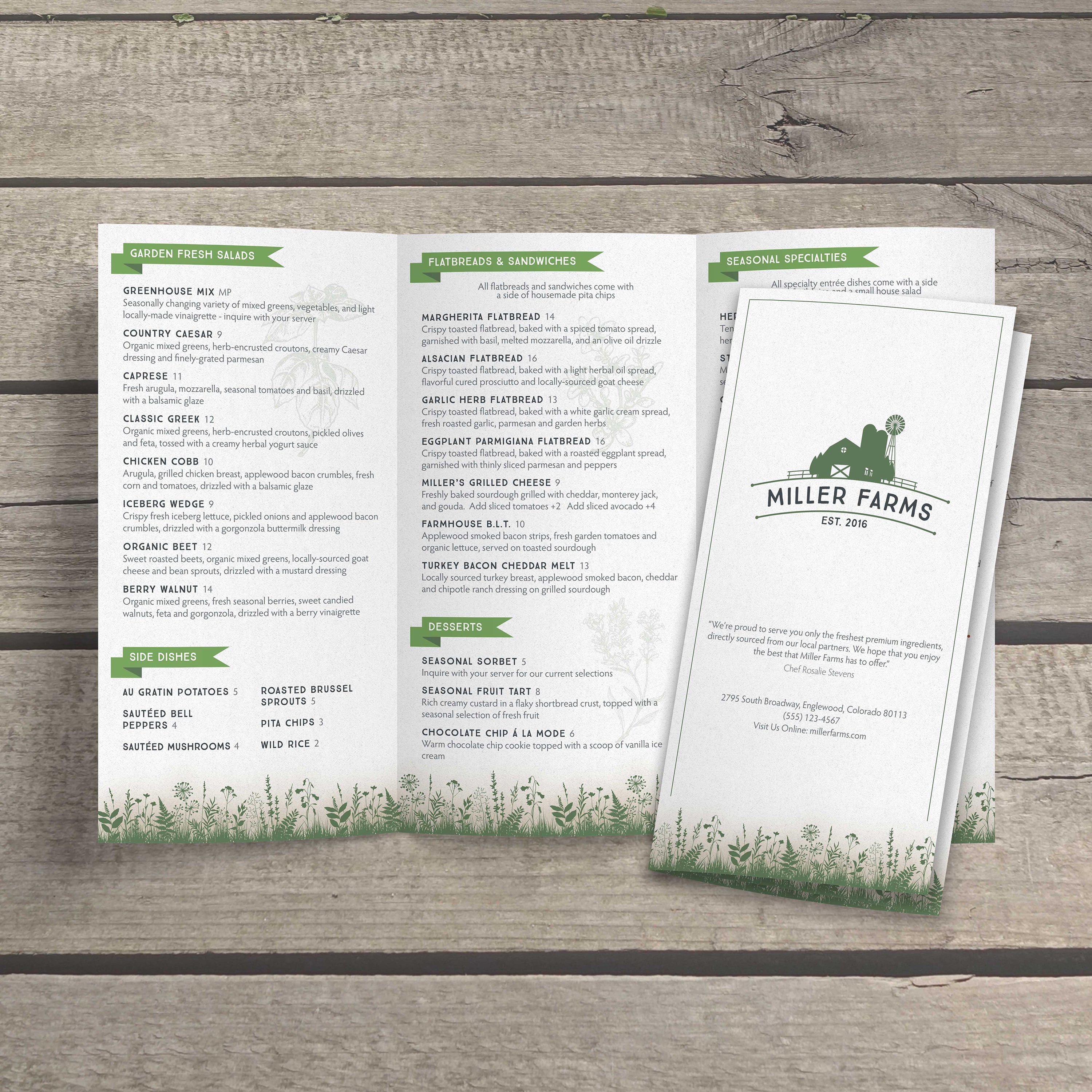
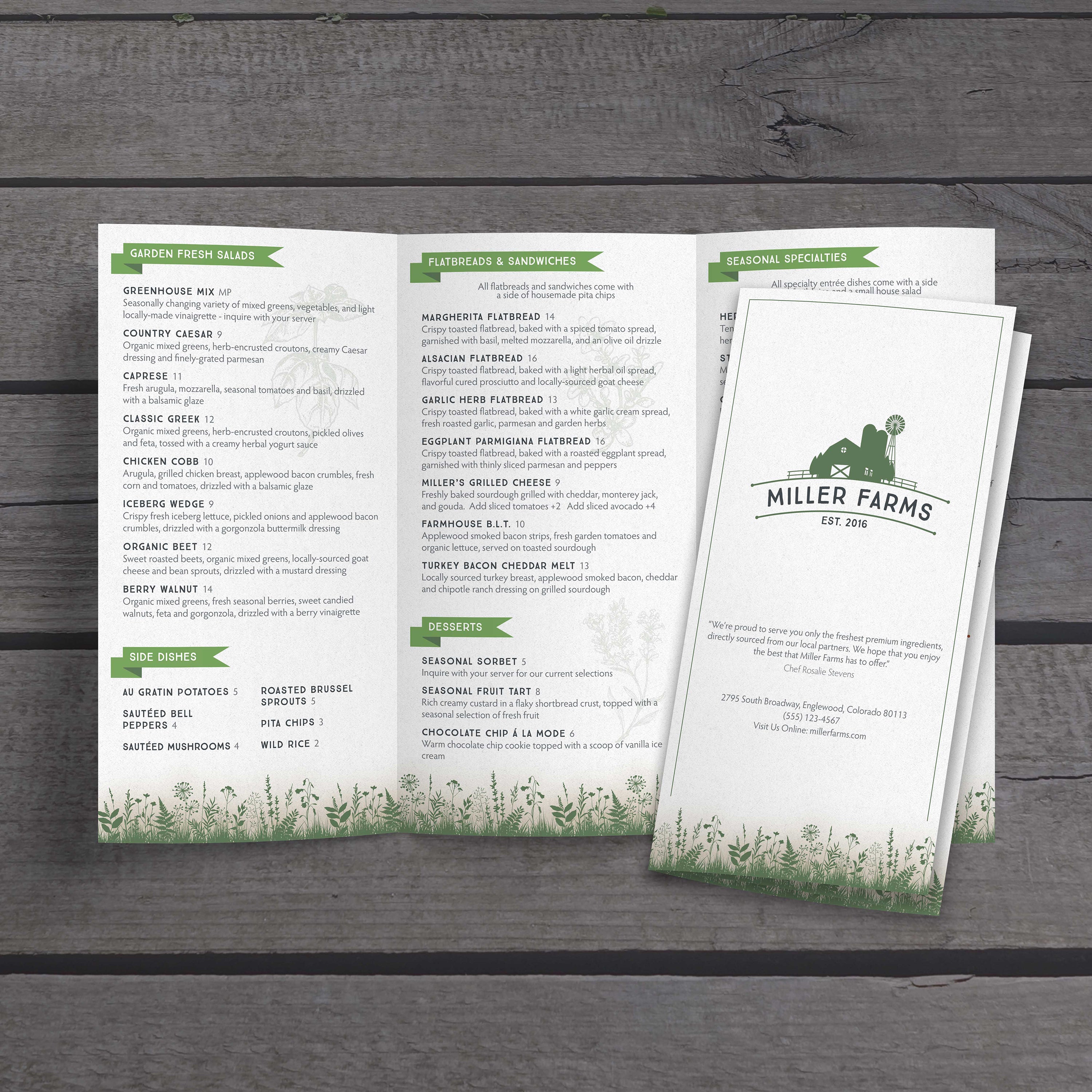
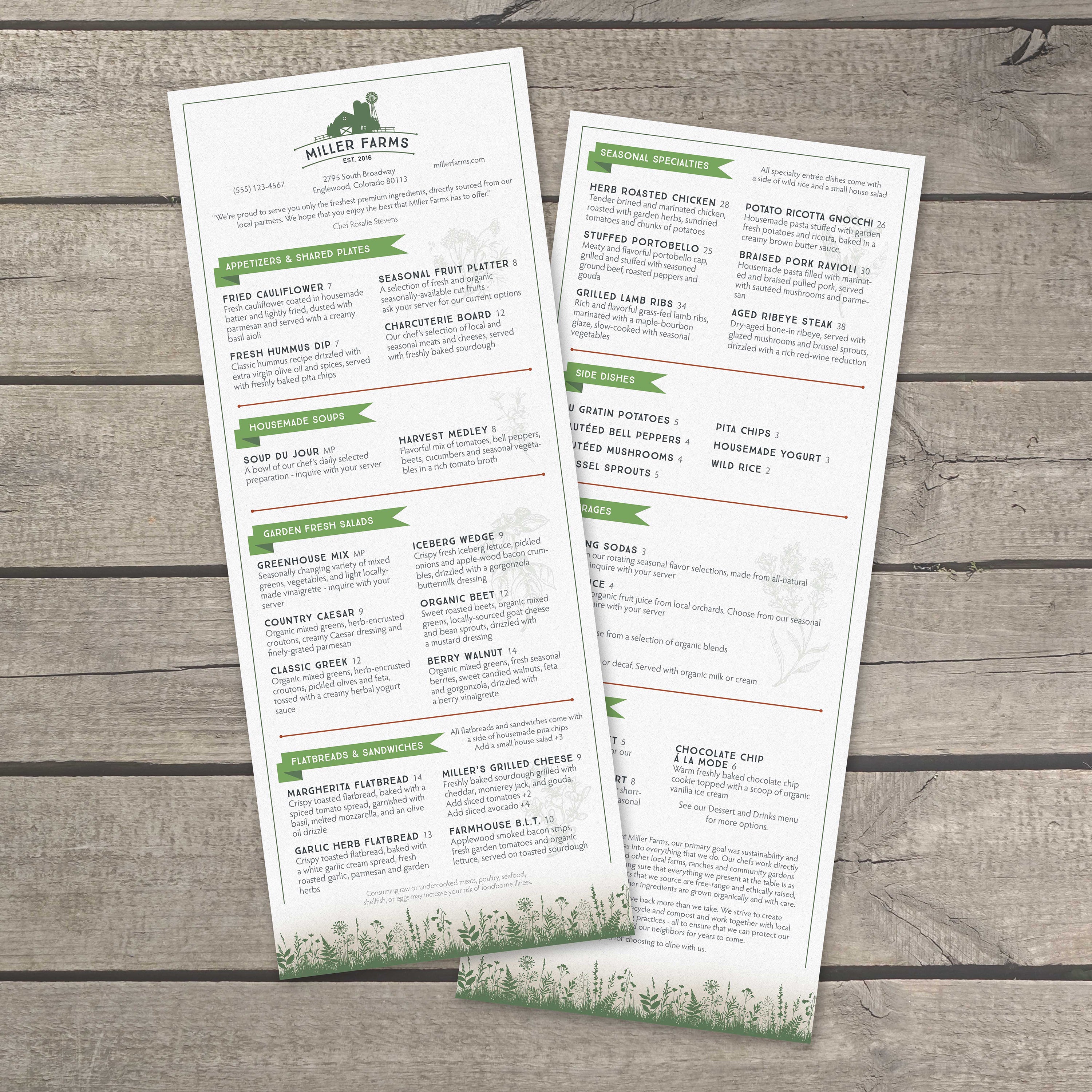
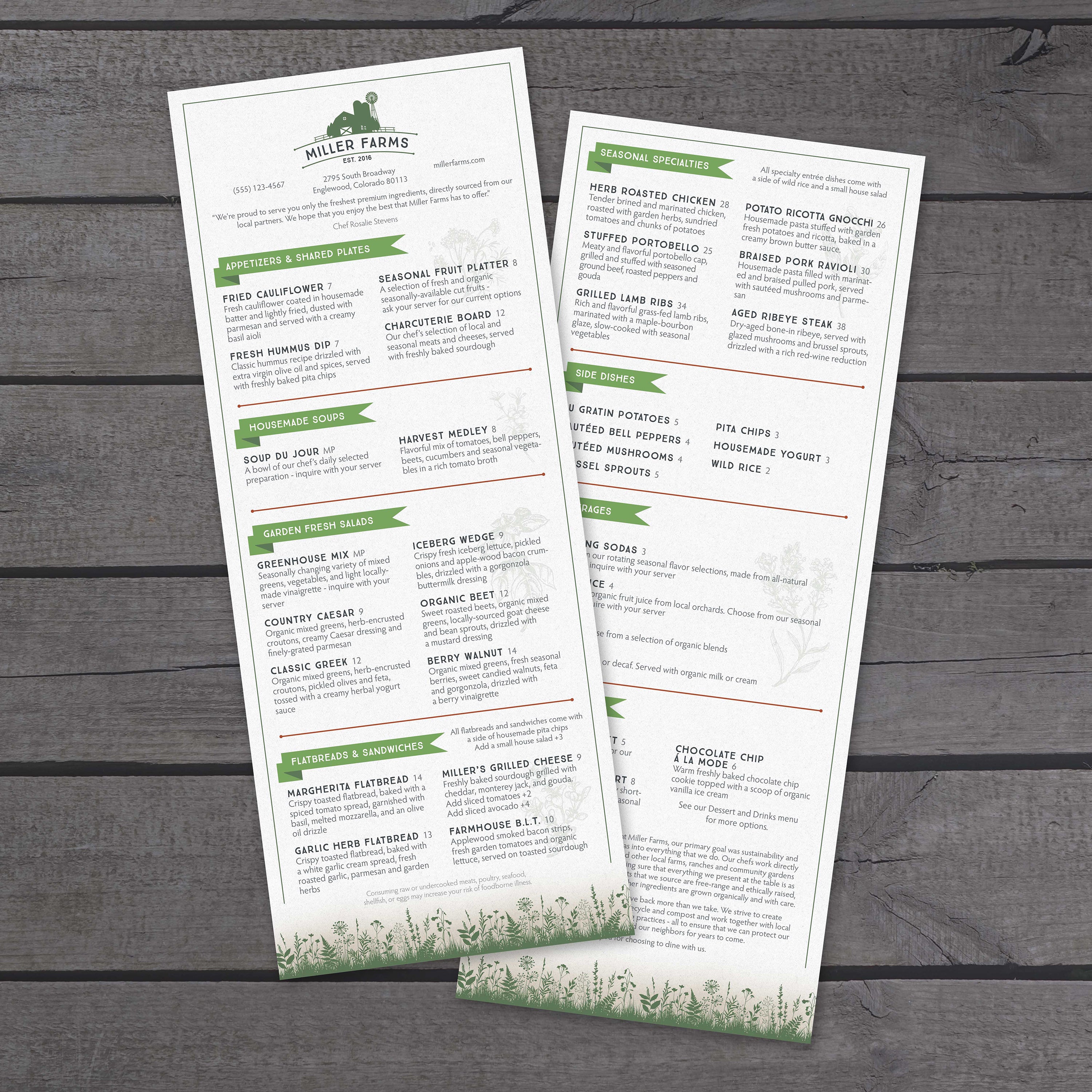
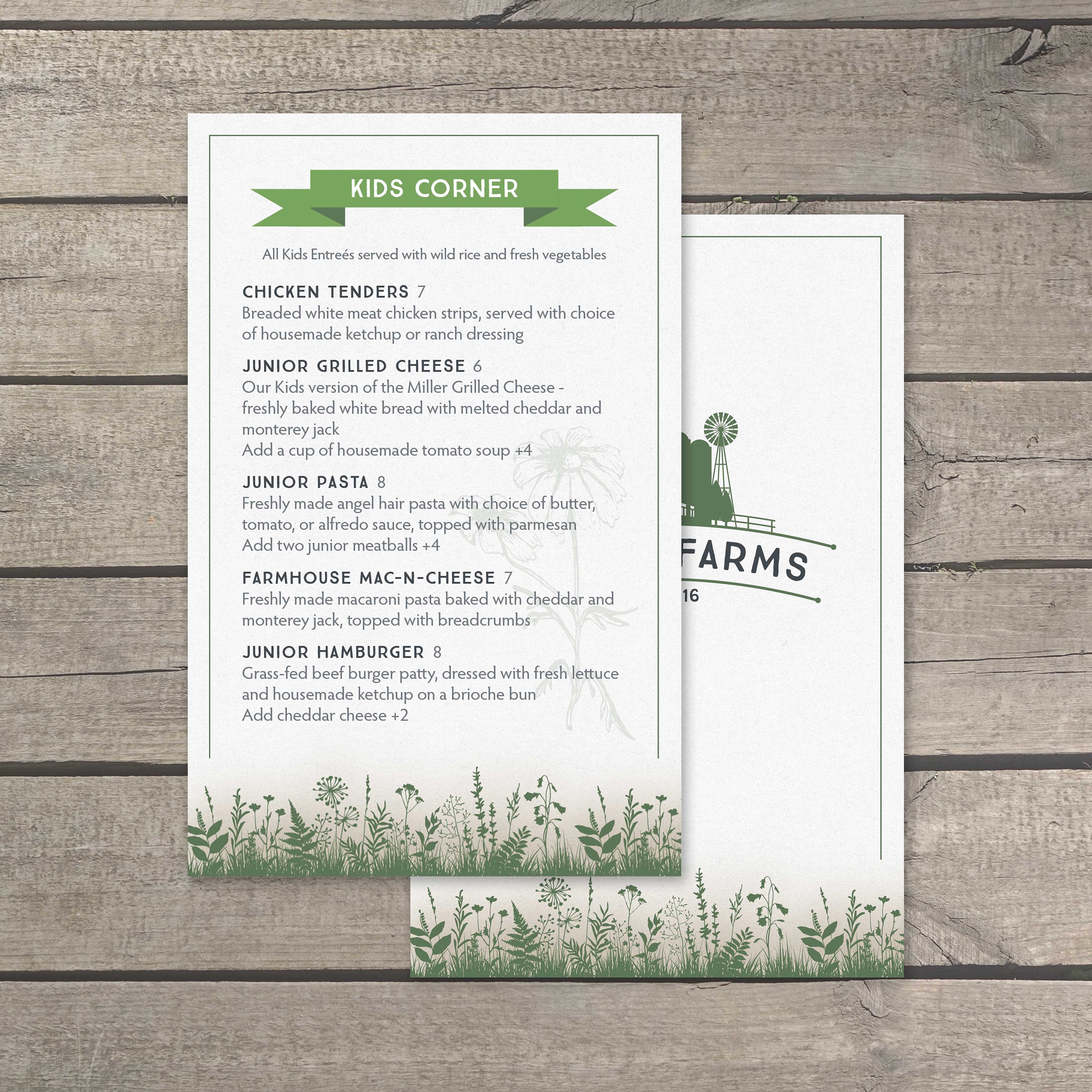
A rustic-chic farm-to-table menu should feel handcrafted and seasonal while staying easy to scan, fold-friendly, and durable enough for daily handling and cleaning.
Use a Natural Palette with Clean Contrast
Earth tones, such as deep greens, warm browns, and muted creams, reinforce the local, seasonal theme, but readability remains the top priority. Maintain a strong contrast between the text and background so guests can scan in varied lighting, especially during brunch service or when seated outdoors. Use color to guide the eye toward seasonal highlights rather than covering the entire menu in heavy texture. If you want a layout that already supports this clean, modern-rustic balance, our free modern cafe menu templates provide a strong starting point for farm-to-table design.
Choose Typography That Feels Handcrafted but Reads Fast
Rustic-chic design pairs best with slab-serif or hand-lettered style headers, complemented by a clean, highly legible body font. Keep spacing generous so dish names, ingredients, and pricing don’t crowd each other. This is especially important for produce-forward menus where details like preparation style, sourcing notes, or seasonal substitutions change regularly.
Add Small Visual Touches Without Overloading the Layout
Minimal line drawings of vegetables, herbs, farm tools, or field motifs can support the farm-to-table narrative without distracting from the ordering process. Use icons strategically to highlight vegetarian options, daily harvest specials, or chef picks. Keep these elements consistent across sections so the menu feels curated rather than decorative.
Build Folding Formats Around Service Flow
Farm-to-table menus often feature rotating specials, tasting boards, seasonal cocktails, and dessert options that benefit from being presented individually. Bi-fold and tri-fold formats create clean category breaks and reduce table clutter, while gate folds work nicely for chef’s tasting selections or seasonal showcases. Menus that use traditional lamination also cannot be folded reliably and often cloud up or crack at creases, while synthetic waterproof paper supports these folded layouts without degradation. For narrow folded formats that sit neatly on small tables or bar tops, our free 4.25 x 11 menu templates make it easy to organize rotating seasonal sections without crowding.
Match Thickness to Traffic, Reuse, and Printing Needs
Choose the thickness based on how often the menu will be handled and whether it will be reused. Lighter options, such as 5 Mil, are flexible and easy to print in-house, while thicker options add a premium feel and long-lasting durability. TerraSlate is available in multiple thicknesses, including 14 Mil for maximum durability, which may require a commercial press and is compatible with high-quality printers. If you need a standard full-page layout for dine-in service, inserts, or seasonal menu swaps, our free 8.5 x 11 menu templates help keep formatting consistent while still leaving plenty of room for farm-fresh detail.
Protect the Look with Durable, Easy-Clean Materials
Rustic-chic menus often include detailed typography and subtle design textures that can look worn quickly on paper. TerraSlate waterproof paper is fade-resistant, archival-quality, and rip-proof, helping design details stay crisp even under heavy service conditions. Simple soap and water are recommended for our paper. TerraSlate can print menus for you with our proprietary TerraShield™ anti-microbial coating, offering an industry-leading turnaround time that supports hygiene standards without compromising presentation.
Keep the Menu Modular for Seasonal Updates
Design the layout to allow for the easy swapping of seasonal items without requiring reformatting of the entire menu. Use dedicated “Harvest Features” or “Today’s Farm Picks” areas to keep updates consistent across services. This maintains the rustic-chic look while allowing for quick, clean, and operationally efficient daily menu adjustments.