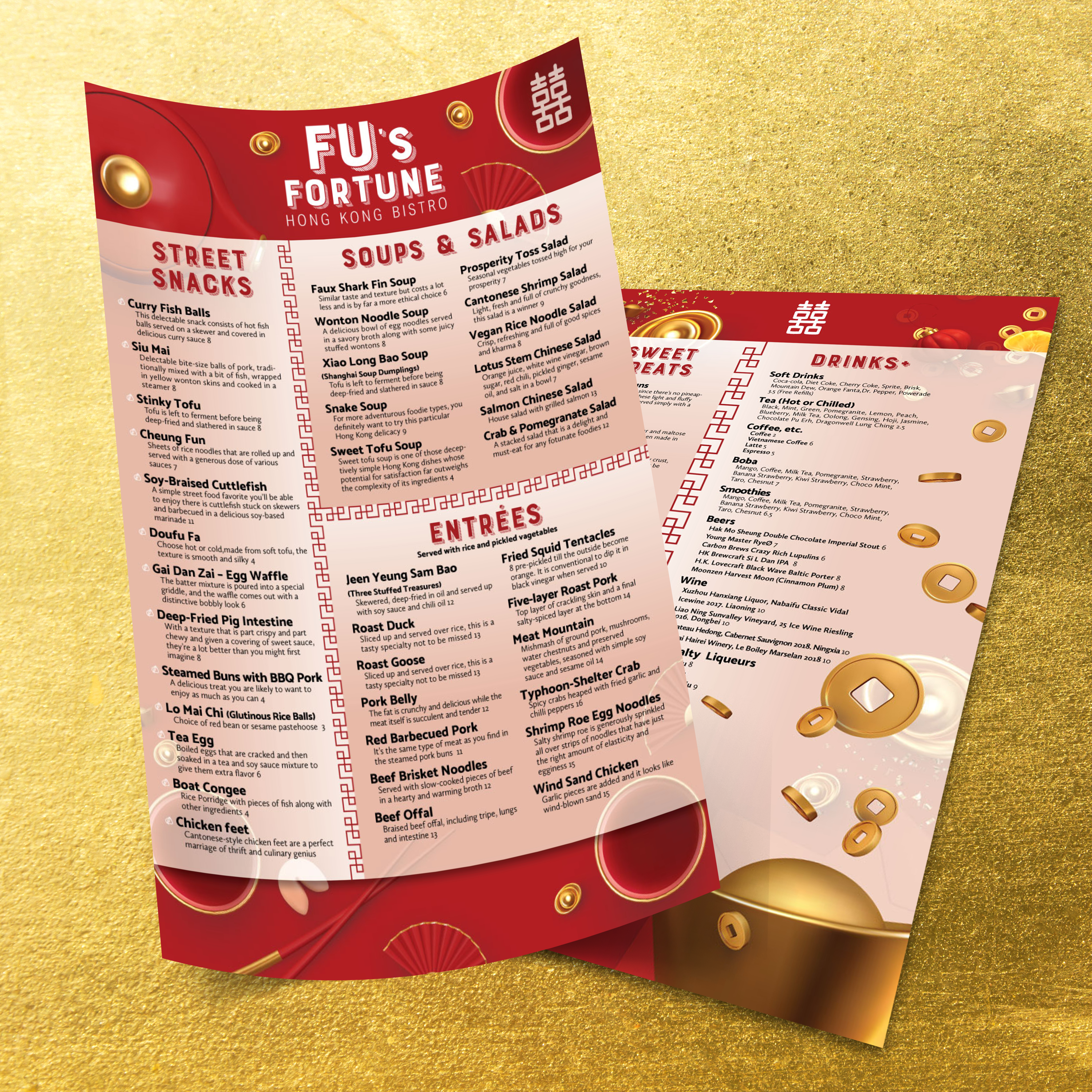
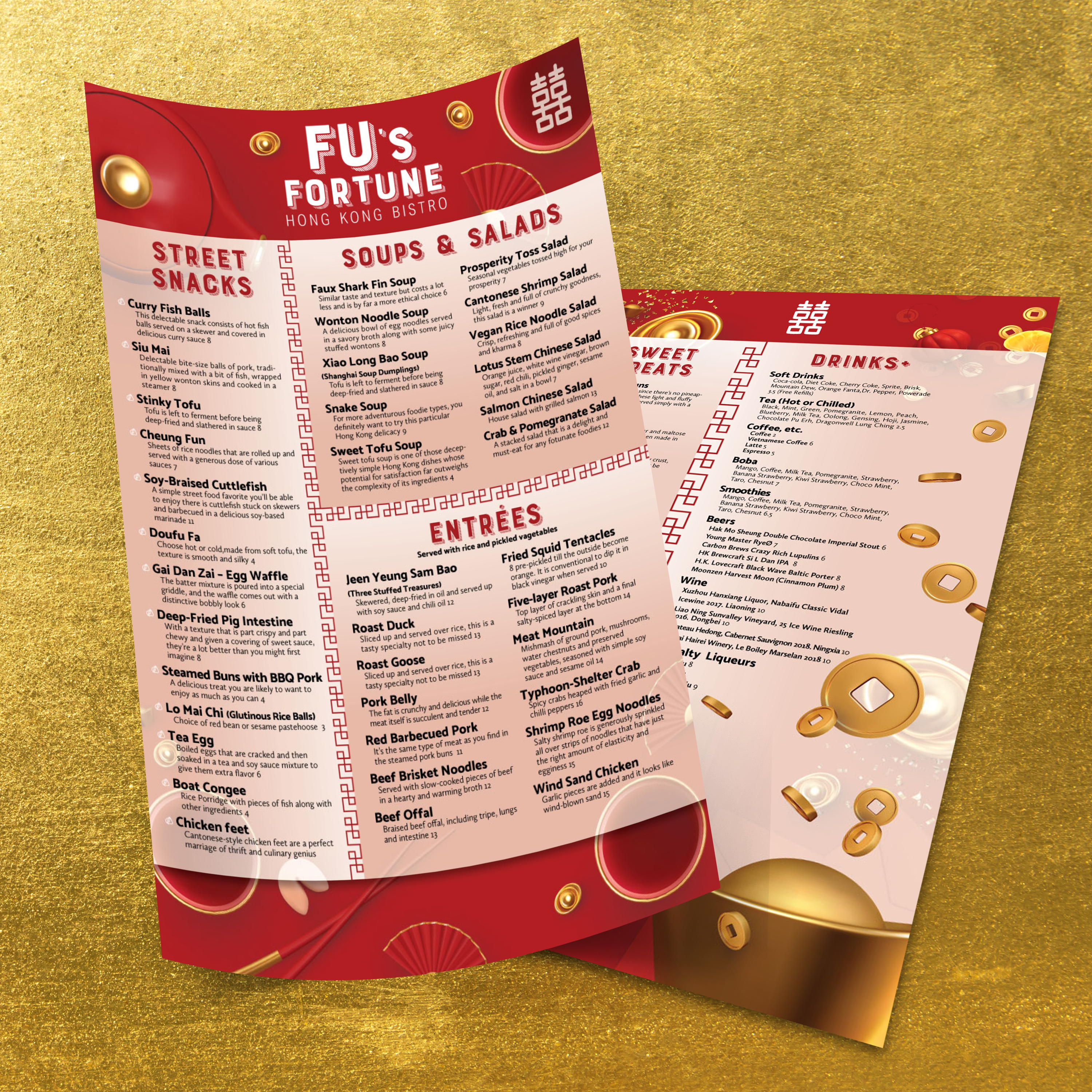
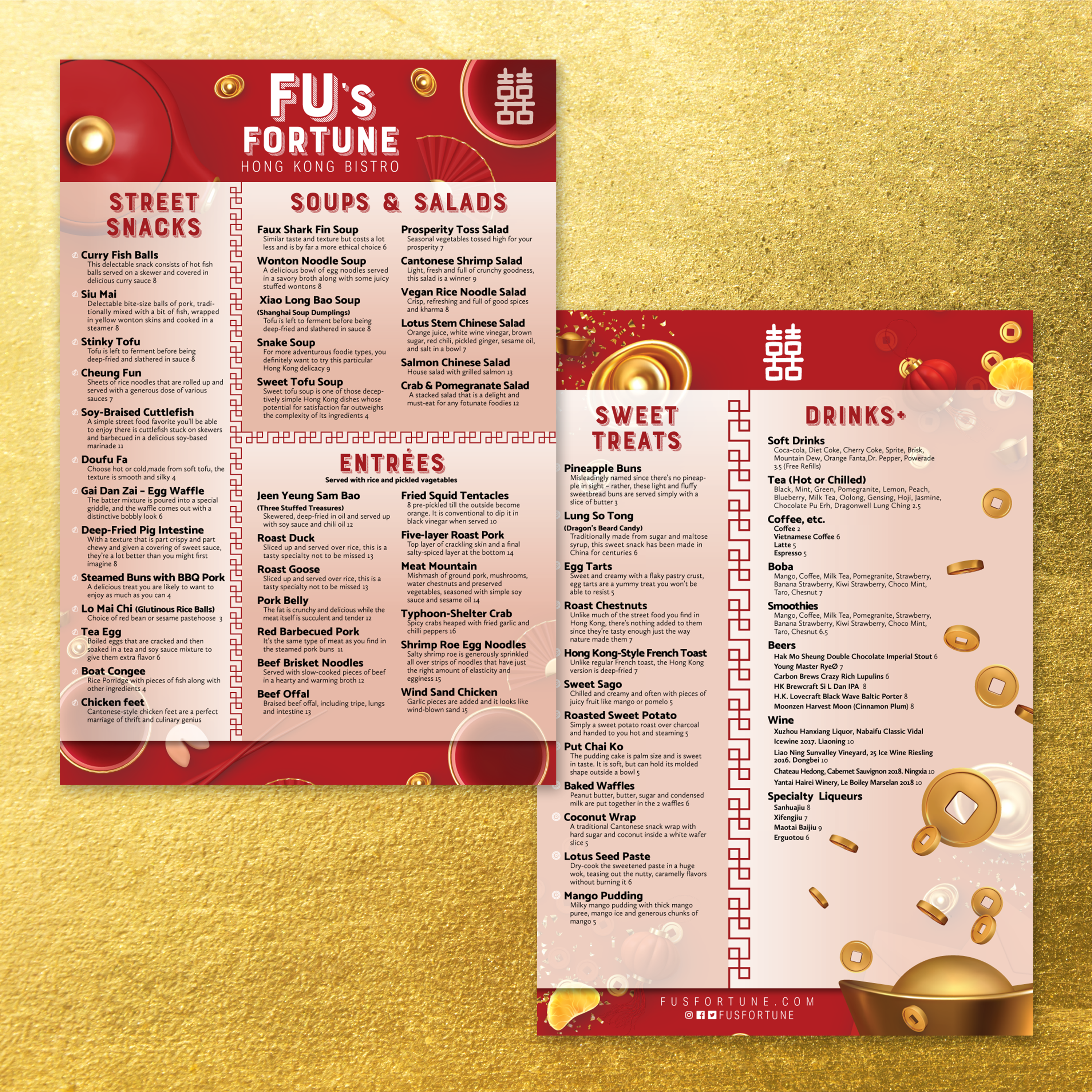
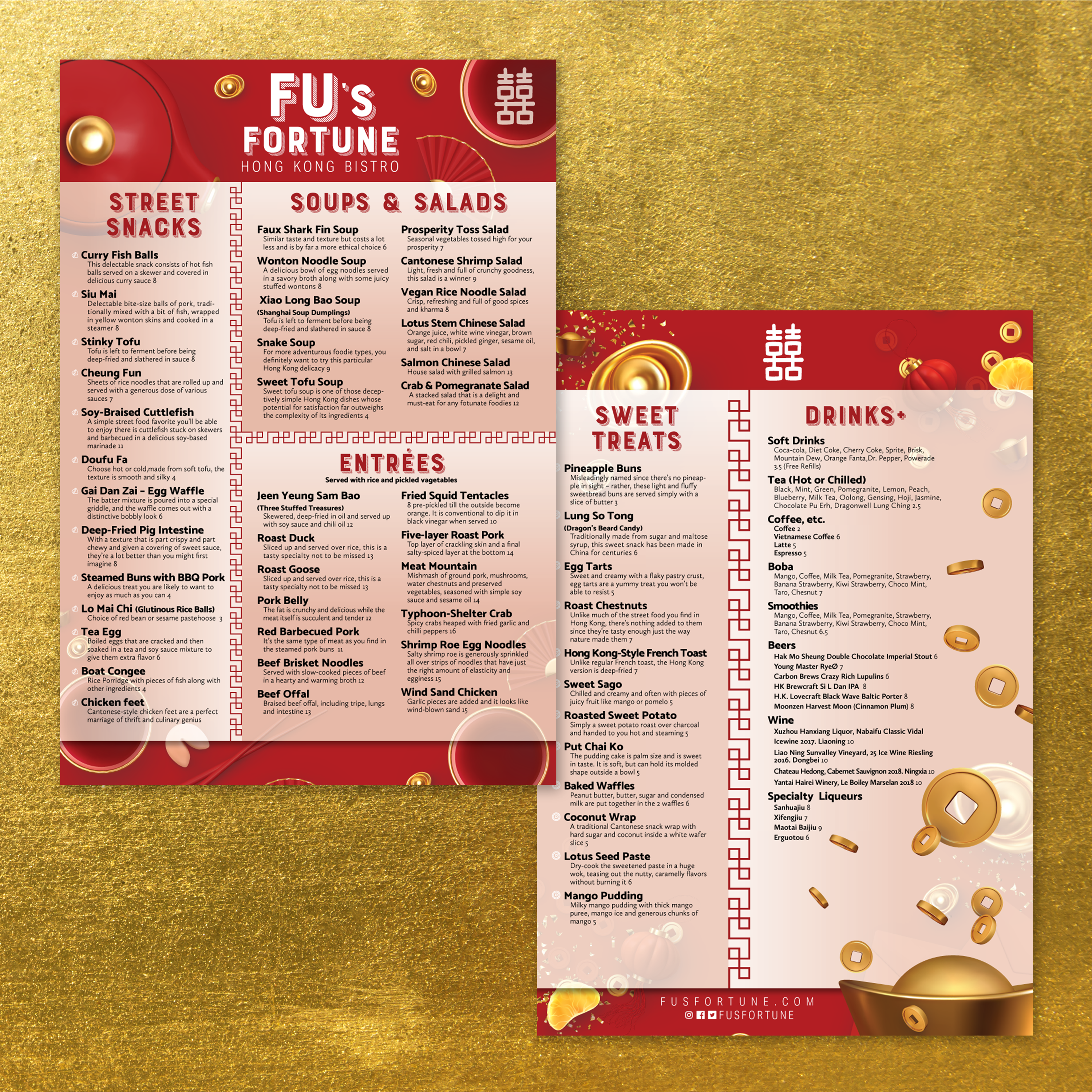
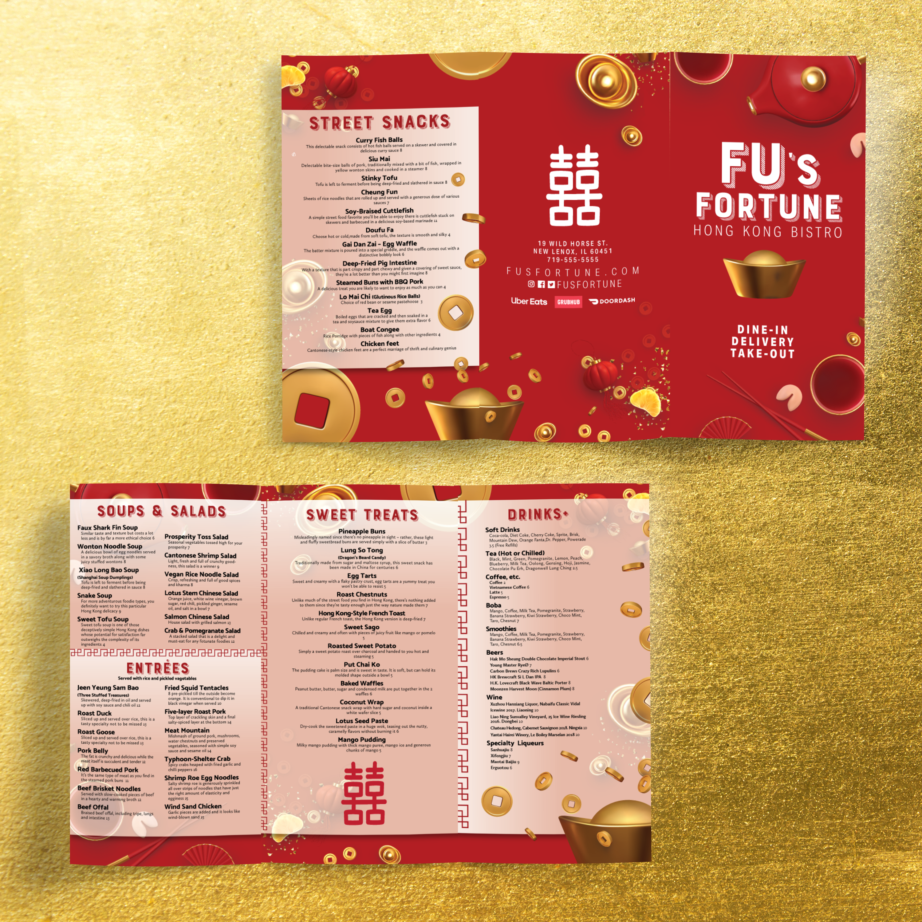
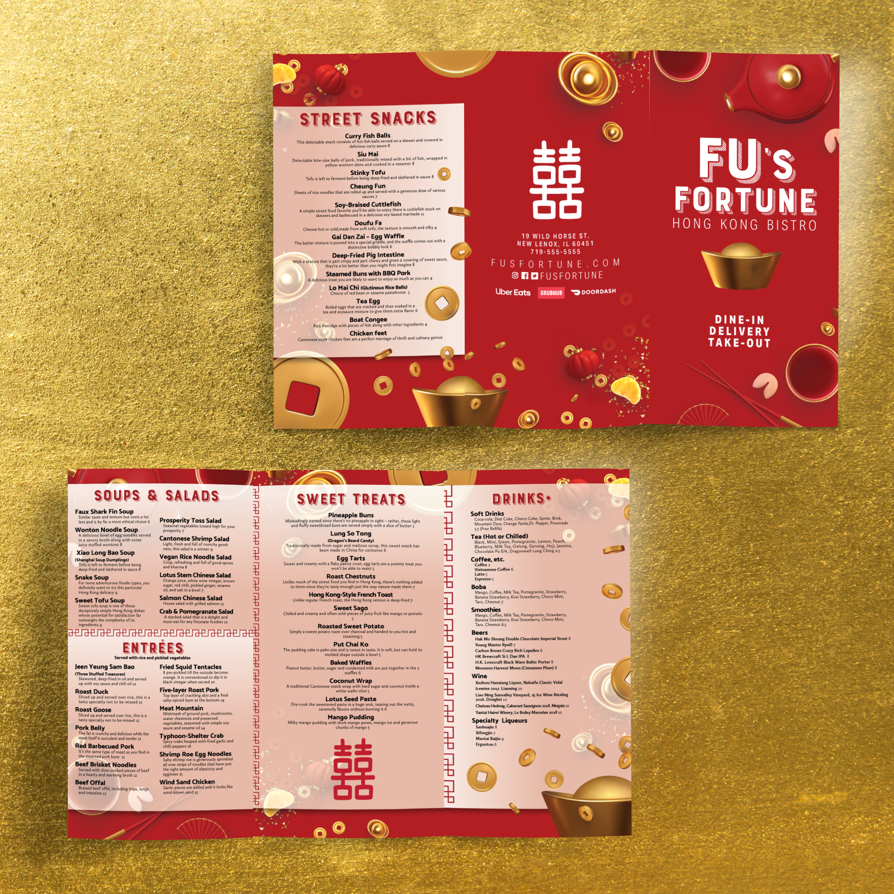
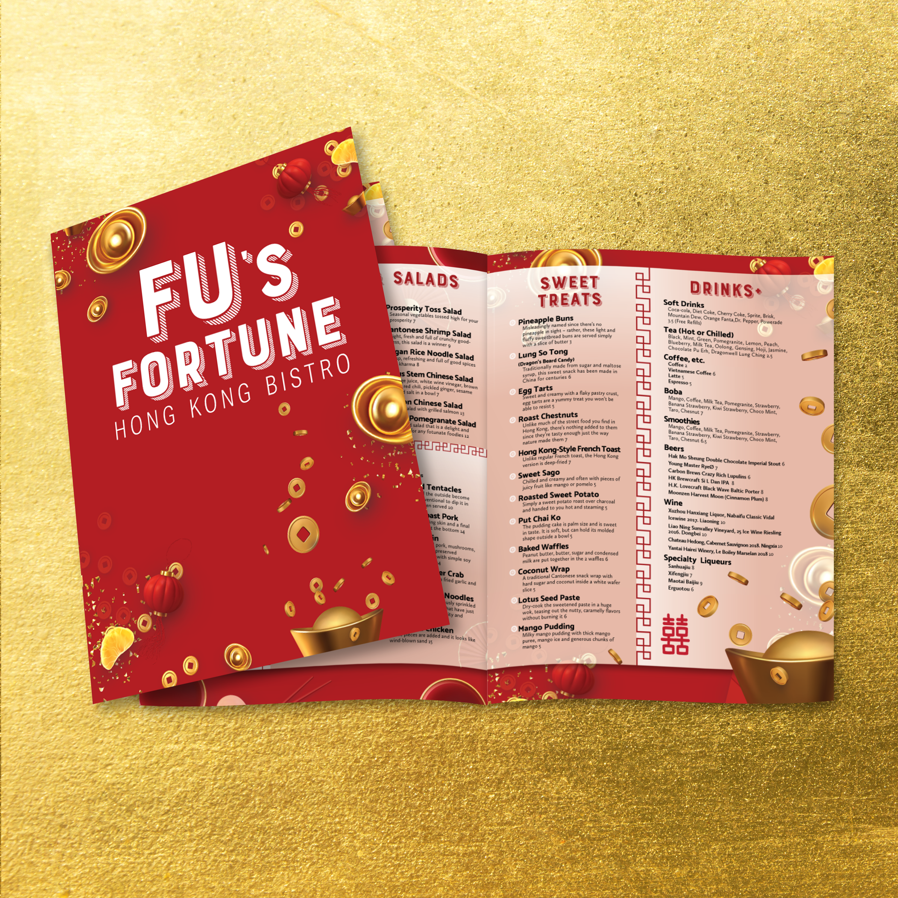
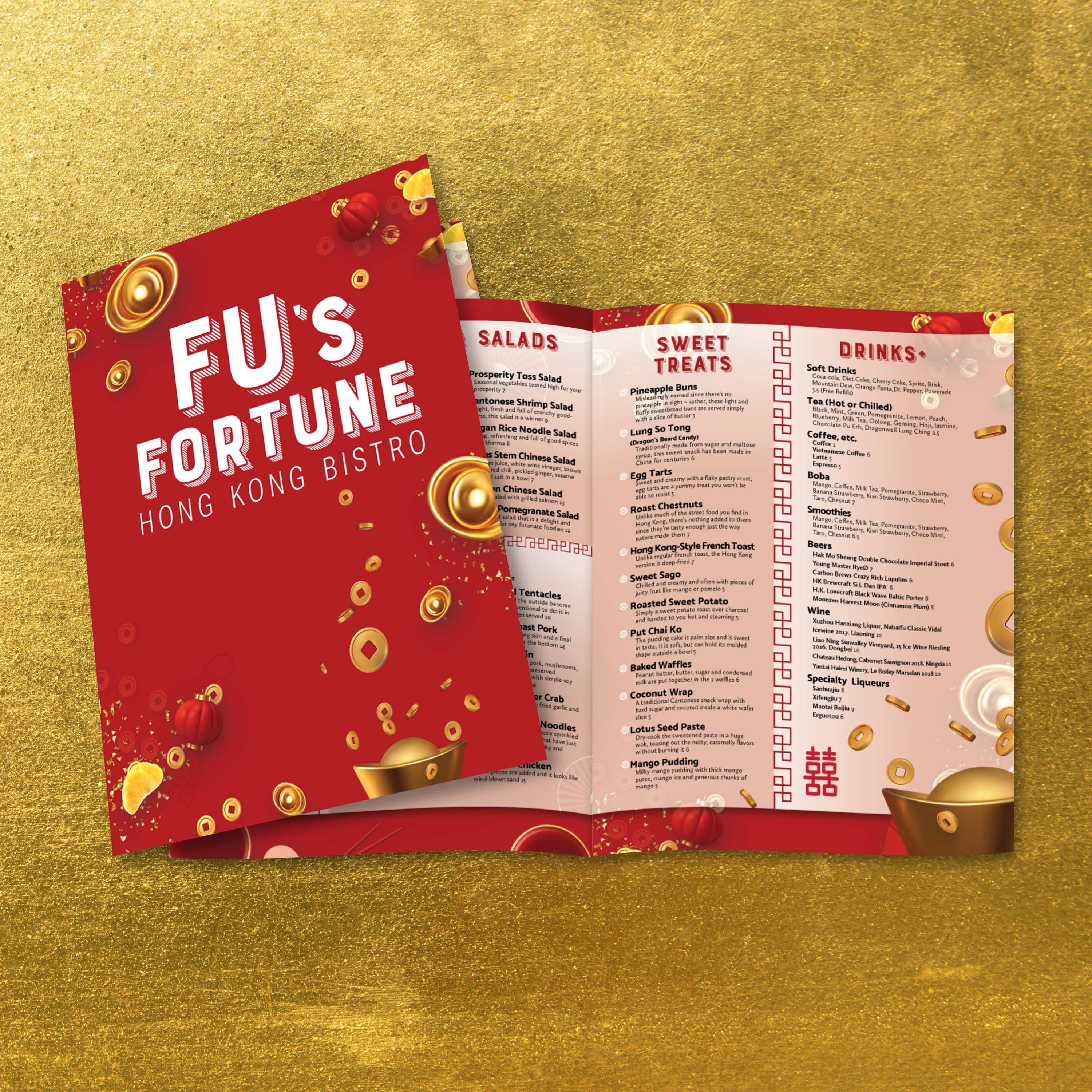
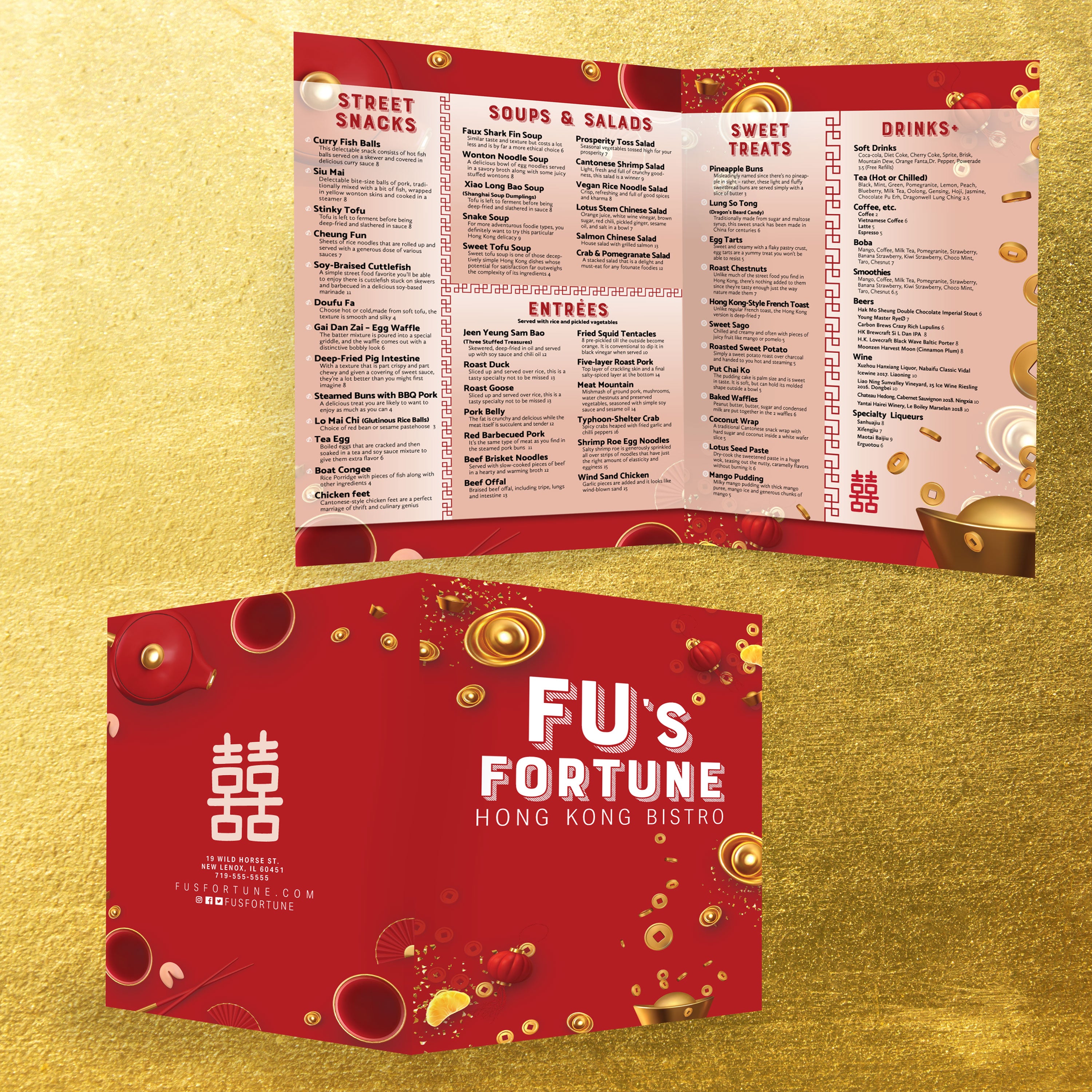
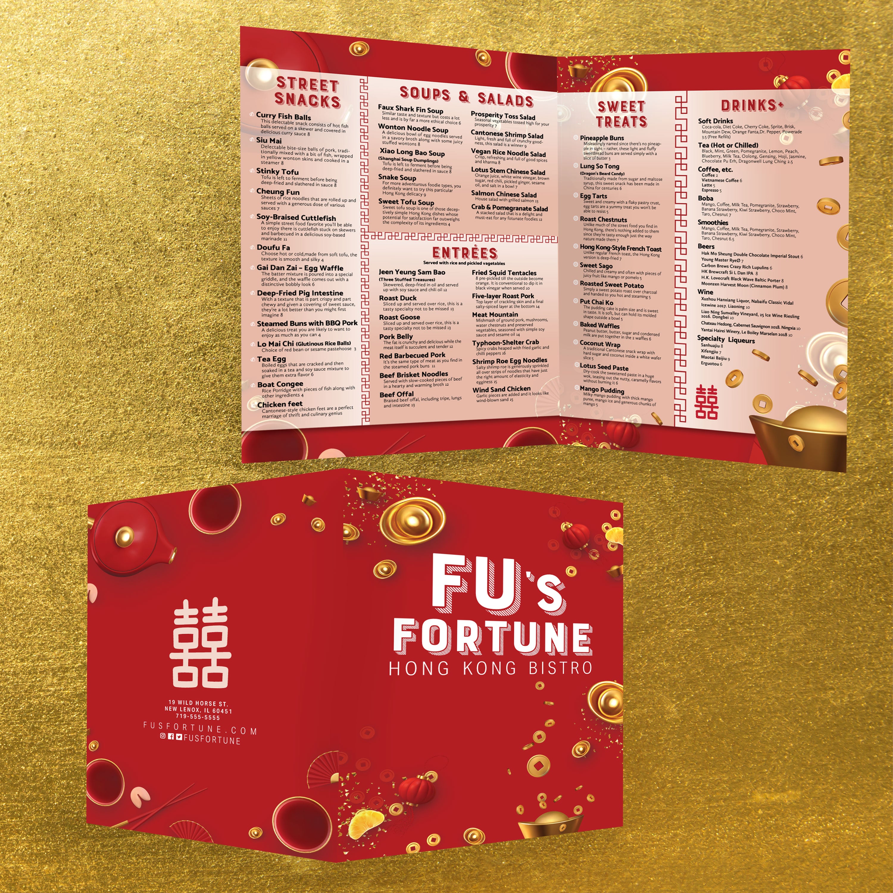
A strong Chinese menu design should evoke a sense of authenticity and cultural grounding. Still, it also has to perform like a modern brand asset: clear, consistent, durable, and easy to update across service formats and locations.
Use Cultural Motifs with Restraint and Purpose
Traditional elements, such as red tones, bamboo textures, plum blossoms, and subtle geometric borders, can convey heritage without overwhelming the layout. Keep motifs as accents rather than full-background patterns so dish names, pricing, and category labels remain easy to scan in busy dining environments.
Pair Calligraphy-Inspired Fonts with High Readability Typography
Brush-style fonts are best suited for section titles or feature callouts, while dish descriptions should utilize a clean, highly legible typeface. This combination preserves the cultural character while ensuring guests can read quickly under low-light dining conditions and during peak service rushes.
Build a Modern Visual Hierarchy Around Classic Color Palettes
Red, gold, and black are powerful cultural signals, but they need controlled contrast to avoid visual fatigue. Use strong hierarchy through spacing, clear headers, and consistent formatting for spice levels, combo notes, and chef specials so the menu reads like a modern, organized guide rather than a dense poster.
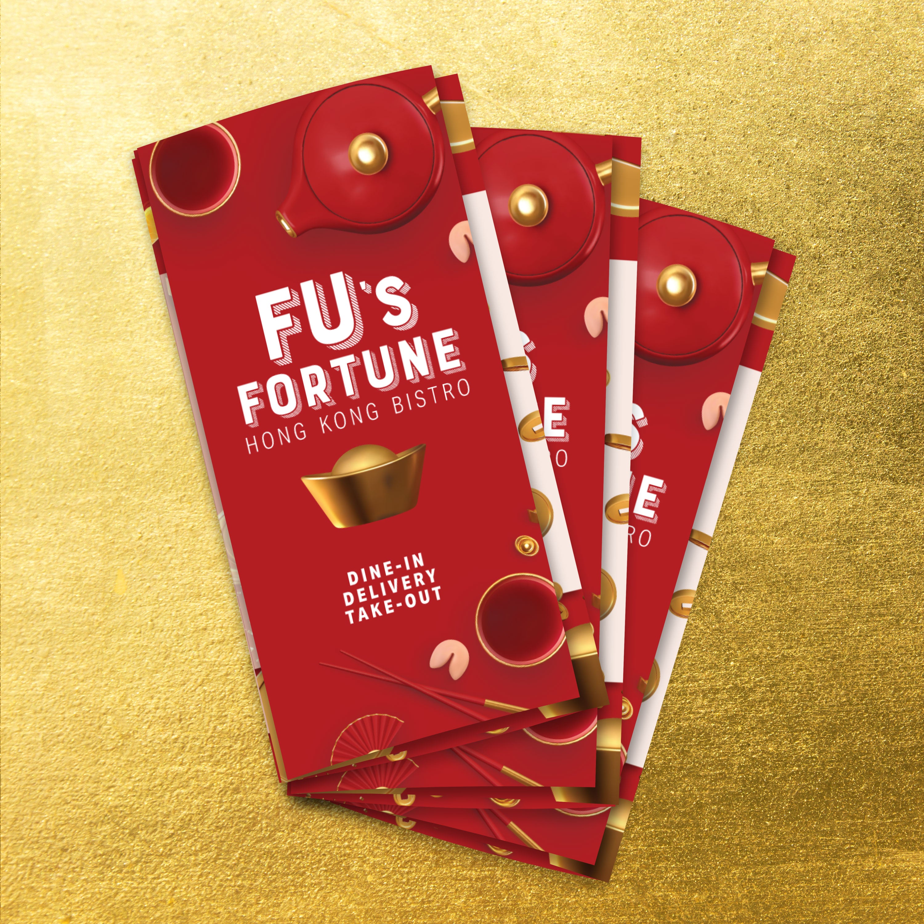
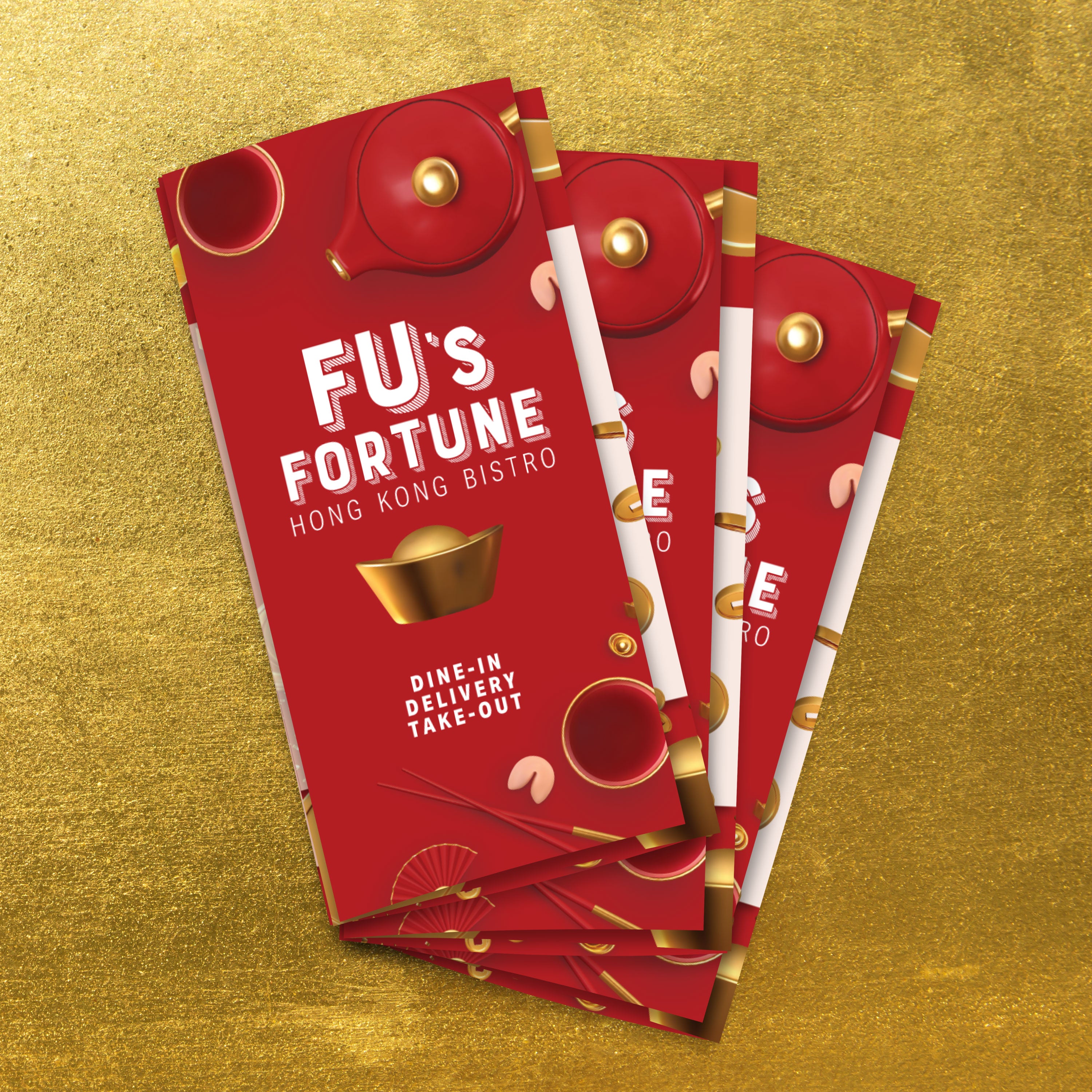
Design for Folded Formats Without Losing Brand Consistency
Folded menus help Chinese restaurants organize large category lists, banquet options, and specialty sections. Menus that use traditional lamination also cannot be folded reliably and often cloud up or crack at creases. Synthetic waterproof paper supports bi-fold, tri-fold, and gate fold designs while keeping folds crisp and layouts consistent across every panel.
Protect Cultural Detail with Durable, Fade-Resistant Materials
Decorative borders, delicate linework, and bilingual typography require clean print fidelity. High-GSM synthetic menus maintain vivid color and crisp detail through spills, grease, humidity, and heavy handling. This prevents the loss of authenticity that occurs when laminated menus become cloudy or paper menus stain and warp.
Align Sustainability with Long-Term Brand Presentation
Modern branding increasingly includes sustainability expectations. Rip-proof, archival quality menus reduce waste by lasting longer and requiring fewer reprints. TerraSlate waterproof paper is recyclable through standard curbside bins, helping operators reduce replacement cycles while keeping menus presentation-ready across multiple menu seasons.
Ensure Print Compatibility Across Locations and Equipment
Multi-location restaurants benefit from templates that print consistently across different environments. TerraSlate is available in multiple thicknesses, including 14 Mil for maximum durability, which may require a commercial press and is compatible with high-quality printers. This enables everything from lightweight takeout inserts to premium dine-in menus using one brand-consistent design system.
Make Room for Modern Add-Ons Without Breaking Aesthetic Flow
Modern menus often require QR codes, allergen notes, and dietary callouts. These elements should be integrated into dedicated zones so they remain functional without disrupting the cultural design. Folded panels and modular template blocks help you add digital touchpoints while maintaining a clean and traditionally inspired layout.