Plantillas de menú de dispensario

14 productos

Mostrando 1 - 14 de 14 productos

Mostrando 1 - 14 de 14 productos
Ver

Recently viewed

Dispensary menus change often, and a structured template helps keep updates fast, clean, and consistent without reworking the entire layout.

Consistent Product Listings During Inventory Changes

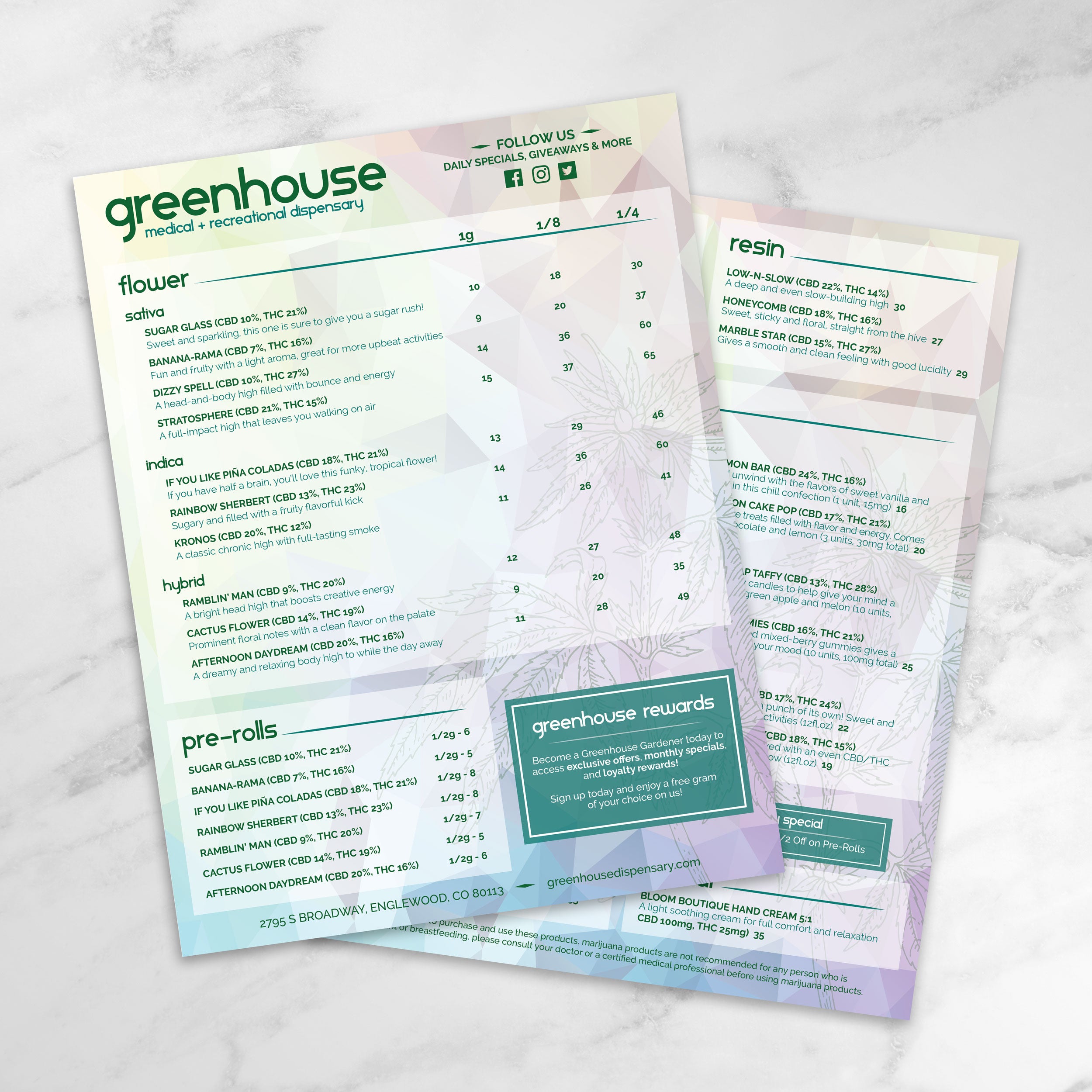
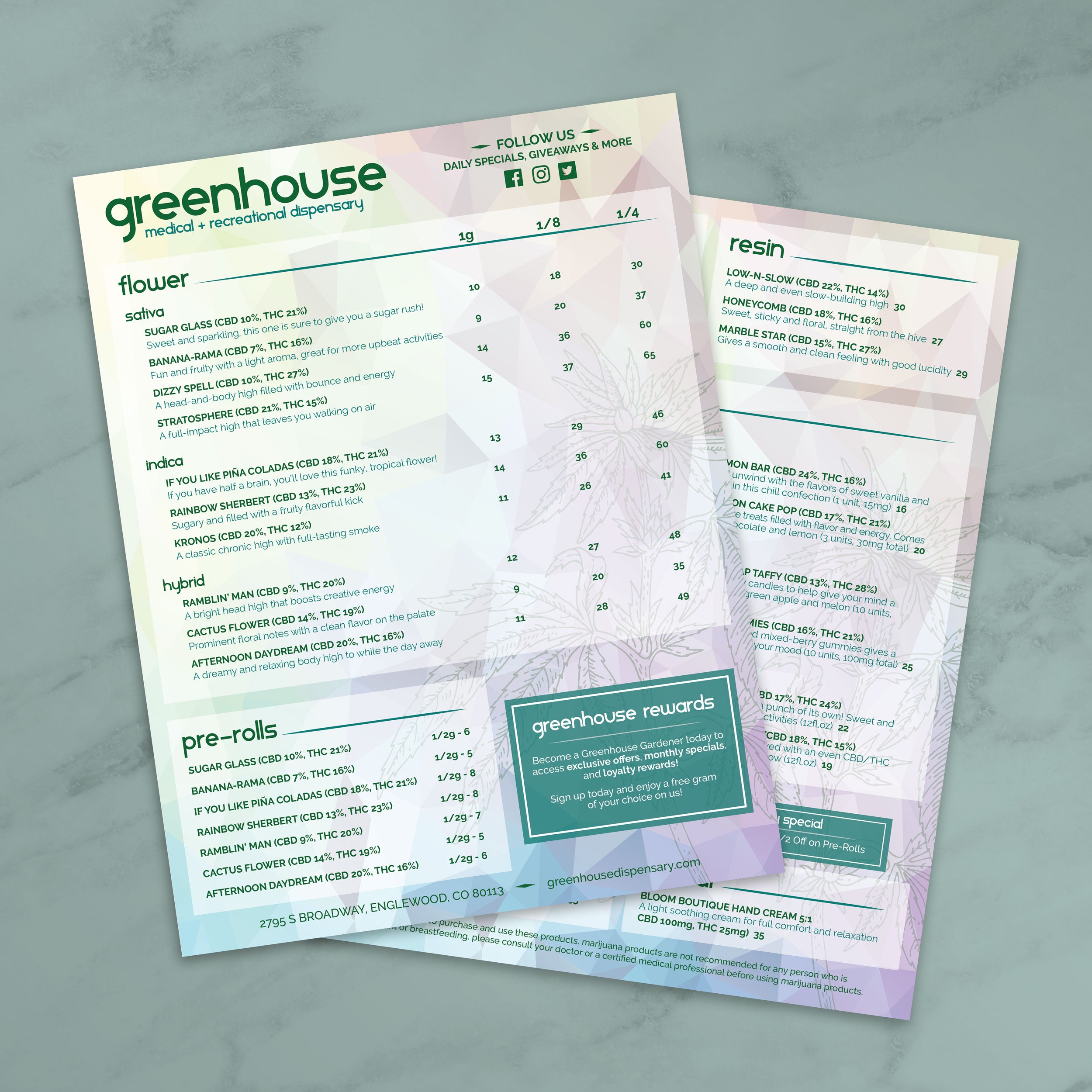
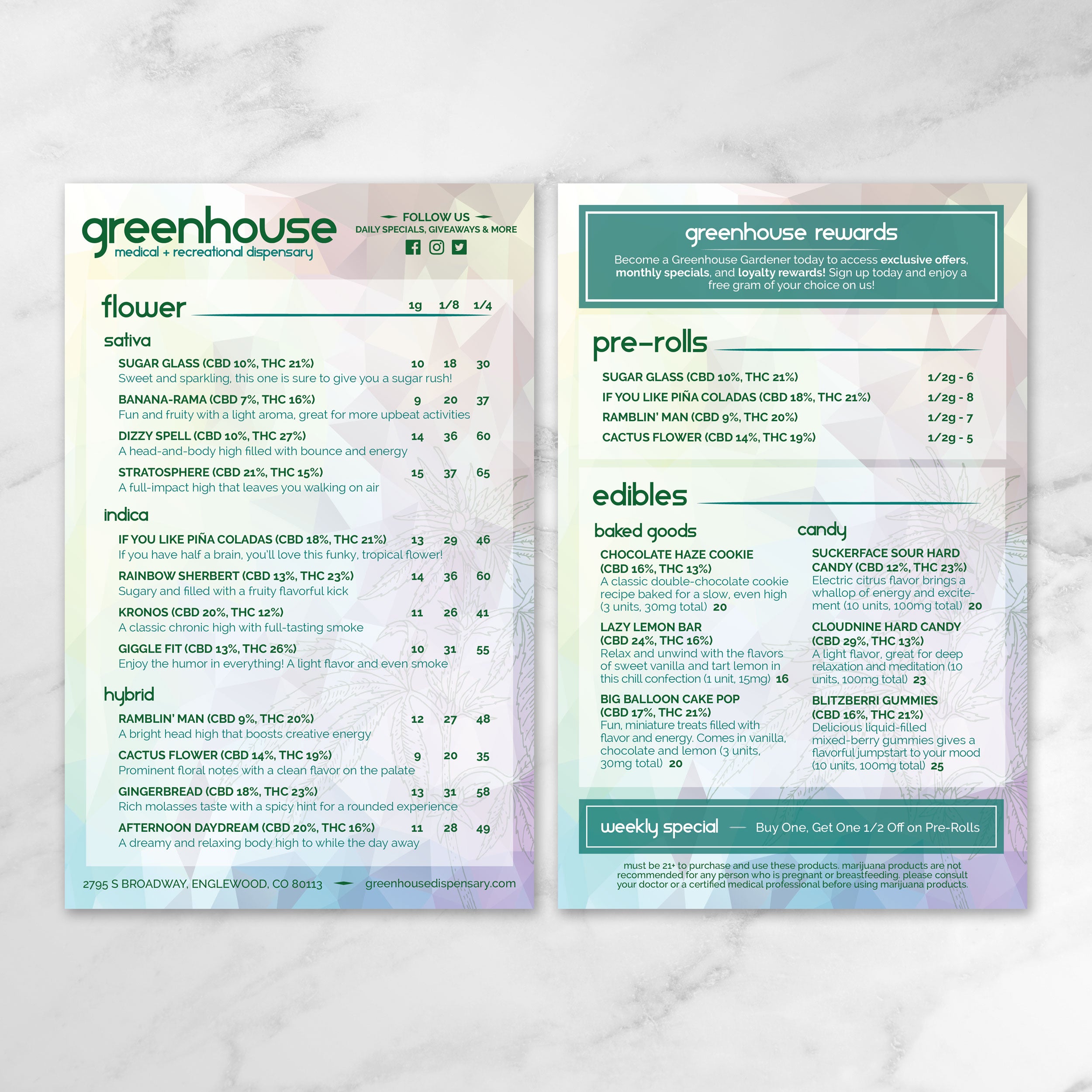
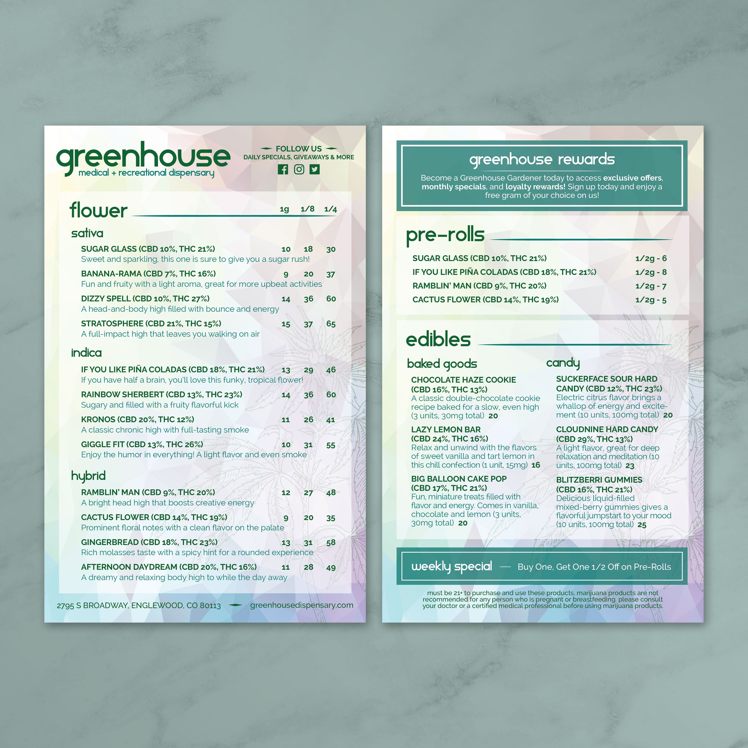
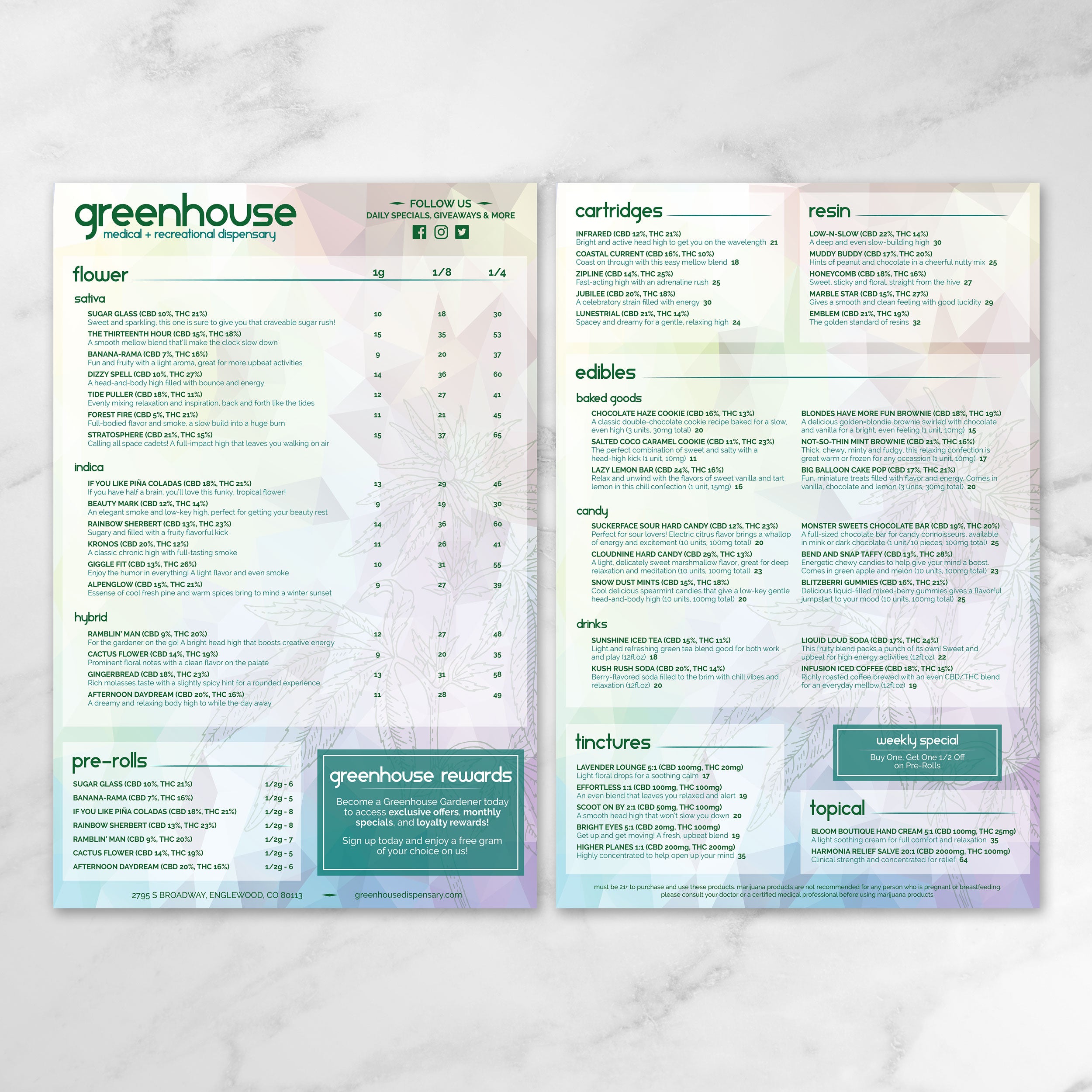
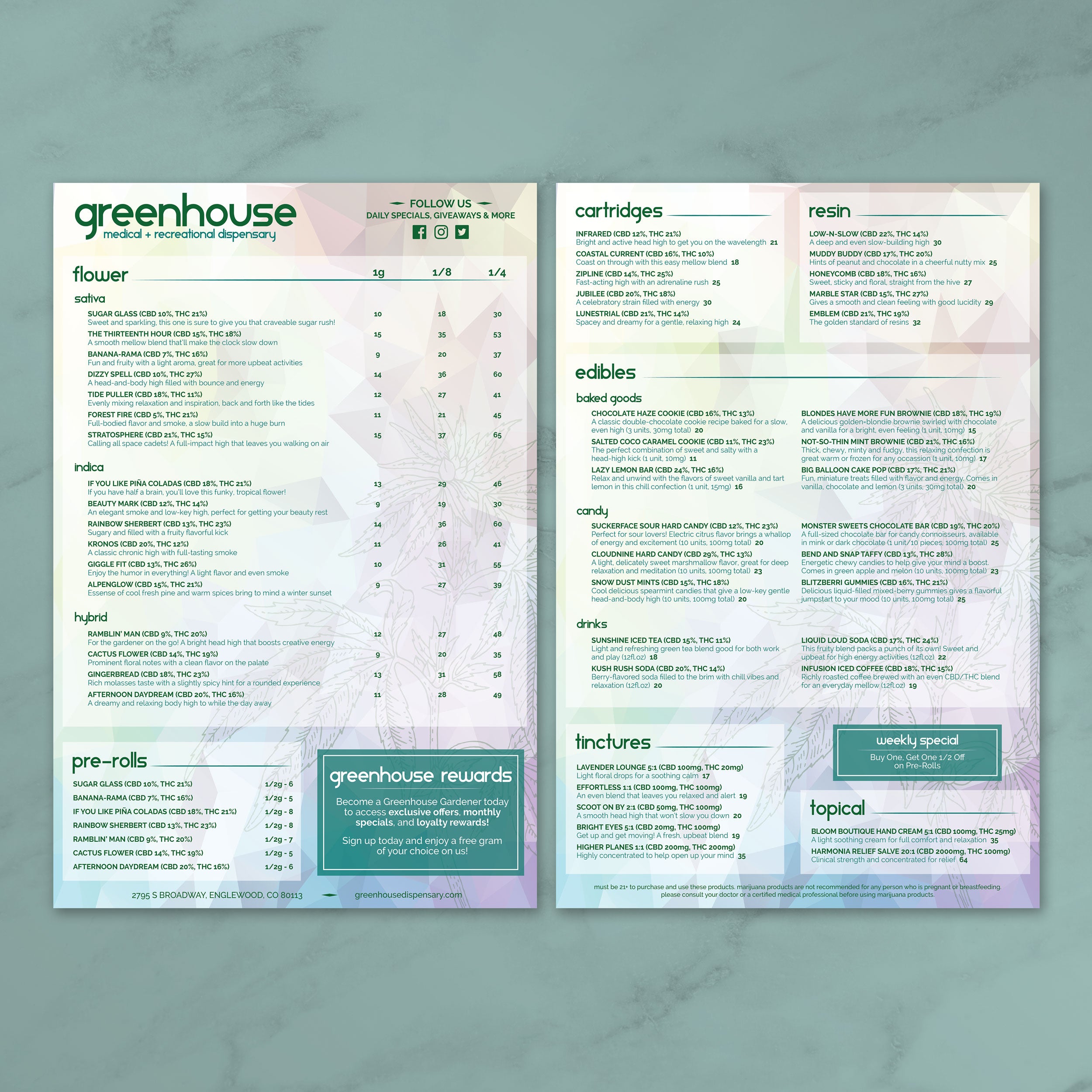
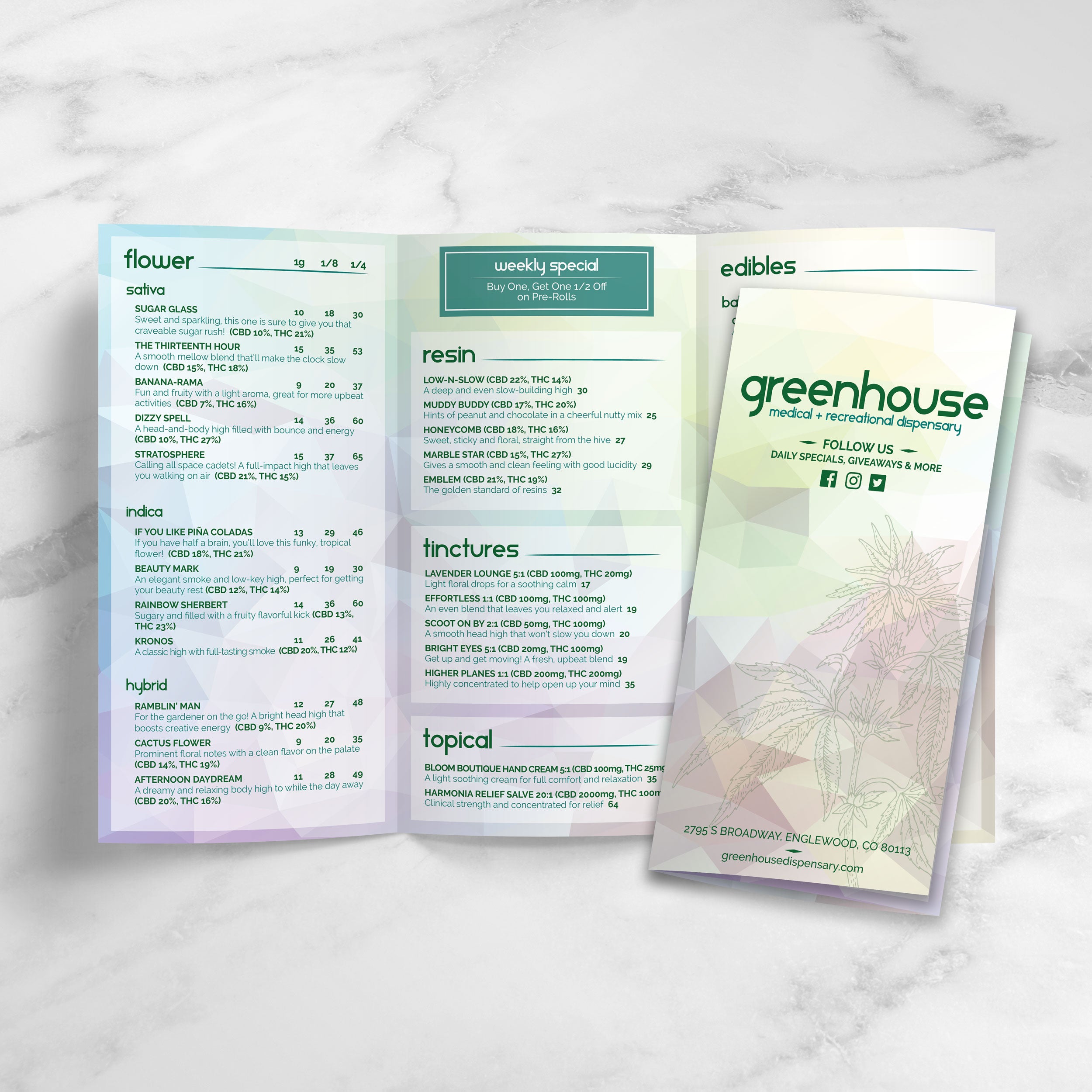
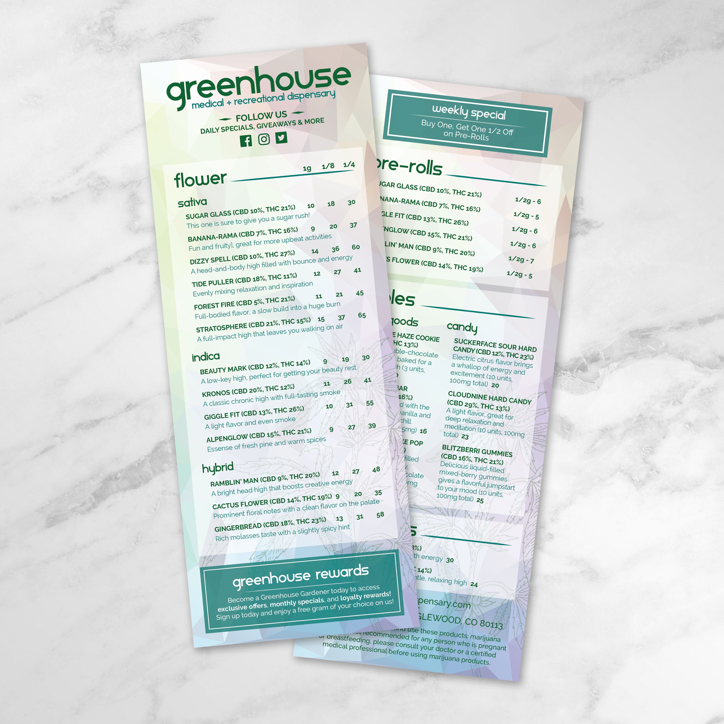
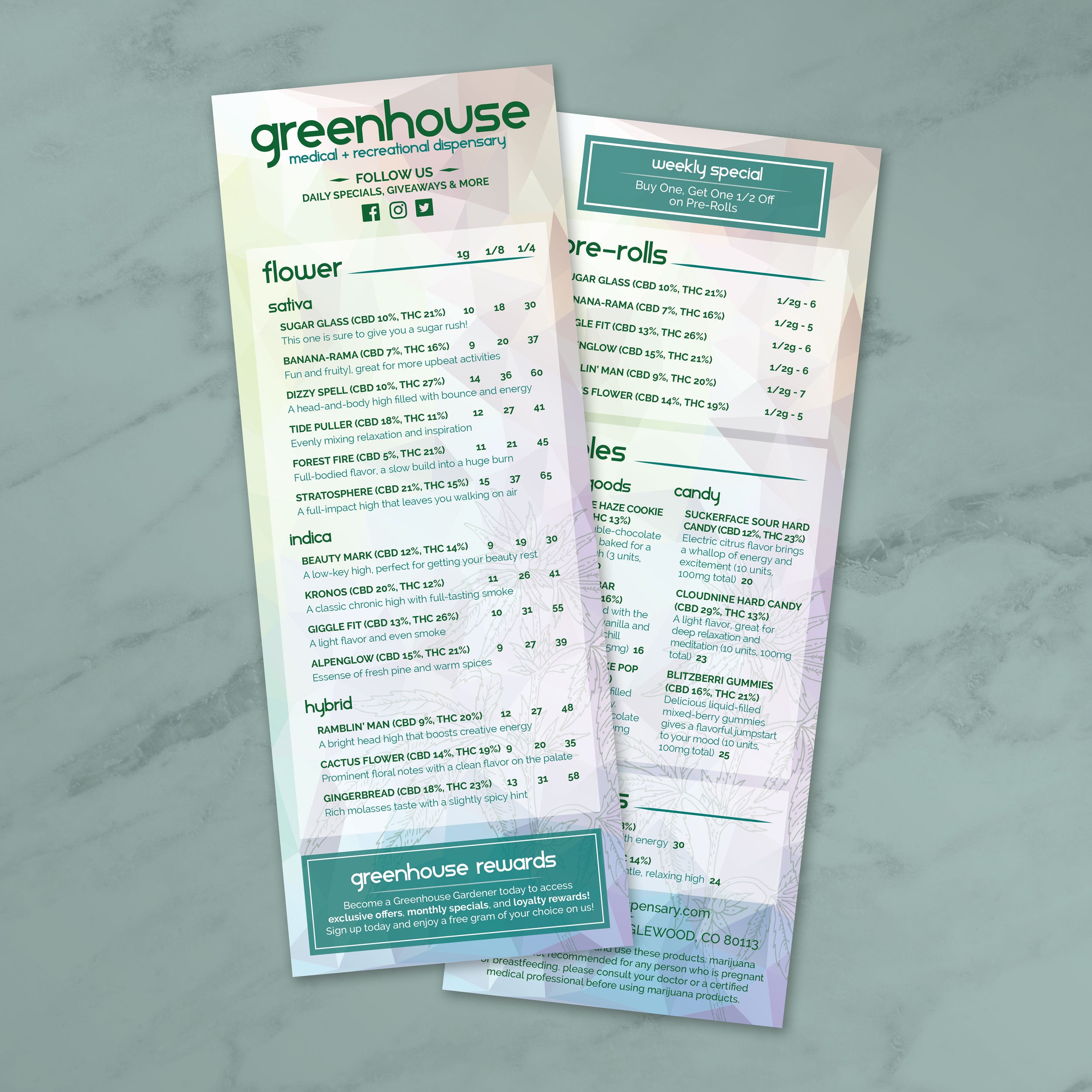
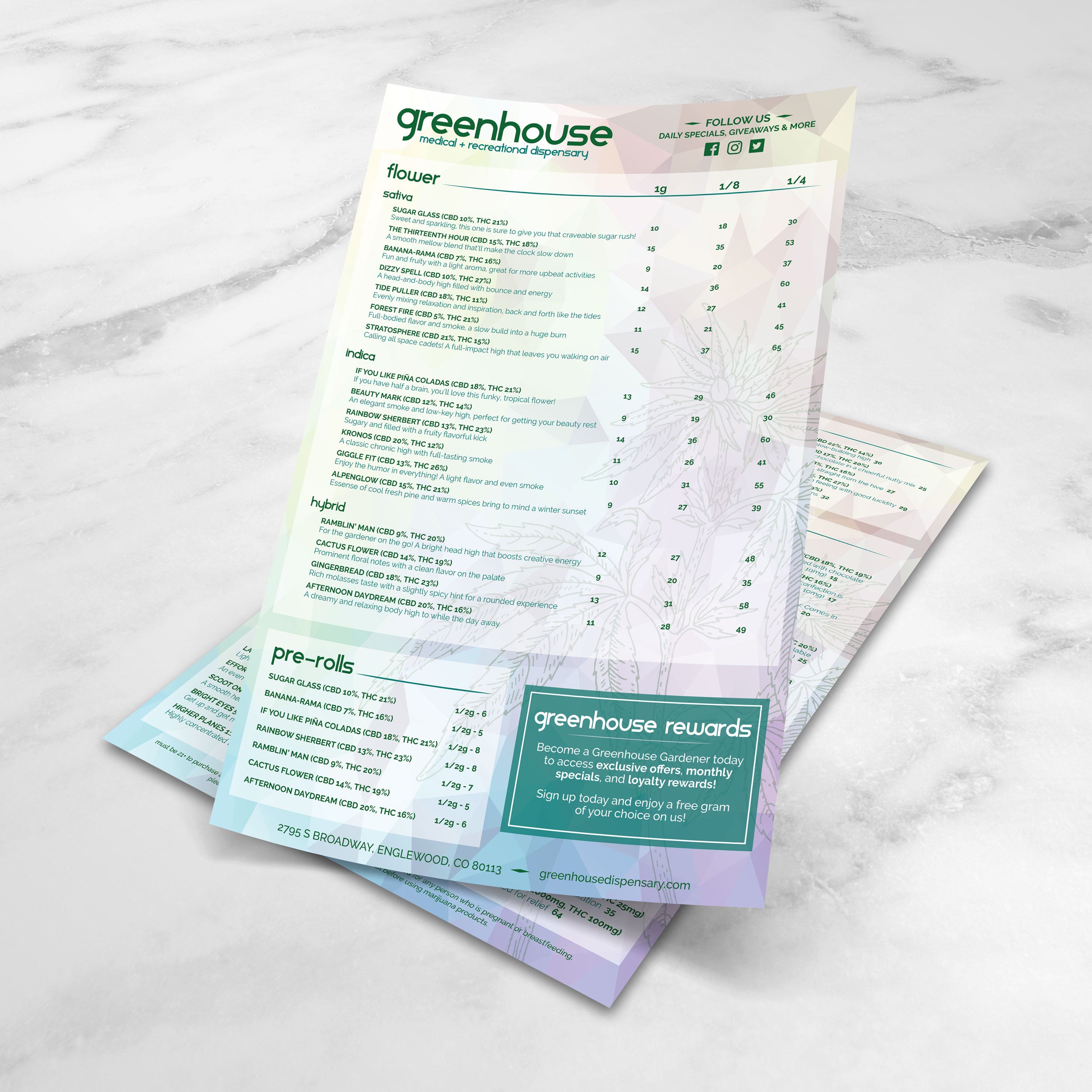
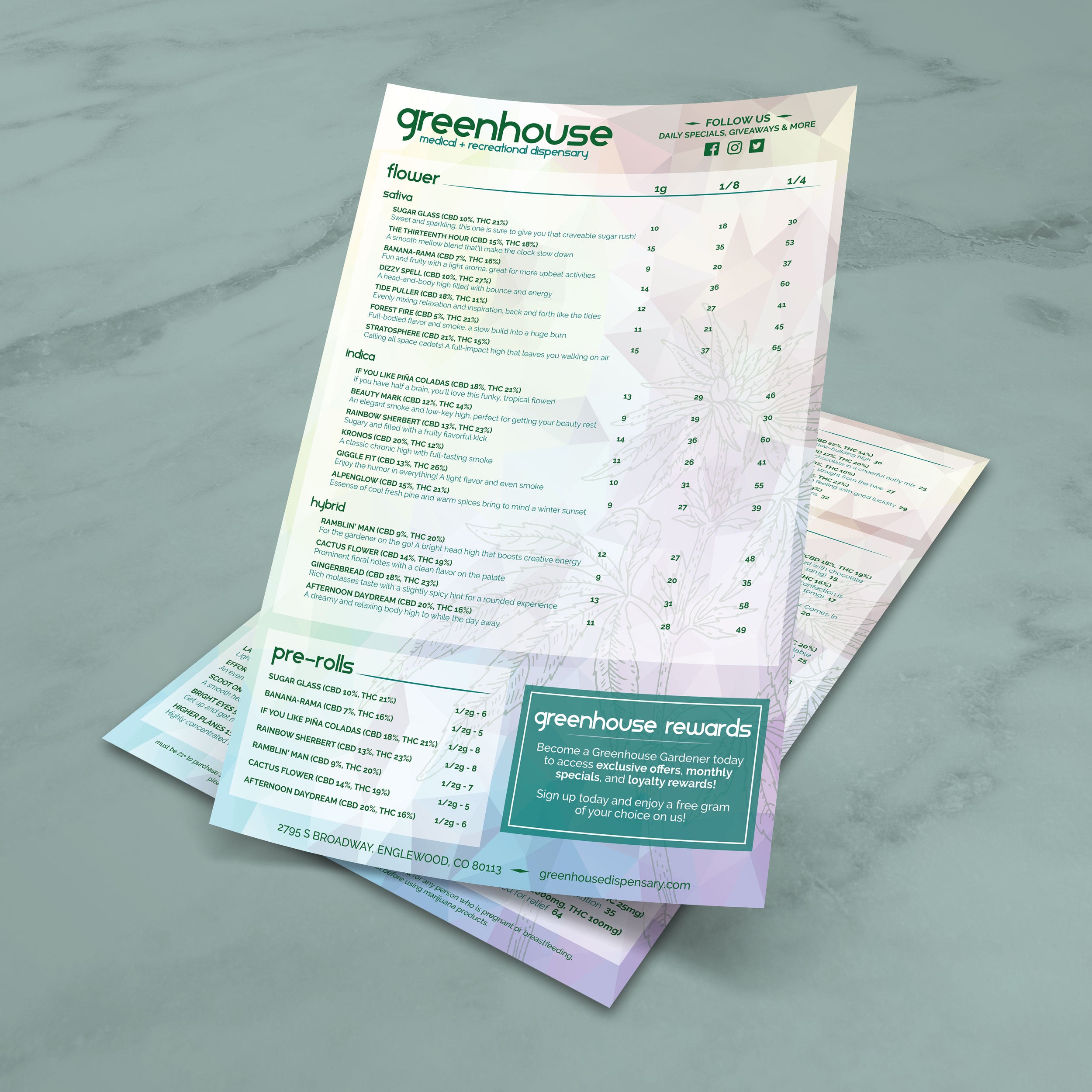
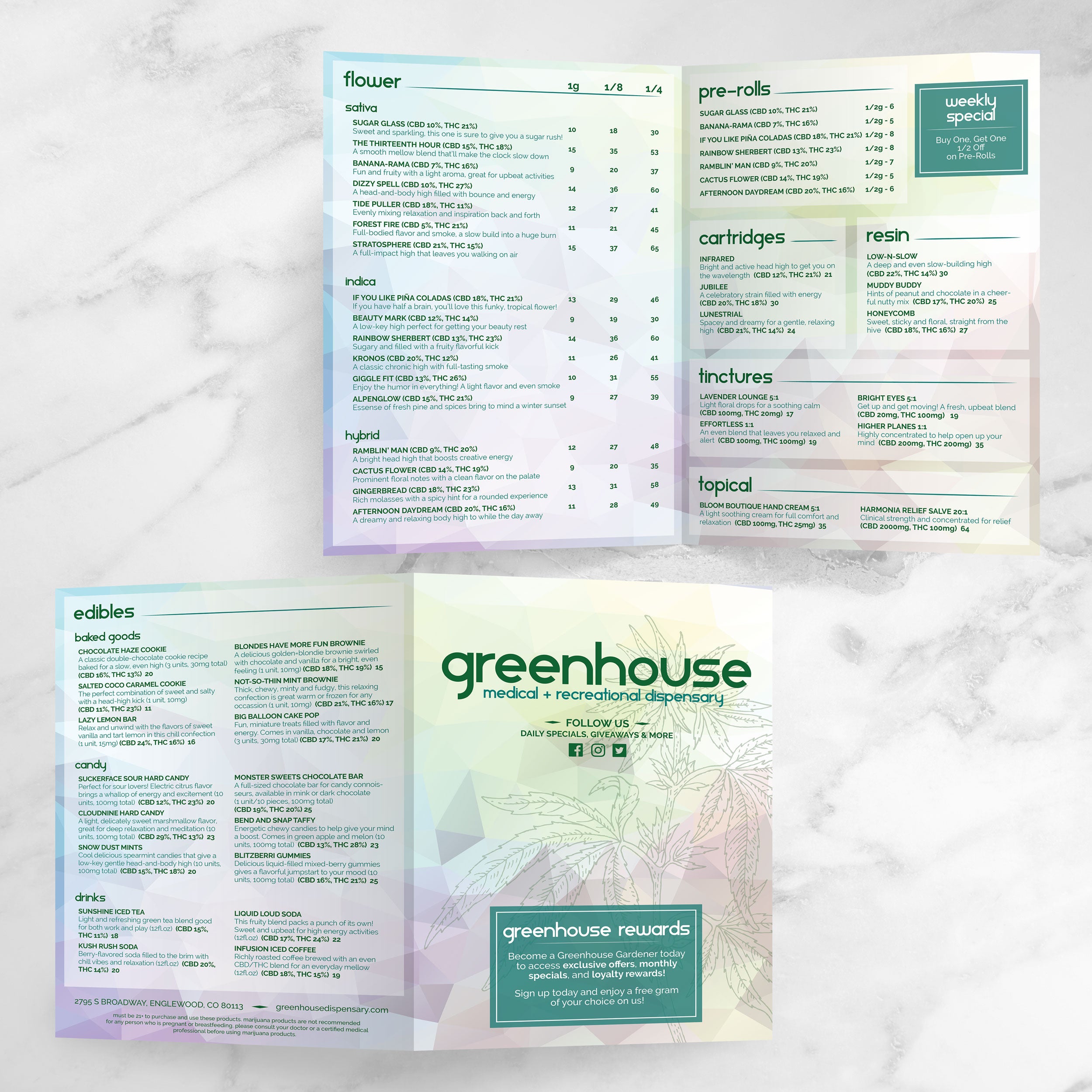
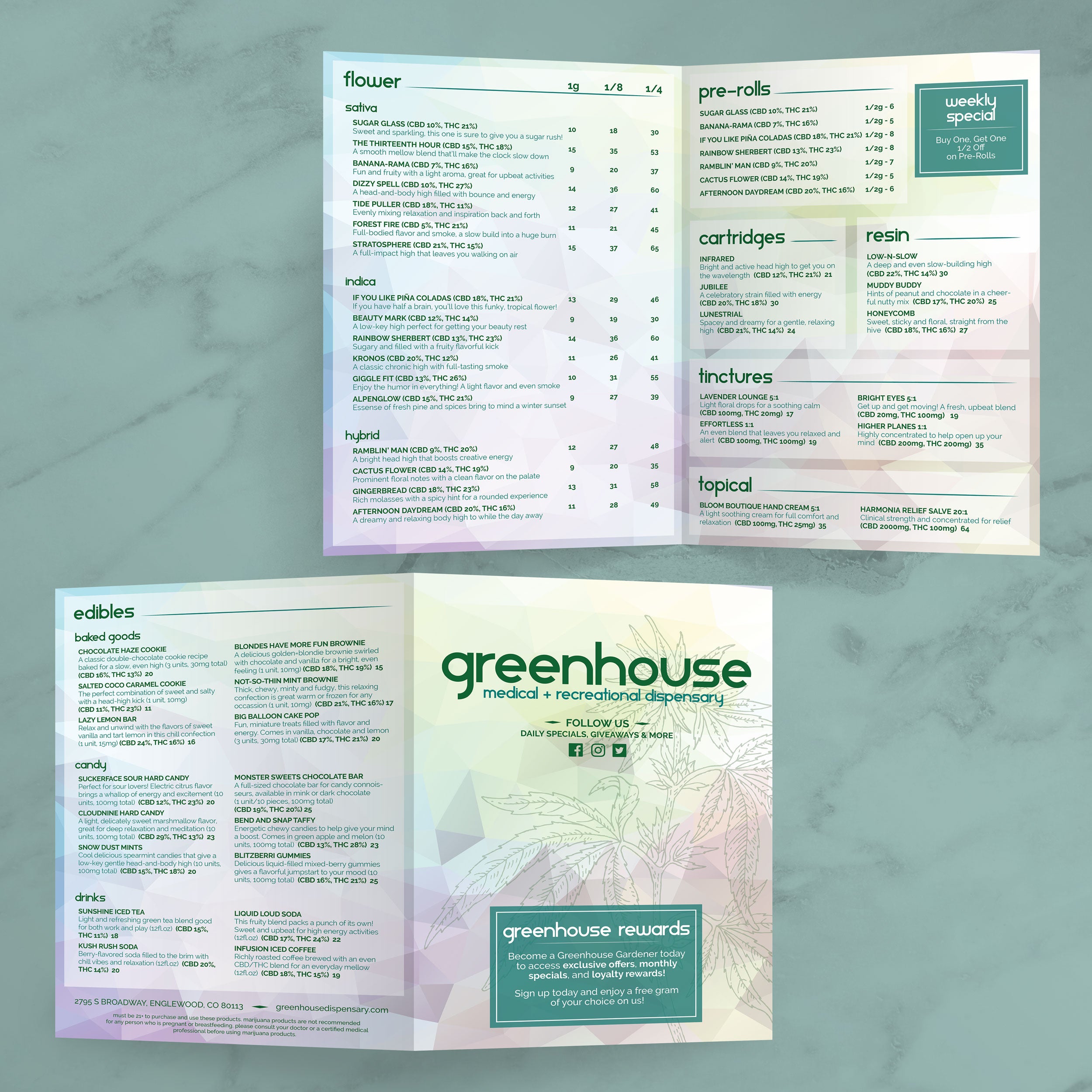
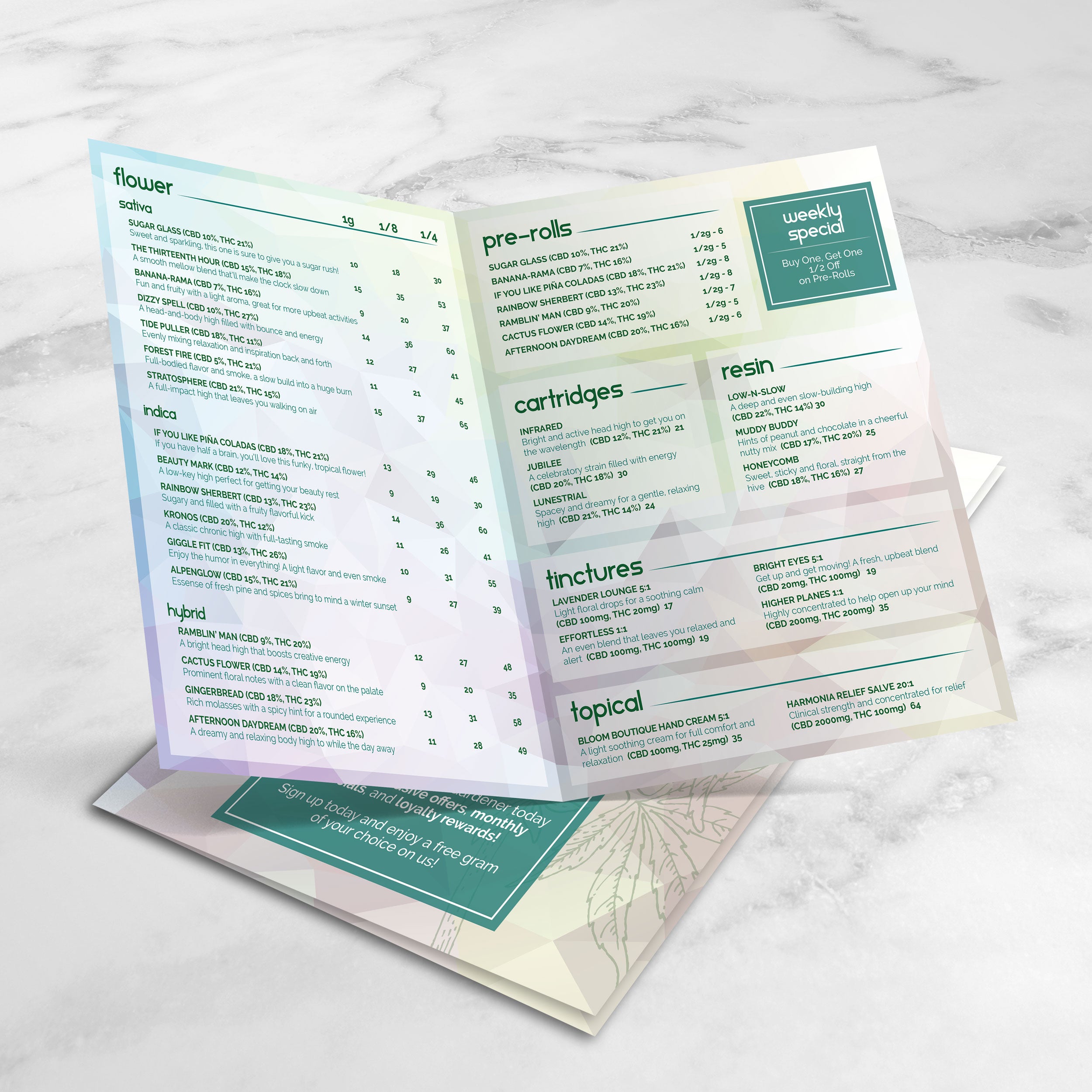
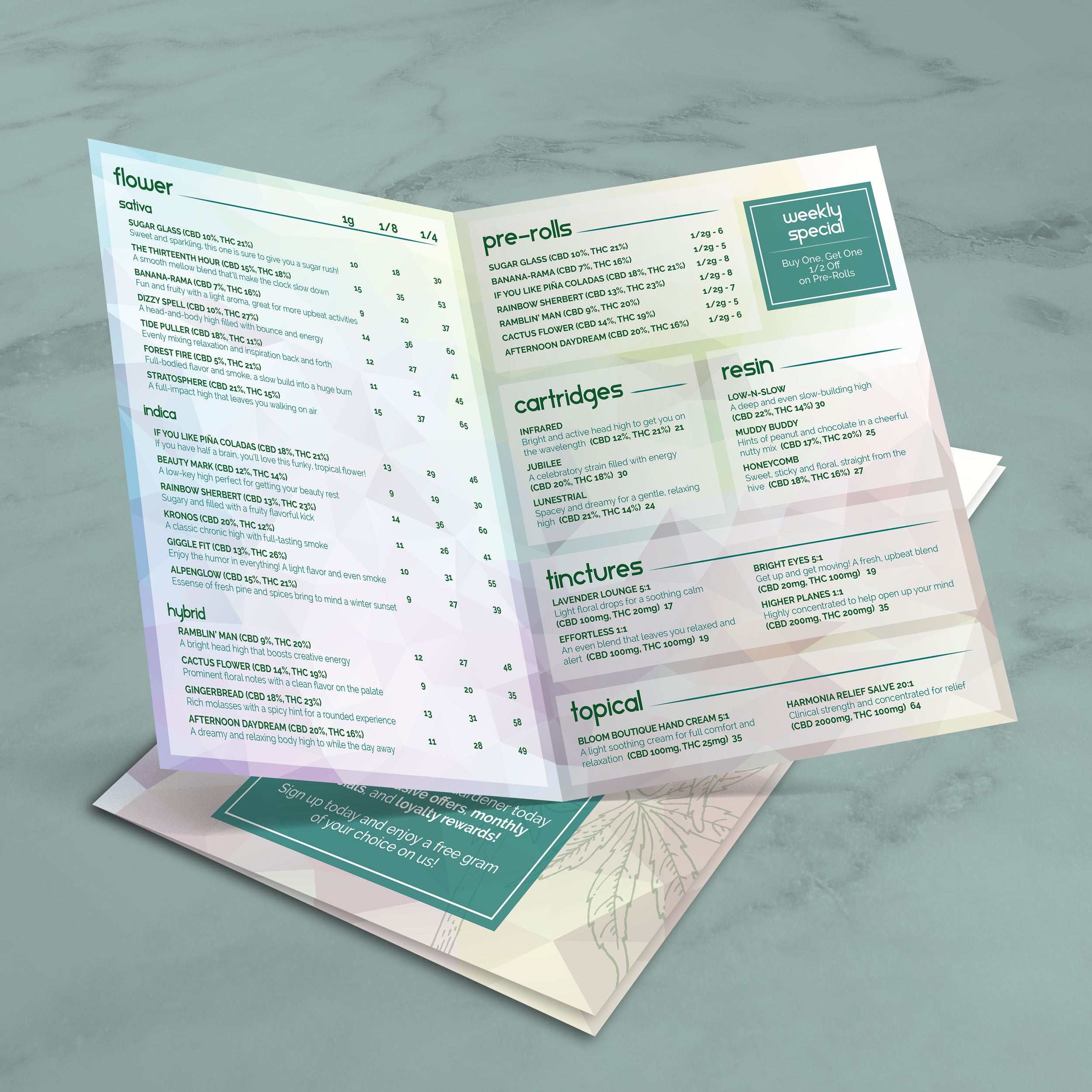
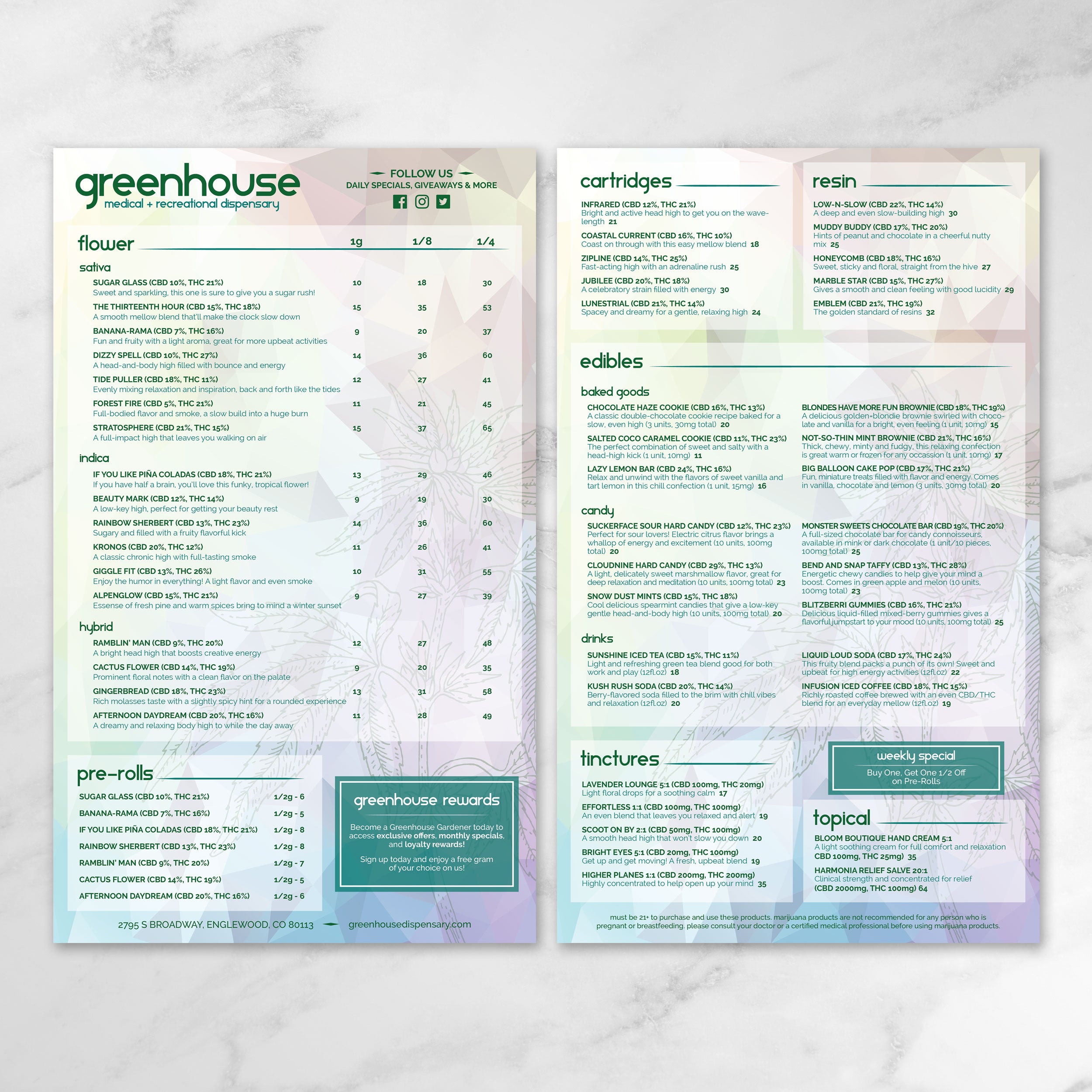
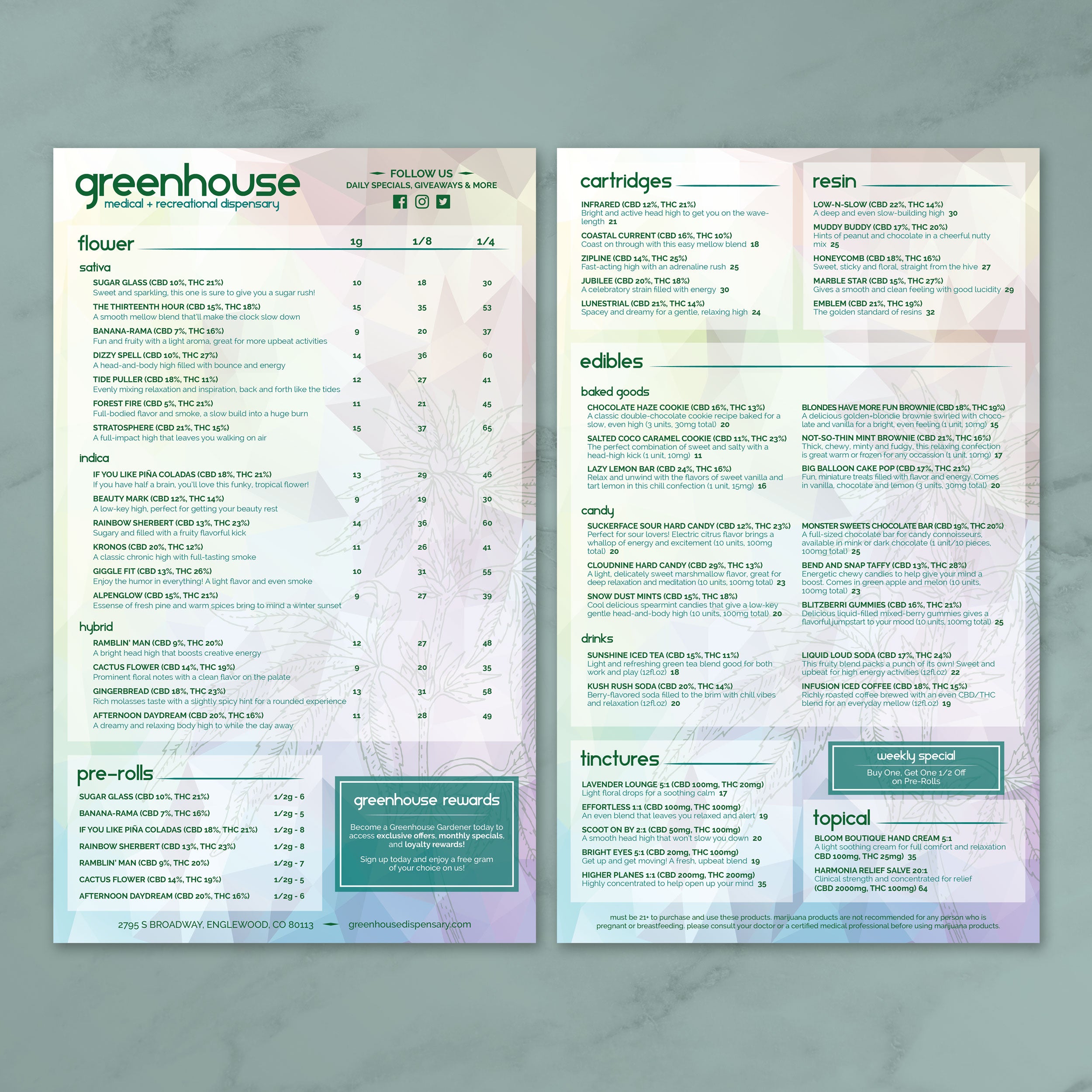
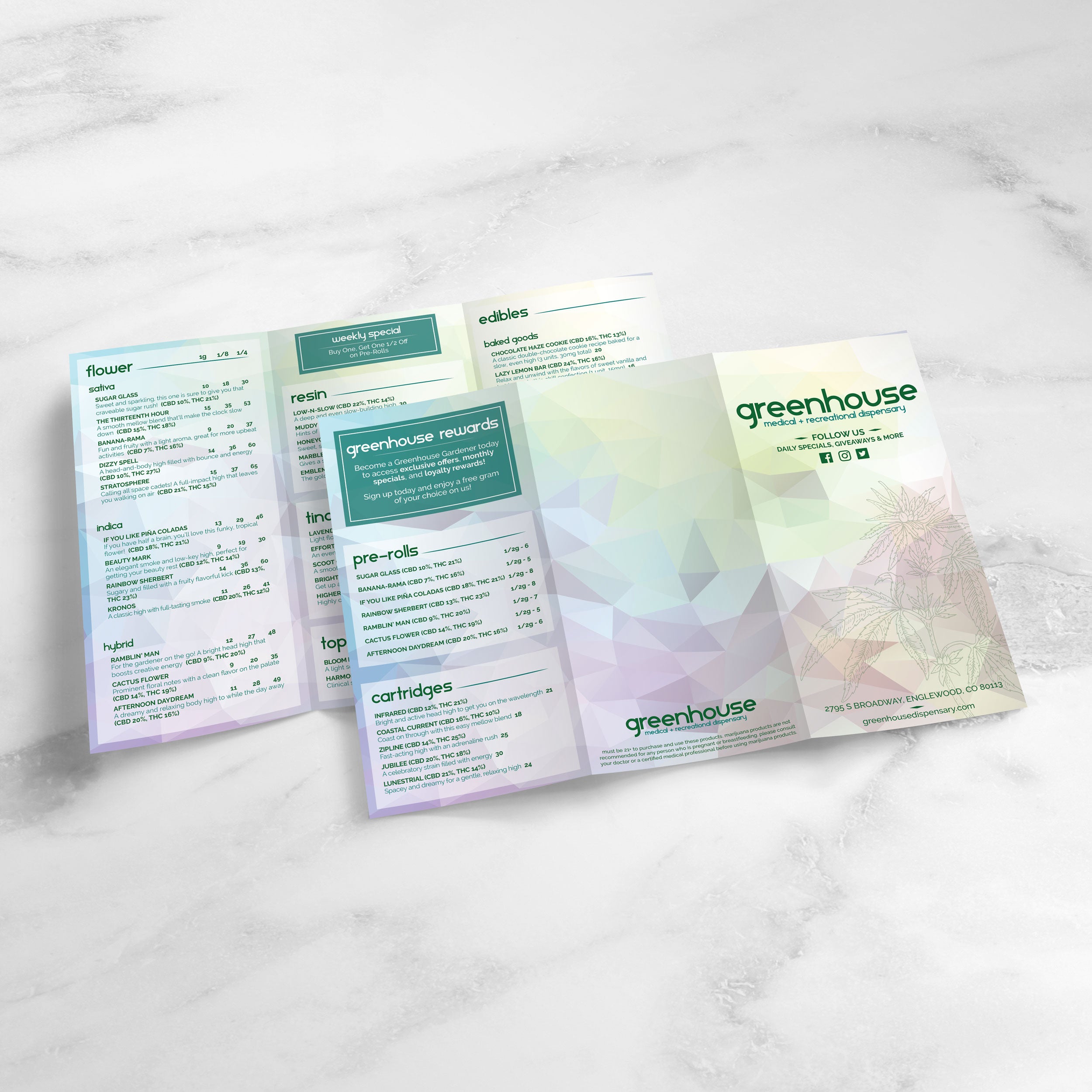
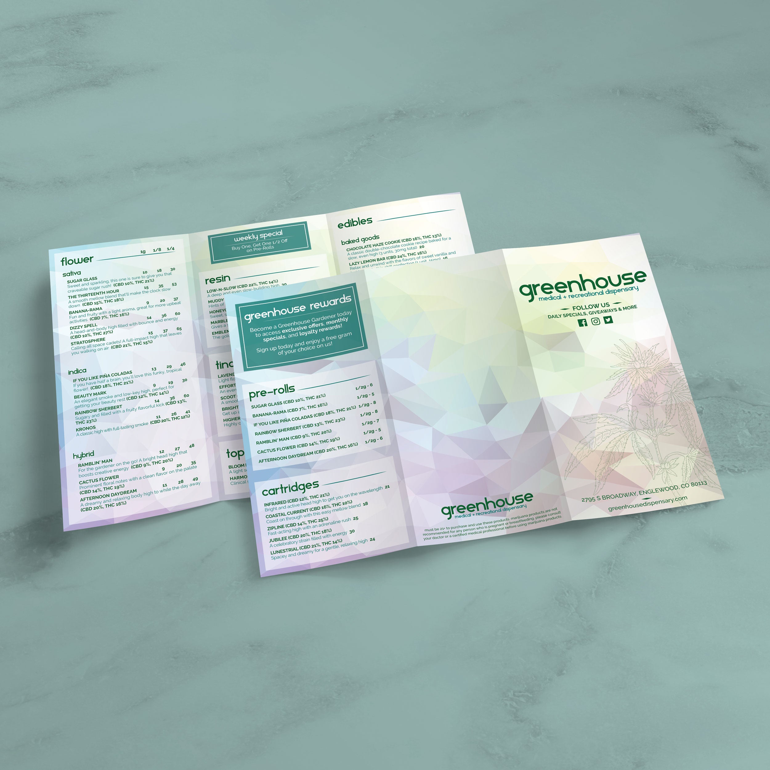
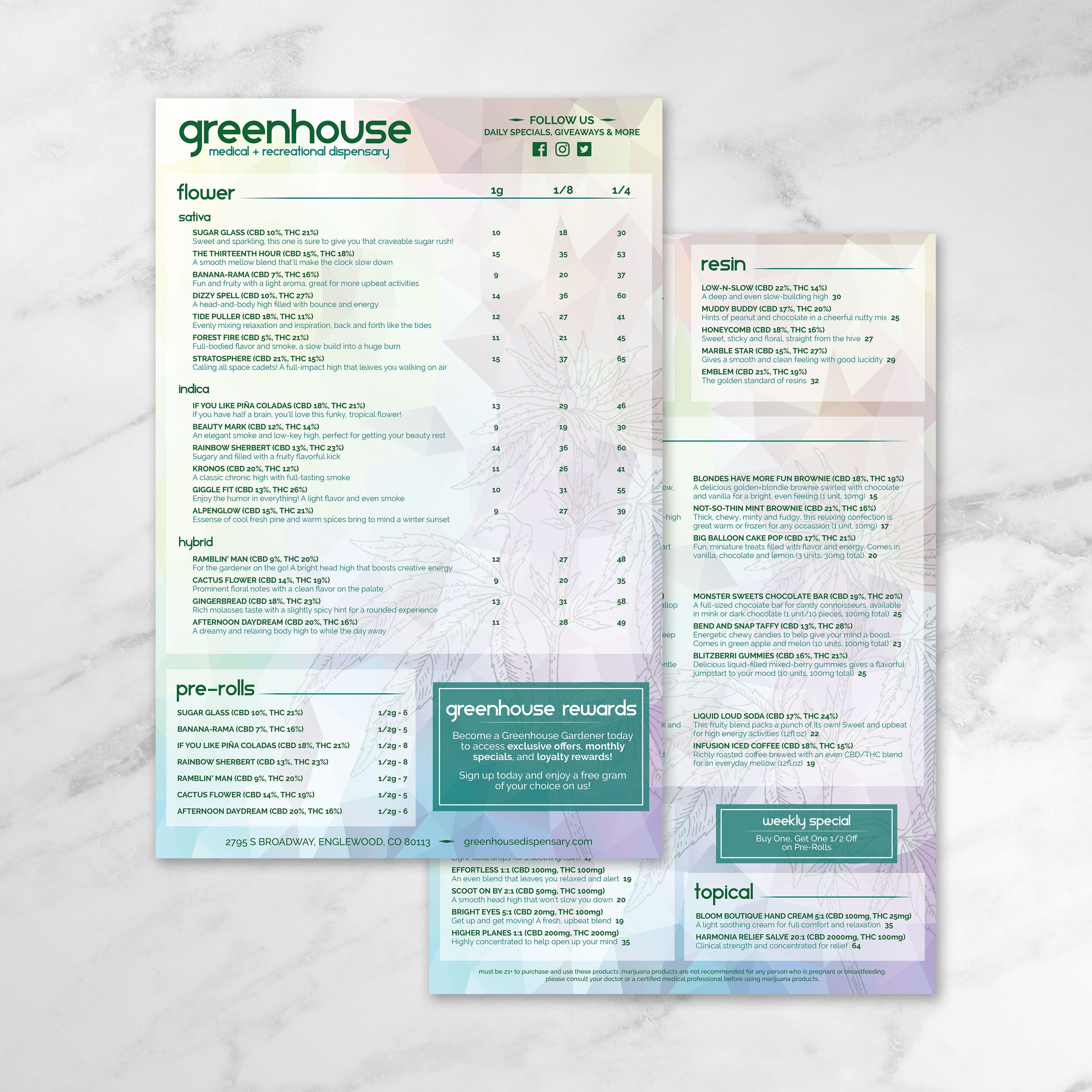
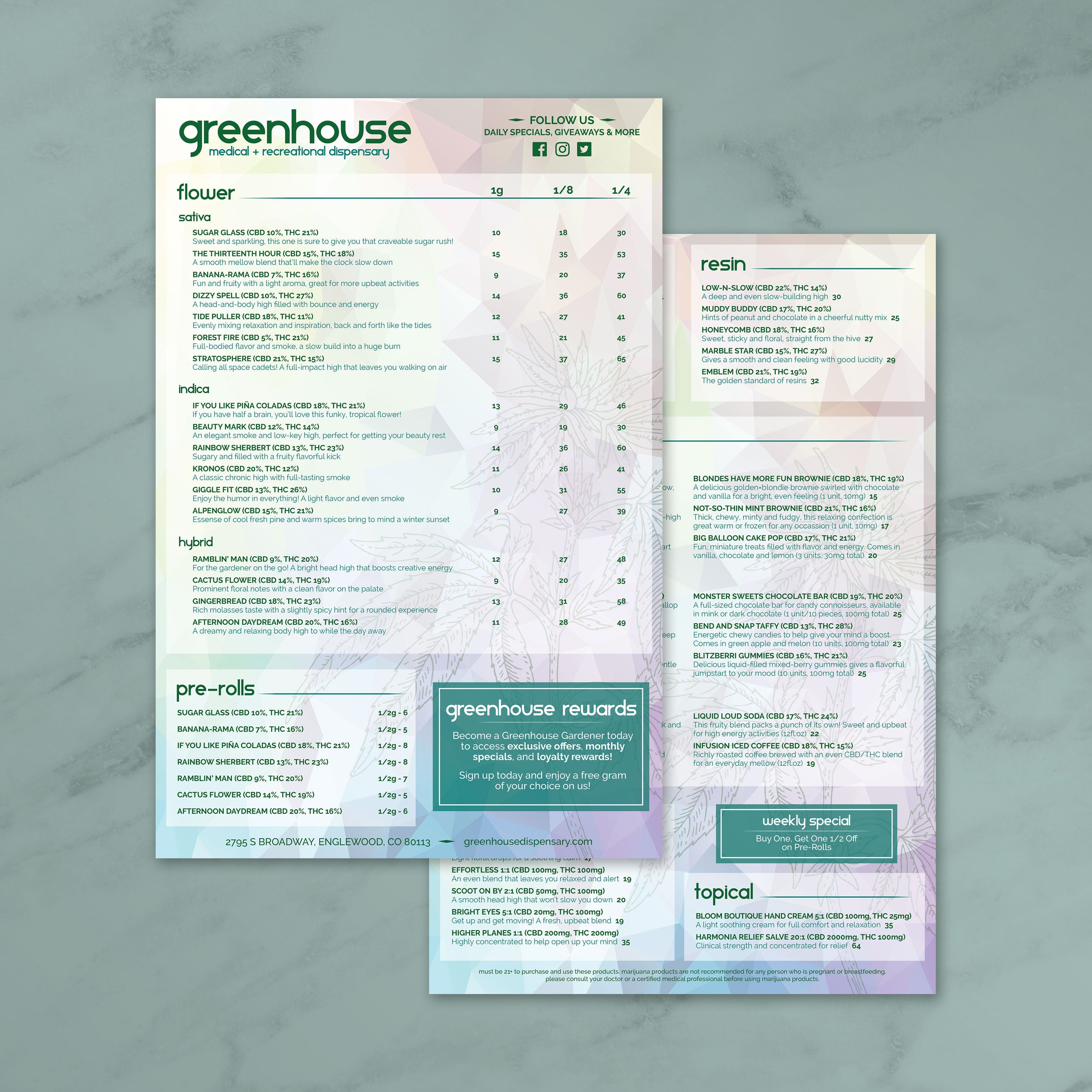
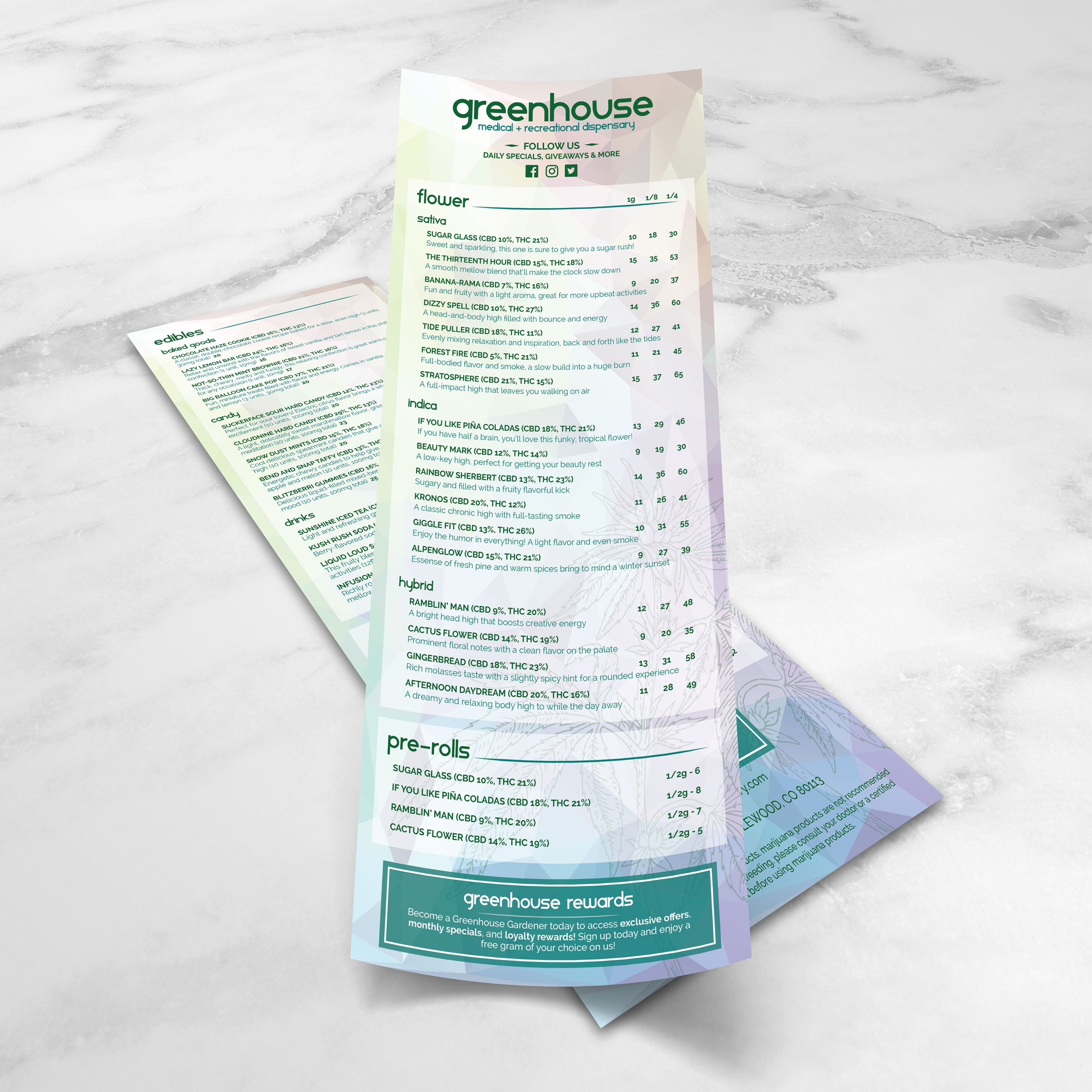
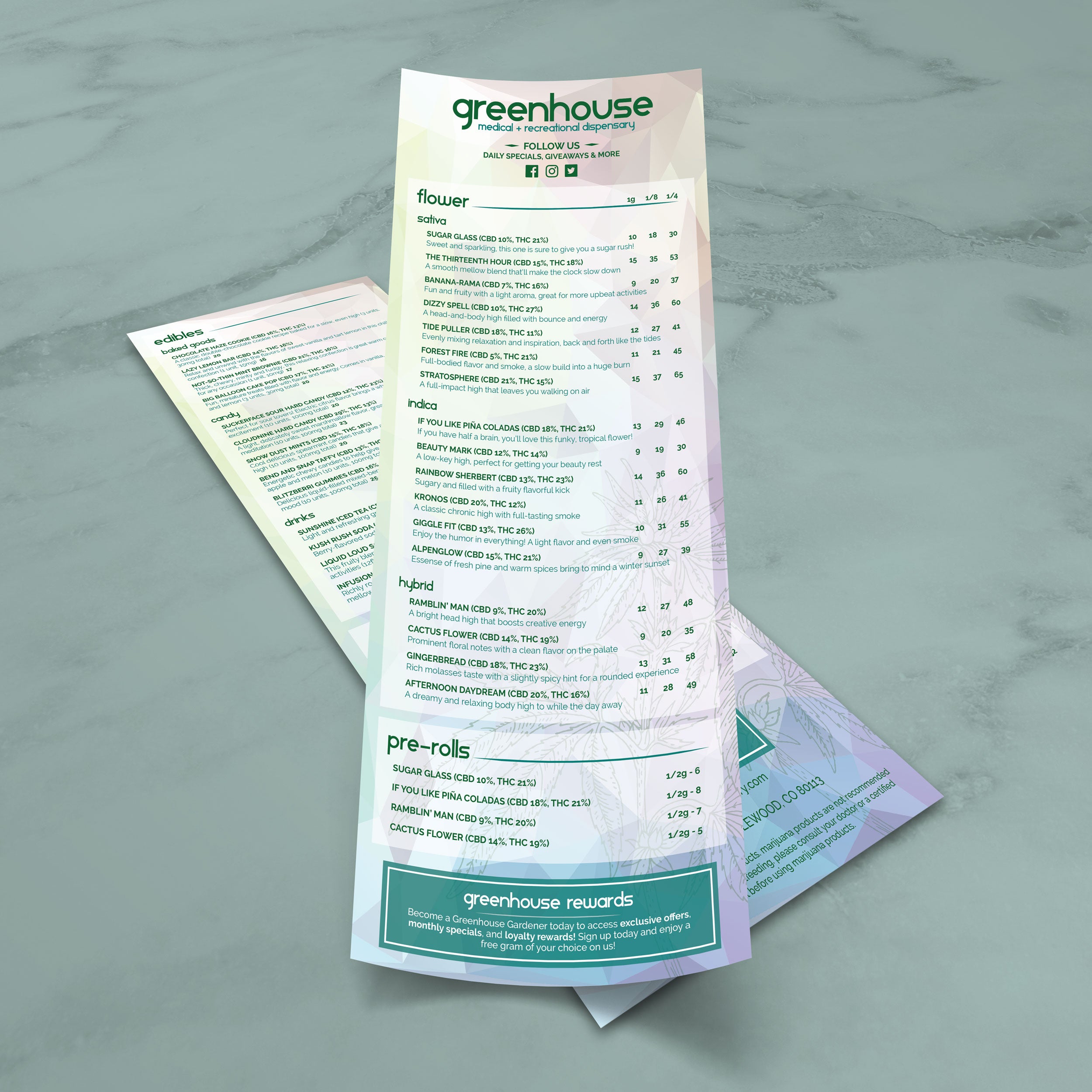
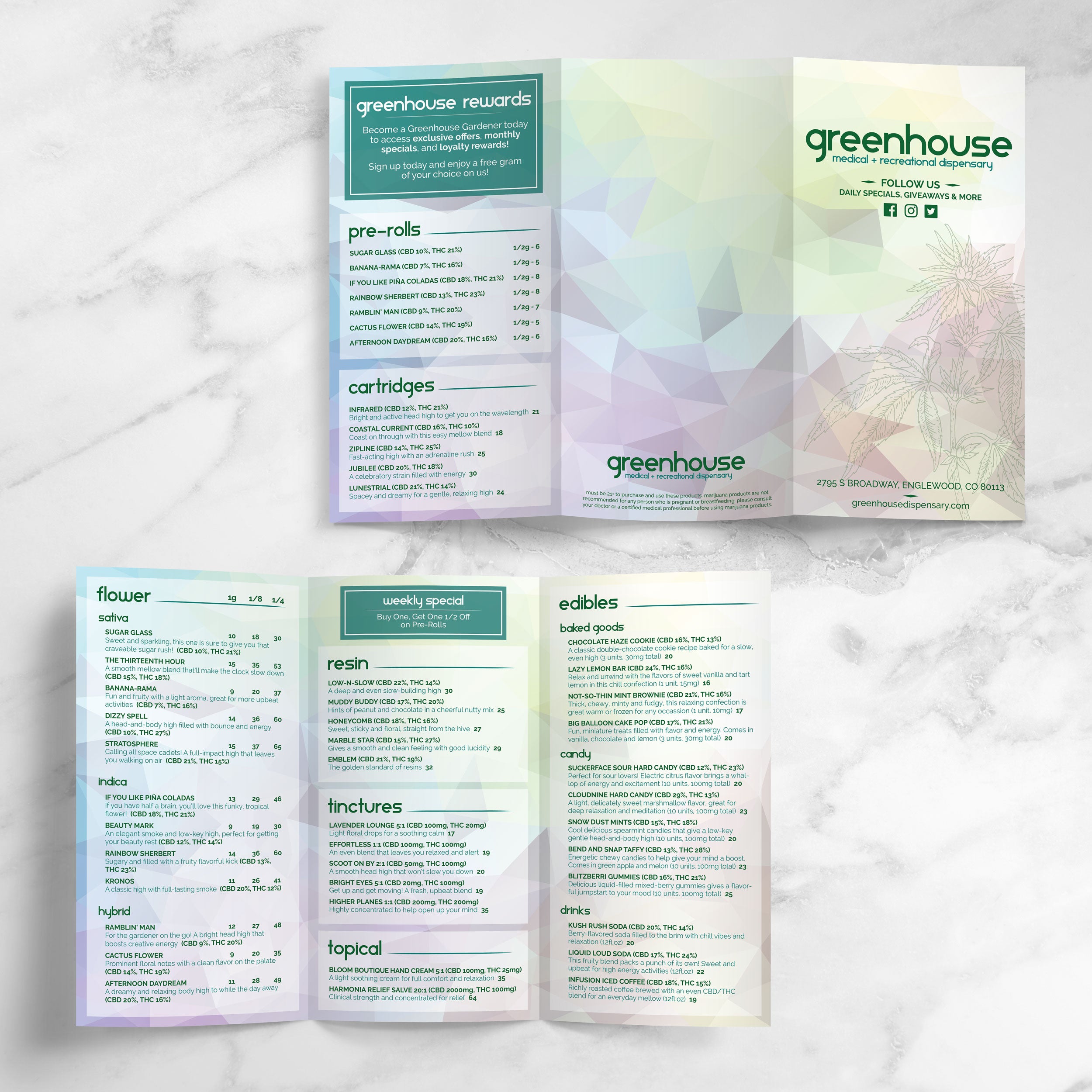
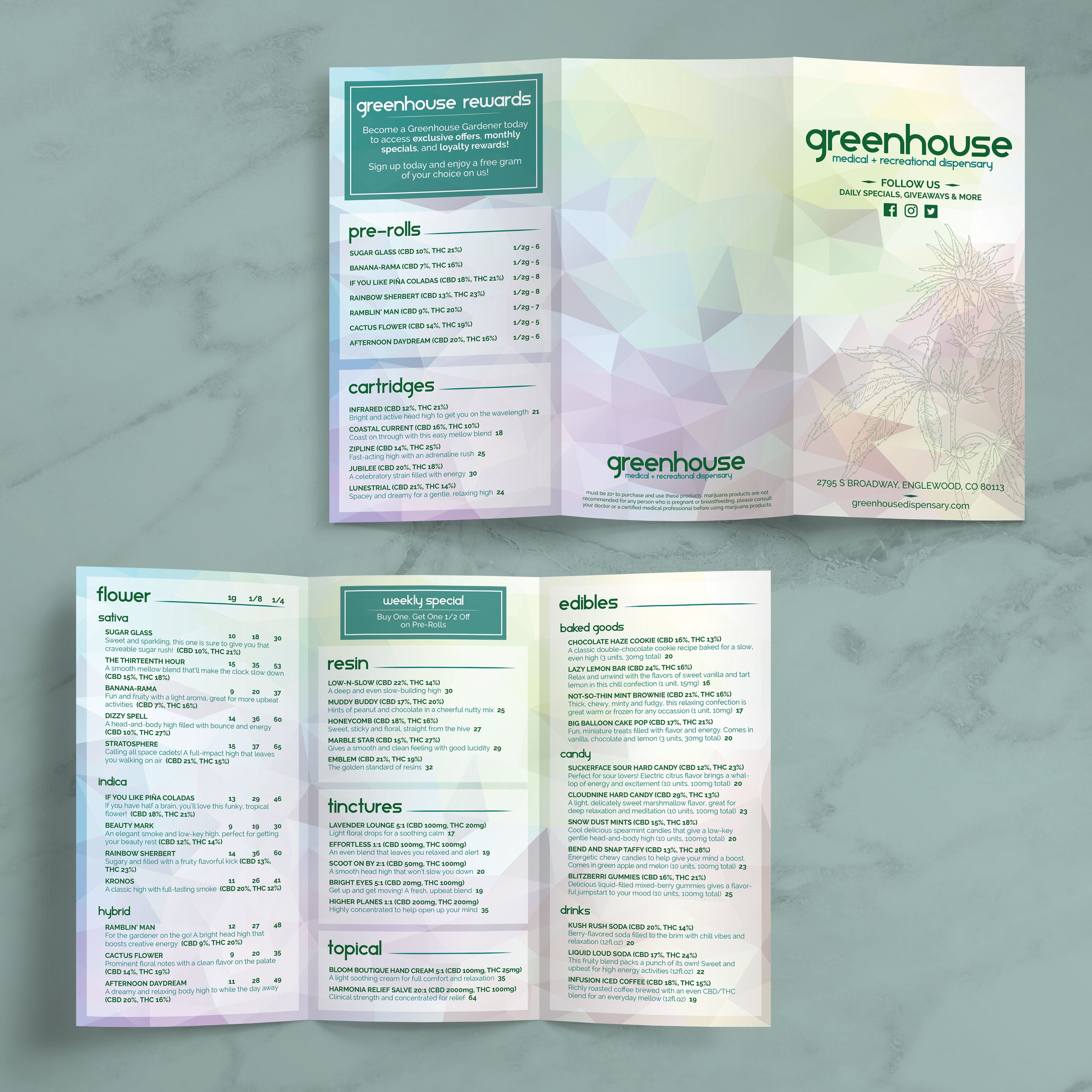
When inventory shifts daily, consistency keeps the menu readable. A strong template locks in spacing, font sizes, and category structure so new items can be added without disrupting alignment. This matters when menus list a high number of products across multiple categories, because customers can still scan quickly even as offerings rotate. Using free dispensary menu templates allows product names, weights, potency details, and pricing to follow one standardized format, reducing confusion caused by uneven styling.

Layouts That Reduce Errors During Fast Updates

Templates built with clear rows, predictable columns, and consistent headings help minimize mistakes. When pricing and product details appear in the same position every time, staff are less likely to mislabel items or place incorrect prices. Clean layouts also make it easier to review changes before printing, which is important when updates happen frequently throughout the week.

Organized Presentation for Large Product Lists

Large menus become cluttered when categories blend together or when spacing gets too tight. A well-designed template uses hierarchy, section breaks, and consistent spacing to guide the eye. Categories such as Flower, Pre-Rolls, Edibles, Concentrates, and Vapes remain clearly separated while still fitting a high volume of listings. This keeps the menu organized instead of overwhelming and helps customers find what they want faster.

Clear Categories That Reduce Counter Questions

Logical category structure reduces friction during ordering. When customers immediately understand where to look and how to compare products, they rely less on staff for basic clarification. This speeds up service and creates a smoother experience overall. Templates preserve this clarity even as products change, because the layout stays stable while only the content updates.

Practical Checks Before Choosing a Free Template

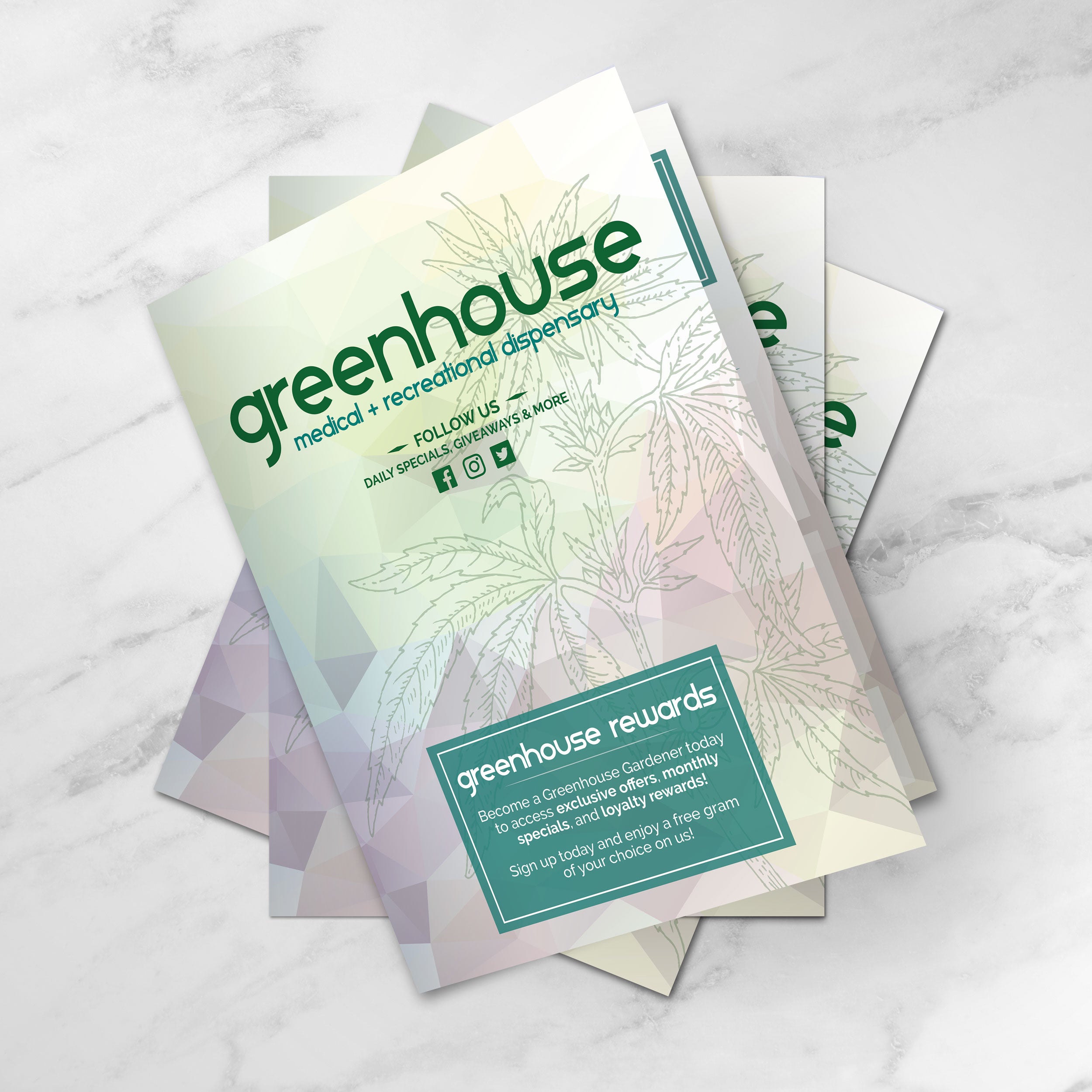
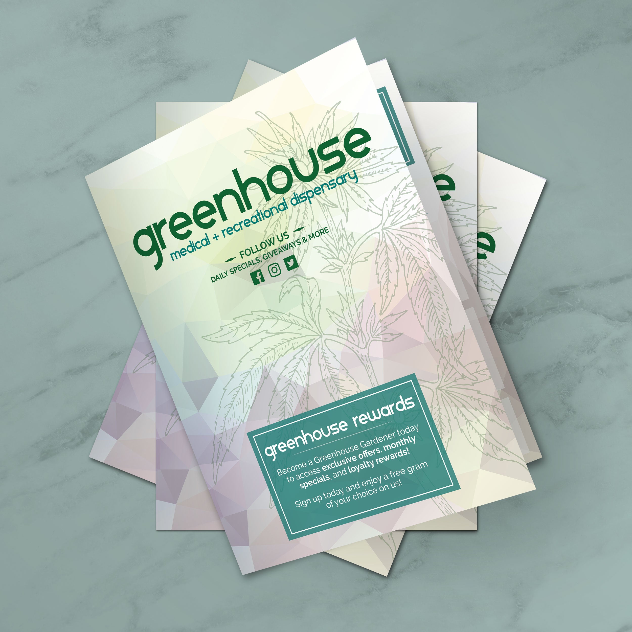
Before using any template, it should support the details customers expect, including weight, potency, pricing format, and clear category labels. It should also be easy to edit without breaking the design. If the menu will be printed and handled daily, durability matters. We print menus on TerraSlate waterproof, rip-proof paper designed for heavy handling and repeated cleaning, avoiding the clouding and delamination common with traditional lamination.

A dispensary menu should help customers compare options quickly and confidently, especially during busy periods.

Predictable Placement of Weight, Potency, and Price

Customers usually compare the same details first, including weight, potency, and price. A strong layout keeps these elements in consistent positions across every listing. When the eye knows where to look, comparisons happen faster, and decisions feel easier. Predictable formatting also reduces misreads, which is critical in a dispensary setting.

Readable Strain Naming at a Distance

Strain names should stand out without overpowering the menu. Clean templates use subtle font-weight changes rather than oversized text or decorative elements. Keeping spacing consistent between listings prevents items from blending together and ensures strain names remain readable from several feet away, even in busy retail environments.

Clear Separation Between Product Categories

Category separation is essential for fast navigation. Each section should have a distinct header, sufficient spacing, and a consistent internal structure. When categories are formatted similarly but visually separated, customers move through the menu naturally instead of stopping to reorient themselves.

Controlled Use of Callouts for New or Featured Items

Callouts work best when used sparingly. A small, consistent marker for new or limited items draws attention without cluttering the layout. Overuse creates visual noise and slows scanning. Well-structured templates support subtle emphasis so featured items stand out while the menu remains clean.

Spacing and Font Choices That Prevent Crowding

Dense menus require thoughtful spacing. Readable fonts with clean letterforms perform better when listings include numbers, weights, and pricing on the same line. Adequate line spacing and margins prevent skipped items and misread details, keeping the menu usable even when it contains a large number of products.

A menu is one of the first things customers interact with, and the layout signals how organized, modern, and trustworthy a dispensary feels. Templates make it easier to maintain a clean visual system while presenting product information in a way that feels intentional, polished, and consistent across formats.

Design Choices That Create a High-End First Impression

Premium menus rely on restraint. Clean typography, consistent spacing, and a clear hierarchy create a refined look without adding visual clutter. Instead of heavy graphics, a modern dispensary menu uses alignment and structure to guide the customer’s eyes from category to category. This makes the menu feel professional and helps products appear more curated and easier to compare.

Minimal Styling That Builds Trust and Supports Clarity

Minimal styling improves confidence because customers can see details clearly without distractions. When potency, weight, and price are presented cleanly, customers spend less time questioning what they’re reading and more time deciding what they want. A simple, modern template also helps eliminate formatting inconsistencies that can make menus feel rushed or outdated.

Consistency Between Printed Menus and Digital Displays

A premium look depends on consistency across where the menu appears. Fonts, spacing, category names, and pricing formats should match whether the menu is on a wall display, at the counter, or printed as a handheld menu. Templates help keep the same structure across formats, so customers don’t have to relearn the menu each time they view it, which supports faster ordering and a smoother experience.

Branding That Supports Readability Without Taking Over

Branding works best when it reinforces identity without competing with the content. Subtle use of brand color for headers, section dividers, or small accents helps maintain a modern feel while keeping product listings easy to scan. We offer template collections that provide strong structure and clean layout inspiration, including Free salon menu templates. We also have Free simple Italian menu templates and Free build-a-burger menu templates that allow dispensaries to borrow proven formatting approaches and adapt them to their own product categories without overdesigning.

A Single Master Template for Cleaner Updates Across Categories

One master template helps standardize formatting across every category, which reduces mistakes and makes updates faster. When product listings follow the same structure, staff can edit confidently, and customers can compare options easily. We support this workflow by printing menus on TerraSlate waterproof, rip-proof paper designed for heavy handling and repeated cleaning, and unlike menus with traditional lamination, our menus avoid clouding and delamination over time.

Dispensary menus are viewed in multiple places, and each format serves a different purpose. Choosing the right format helps customers read more quickly, enables staff to update more easily, and maintains a consistent look across the space.

  • Wall Menus That Support Fast Scanning From a Distance: Wall menus are most effective when they focus on high-level product categories and core details that can be easily read from several feet away. Larger text, clear section separation, and simplified descriptions help customers browse while waiting in line, reducing bottlenecks at the counter and making ordering smoother during peak hours:
  • Counter Menus Designed for One-on-One Interaction: Counter menus facilitate closer viewing and provide more detailed information. These formats can include additional product details like potency ranges or size options without overwhelming the layout. A clean structure allows staff to reference items easily while guiding customers through choices without flipping between multiple pages.
  • Handheld Menus for Curated or Limited Selections: Handheld menus are ideal for curated lists, daily specials, or focused product categories. Because these menus are handled directly by customers, clarity and durability matter. Short descriptions, tight category focus, and consistent formatting keep these menus easy to use without slowing down service:
  • Digital Displays That Mirror Printed Menu Structure: Digital menus should follow the same layout logic as printed menus. When customers see the same category order, spacing, and formatting across formats, navigation feels familiar. This reduces confusion and helps customers move from browsing a screen to placing an order without hesitation:
  • Standardized Formats That Simplify Updates Across Locations: Using consistent formats across wall menus, counter menus, and handouts makes updates faster and more accurate. When all versions follow the same design system, staff can apply changes confidently without worrying about breaking layouts. We support this consistency by printing menus on TerraSlate waterproof, rip-proof paper that holds up to daily handling and repeated cleaning, keeping every format looking clean and professional.

When menu formats are chosen intentionally, the experience feels organized from the moment customers walk in, helping the space run more efficiently while maintaining a modern, polished presentation.

Dispensary menus get handled constantly, and they need to stay clean, readable, and professional even after repeated use. Printing the menu on the right material helps preserve clarity, reduces replacement costs, and prevents worn-out menus from lowering the overall impression of the shop.

Common Issues with Traditional Lamination

Menus with traditional lamination often look fine at first, but repeated cleaning can create visible wear. Over time, lamination can cloud up, bubble, or start separating along the edges. Once the menu loses clarity, even a well-designed layout can look worn and unprofessional. These issues usually lead to frequent reprints, especially in high-traffic environments where menus are wiped down throughout the day.

Why Waterproof Menus Support Better Daily Maintenance

A waterproof menu material is easier to maintain because it can be wiped down without damage. Simple soap and water are often the most practical options for daily cleaning, especially when handled by many customers. Waterproof menus stay readable because they don’t rely on a laminated layer that can cloud or peel. This helps keep the menu looking consistent from day one through repeated cleaning cycles.

Thickness Considerations for Different Dispensary Use Cases

Different menu types benefit from different thickness options. Counter menus often need a stronger feel to withstand frequent handling, while wall menus may prioritize a balance between durability and ease of mounting. A thickness that is too thin can bend and show wear quickly, while thicker stock can maintain structure longer. The key is matching thickness to where and how the menu is used, rather than choosing one option for every placement.

Folded Menus for Larger Product Selections

Folded menus are useful when product selection is extensive, and categories need more space. Folded formats can keep sections organized while making the menu easier to hold and store. They also help prevent clutter by spreading content across panels instead of compressing everything into one page. For dispensaries with a wide variety, folded menus can improve browsing and reduce the time customers spend searching.

Printing for Fast Updates Without Starting Over

Frequent inventory and pricing changes require a menu that is easy to update and reprint without disruption. When templates are designed for editing, staff can replace product listings quickly and keep formatting consistent. We print menus on TerraSlate waterproof, rip-proof paper, and we can also print menus for you with our proprietary TerraShield™ anti-microbial coating with industry-leading turnaround and fast shipping, helping dispensaries keep menus fresh without relying on traditional lamination that can cloud up or delaminate over time.

Accuracy and clarity matter in dispensary menus because customers compare details closely and expect information to be consistent across categories. A strong template reduces mistakes by standardizing how product data is displayed, making updates easier to review, and keeping listings readable even when inventory changes quickly.

Standard Formatting That Limits Pricing Mistakes

Templates reduce pricing errors by keeping prices in a consistent position and format across the entire menu. When every listing follows the same structure, it’s easier to spot a misplaced price, a missing size, or a formatting inconsistency before the menu goes live. Consistent formatting also prevents staff from improvising layouts during quick edits, which is when most errors happen.

Clear Product Details That Reduce Back-and-Forth Questions

When weight and potency details are displayed cleanly and consistently, customers can compare options without repeatedly asking staff for clarification. This builds confidence at the point of purchase because customers feel like they can understand what they’re buying at a glance. Clear product detail placement also supports smoother ordering, especially during busy hours when staff need the menu to do more of the explaining.

Template Structure That Improves Staff Workflow

A standardized template acts like a system, not just a design. Staff learn where information belongs, how updates should be entered, and how categories should be organized. This reduces training friction and makes it easier for multiple team members to update the menu without creating inconsistent formatting. Over time, a stable structure leads to fewer errors and faster updates.

Visual Consistency That Supports Trust and Repeat Visits

Customers tend to trust menus that look organized and professionally maintained. When a menu remains consistent in layout, spacing, and category structure, it signals reliability. Even small design inconsistencies can create doubt, especially when customers are comparing similar products and pricing. A clean template helps maintain a modern presentation that supports repeat business.

Durable Printing That Helps Menus Stay Clear Longer

A menu that stays clean and readable over time supports trust because it looks maintained, not worn out. We print menus on waterproof, rip-proof TerraSlate paper designed for heavy handling and repeated cleaning, so the menu stays clear without the clouding and delamination issues common with traditional lamination. Simple soap and water is recommended for our paper, which makes daily upkeep practical while preserving a professional look.