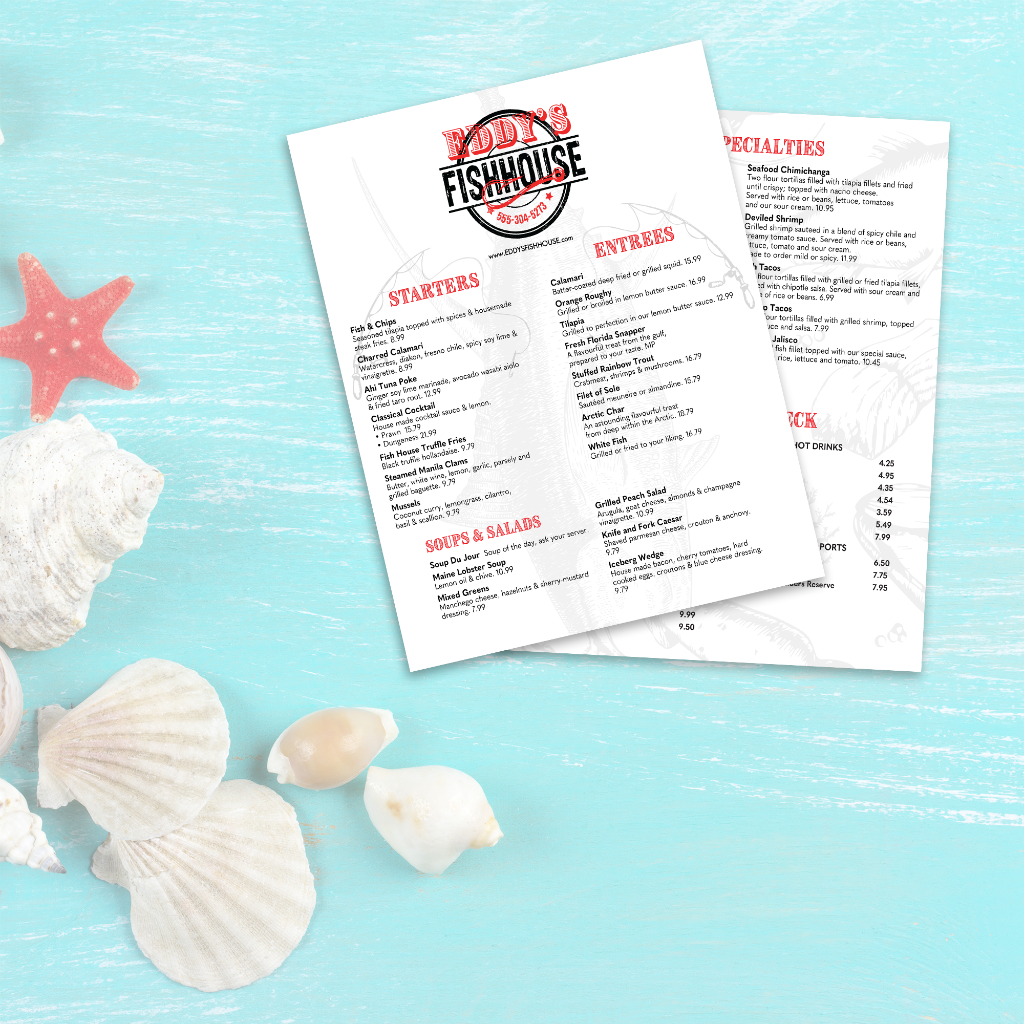
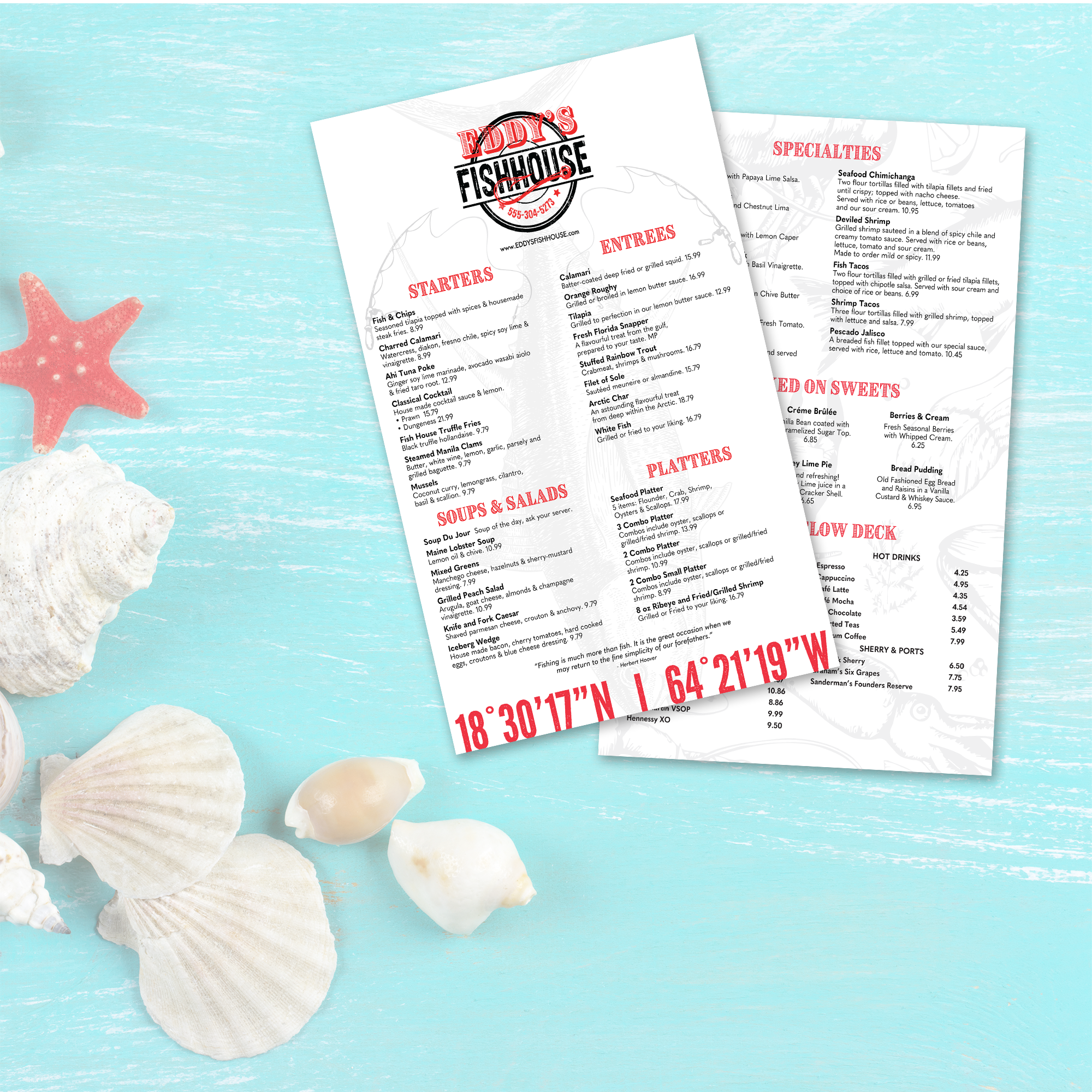
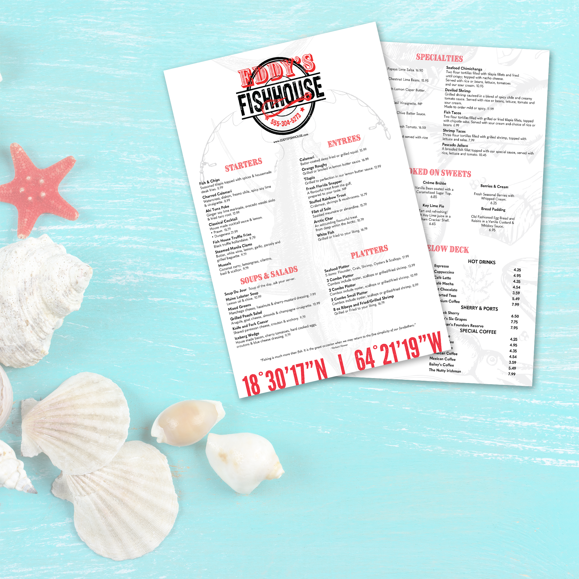
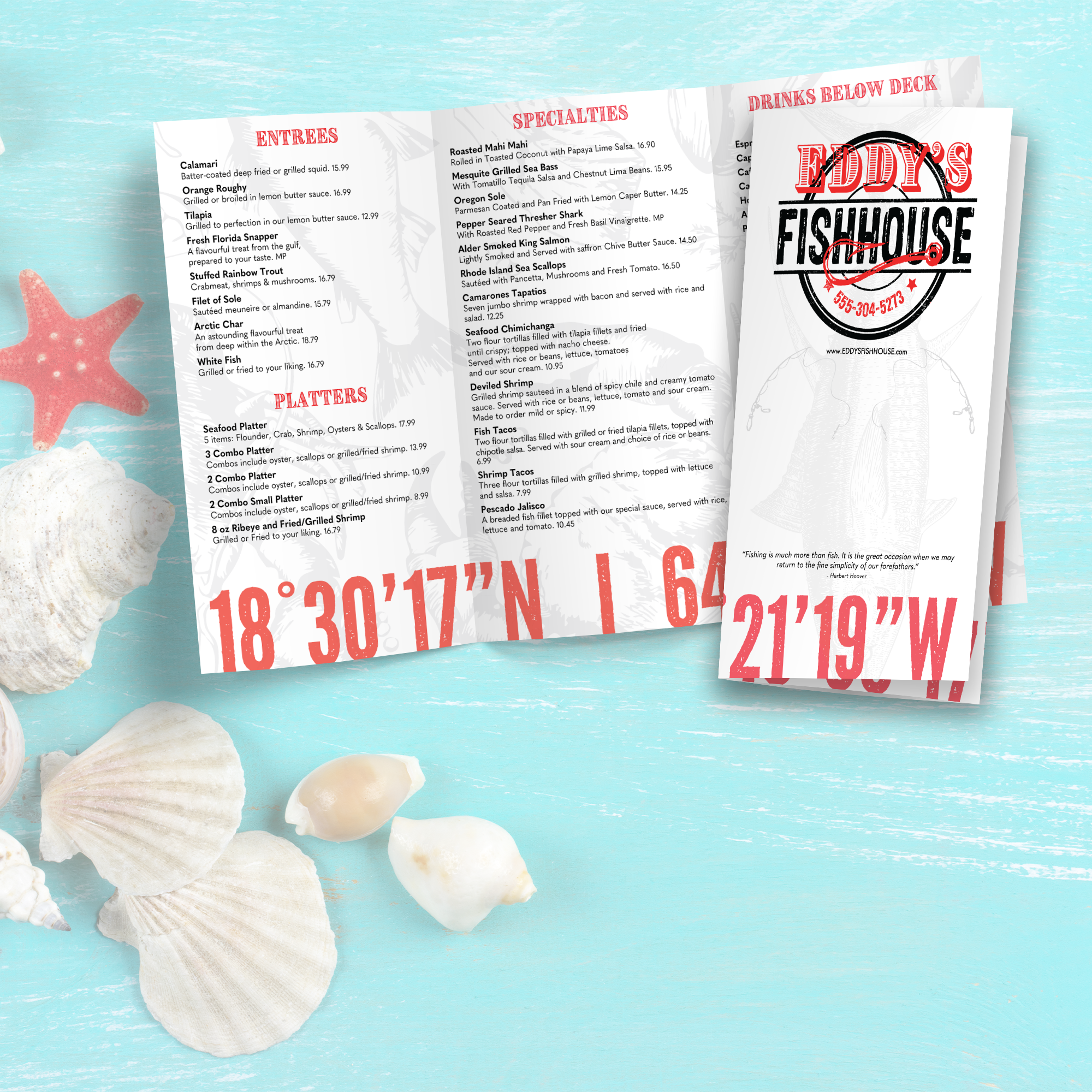
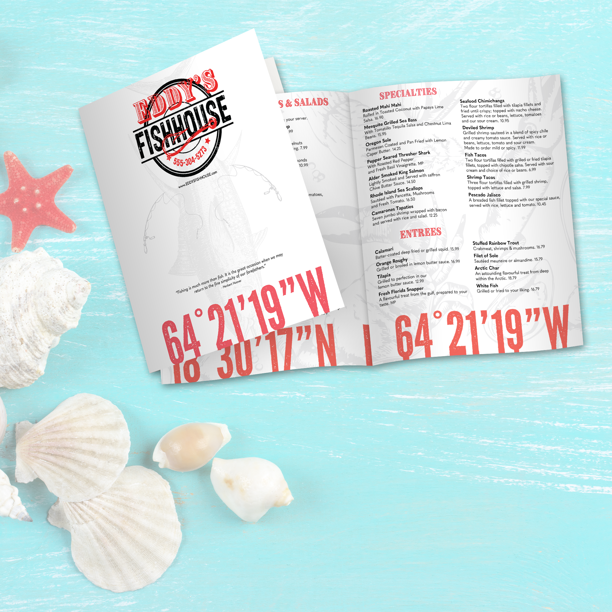
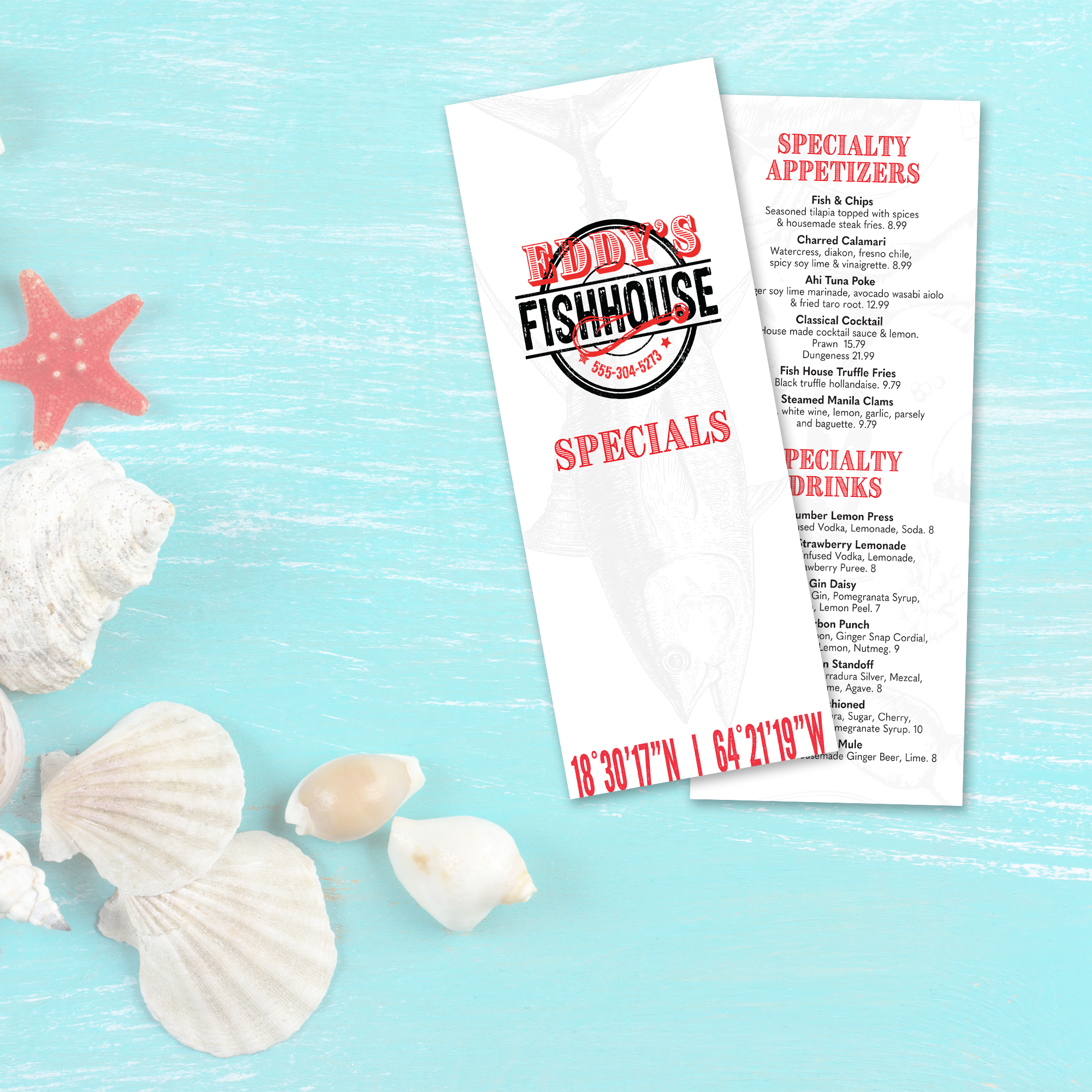
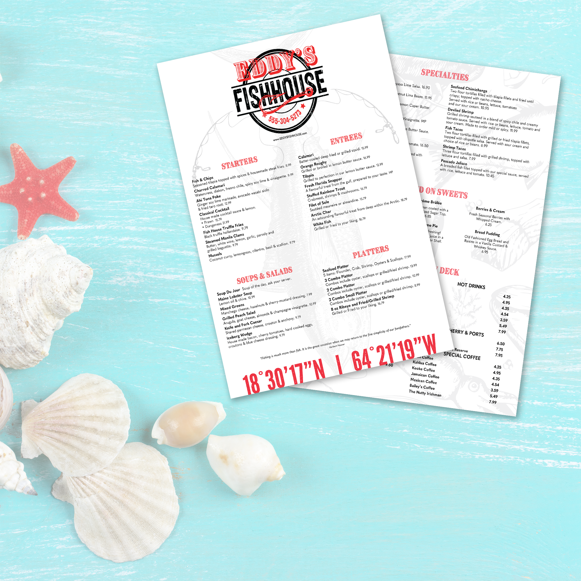
An upscale fish house menu must convey quality before a guest even reads the first dish description. The design should evoke a sense of calm, intentionality, and premium quality, with layout choices that prioritize readability over visual crowding. That’s why using a free upscale fish house menu template is such a strong starting point. A well-built template provides the proper structure for refined typography, balanced spacing, and a menu flow that feels curated rather than cluttered. Many fish houses also benefit from starting with our proven base layout, like our free fish house menu templates, and then refining the structure to match a more upscale dining experience.
How White Space Creates a Calm, High-End Dining Feel
White space is one of the fastest ways to signal a premium experience. Upscale menus do not try to fit every item possible onto one page. Instead, they create breathing room around categories, item names, and pricing so guests can scan without effort. This also keeps the menu from feeling like a list, making it easier for guests to focus on standout items like chilled seafood towers, fresh catch entrées, or the chef's features.
Typography Choices That Enhance Seafood Presentation
Typography should appear refined yet remain easy to read in real-world service conditions. Upscale menus often feature clean fonts, consistent sizing, and a strong hierarchy, rather than decorative text. The goal is to make item names feel confident and premium while keeping descriptions subtle and supportive. When typography is consistent across categories, the menu looks professional, and the food feels more intentional.
Menu Density Decisions That Prevent Visual Overload
Seafood menus can become crowded quickly because they often feature a variety of items, including raw bar selections, entrées, sides, sauces, and market specials. An upscale layout should avoid dense blocks of text and long descriptions. Instead, it should prioritize fewer words, clean spacing, and consistent formatting so that guests can understand the options quickly. A template helps by enforcing margins, spacing, and predictable formatting patterns that keep the menu from becoming visually overwhelming.
Subtle Design Signals That Communicate Quality
Premium menus use subtle design signals rather than bold visual elements. Simple dividers, light section labeling, and consistent alignment create a sense of refinement that doesn't distract from the food. These details help guests feel that the restaurant has a higher standard of quality. When the menu looks clean and restrained, it reinforces the perception that ingredients and preparation are the focus.
Layout Errors That Undercut an Upscale Impression
Common mistakes include crowded spacing, inconsistent font styles, overly lengthy descriptions, and inconsistent pricing placement. Another issue is overusing design elements, such as multiple font styles, heavy borders, or excessive callouts, which can make the menu look cluttered instead of premium. A strong template prevents these errors by incorporating the upscale structure into the design, ensuring the menu remains readable, balanced, and aligned with the dining experience.